


Percentile bands can help add more depth to a simple line chart. They show typical ranges, variability, and extremes all at once.
Last year I completed a Workout Wednesday challenge by Sean Miller focused on visualizing percentile bands in Tableau. I’d highly recommend giving it a try!
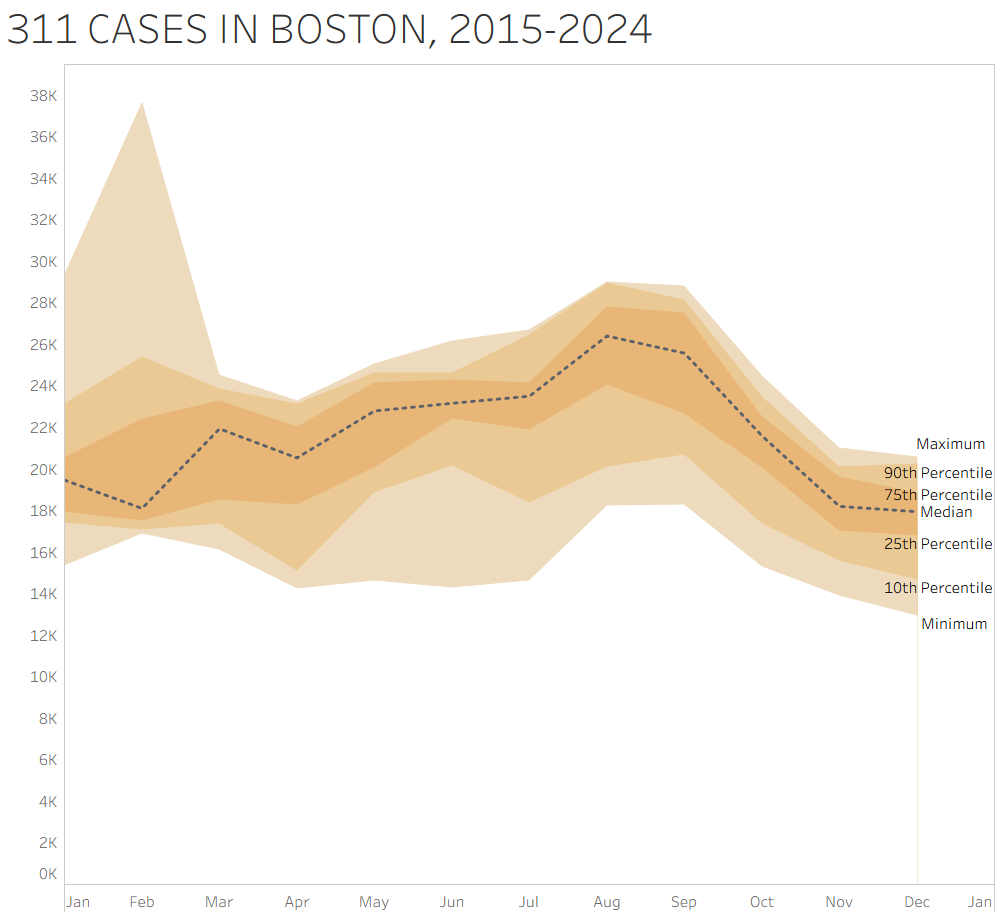
Today, I wanted to see if I could recreate the visualization, this time using data on Boston 311 calls. The key idea in this analysis is aggregating at the month level across years. Instead of looking at a continuous timeline, I grouped all Januarys together, all Februarys together, and so on. This lets me ask the question: for a given month, how does that month typically behave across years?
Here is the final visualization:
Step 1: Understand the data
Each row in the dataset represents a specific month-year combination (e.g., January 2015, February 2016), along with the total number of 311 cases.
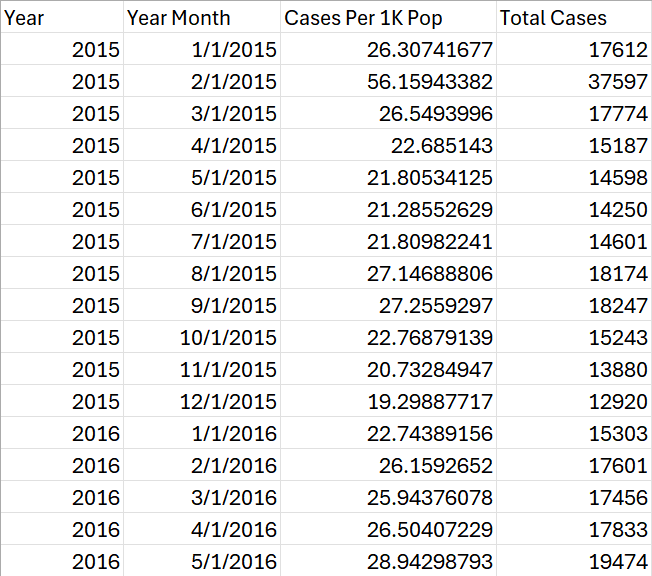
Because of this structure, no additional cleaning was needed. I could directly aggregate across years by month, grouping all January observations together, all February observations together, etc., to build distributions for each month.
Step 2: Create Calculations for Percentile Bands
The visualization is built by layering multiple area charts (for the bands) and a line chart (for the median).
Create the following calculated fields:
Median
PERCENTILE([Total Cases], 0.5)
Maximum
MAX([Total Cases])
Minimum
MIN([Total Cases])
10th Percentile
PERCENTILE([Total Cases], 0.10)
25th Percentile
PERCENTILE([Total Cases], 0.25)
75th Percentile
PERCENTILE([Total Cases], 0.75)
90th Percentile
PERCENTILE([Total Cases], 0.90)
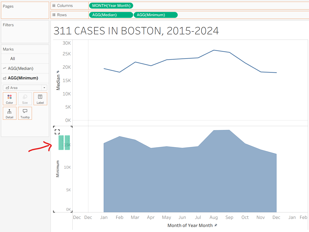
Step 3: Build the Median Line Chart
- Drag Month to Columns (continuous/green pill), aggregated by month. This should display just 12 values (Jan–Dec)
- Drag Median to Rows
- Set the Marks type to Line
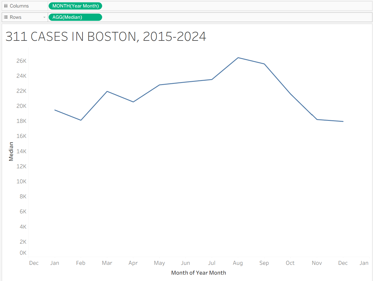
You may want to format the x-axis to display month abbreviations instead of numbers.
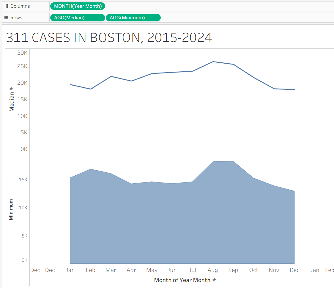
Step 4: Add Percentile Band Area Charts
Now we can build the layered bands.
Drag minimum to the rows column, and change its Marks type to Area Chart.
Your sheet should look like this:
To the bottom area chart, drag in the remaining calculations on top of the y-axis axis
- 10th Percentile
- 25th Percentile
- 75th Percentile
- 90th Percentile
- Maximum
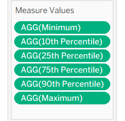
When dragging them in, you should see the following visuals on your axis:
At this point, you should have multiple overlapping area charts:
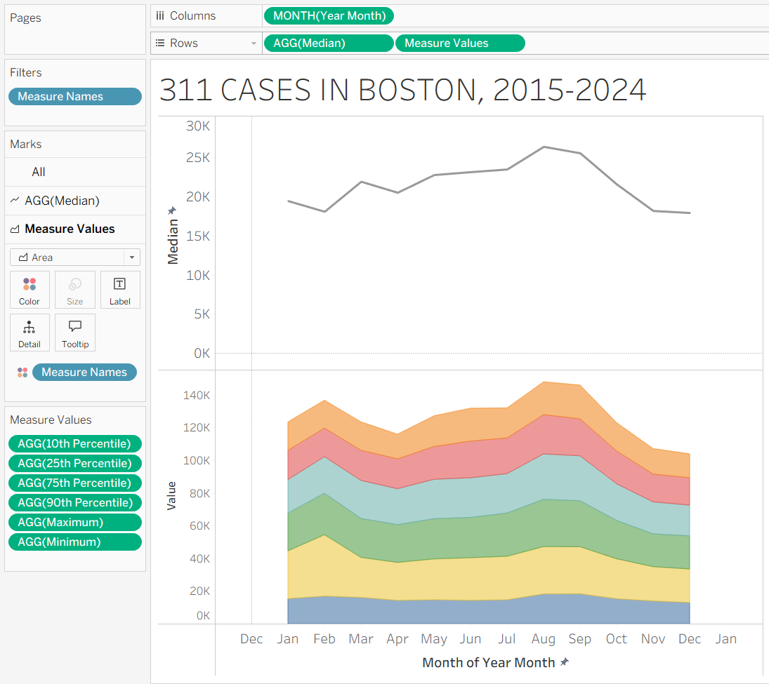
Step 5: Turn off Stack Marks
Tableau defaults to stacking area charts. But we don’t want to stack our charts on top of each other – we want them to layer.
In the topmost toolbar, go to Analysis → Stack Marks → Off
Step 6: Create a Dual Axis
- Right-click the Measure Values pill → Dual Axis
- Right-click one axis → Synchronize Axis
This should overlay the percentile bands with the median line.
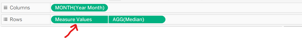
Step 7: Reorder the Layers Correctly
The order of measures determines how the bands show up.
Ensure your measure values on the left are sorted correctly, from smallest to largest percentile.
Also ensure that in the rows column at the top of your sheet, Measure Values is to the left of AGG(Median). This ensures the median line appears on top of all the area charts.
Step 8: Assign Colors
Assign your desired color shades to the line and area charts
I went for shades of brown, like so:
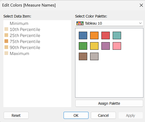
- Area Charts:
- Minimum = white (no fill)
- 10th Percentile and Maximum: Shade 1
- 25th Percentile and 90th Percentile: Shade 2
- 75th Percentile: Shade 3
- Set opacity at 0%
- Median line:
- Color: black
- Line style: dashed
Step 9: Final Formatting Edits
- Hide rightmost y-axis
- Adjust the x-axis to run from 1 (January) to 13 (next January) for spacing
- Drag Measure Names to Label if needed
- Clean up gridlines and format text size for readability
There you go!