Build your Team
Enhancing your data team with ours
Our consultants come armed with both technical and soft skills to support you to make the most of your data.

The Data School has been paramount to our success at JLL. It has allowed us to bring in highly skilled Tableau and Alteryx consultants. It saves considerable time trying to recruit contractors as I know their skills and training are to the highest standard. Over the past 5 years my team has developed analytical insights which have generated multi million dollar savings of which a considerable amount can be attributed to the Data School consultants we have had working on projects.
Paul Chapman, Global Director of Performance Management, BI and Innovation at JLL

Alteryx
Partner of the Year
EMEA
Tableau
Community Impact 2024
EMEA ESMB
DataIQ
Data for Good Champion
Finalist
DataIQ
Best Data Academy or Skills Development
Finalist

Alteryx
Partner of the Year
Europe

DataIQ
Data for Good Champion
Champion

Tableau
Data for Good 2021
EMEA
What our consultants are working on
We believe that sharing knowledge and expertise is key to driving innovation and growth in the data community. That's why we're excited to share our latest insights, tutorials, and industry trends with you through this blog.
Written by our team of experienced data consultants, these posts aim to solidify their own learning while giving back to the community.


Sat 05 Jul 2025 | Hannah Norfolk
Understanding the Cross-Tab and Transpose Tools in Alteryx
When I was introduced to Alteryx, I found both the Cross-Tab and Transpose tools easy to mix up, and I found myself using trial-and-error to understand the configuration pane for both. Here I will break down what both reshaping tools do, and how to approach their configuration panes


Fri 04 Jul 2025 | Ollie Ross Russell
How to Remove the “ABC” Column from a Table in Tableau
If you’ve built a table in Tableau and noticed the unwanted “ABC” column at the end, like in this table, you're not alone. This column appears when Tableau expects a measure or value to display in the body of the table, but none is provided

Fri 04 Jul 2025 | Louis Phipps
Configuring the Find & Replace Tool in Alteryx
Alteryx defines the Find & Replace tool as
"Search for data in one field from one data stream and replace it with a specified field from a different data stream"
This tool works very similarly to the VLOOKUP function in Excel


Thu 03 Jul 2025 | Rosh Khan
Aliasing Null Dates in Tableau (The Easy Hack)
Did you know you can’t alias dates directly in Tableau like you can with text fields?
That means if you want to show something like “Christmas Period” instead of 25/12/2023, Tableau won’t let you do it natively


Thu 03 Jul 2025 | Harry Caplin
Triple Drill-Down Bar Chart in Power BI
The Triple Drill-Down Bar Chart is a smart way to let your audience explore data across three hierarchical levels without cluttering the report or overwhelming them with filters


Wed 02 Jul 2025 | Joseph Darton
Full Moons & Easter Sundays
2023 Week 16 of Preppin' Data Challenges looked at the variation of the day in which Easter Sunday falls on. Turns out this is based on the full moon


Thu 03 Jul 2025 | Mariia Sapsai
Wie kannst du eine Shape Map in Power BI Desktop erstellen?
Die Shape-Map-Visualisierung ist nur in Power BI Desktop verfügbar. Da sie sich in der Vorschau befindet, muss sie vor der Verwendung aktiviert werden

Thu 03 Jul 2025 | Mariia Sapsai
Wie kannst du eine KPI bauen?
Für diese KPI habe ich das Superstore-Dataset benutzt.
Das Erste, was wir machen können, ist ein Liniendiagramm zu erstellen. Für verschiedene Ziele kannst du verschiedene Diagrammtypen verwenden – das kann auch ein Balkendiagramm sein, je nachdem, was dir lieber ist
Thu 03 Jul 2025 | Rosh Khan
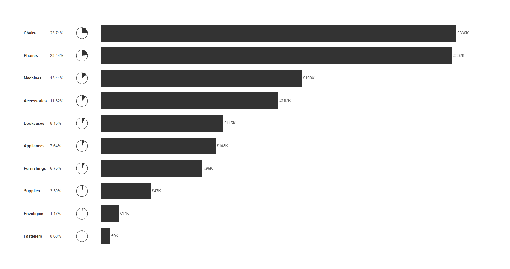
Combining Bar and Pie Charts in Tableau: A Cleaner Way to Show Totals and Percentages
When you're trying to show both absolute values and percentages of total, using separate bar and pie charts often creates more confusion than clarity.
Viewers have to jump between visuals, match colours, and mentally piece things together
Thu 03 Jul 2025 | Rosh Khan
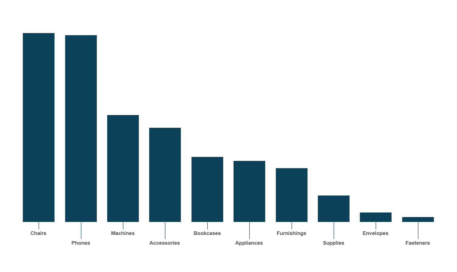
How to Offset Label Position in Tableau
Handling Overlapping Labels in Tableau: A Simple Staggered Approach
When working with bar charts in a tight dashboard layout, labels can easily become cluttered. Long labels or a high number of bars often lead to overlapping text, which makes the visual harder to read and less effective


Thu 03 Jul 2025 | Birthe Claussen
Sheets as Tabs in Tableau Public
Sometimes you don’t want to publish whole dashboards in Tableau Public, but a workboot with several sheets displayed as tabs above.
If you upload your workbook (only sheets, no dashboard) to Tableau Public it will display just the sheet you were currently working on
Want to know more?
Whether you're planning for the future or you have a project that needs to get started next week our team are more than happy to help.
Complete our contact form with your name, company email and a brief message and we will get back to you as soon as we can.