


It's Day 4 of Dashboard Week! (And our last day of training?!)
During this training week, we’re given a prompt each morning and challenged t0 complete a dashboard by 3 pm.
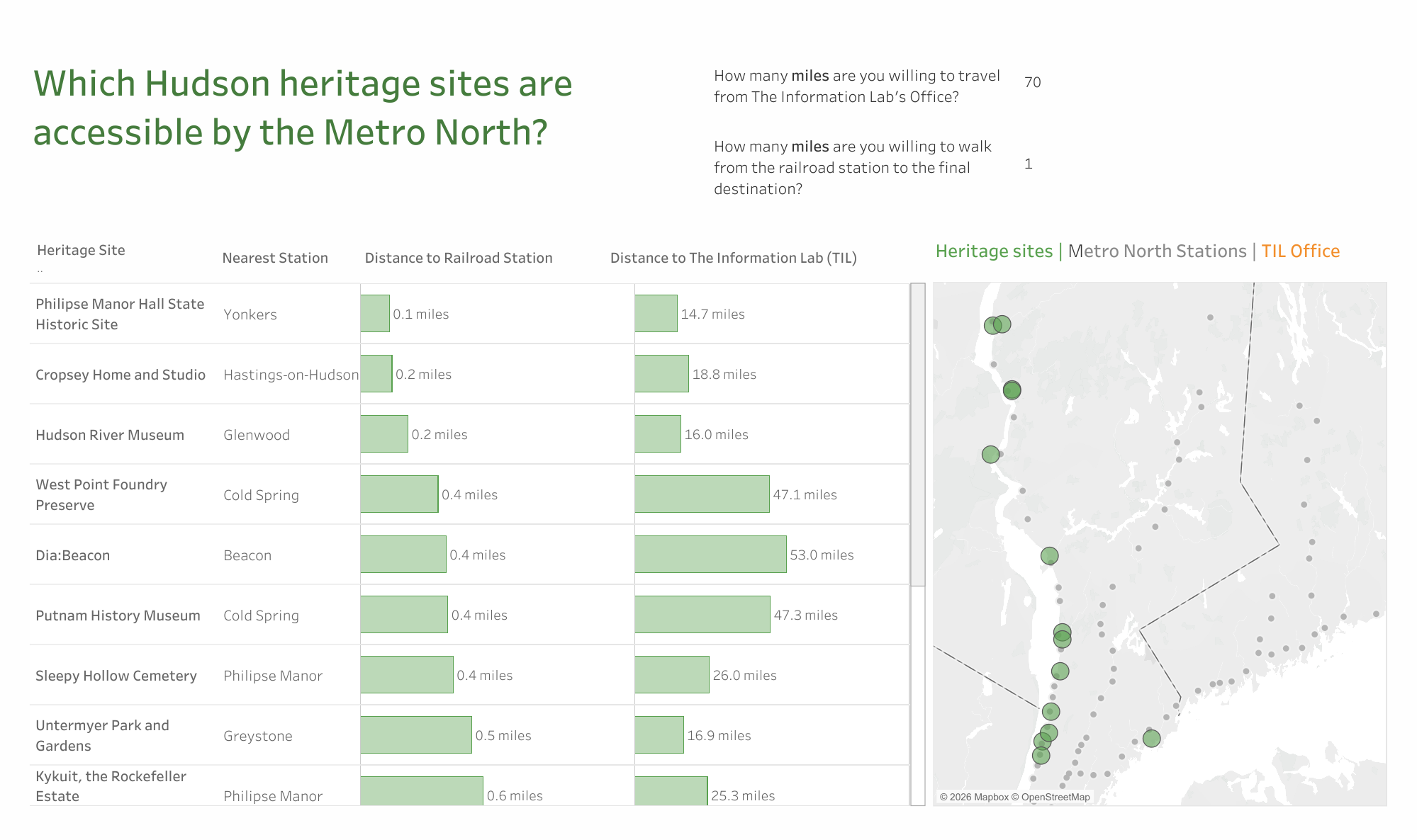
Today, we were asked the question: Where should the Information Lab's New York Office go on our next outdoor adventure?
Specifically, we had to find the longitude and latitude of sites in the Hudson River Valley Heritage Area, calculate distances and drive time between those points and The Information Lab's New York Office, and then bring in additional data for analysis to construct a dashboard.
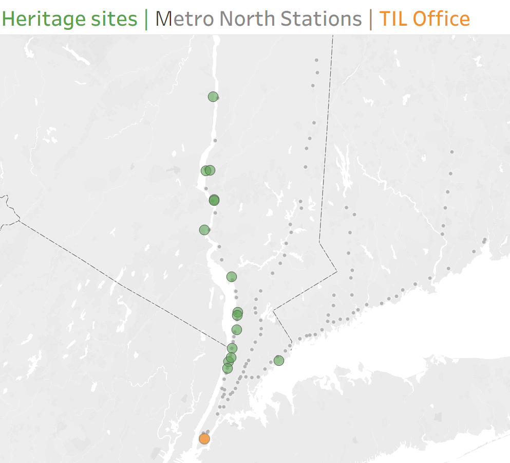
As a car-less New Yorker, I wanted to build a dashboard focused on which heritage sites were accessible by the Metro North.
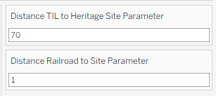
Specifically, I wanted the user to be able to input certain conditions – how many miles they were willing to travel from our office, how many miles they were willing to walk from the station to the final destination – and view heritage sites that would be relevant to them.
Here is a link and screenshot of my final dashboard:
Below, I will walk through my process! Ther Alteryx section is fairly similar to my work from Tuesday, with some changes.
First, I assembled the dataset for Heritage Sites
Since there wasn't a pre-existing heritage site dataset, I decided to create one by webscraping the Hudson River Valley's Heritage Site website.
I chose this route because, when inspecting the page source (right click --> View Page Source), I noticed that there was a clean list of all the heritage sites on that page, with their addresses, latitude, longitude, and page URLs:
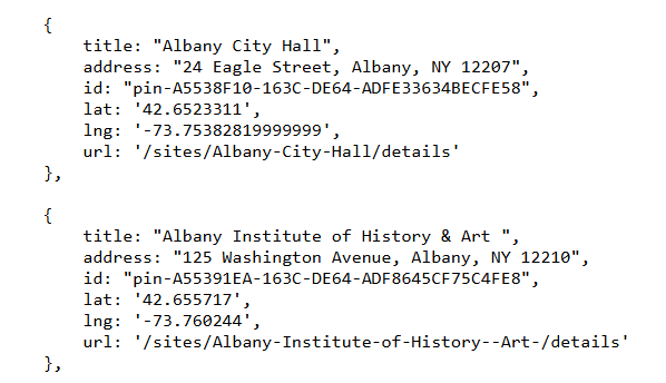
This made it fairly easy to scrape the page to get all the information on the heritage sites that I needed.
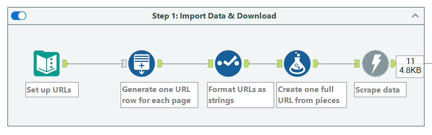
I decided to webscrape using Alteryx. I started by setting up a list of 11 URLs I wanted to scrape (to represent the 11 pages of heritage sites), then I used the Download tool to pull in the data:
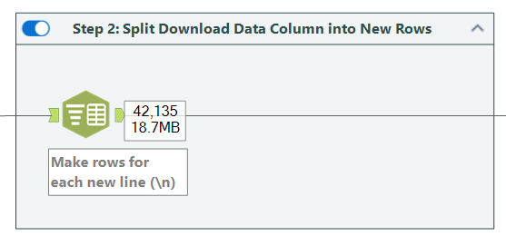
Next, I made each heritage site its own row
I split each new line in the code (\n) into its own row using the text-to-columns tool.
Next I performed some cleaning so that the data would be easier to read and parse through.
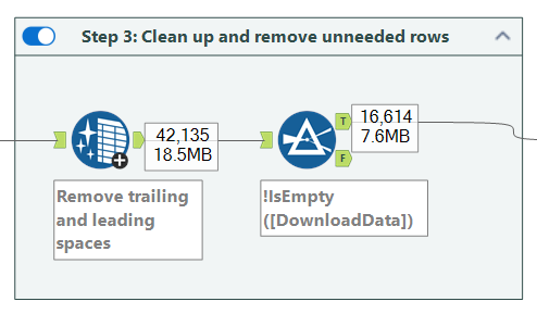
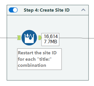
I then used the Multi-Row Formula tool to create a site ID that groups rows belonging to the same “site.” Each time a new site starts (marked by "title:"), I assigned a new ID. All following rows inherit that same ID until the next "title:" appears.
IF CONTAINS([DownloadData], "title:")
THEN [Row-1:Site_ID]+1
ELSE [Row-1:Site_ID]
ENDIF
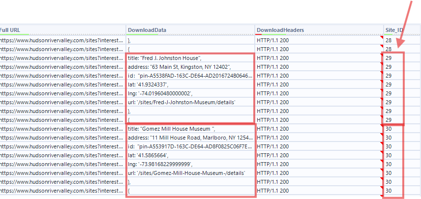
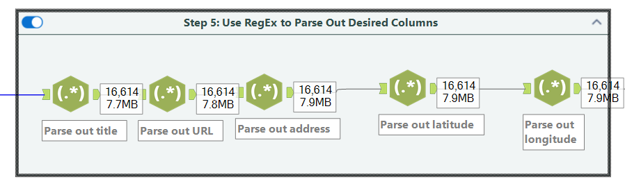
Next I used RegEx to parse out the information I was interested in: title, URL, address, lat, and long:
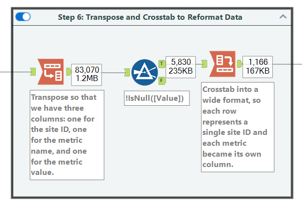
I then did some crosstab-ing and transposing to get the data into the right format:
A bit more cleanup:
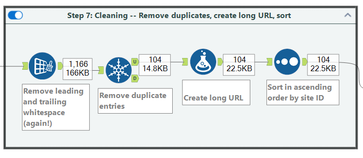
At this point I had 104 rows – one for each heritage site.
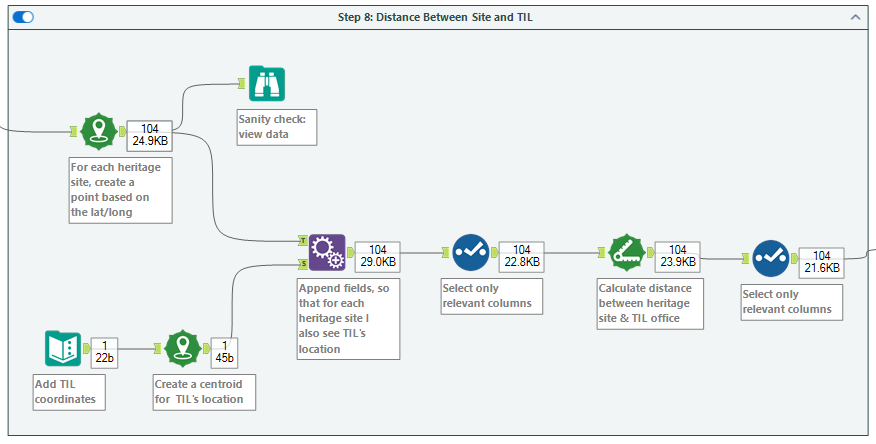
Third, I brought in data on The Information Lab's location
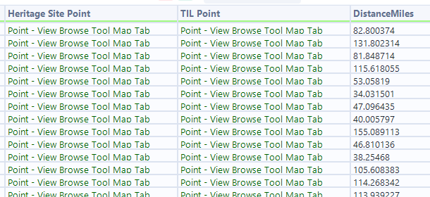
I created a new text input and added the Information Lab's latitude and longitude, which I turned into a point. Then I appended that location to every single row in the dataset, so that I could compare the distance between each heritage site and the TIL office.
Fourth, I brought in data on Metro North Stations
I then brought in Metro North station data, and used the "Nearest" tool in Alteryx to find, for each heritage site, which metro station was the nearest and how far away it is.
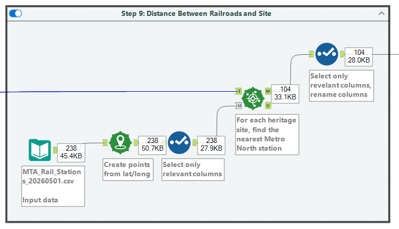
At this point, I exported the data and headed over to Tableau!
Fifth, I began building the dashboard in Tableau
Building the dashboard was super fun. I had two data sources (1) first, the heritage sites and their nearest Metro North Stations, and (2) second, a list of all the Metro North Stations.
When assembling the map, I created three map layers – one for the Heritage sites (data source #1), one for the TIL office ((data source #1), and one for the Metro North stations (data source #2). This allowed me to have three Marks cards, and make the points on each of those layers a different color:
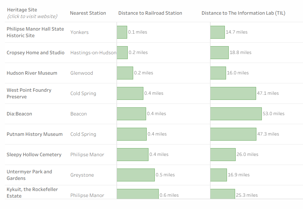
Since I had already calculated the distances between (a) the TIL office and each heritage point, and (2) each heritage point and the nearest Metro North station, I could also easily set up parameters/filters to allow the user to select how far they were willing to travel:
I then went ahead and built a bar chart, which once again was a breeze given that I had already calculated distances in Alteryx:
I also had time to add two dashboard actions:
(1) a highlight action, so that whenever a user hovers over the bar chart it highlights that point on the map
(2) a URL action, so that whenever a user clicks on a heritage site in the bar chart it takes them to the website for that particular heritage site
What a fun challenge, and a great way to wrap up training!