


A cycle plot is a specialized line chart used to visualize seasonal trends in data. It helps compare values across time—especially when patterns repeat (e.g., monthly, weekly, or quarterly).
In this tutorial, we’ll walk through building a dual-axis cycle plot in Tableau using their native Superstore dataset.
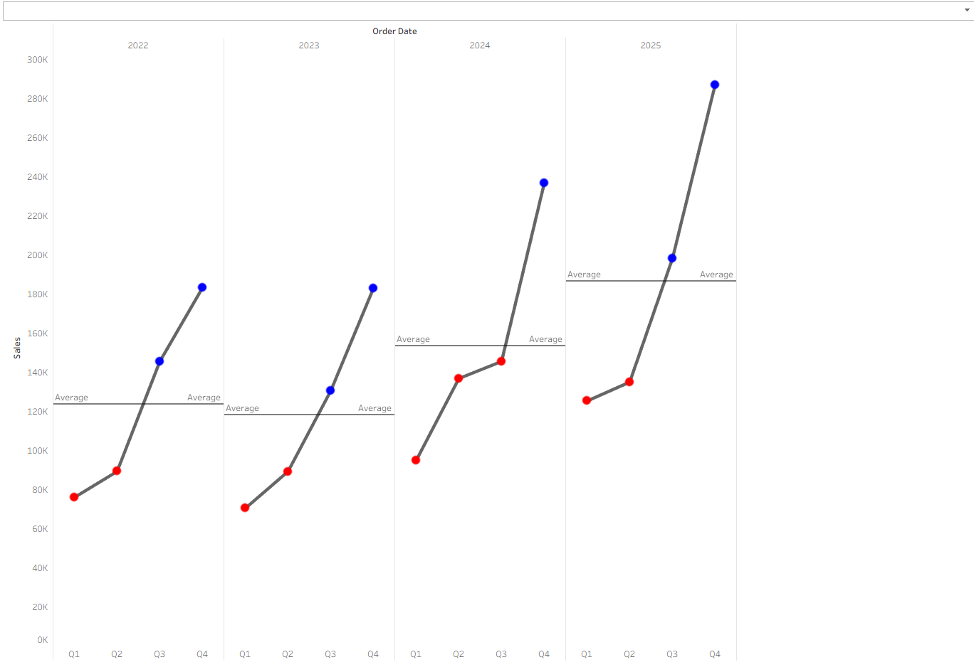
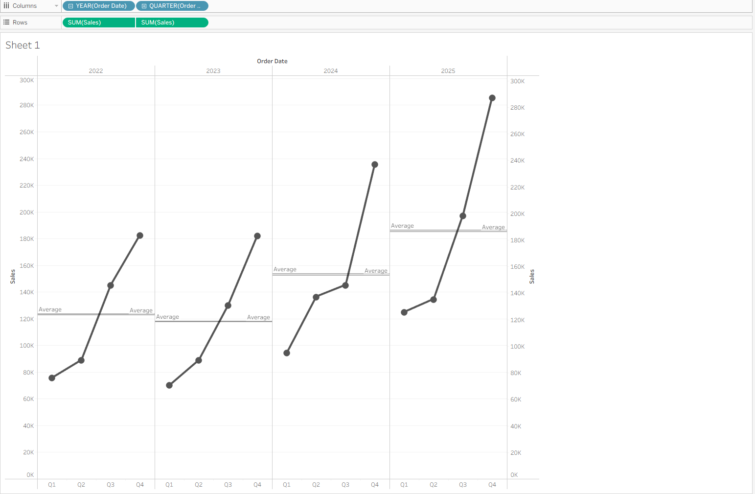
Purpose: To visualize how sales vary by quarter across different years, and highlight where values fall above or below the average. See below for our expected final visualization.
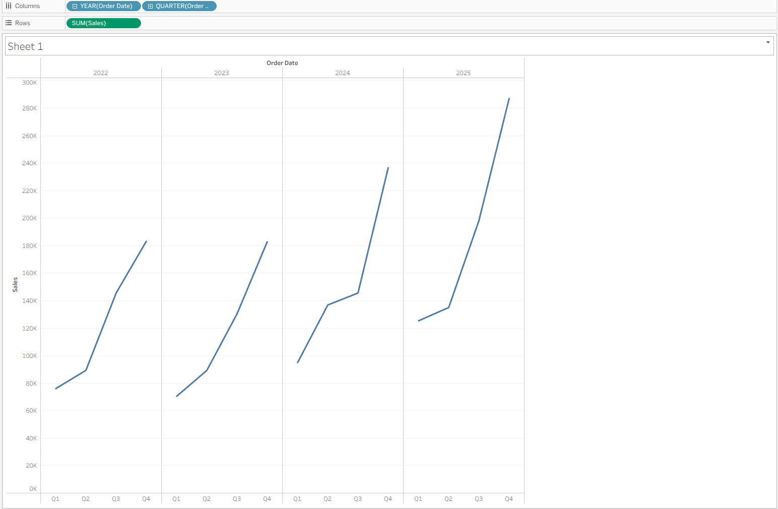
Setting Up Your Main Graph
- Drag Order Date to Columns. It will default to YEAR(Order Date).
- Expand the Date Hierarchy. Click the plus sign (+) on the YEAR(Order Date) pill to reveal QUARTER(Order Date).
- Reorder the Pills. Drag QUARTER(Order Date) to the left of YEAR(Order Date). Your Columns shelf should now read: QUARTER(Order Date) → YEAR(Order Date)
- Drag Sales to Rows.
At this stage, your worksheet should resemble a standard line chart with sales trends by quarter across multiple years.
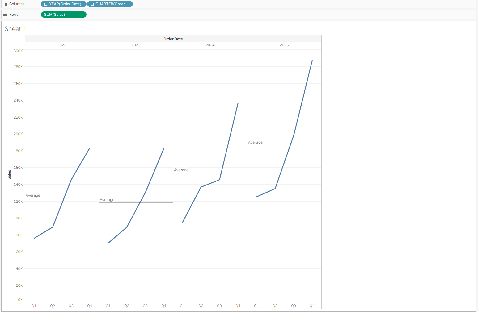
Creating Average Lines
- Navigate to the left side panel which is split into Data and Analytics.
- Click and drag Average Line to the main canvas and hover over Pane before releasing your mouse.
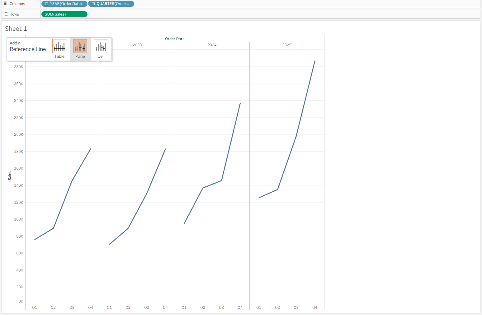
This adds a visual reference line for the average sales per pane (in this case, per quarter).
Dual Axis
- Duplicate the Sales Pill on Rows. Hold Ctrl (or Cmd on Mac), click the existing Sales pill, and drag a copy to the right—creating a second axis.
- Change the Mark Type. Click on the second Sales chart's Marks card, and change the mark type from Line to Circle.
- Combine the Two Axes.
- Right-click on the second Sales axis and choose Dual Axis.
- Right-click on the axis again and choose Synchronize Axis.
(Optional) Hide the right-hand axis for a cleaner view.
You should now see a cycle plot with a line and circles overlayed.
Coloring the Graph
Go to Analysis → Create Calculated Field and name it something like "Above or Below Average.
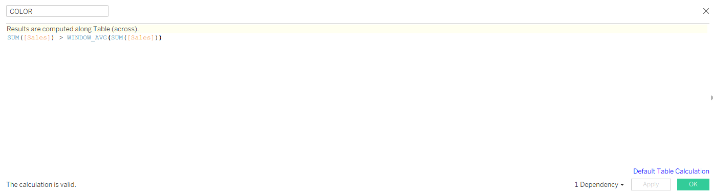
Drag this field to ‘Color’ in the marks card of the second axis.
Be sure to edit the table calculation so that it’s calculated across the pane. Right click on the calculation and press ‘Edit table calculation.'
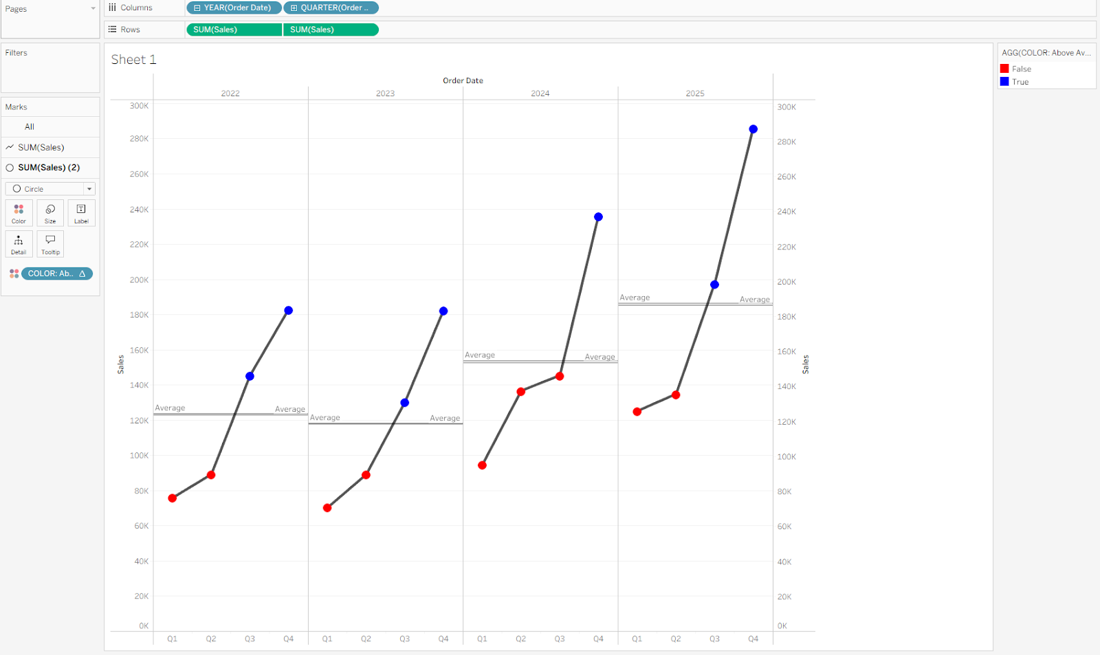
Now you have a cycle plot! Cycle plots are incredibly useful when analyzing cyclical or seasonal data, including:
- Website traffic trends (e.g. peak days of the week)
- Sales cycles (e.g. quarter-over-quarter comparisons)
- Operational metrics (e.g. manufacturing or support volume trends)
They not only help identify repeating patterns for forecasting, but also highlight outliers or underperformance worth further analysis.