


In this post, we are going to go over the foundations of dashboard design in Tableau.
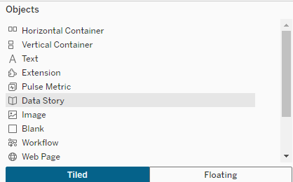
In this post, we are going to focus on the following four objects as key to foundational design:
- Horizontal Containers
- Vertical Containers
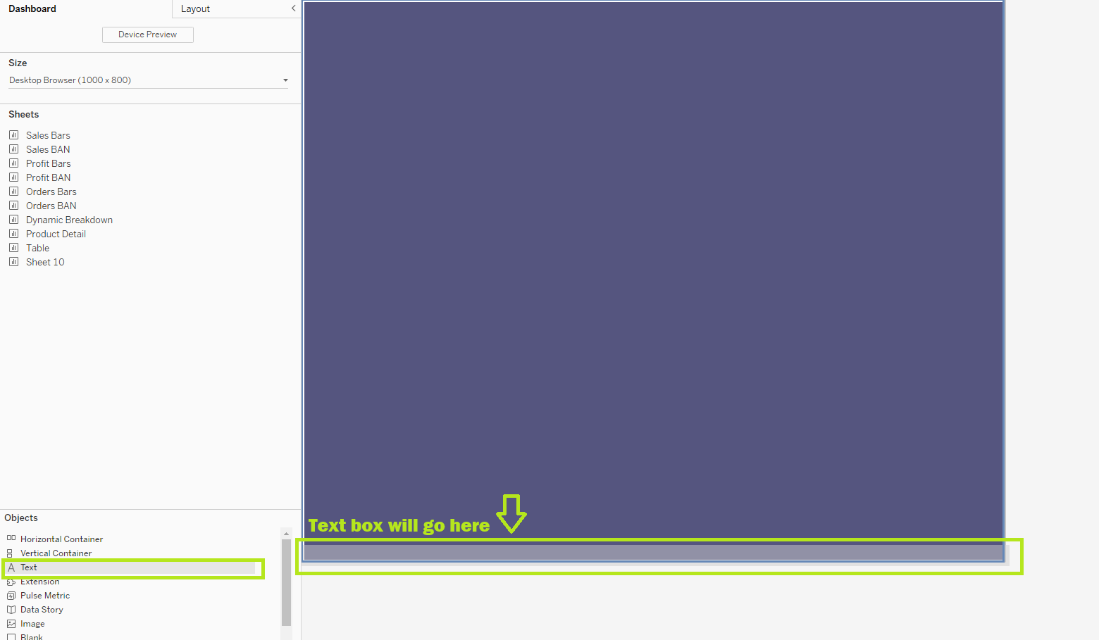
- Text
- Blanks
You'll also notice at the bottom of the objects menu, are buttons to select "Tiled" or "Floating." General best practice for business layouts is to avoid floating containers. Floating containers can be useful when you're designing something beautiful for Tableau Public, but when you want something functional, scalable, and handoff-able, the majority of your dashboard should be based on a "Tiled" or Containerized layout.
The purpose of this post is to understand how to plan your dashboard using horizontal and vertical containers, and how to implement that plan.
1. Wireframe Your Layout
The number one tip for using containers effectively is to plan ahead.
Before you build, sketch or at least mentally map where things should go. I like to use a wireframing tool called Excalidraw, but there are other tools such as Figma, Canva, and even plain old pen and paper.
Keep in mind:
- People read left to right, top to bottom (at least in English). Put your most important content in the top-left, where attention naturally goes.
- Think about what matters most: key KPIs, high-level numbers, or filters? Make sure those stand out.
- Consider interactivity. Will you group filters, parameters, and instructions in a single “control panel” area? Or scatter them contextually throughout the dashboard? Both approaches work — just choose one intentionally.
Below is an example of a dashboard that uses Tiled containers, but it not well thought out:
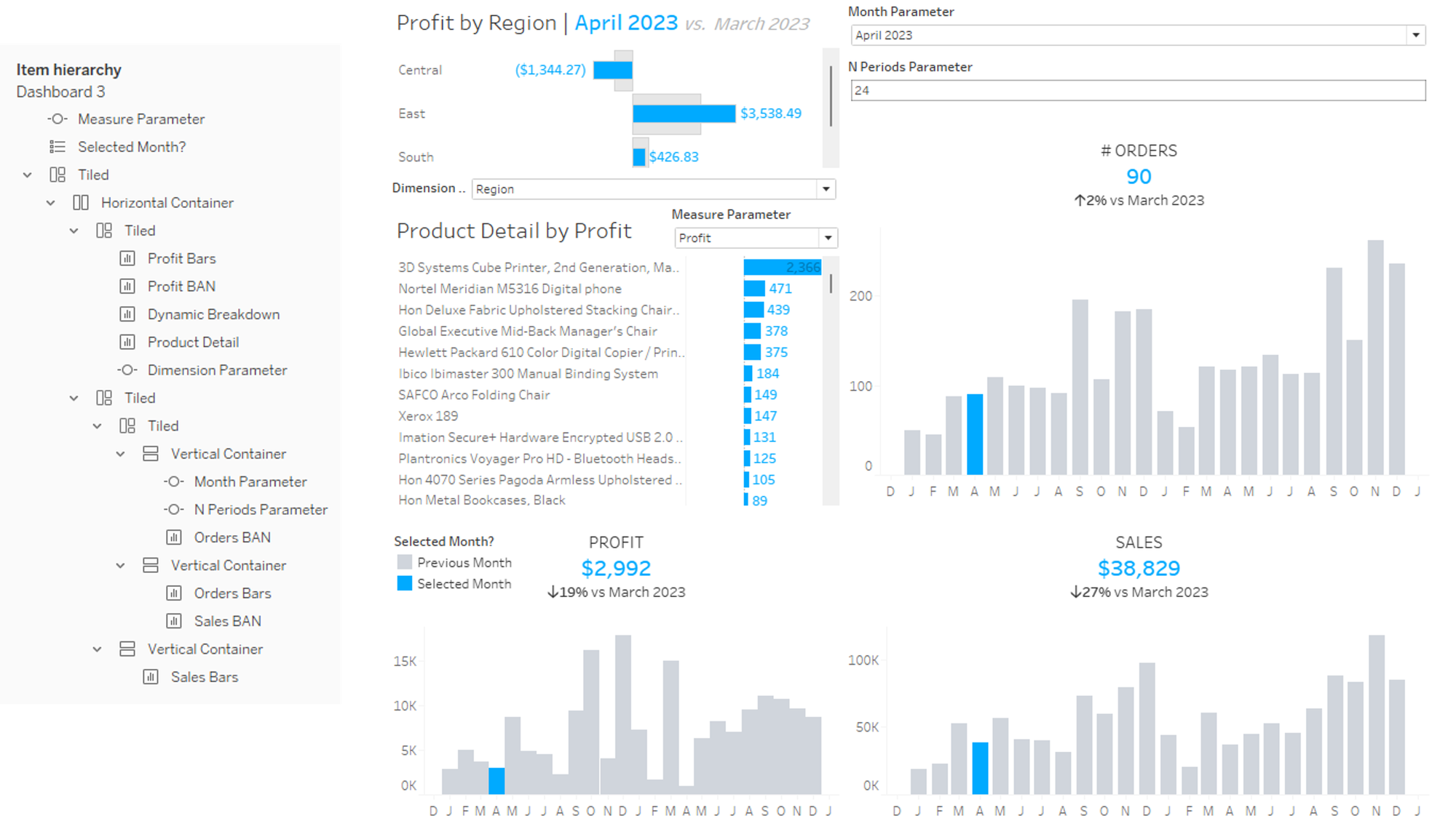
Since Tiled containers snap into place, it can give you as a designer the false sense that your dashboard is organized. However, in the example above, the important metric values and their respective KPI's are not in grouped together, and not organized to be the first thing you see. You can also see in the item hierarchy how the separate sheets are grouped together.
Instead, a good dashboard follows the logic:
- What is the big, universal question?
- How can the user can learn more about that question with breakdowns or additional contributing information?
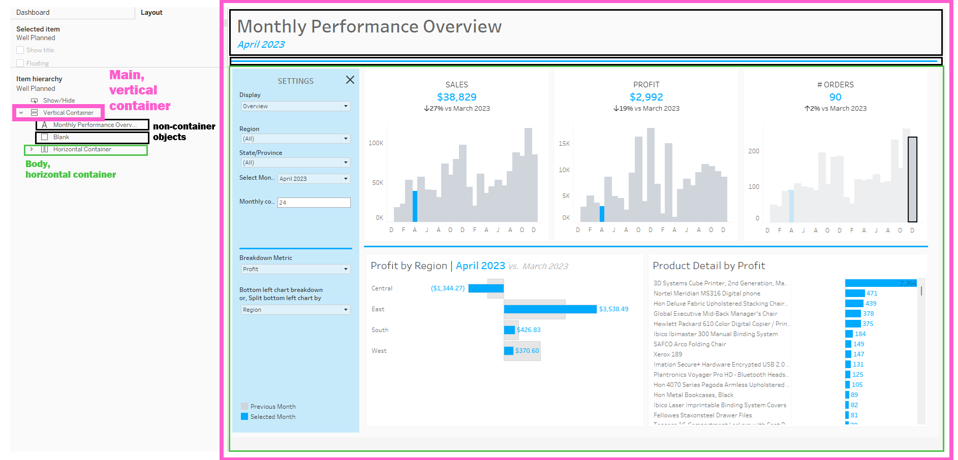
Below is an example of the same dashboard above, with intentional organization:
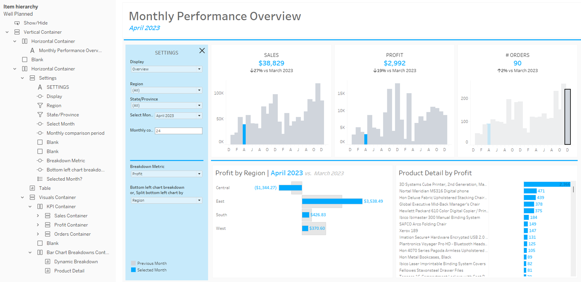
You can see all the settings together on one, well defined pane on the left side. The important numbers are at the top, and the user understands that the three key performance metrics are:
- Sales: how much has been sold in the selected month, and how has that compared to other monthly sales?
- Profit: how much profit did those sales contribute to in the selected month, and how does that compare to other months?
- Orders: how many orders contributed to monthly profit and sales, and is that usual based on other months?
Below that, the user sees additional breakdowns, for which they can choose the metric based on the key performance metrics.
This dashboard also uses containers to group together each main metric so that there is a KPI and a visual.
2. Build: Set Up Your Main Container
Once you’ve planned, it’s time to build. And here’s the golden rule:
👉 Watch out for a 'Tiled' icon on your item hierarchy.
This will sound counter-intuitive, since I stand by avoiding floating containers in a business dashboard. But a very useful hack for getting around the Tiled container starts with using a floating container.
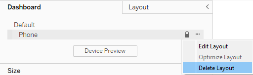
Step 1: Delete the phone layout
If you need a dashboard to be easily viewed on a phone, there are other strategies, but you should not expect one dashboard to be easily viewable from phone and desktop.
Step 2: Add your main container
Decide if your layout should be vertical (objects stacked top-to-bottom) or horizontal (objects side-by-side).
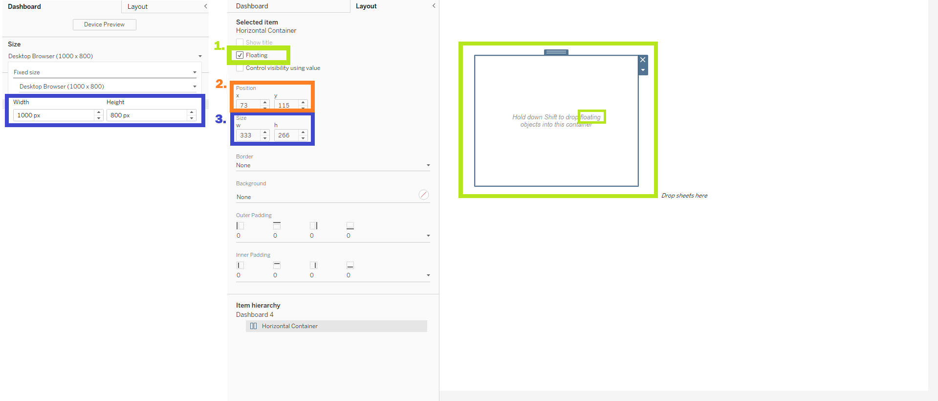
- Hold Ctrl + Shift and drag that container onto the dashboard as a floating container. This will make it the “parent” container for everything else.
- Set the position to
(0,0)and size it to match your dashboard. That way, the container will resize along with your dashboard. - Set the size to match the size of your dashboard
Step 3: Group related things
Objects that belong together (like a title and KPI, or a filter and its chart) should live in the same container. This keeps everything aligned and makes resizing much less painful.
The body of this container is Vertical, with 3 objects stacked vertically: two non-container items (title text and a blank serving as a line) and a horizontal container containing the body of the dashboard (contents including settings, charts and KPIs).
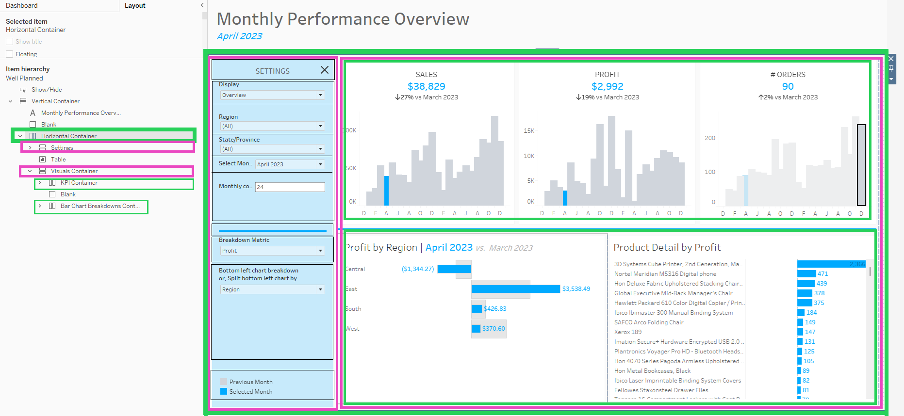
The body itself is a horizontal container, with two vertical containers nested inside for the settings and the visuals. The settings container has multiple non-container items such as filters, blanks and legends. The Visuals container contains two stacked horizontal containers. The top horizontal container contains the main metrics, and the bottom contains further breakdowns.
Step 4: Use floating sparingly
Floating objects can be great for callouts or logos, but use them intentionally. If you’re relying on floating to “fix” alignment issues, it’s usually a sign your containers need adjusting.
3. Review: Test and Iterate
Once you’ve built, step back. Show your dashboard to someone else. Ask:
- What’s the first thing you notice?
- How would you use this dashboard? (Can you find the controls easily?)
- What is the main message or insight you gather from this dashboard?
Use that feedback to improve your work!
✨ With a little planning you’ll spend less time wrestling with container placement and more time focusing on insights that matter.