


Today we were tasked with recreating a new style of dashboard, and this one really caught my interest. Instead of combining multiple worksheets, every single visualization was built within a single worksheet. I hadn’t tried this approach before, so it was a great opportunity to learn something new!
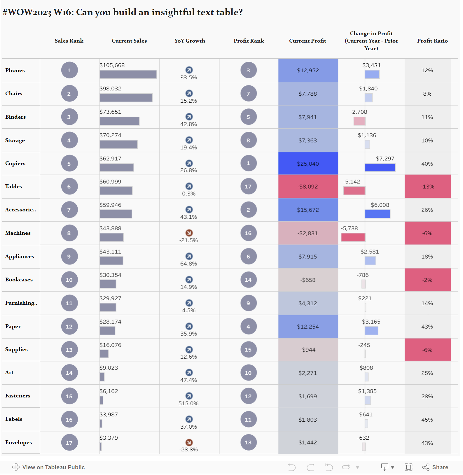
This was made possible using a technique I hadn’t taken advantage of until now: dummy measures. Since Tableau requires a numeric value on Rows or Columns to plot, you don’t always have a real measure that works across multiple independent visuals in the same worksheet. That’s where dummy measures like MIN(0), MIN(1), or AVG(1) come in, they act as placeholders allowing you to create multiple axes for different chart types.
Take this graph for example. Lets see what happens if we try and recreate without some of these dummy measures in the rows and columns tab:
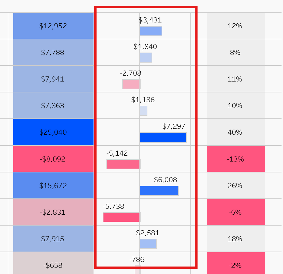
We've split the Sub-Categories we're measuring into those that have made positive profit in the latest year compared to the previous year, and those that have made negative profit.
This can be done with the following calculations:
- IF SIGN([Change in Profit])= -1 THEN [Change in Profit] ELSE NULL END
- IF SIGN([Change in Profit])= 1 THEN [Change in Profit] ELSE NULL END
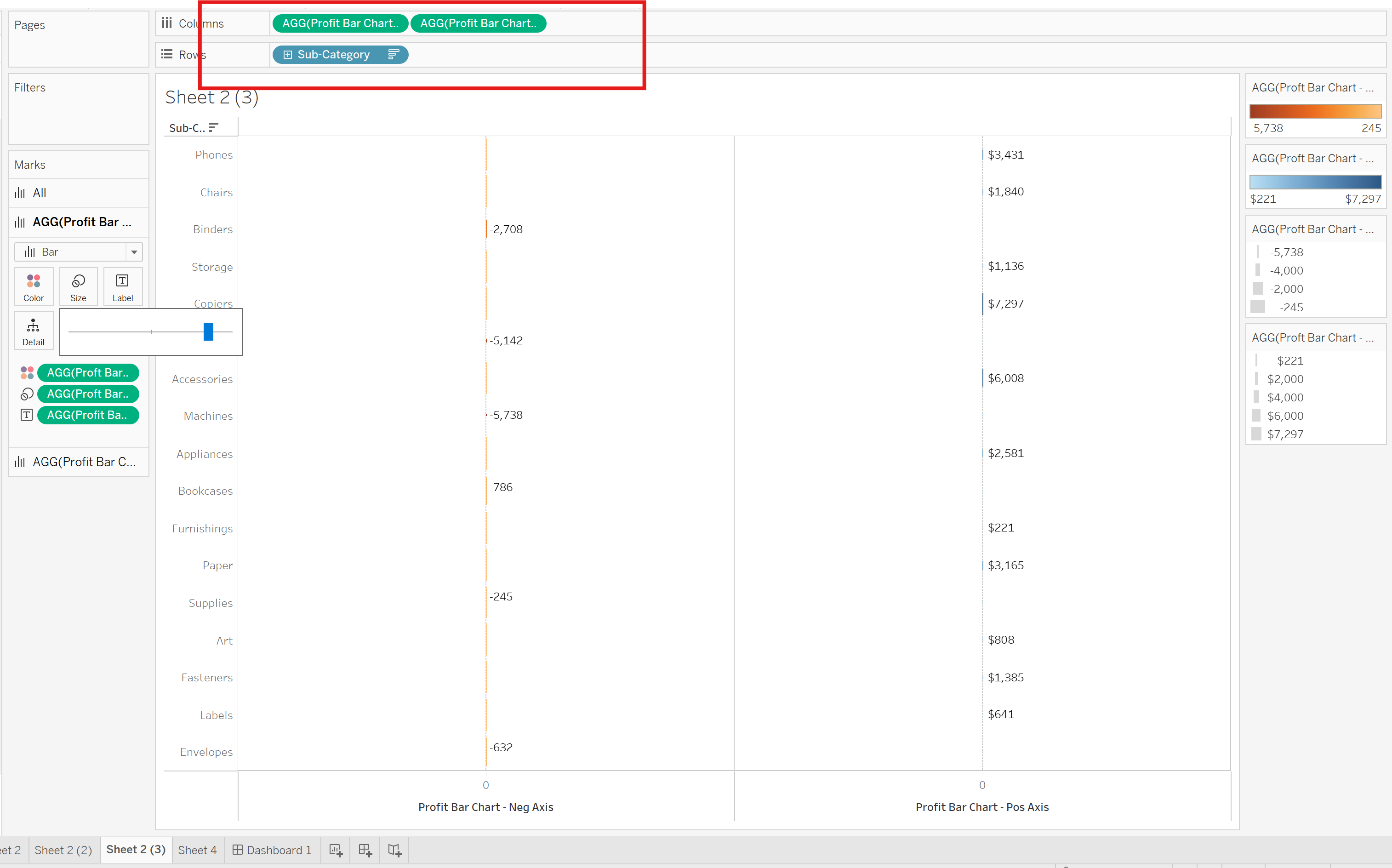
This splits them based on their sign, and returns a Null for anything not with that sign. We then assign this to size, colour, and label to fill out our visualisation, while setting the Marks type to bar to finish off. Of course, it's never that simple and we are still missing one key item, one of those dummy variables that we were on about earlier. As highlighted in the top left of the screen, we only have the sub-category dimension and we need another one of those MIN() measures to finish off.
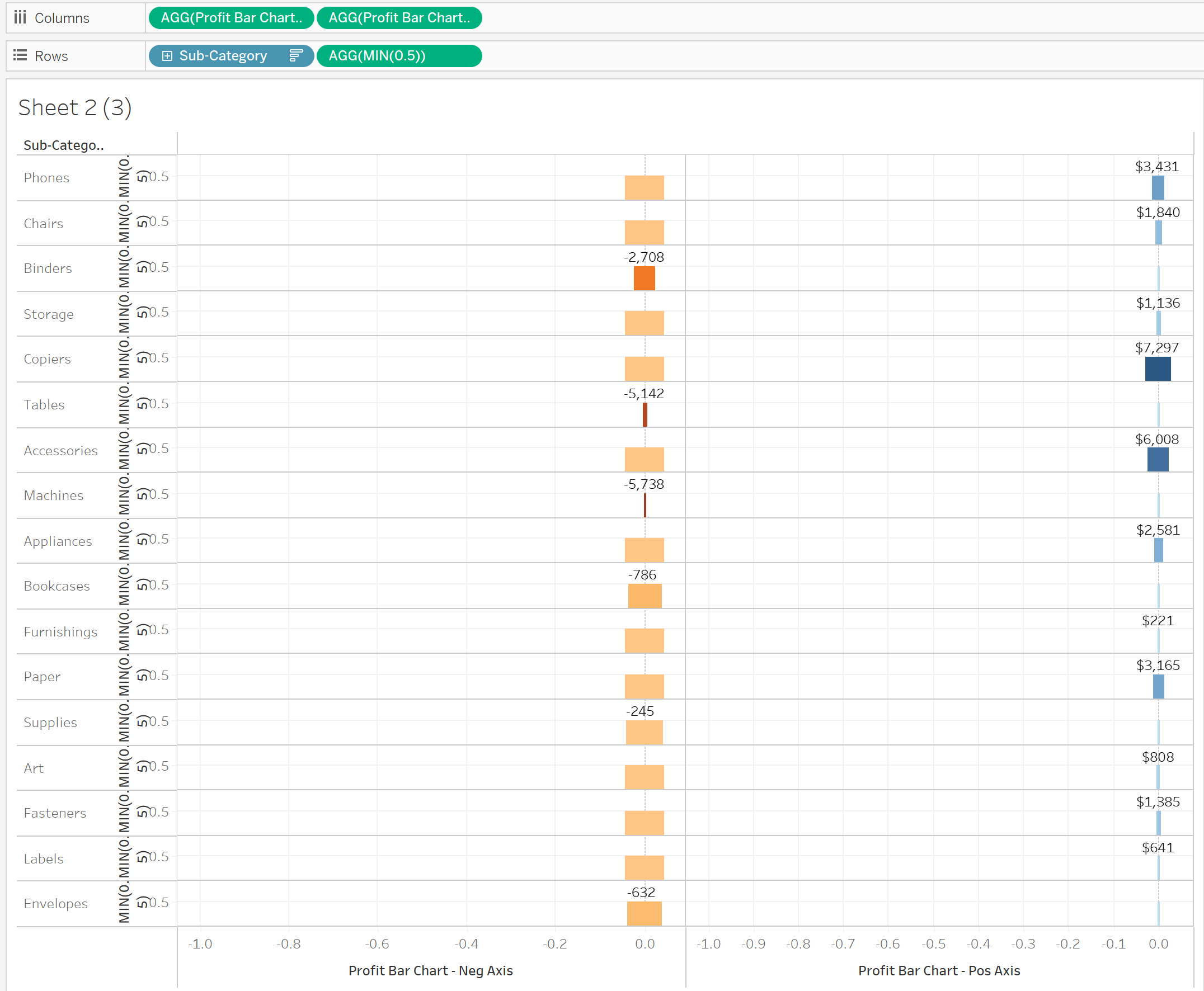
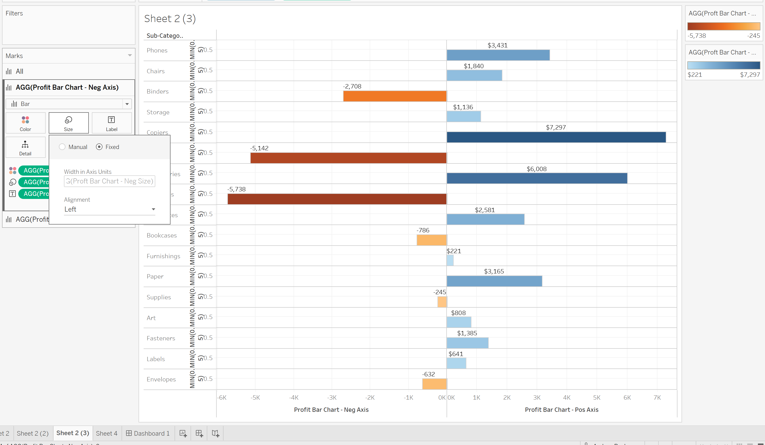
Next, change the sizing on both Marks cards from Manual to Fixed, then select Dual Axis and Synchronize Axis. At this point, you should have your completed change-in-profit graph.
Remember: you’ll need a dummy measure on Columns for each separate visualization you want to include, but only one on Rows. With that setup, you’ll end up with something that looks like this:
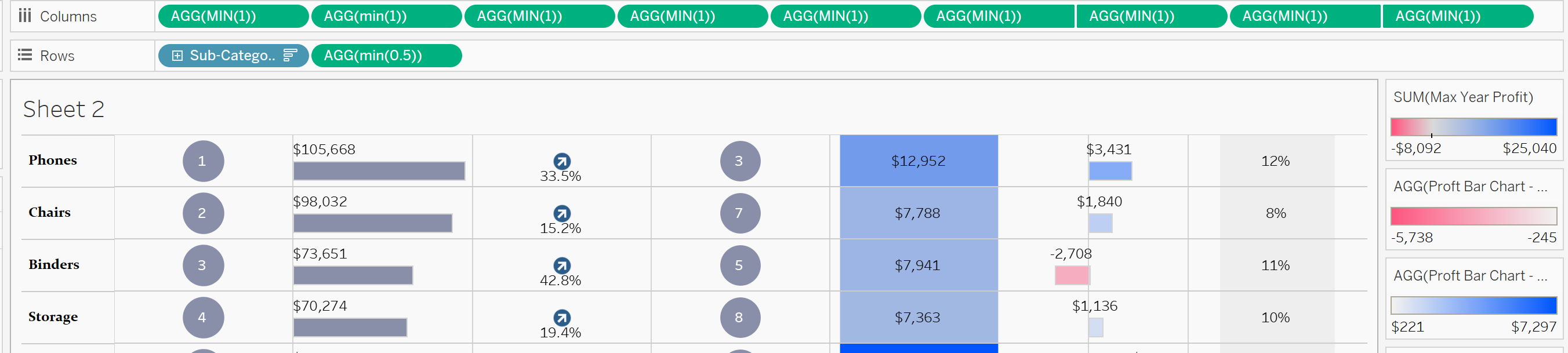
The Marks card will be your friend from hear on out and you will use your real measures measures to fine tune your other visualisations.