


Recently, it has become possible for to support visualisation Libraries! Meaning we can now publish custom visualisations created in Deneb and use Vega and Vega-lite to create custom visuals!
For Context, Deneb is a window that allows Power BI users to directly connect to visualisation libraries within Power BI.
What is Vega and Vega-lite?
Vega and Vega-lite are languages that you can use to create custom visuals using code. This code is in a JSON format and is used to tell Power BI how your visualisation should look.
They are known as Declarative visualisation tools, in which you fill out a formatted JSON, and Vega / Vega-lite goes and computes the maths and draws the visual behind the scenes.
This allows you to create specificity in what you create. This blog is designed to take you through a basic Power BI report I have made while i was exploring this!

It started with a recent Workout Wednesday (https://www.workout-wednesday.com/pbi-2026-w22/) and then branching out and exploring other visuals from the Vega-lite and Vega Packages. I will also be providing the JSON I used so that you can recreate it yourself!
But first, a mini tutorial!
First, open a blank report and go to the visualisation pane and click on the ellipses and "Get more Visuals"
Then search for Deneb, this is where we will be placing in the JSON files created.
Import your data into the report so that you can build off those fields in your visuals.
Now select the Deneb icon and a window in your visual should pop up, drag your fields in, for this context that would be :
- Longitude
- Latitude
- Direction
- Size.
For all the visuals on this dashboard, I used prebuilt JSON scripts from these websites:
But tweaked some things so that we can connect to the data from Power BI.
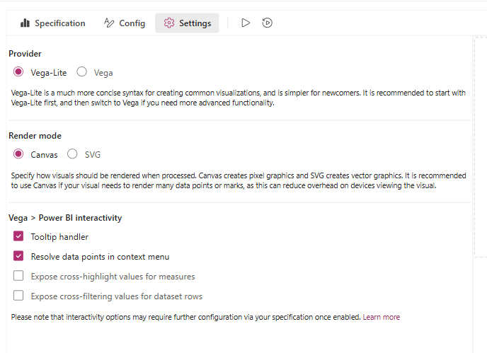
Once you have set up the fields and you see the Deneb interface, select the following:
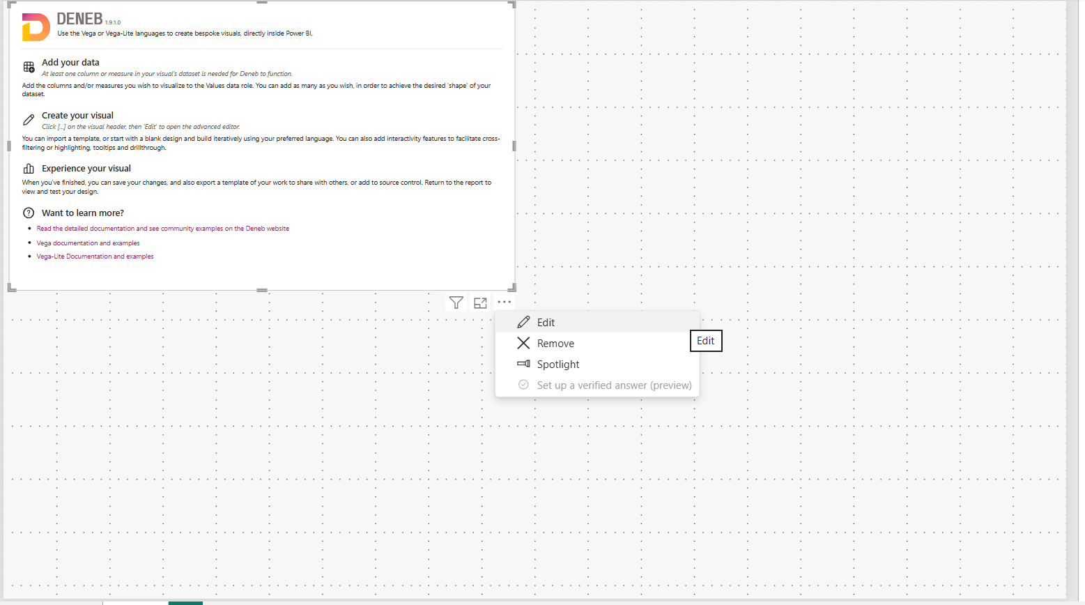
This should then open this view...
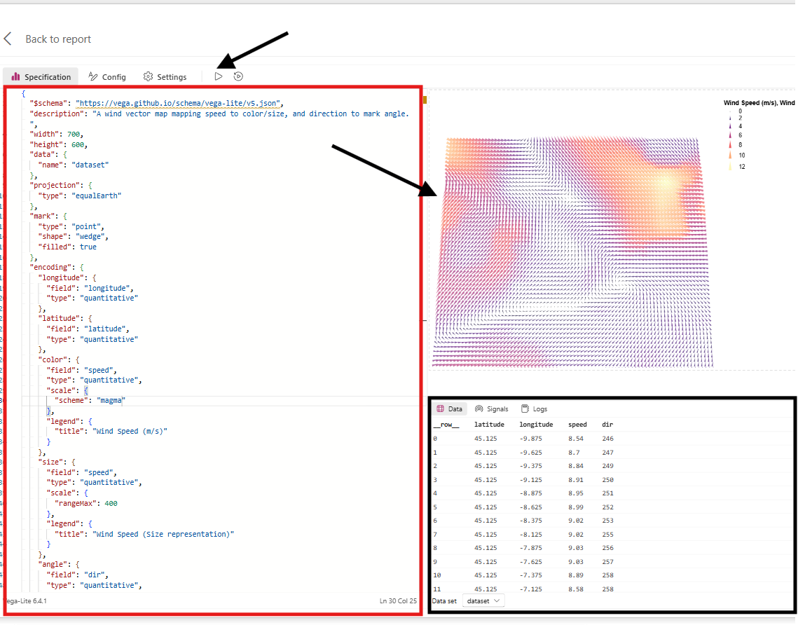
The Left panel is where your JSON script is going to fall into; this is also where you can edit the script and customise your visual. Once you are happy with your script, you can press run, and the preview of the visual will be shown on the top right.
Below is the underlying table that was used to create the visual, as well as logs and performance. Here is where any errors etc will pop up so you can Debug why your visual may not be as expected
#_Resoruces used
Here is the link where I got the JSON script :
, etc.,
Customising your visual
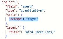
You may notice that the default script in the visual above has different colours than what you saw in the example above.
This is because I changed the colour scheme within the JSON file in Deneb.
What I did
I went to https://vega.github.io/vega/docs/schemes/ and found a colour scheme I liked! I then went to the following part of the JSON Script and updated the following part of the script:
You can also customise your titles, legends, and so many other aspects of our custom visual
General Parts of the JSON Script (Naturally, this will vary across visuals):
Rendering Rules & Metadata
This part of the script tells Deneb what rules to follow when rendering this script, as well as specifying the Width & Height of the visualisation.
Setting the code to work with Power BI
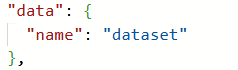
Here we are stating that we are calling whatever we have dragged into our Values shelf in our visualisation panel as the data source, allowing for this script to be dynamic across different data sources.
Visual Object Settings
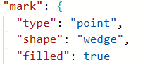
Here we are defining what our marks in our visuals look like
Canvas Background Tab
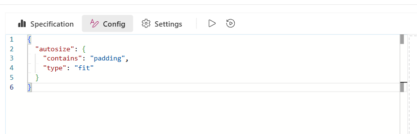
Here we can set the background colour or remove borders, etc
The Dashboard Visuals and their corresponding JSON codes.
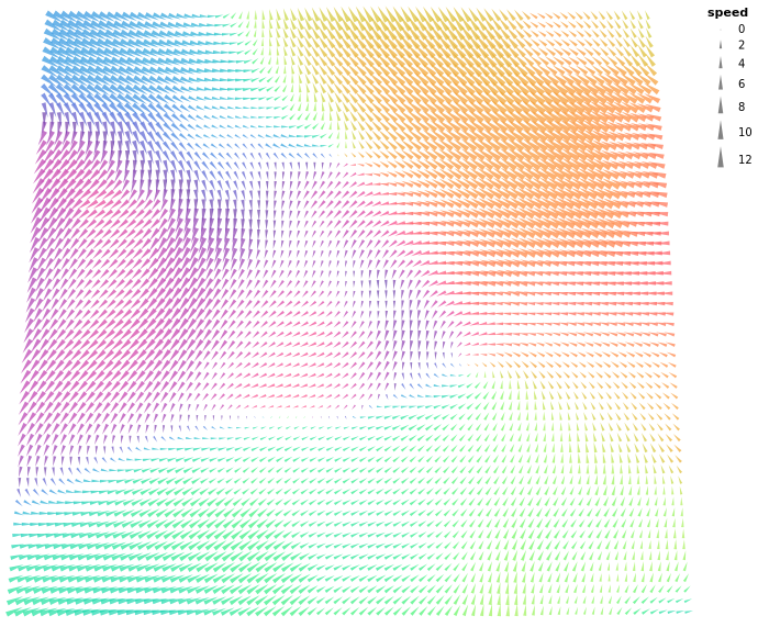
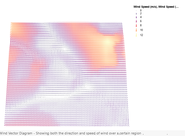
Wind Vector Visual - VegaLite
WOW/ Inspiration:
https://www.workout-wednesday.com/pbi-2026-w22/
Data source:
https://github.com/vega/vega/blob/f436c6727018c7bfb41dce846b5746f7a494f7cd/docs/data/windvectors.csv
Provider I used :
For this visual, I used Vega-lite, but for all the visuals moving forward i used Vega. You can switch them here i the settings pane
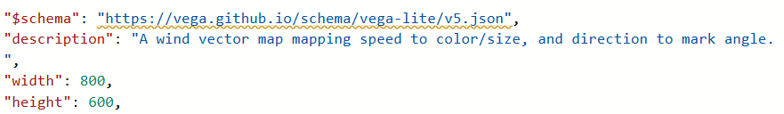
JSON Script Used
{ "$schema": "https://vega.github.io/schema/vega-lite/v5.json", "description": "A wind vector map mapping speed to color/size, and direction to mark angle.", "width": 800, "height": 600, "data": { "name": "dataset" }, "projection": { "type": "equalEarth" }, "mark": { "type": "point", "shape": "wedge", "filled": true }, "encoding": { "longitude": { "field": "longitude", "type": "quantitative" }, "latitude": { "field": "latitude", "type": "quantitative" }, "color": { "field": "speed", "type": "quantitative", "scale": { "scheme": "magma" } }, "size": { "field": "speed", "type": "quantitative", "scale": { "rangeMax": 400 }, "legend": { "title": "Wind Speed" } }, "angle": { "field": "dir", "type": "quantitative", "scale": { "domain": [0, 360], "range": [180, 540] }, "legend": { "title": "Wind Direction (Degrees)" } } }, "config": { "view": { "fill": "#111111", "stroke": null } }}
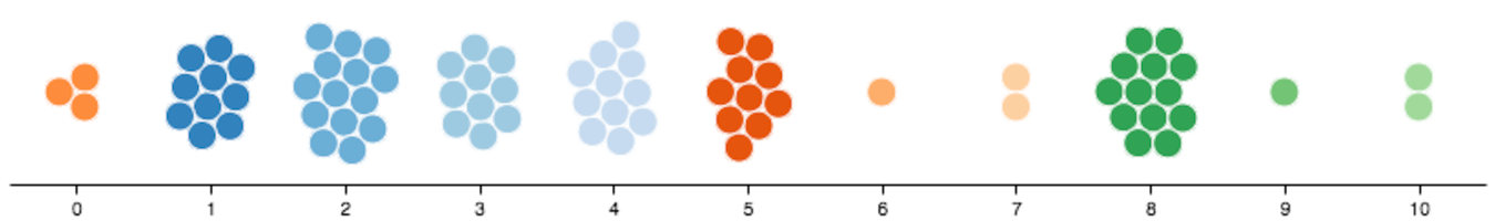
Beeswarm Plot - Vega
Inspiration :
Data Source - Mock data source from Gemini :
JSON Used
{ "$schema": "https://vega.github.io/schema/vega/v6.json", "description": "Physics Beeswarm Distribution by Region", "width": 1000, "height": 200, "padding": {"left": 10, "right": 10, "top": 10, "bottom": 30}, "autosize": "none",
"signals": [ { "name": "cx", "update": "width / 2" }, { "name": "cy", "update": "height / 2" }, { "name": "radius", "value": 5, "bind": {"input": "range", "min": 2, "max": 10, "step": 1} }, { "name": "collide", "value": 1, "bind": {"input": "range", "min": 1, "max": 5, "step": 1} }, { "name": "gravityX", "value": 0.2 }, { "name": "gravityY", "value": 0.15 }, { "name": "static", "value": true, "bind": {"input": "checkbox"} } ],
"data": [ { "name": "dataset" } ],
"scales": [ { "name": "xscale", "type": "band", "domain": { "data": "dataset", "field": "Region", "sort": true }, "range": "width" }, { "name": "color", "type": "ordinal", "domain": {"data": "dataset", "field": "Region"}, "range": {"scheme": "pbiColorNominal"} } ],
"axes": [ { "orient": "bottom", "scale": "xscale", "labelFontSize": 12, "labelFontWeight": "bold" } ],
"marks": [ { "name": "nodes", "type": "symbol", "from": {"data": "dataset"}, "encode": { "enter": { "fill": {"scale": "color", "field": "Region"}, "xfocus": {"scale": "xscale", "field": "Region", "band": 0.5}, "yfocus": {"signal": "cy"} }, "update": { "size": {"signal": "pow(2 * radius, 2)"}, "stroke": {"value": "white"}, "strokeWidth": {"value": 1} }, "hover": { "stroke": {"value": "#000000"}, "strokeWidth": {"value": 2.5} } }, "transform": [ { "type": "force", "iterations": 300, "static": {"signal": "static"}, "forces": [ {"force": "collide", "iterations": {"signal": "collide"}, "radius": {"signal": "radius"}}, {"force": "x", "x": "xfocus", "strength": {"signal": "gravityX"}}, {"force": "y", "y": "yfocus", "strength": {"signal": "gravityY"}} ] } ] } ]}
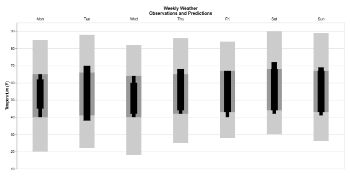
Weekly Temperature Chart - Vega Lite
Depicts the range of temperature forecasted for a week (Light Grey ), the typical range ( dark grey ), and lastly the actual range recorded for the particular day of the week.
Inspiration: https://vega.github.io/vega-lite/examples/bar_layered_weather.html
Data Source Mock dataset from Gemini:
JSON used
{ "$schema": "https://vega.github.io/schema/vega-lite/v6.json", "description": "A layered bar chart with floating bars representing weekly weather data", "config": { "style": { "hilo": { "size": 20 } } }, "title": { "text": ["Weekly Weather", "Observations and Predictions"], "frame": "group" }, "data": { "name": "dataset" }, "width": 1000, "height": 490, "encoding": { "x": { "field": "id", "type":"ordinal", "axis": { "domain": false, "ticks": false, "labels": false, "title": null, "titlePadding": 25, "orient": "top" } }, "y": { "type": "quantitative", "scale": {"domain": [10, 95]}, "axis": {"title": "Temperature (F)"} } }, "layer": [ { "mark": {"type": "bar", "size": 44, "color": "#ccc"}, "encoding": { "y": {"field": "record_low"}, "y2": {"field": "record_high"} } }, { "mark": {"type": "bar", "size": 44, "color": "#999"}, "encoding": { "y": {"field": "normal_low"}, "y2": {"field": "normal_high"} } }, { "mark": {"type": "bar", "size": 20, "color": "#000"}, "encoding": { "y": {"field": "actual_low"}, "y2": {"field": "actual_high"} } }, { "mark": {"type": "bar", "size": 10, "color": "#000"}, "encoding": { "y": {"field": "forecast_low_low"}, "y2": {"field": "forecast_low_high"} } }, { "mark": {"type": "bar", "size": 10, "color": "#000"}, "encoding": { "y": {"field": "forecast_low_high"}, "y2": {"field": "forecast_high_low"} } }, { "mark": {"type": "bar", "size": 16, "color": "#000"}, "encoding": { "y": {"field": "forecast_high_low"}, "y2": {"field": "forecast_high_high"} } }, { "mark": {"type": "text", "baseline": "bottom", "y": -5}, "encoding": { "text": {"field": "day"} } } ]}
Hope you found this blog helpful! Have fun exploring!