


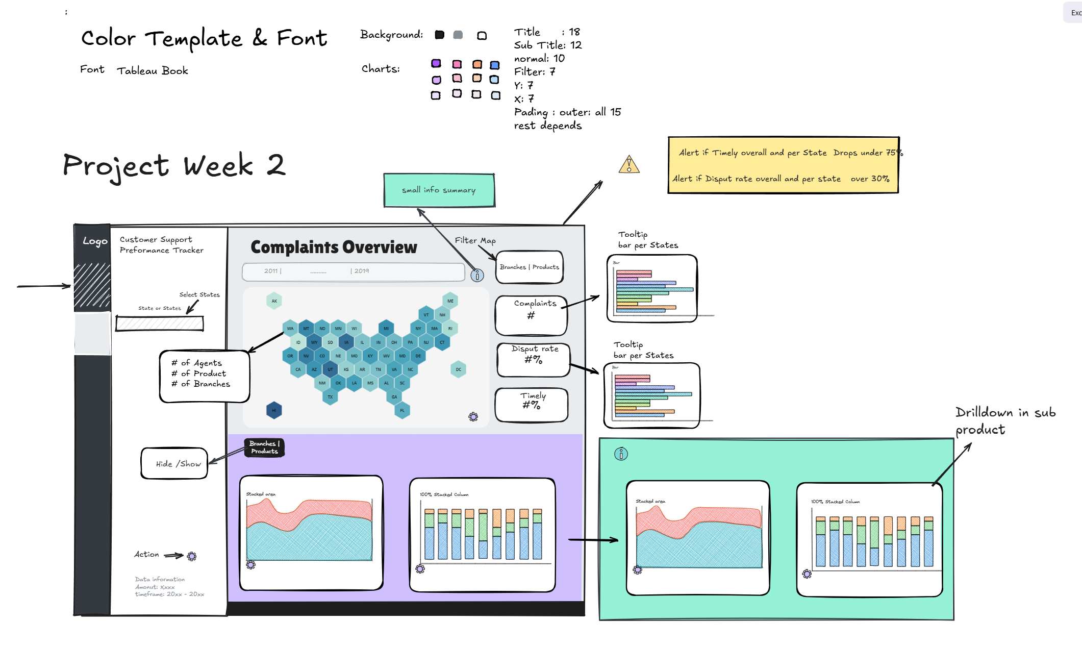
Is there a "perfect" way to present a dashboard sketch? The short answer is no. Your audience changes, your requirements shift, and the setting varies. The real challenge lies in balancing the needs of technical and non-technical stakeholders.
If you get too technical, you lose half the room; if you stay too shallow, you risk looking unprepared. Instead of guessing what might "wow" them, a better strategy is to focus on minimizing friction. Aim to eliminate anything that causes confusion or visual fatigue.
The Trap of the "All-in-One" Sketch
made in Excalidraw
We’ve all seen it: a single slide crammed with every chart type, function, and calculation imaginable. While a seasoned developer might appreciate the complexity, for a non-technical stakeholder, this is visual sensory overload. When a sketch is too busy:
- The narrative is lost: It’s nearly impossible to maintain a "red thread" (a logical flow).
- Cognitive load increases: You spend more mental energy remembering what to explain next than actually engaging with your audience.
- Details get missed: In the heat of a presentation, it’s easy to skip over vital features.
The Solution: Break your presentation into four digestible "chapters."
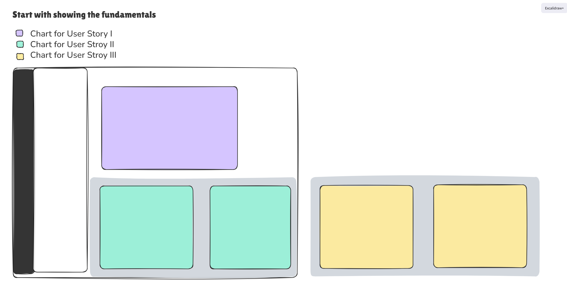
The Four-Step Framework for Success
1. The Foundation (The "Must-Haves")
Start with the User Stories and Core Requirements. This is the bedrock of your project.
The Analogy: You wouldn't show off a finished roof if the house has no foundation. Even the most beautiful "nice-to-have" features are worthless if the primary business questions aren't answered first. Validate the core logic before moving on.
made in Excalidraw
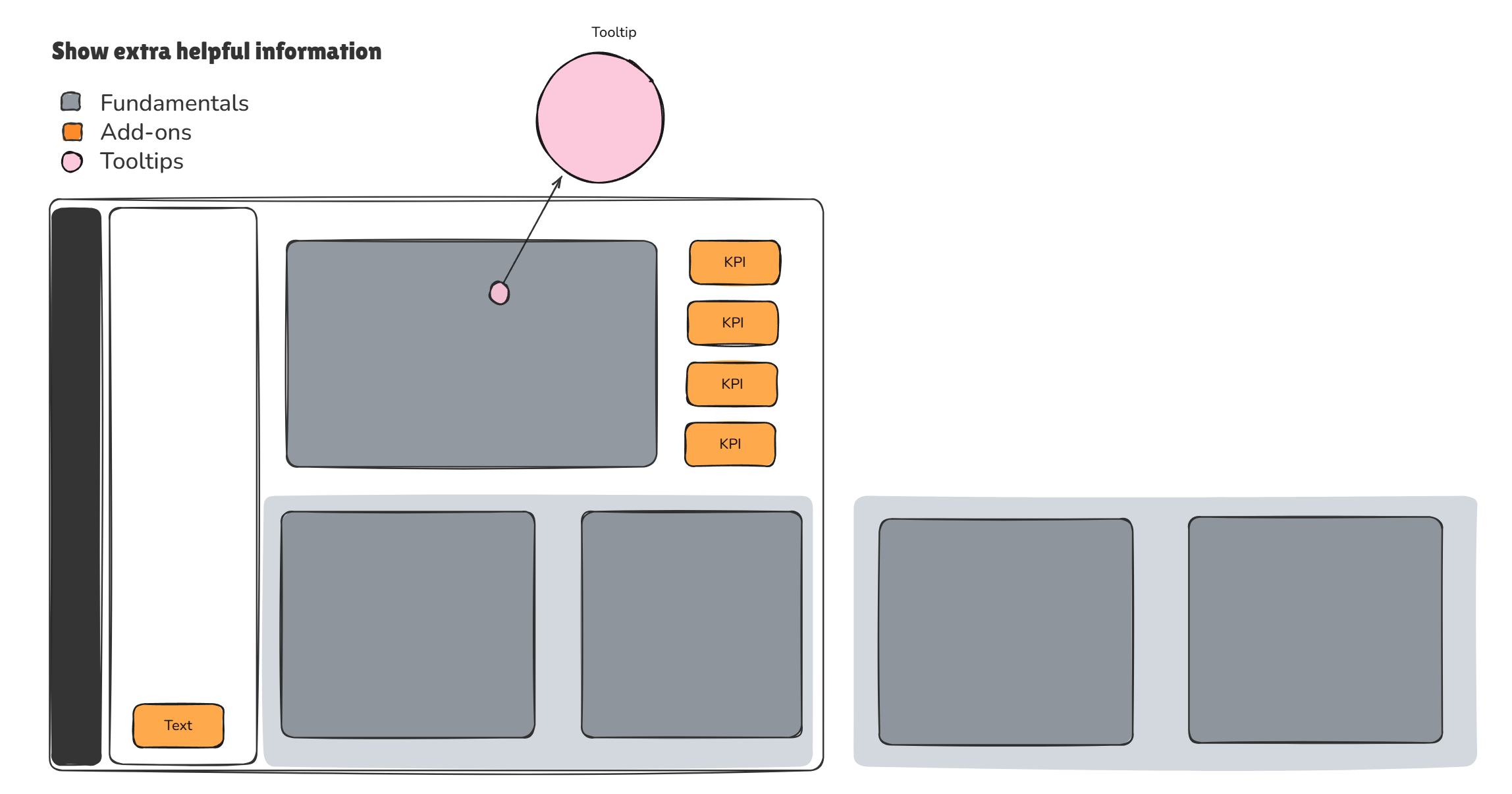
2. Supplemental Insights (The Supporting Cast)
Once the foundation is solid, introduce the information that adds depth. This includes:
- Secondary KPIs that support the primary user stories.
- Tooltips that provide context without cluttering the UI.
- Additional charts that offer a deeper "why" behind the numbers.
made in Excalidraw
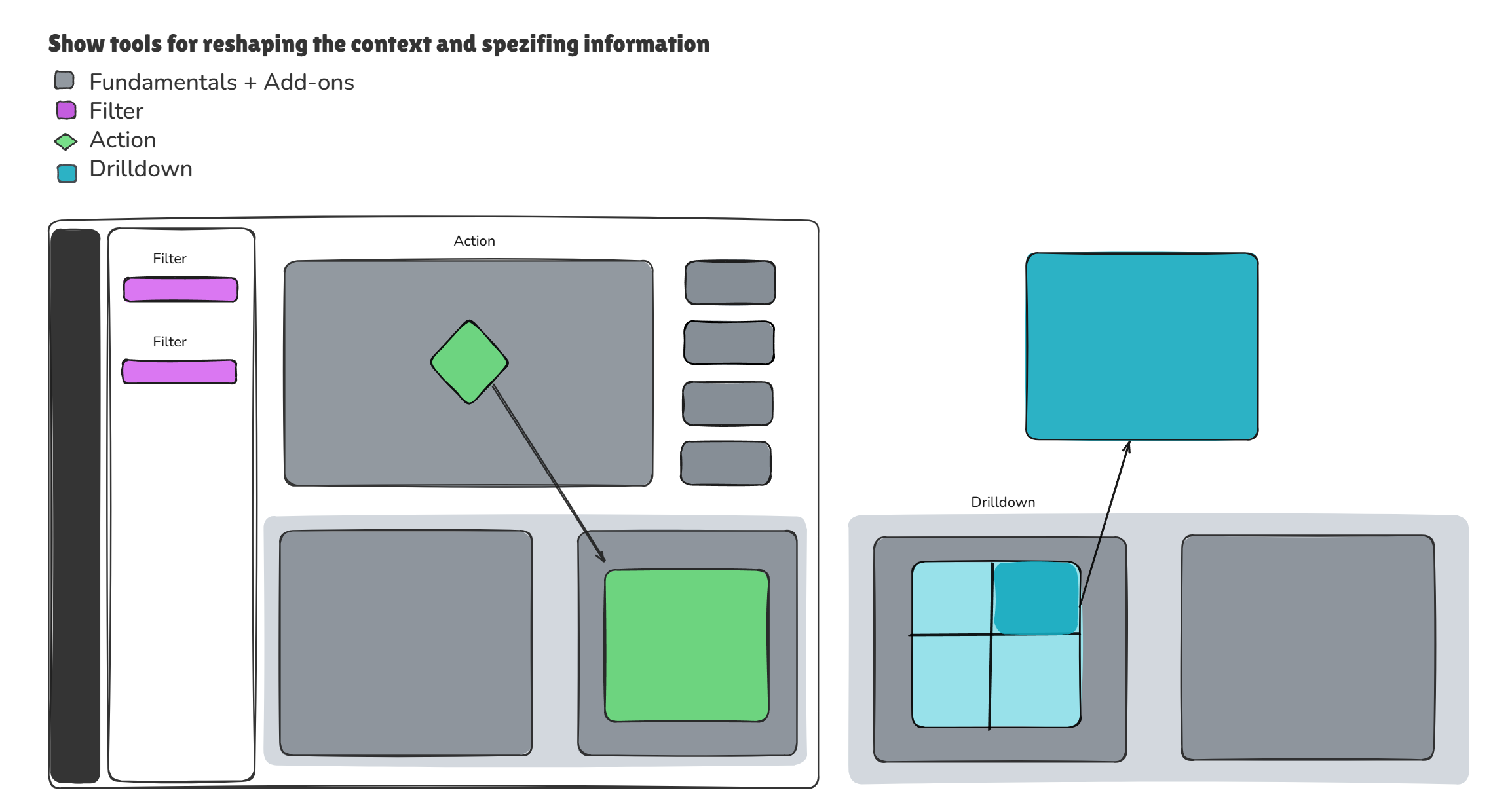
3. Interactivity & Context (The "How-To")
Now, show the stakeholders how they can "play" with the data. This section focuses on modifying the context to suit specific needs.
- Filters & Actions: How do we narrow down the view?
- Drill-downs: How do we go from the big picture to the granular details?
made in Excalidraw
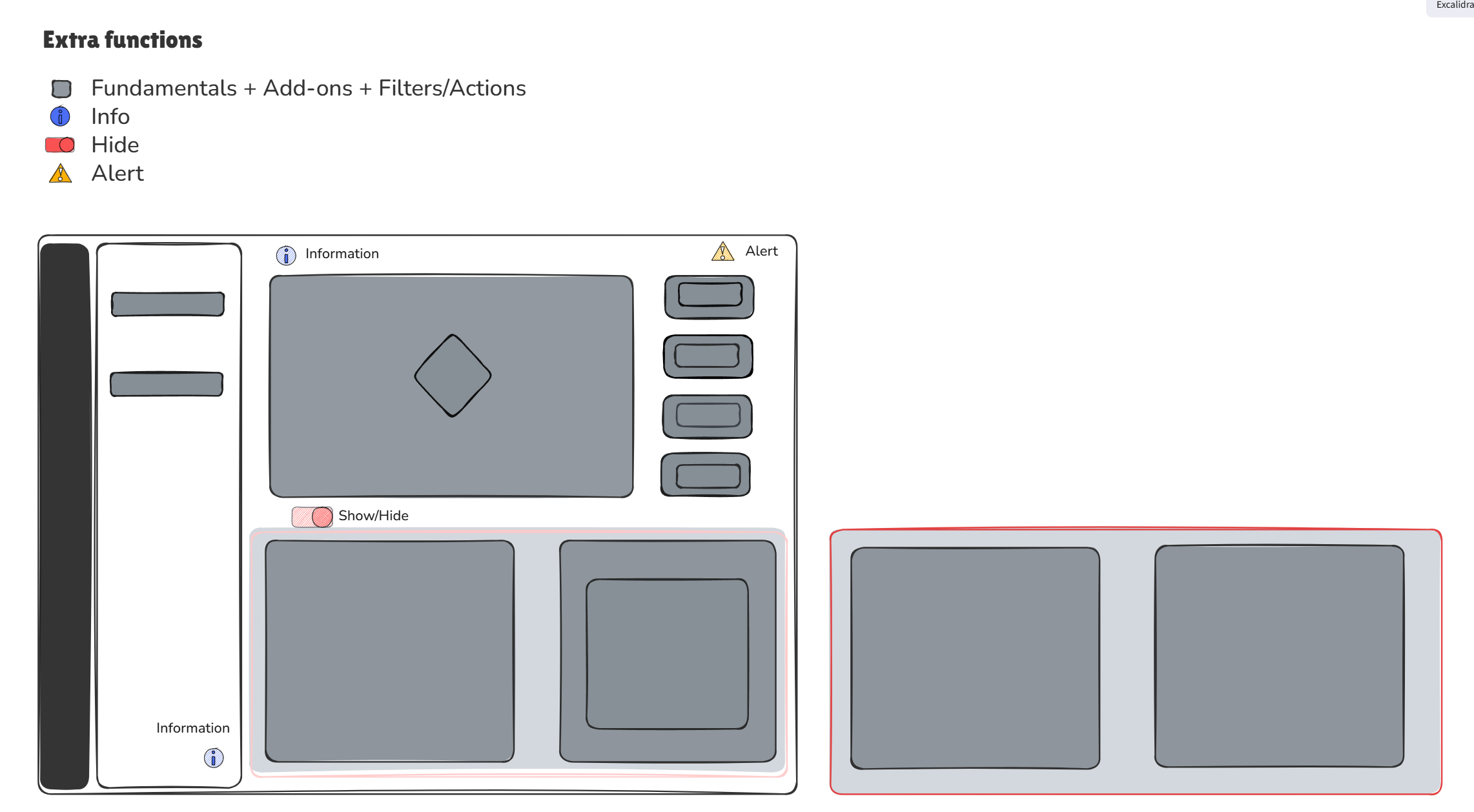
4. Utility & System Functions
This is where you explain the "quality of life" features. Address how the user will navigate and manage the dashboard:
- Alerts: How are users notified of anomalies?
- Info Buttons: Where can users find definitions or help?
- Hide/Seek Elements: Demonstrating how to keep the workspace clean.
made in Excalidraw
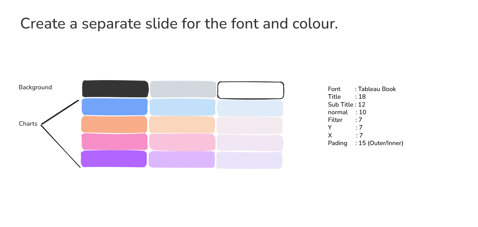
The Finishing Touch: Aesthetics
Only after the logic and functionality are settled should you present the Visual Identity. Use a final slide to showcase your proposed typography and color palette. This ensures that "style" doesn't distract from "substance" during the earlier, more critical stages of the presentation.
made in Excalidraw
Summary
By splitting your dashboard sketch into these segments, you provide a clear structure that respects the stakeholder's time and your own mental bandwidth. You aren't just showing a graph; you are telling a story that starts with a need and ends with a solution.