


Redemption?
If there is anything that DSNY9 knows about me, it is that I absolutely hate Make Over Mondays. Not the concept but the time constraints. Throughout training and mostly by surprise we would be hit with 'You have 1 hour to recreate this Make Over Monday '. Now I'm one who likes to spend time understanding, iterating, and playing with data before I build anything. But, with these, there is no time to do that. It's a skill building exercise to make you think on your feet quick and build something that is presentable in a short time(I would never present any of the ones that I built). But Today? one word, Redemption.
Our goal for today is to rebuild and more importantly, make better one of our Make Over Mondays. And since I have all day, I decided to recreate one of my most ridiculed ones, the radar chart! Here is a little snippet of what I will be recreating today:
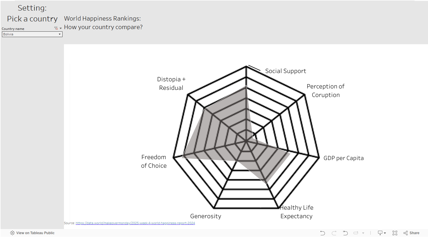
In case you wanted to look for it, you cant. It is and will always be in my Tableau Public Graveyard.
PowerBi: I don't have much experience with this software but from research this morning, I found it is actually much more native to it than Tableau. The tableau creation of this there were many fields that contained complex calculations to get the right amount of spread on a polygon object. But for today we can go and download the PowerBi radar chart and import it right into our canvas. Now one note is that PowerBi wants the data in a certain format which I will show below:
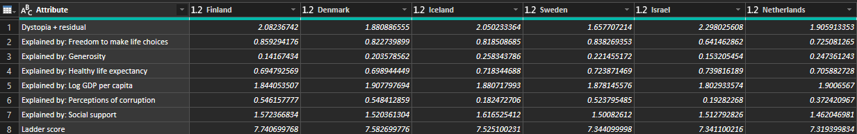
Here there are 8 total rows but a lot of columns. How it is defined is the attributes column will be my points on the chart where as my other columns are all countries and their respective values in those columns. A little bit of pivoting to achieve this and then were good to go!
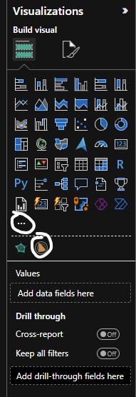
From there we can download a new visualization from the visualization pane and download the Microsoft Radar Chart Viz.
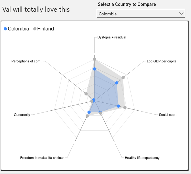
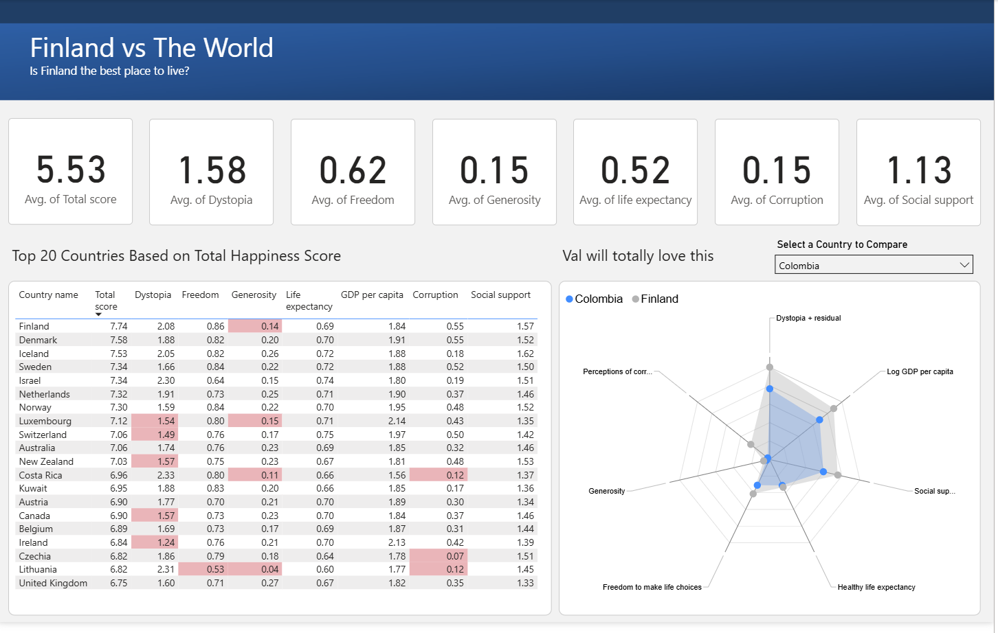
And once you drag in the attributes column it will make the spokes those defined categories we have above. The parameter was a little more tricky. We had to them create all new measures for each country and turn them into AVG of the original column. This then allowed us to fill them into the parameter and in return gave us that drop down menu where we can filter to specific countries compared to the top one(Finland).
Next we wanted to spice it up a bit. I haven't ever previously worked in Power Bi so I wanted to create this into a whole dashboard. Starting with KPI's those were easily made by clicking on the KPI card visualization and feeding it the category I wanted with the aggregation of AVG.
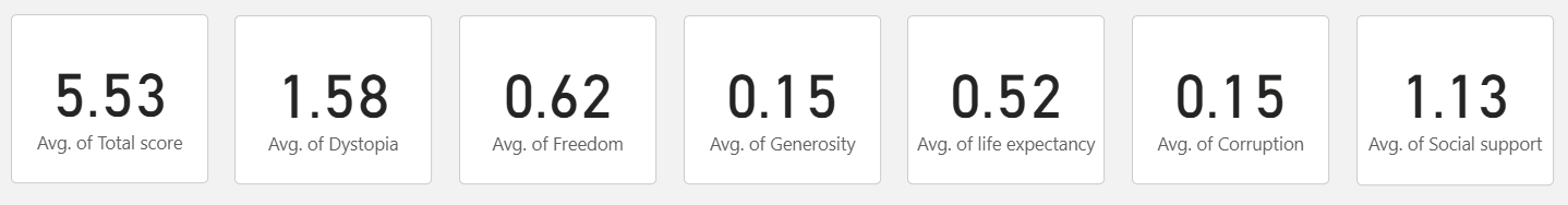
Making a quick and easy adjustment for the cards format these are what they ended up looking like.
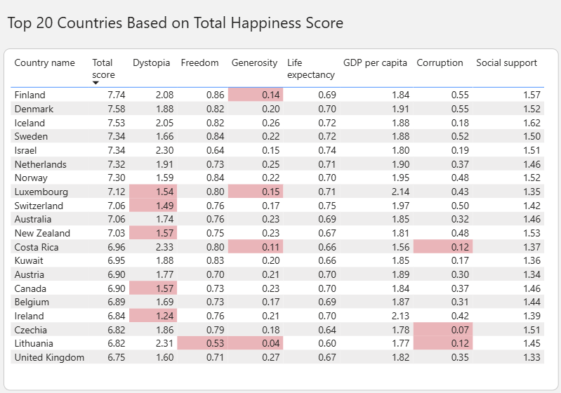
Lastly I wanted to create a table of the top 20 countries based on their total score. Again the Table visualization made this pretty simply by just dragging on the columns I wanted, along with some conditional formatting we were able to highlight the sections of the top 20 Countries that fall below the average in red.
Lastly, We used some PowerPoint tricks to format a nice background image and placed some borders on everything. The final result looks like this!
Some things I loved about Power BI was the native charts that came with it. Once you get used to a different configuration layout there is a lot of functionality. It isn't as intuitive as Tableau is but I did enjoy learning the tool. I think its more beneficial when it comes to reporting like reports that need to be distributed in the Microsoft Ecosystem.
Some limitations I ran into: Parameters are not as easily configurable, the filter pane is not that intuitive and can get messy quick as it also dragged in some columns for me? Not having a calculation that I can easily drag onto the filters pane and having to do conditional formatting took much longer than I would have liked.
All in all I enjoyed this and I hope you enjoyed the read!