


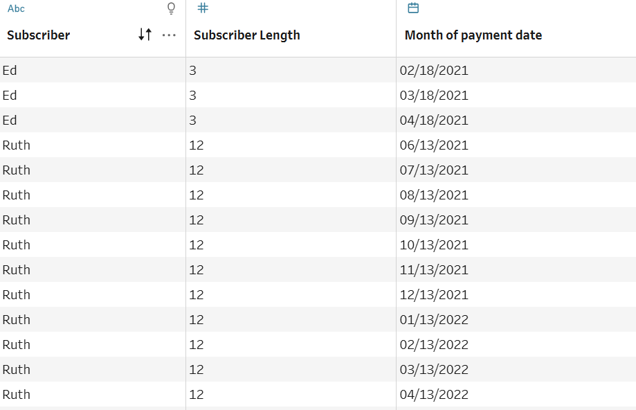
A data scaffold isn't dissimilar from how scaffolding works in construction. In construction, scaffolding supports workers while they're building something. In data, a scaffold supports us by filling in missing rows so we have more data to work with and visualize. Most crucially, scaffolds allow us to conduct accurate analysis by including periods with no data, not just periods with values. Take this table with subscriber information as an example:
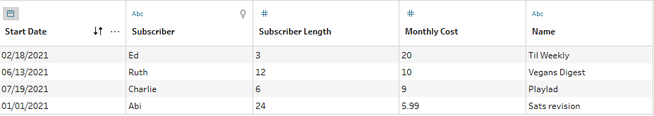
At the moment, we only have 4 dates to work with, which won't allow us to create visualizations with continuous data (i.e., a bar chart exploring payments received per month).
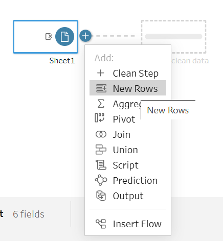
Creating a scaffold will add new rows of data that we currently don't see, such as the other months Ed is subscribed to Til Weekly (03/18/2021 and 04/18/2021). Fortunately, Tableau Prep Builder allows us to do this quite easily with its New Rows feature (important: New Rows is a time-based scaffolding feature and will only work with date or datetime fields).
Before adding our scaffold, we need to create an End Date field for Tableau so that it knows which data to create the scaffold from. Because a scaffold creates new date fields, Tableau needs to know when an interval starts and ends.
Do this by creating a calculated field called 'End Date': DATEADD("month",[Subscriber Length]-1,[Start Date]). Note the -1; we need this here so that we don't account for one extra payment date. For example: Ed's subscription is 3 months, so he'll submit payments on 02/18, 03/18, and 04/18. If we don't subtract 1 in the calculation, we'll log a payment on 05/18 as well.
Make sure your new field is a date field and not a datetime field; the data type in the Start Date and End Date columns need to be the same for the scaffold to ultimately work.
Insert your data in Tableau Prep and click on the '+' icon to select New Rows as your next step.
Click 'Value ranges from two fields' and insert your Start Date and End Date. Rename your field as you wish and select Month as the time increment, since we're measuring this data in months.
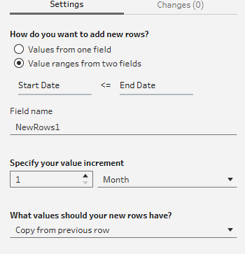
Selecting 'Copy from previous row' is an important one to understand well. Considering the data we're working with here, it's okay for us to copy from the previous row because we're working with subscription data, so we are collecting payments each month. If we were working with sales data, for example, we would definitely not want to copy from the previous row as we'd be inflating our monetary values.
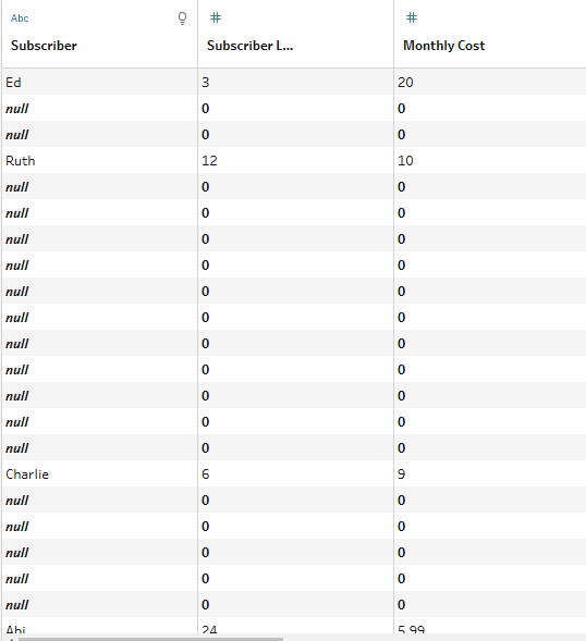
After selecting 'Copy from previous row,' we populate our cells so we're no longer left with nulls or zeros:
Now we have a row for each month of every subscription, and we can create this bar graph with the new table:
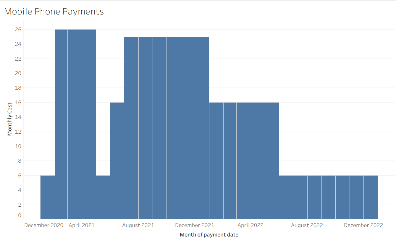
Our new chart lets us see patterns and tell a story instantly without sifting through rows of data. See what a difference scaffolding makes!