


The first week at The Data School Hamburg was very exciting. On the one hand, we had a lot of social contact as we met many talented colleagues. On the other hand, we already started to get the theoretical background necessary to offer consulting to our clients. We talked a lot about data preparation and dashboard planning. Perhaps one of the main takeaways is: plan, structure and sketch your work before you start implementing it in Tableau, Alteryx, or any other tool you happen to be using.
One of our tasks as Consultants at The Data School is to write short blog posts about the topics we are currently learning in our training. For my first blog post, I would like to present the dataset I used for the first dashboard of my application for The Data School. Since large amounts of data are generated everyday, it is also our task to explore and find new datasets that allow us to bring new insights and perspectives about specific topics.
The National Gallery of Art Open Data Program
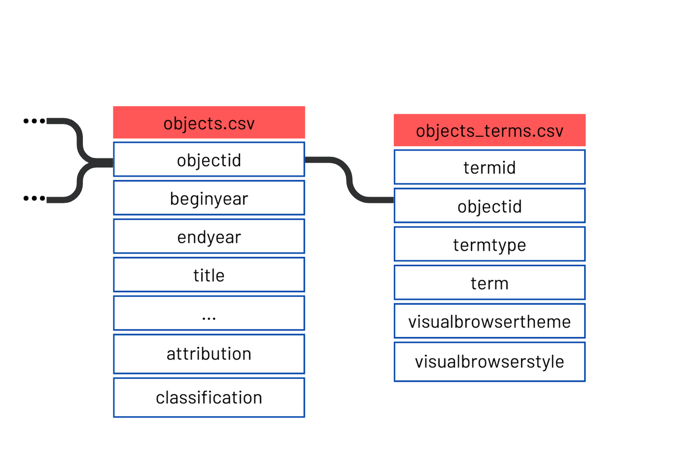
The National Gallery of Art, located in Washington, DC, in the United States, makes a dataset available in their GitHub account including information about more than 130.000 artworks in their collection. Their repository offers access to 17 tables that are related to each other through key variables. Fields available include the title of the artwork, dimensions, author, description, location, year and country where it was produced.
Accessing the data
There are several ways of accessing the data and the best method depends on the tool you would like to use to explore it. Below I provide some suggestions:
- Tableau: download the 17 comma separated values (csv) files and use the ‘Source Data’ section in Tableau to join the relevant datasets. You could start, for example, by performing a left join between the ‘objects’ and ‘objects_constituents’ tables and then a second left join with ‘constituents’ to find out more details about the authors of the artworks.
- SQL Database: if you want to train your SQL skills, one option is to use PostgreSQL to create a SQL database with the ‘CREATE TABLE’ command. The information to create the SQL tables in the server can be found on the National Gallery GitHub. Note that you will also need to install a database management system (DBMS) .
- Python Pandas: finally, you could load the data with Python Pandas, making use of the pandas method ‘pd.read_csv’. After that, the method ‘join’ can be used to merge the desired tables.
Analysis
There are many possibilities of analyses that one can carry out with the data. My interest was in studying if the rectangular format of paintings by famous artists followed the golden ratio. In other words, I wanted to check if the relation between width and height of paintings, or vice-versa, was close to 1.6, the golden ratio. If you would like to know more, please check my dashboard ‘Should You Use the Golden Ratio?’.
Conclusion
The National Gallery of Art Open Data offers a rich source of information about art and history of the art. The datasets are frequently updated and accessible through the institution’s GitHub. There are several tools you can use to access and prepare the data, like SQL, Tableau and Python. I hope it is an interesting source of data for you. Have fun with your analysis!