


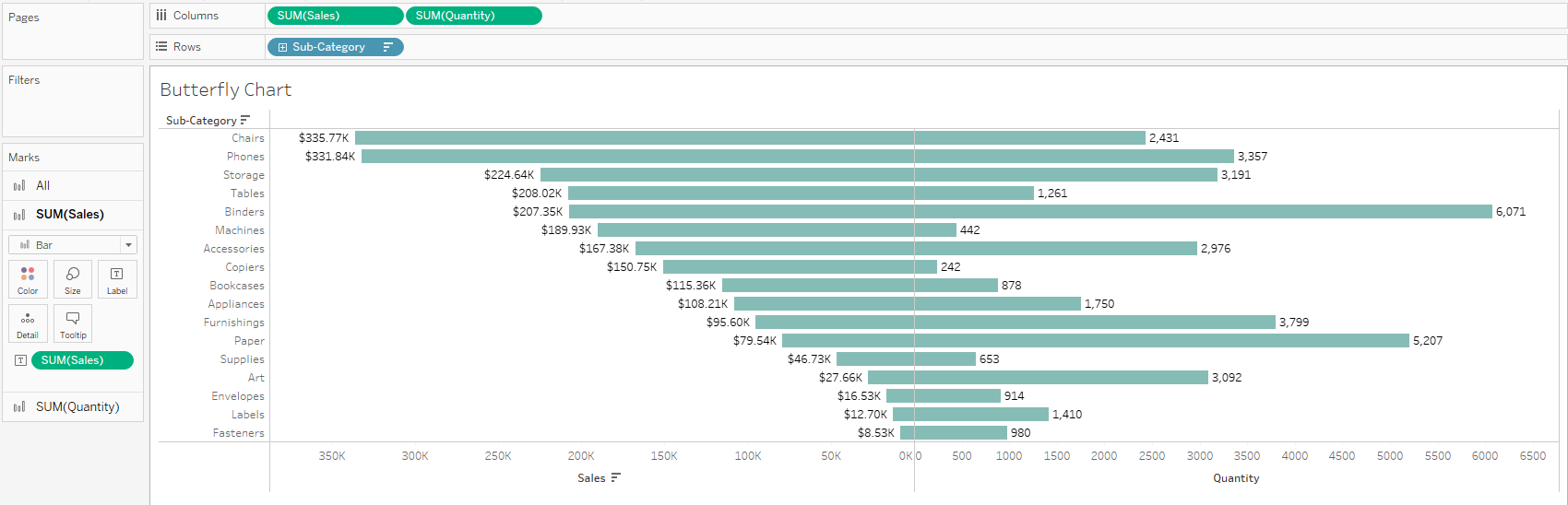
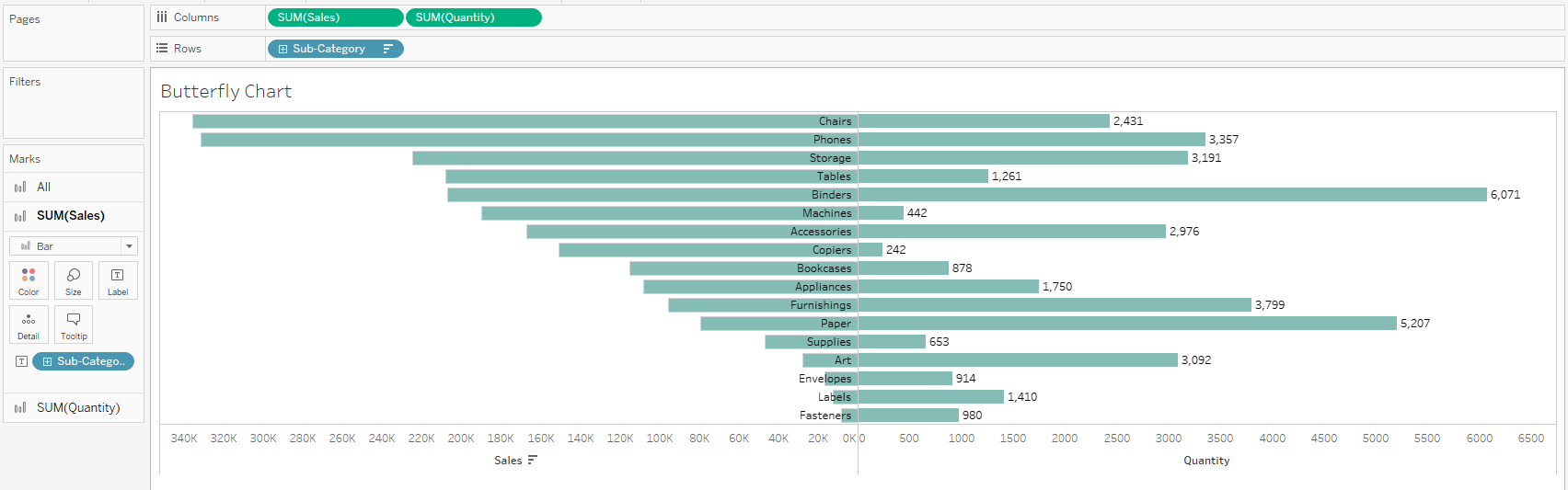
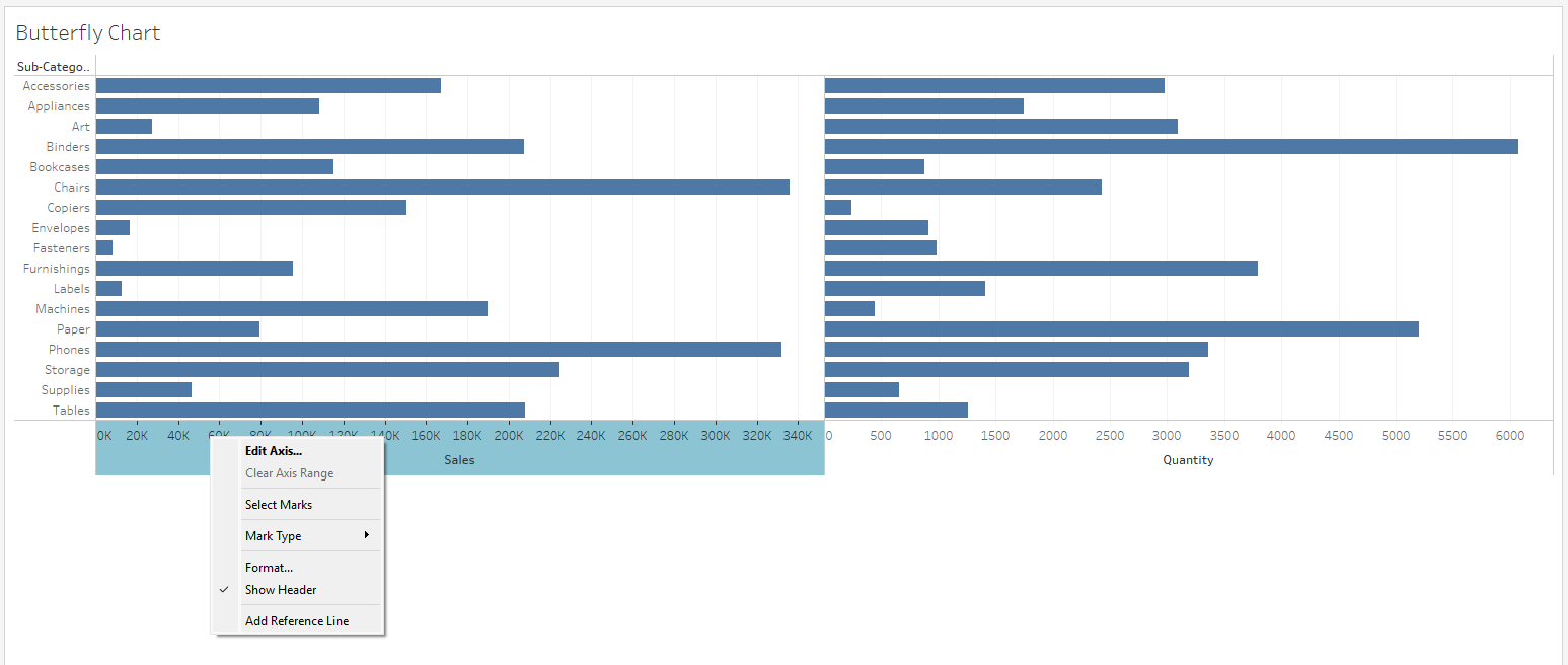
Have you ever made a beautiful butterfly chart in Tableau but couldn't get the labels to run down the center nicely? Maybe you got stuck in one of these common configurations:
Here's a step-by-step to create your butterfly chart and get the labels nicely centered.
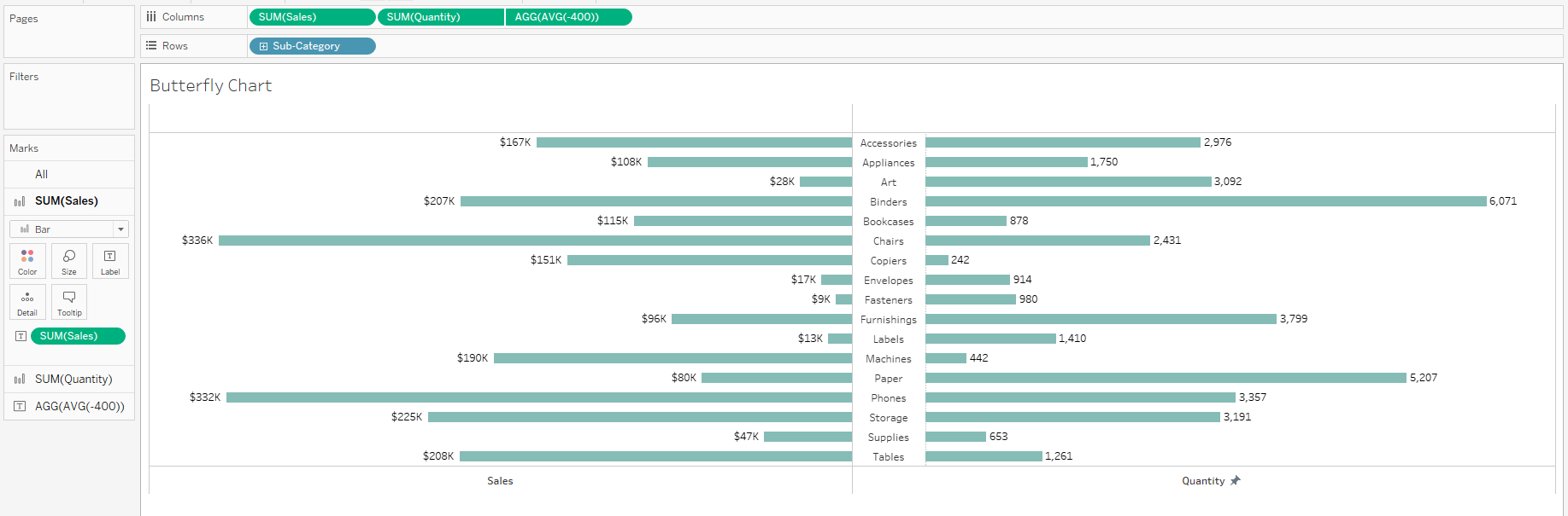
- 1. Drag two measures onto "Columns" and a dimension onto "Rows." Make sure all mark types are set to "Bar".
- I am using SUM(Sales) and SUM(Quantity) as my measures and Sub-Category as my dimension.
- 2. Reverse the direction of the bars on the left
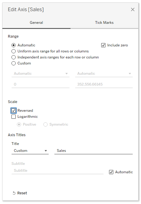
- Right click the axis and select "Edit axis..."
- Go to "Scale" and check the box for "Reversed"
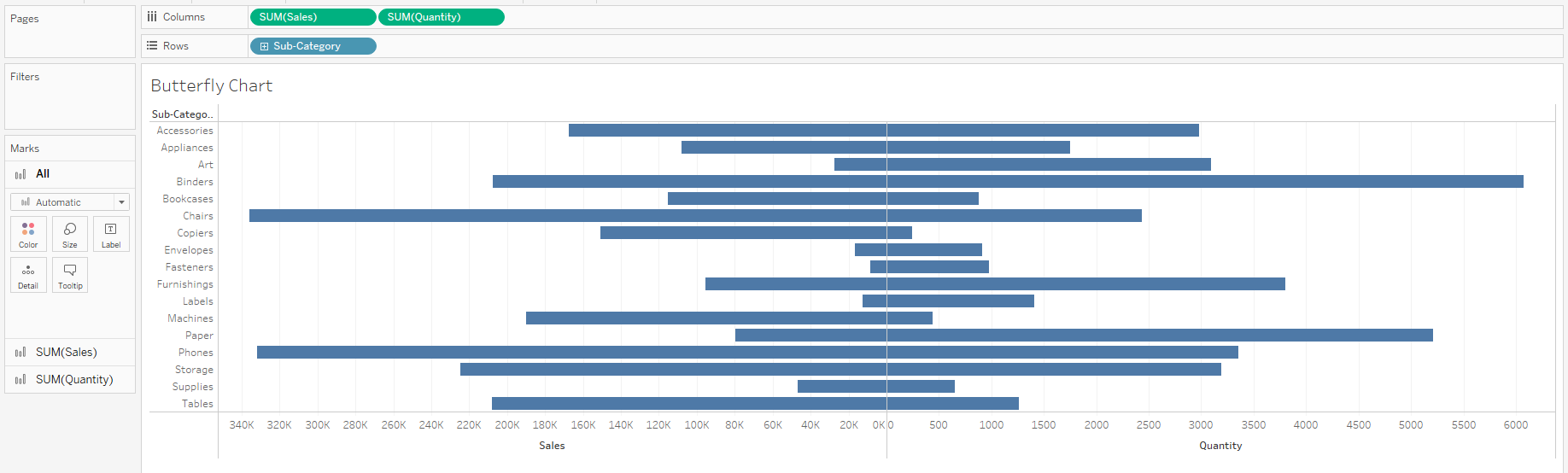
- Now you have your basic butterfly chart.
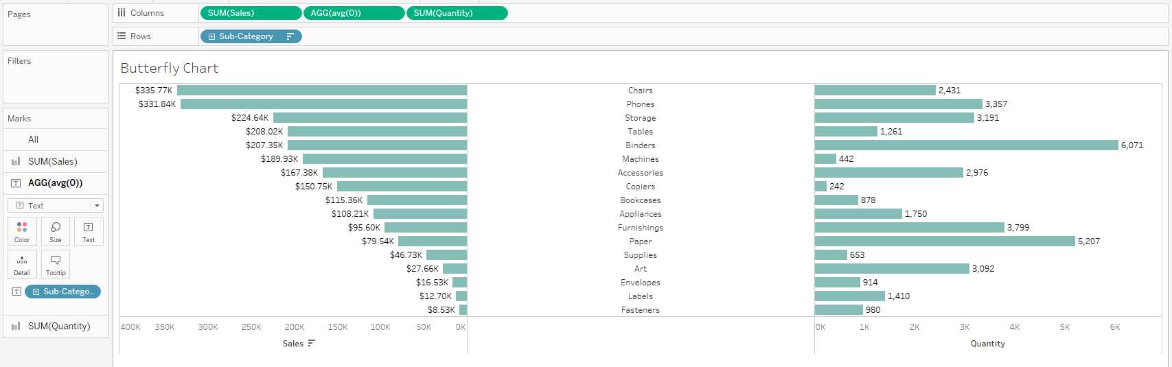
- 3. Add the labels in the center:
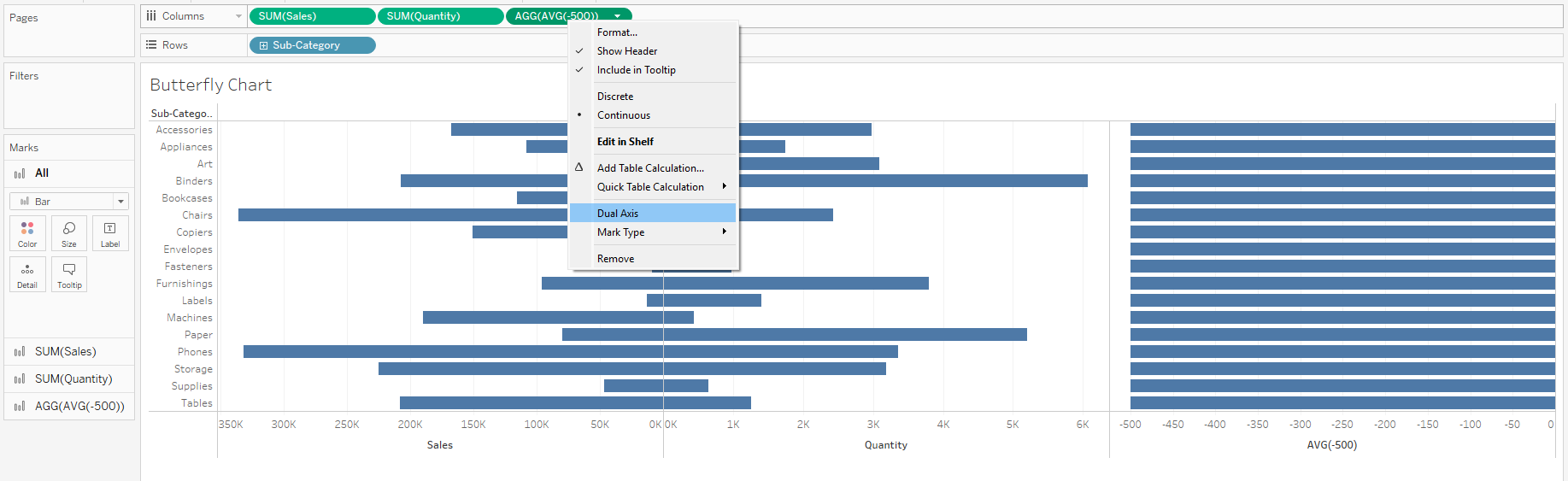
- Double click in the "Columns" shelf and type "AVG(-500)" to create a pill
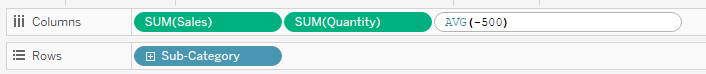
- Right-click on the "AVG(-500)" pill and choose "Dual Axis"
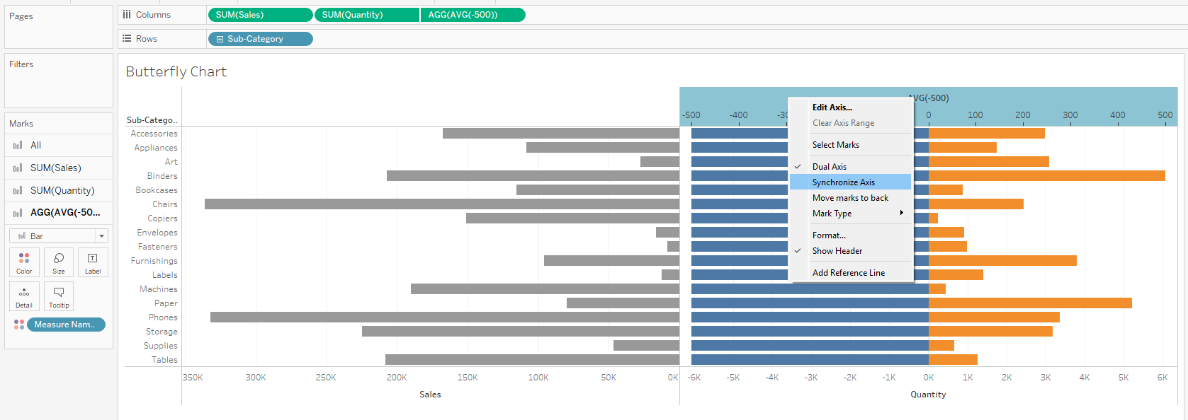
- Right-click on the AVG(-500) axis and select "Synchronize Axis"
- On the Marks Cards, remove "Measure Names" from color everywhere and change the mark type to "Text" for the AVG(-500) pill.
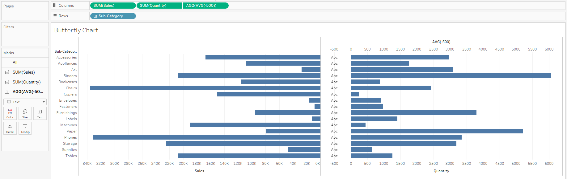
- Drag a copy of your dimension onto text on the Marks Card for AVG(-500)
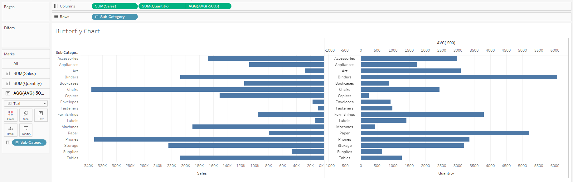
- At this point, the amount of space for the labels may not look correct. You can double click the AVG(-500) pill in the columns shelf and increase or decrease the value to reposition the labels as needed.
- 4. Final Formatting
- Right-click your dimension on the "Rows" shelf and deselect "Show Header"
- Right-click empty space on the chart and open "Format" to remove grid lines
- Double-click the AVG(-500) axis and delete the title. Then go into "Tick Marks" and set both Major and Minor Tick Marks to "None"
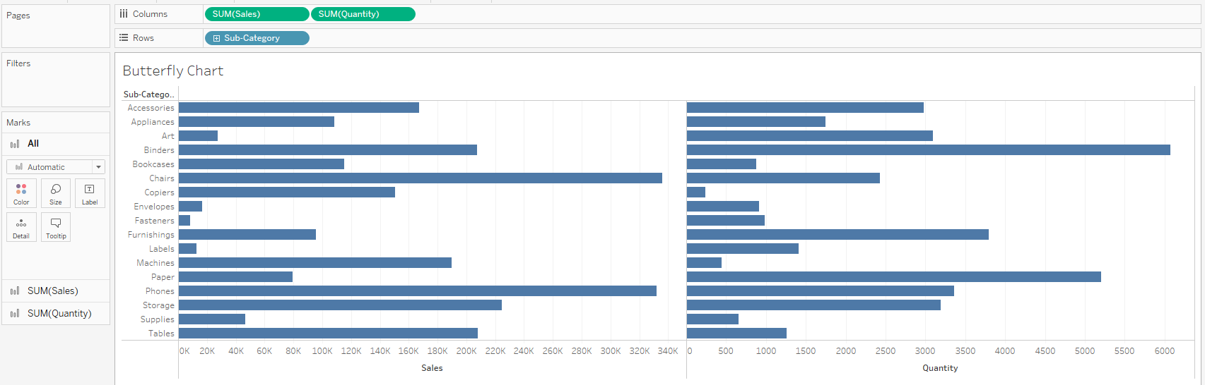
- Add labels, change colors, tooltips, sorting, and formatting to the bars for your two measures as desired.
Voila! You've created a butterfly chart with labels in the center.