Brief
DS53 will be working on the NFL Big Data Bowl 2026 Analytics challenge. This competition focuses on the movement of players during a pass play — specifically from when the Quarter Back releases the ball until the play ends.
You are tasked to create a metric or visual analysis to evaluate NFL player movement during the frames after the ball is thrown. The focus should be narrow and impactful (e.g., receiver separation, defensive pursuit angle, acceleration, route movement, etc.).
Use Tableau Prep for data prep and create an interactive dashboard in Tableau Desktop. Read the kaggle page for more information.
- Publish Tableau dashboard to Tableau Public
- Write accompanying blog post
Present findings 3:00 PM Friday.
Plan
Data
First step was understanding what each file represents. I found each file to contain all of the fields in the data, and appeared to be randomly split between different players and their respective data. I could not tell if it was broken up in a way that each team was a file, as they were all titled "input1-18". The main differentiator was the split between input and output files, with input being data before the pass being thrown, and output containing tracking data after the pass is thrown. The supplementary file contains the contextual information about the game and play. The data is here on Kaggle if you want to have a browse for yourself.
Input

Output

Supplementary

When it came to the data prep, it proved to be a bit of a challenge at best. The main flow was straightforward enough once we had figured out what needed to be done. The aim was to have the data from the frames combined to have the input and output frames in one field, able to act as on variable. Another aim was to have the fields required to provide information about the players included. The data inputs were all of the 18 weeks combined with a wildcard union.

I had set out to create a set of data that would be able to visualise the distance between the offensive player and the nearest defender for every frame, showcasing how over the course of the play they move to create that receiver separation. However there were issues at hand. In the flow, the data would be missing some of the files from the input union. The next issues occurred with duplicating the data to get marks for the receivers and the defenders to then try map a frame by frame calculation of the distance between each player. Unfortunately the time did not allow for me to investigate the issue causing this, but below is as far as my Prep Flow tracked.
Sketching
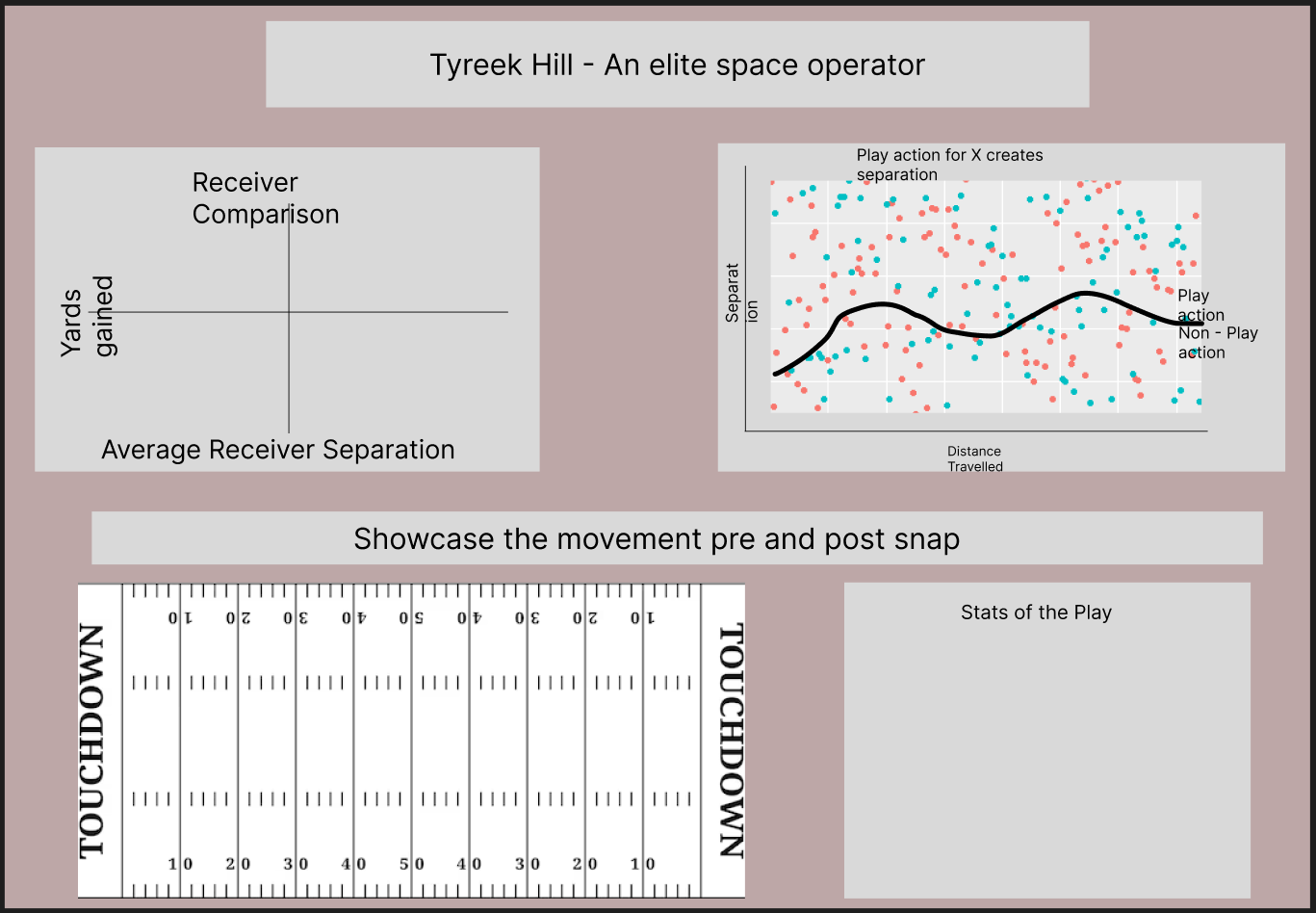
Trying to build a narrative and avenue of analysis took longer than I wanted it to. Without the level of knowledge about NFL that I would like to be able to think of a specific avenue to analyse myself, I stuck with one of Coach Lorna's suggestions and decided to look at receiver separation.
I browsed for what metrics were then used to analyse this category. I found the ASS Score, which score the average separation of players. This would require extensive modelling, so I decided to stick with the average separation value itself.
Next, an article breaking down the separation and analysing the non-play vs play action passes. It also makes the valuable point of when is the best point in time to analyse the seperation, and mentions the start of the play and the end. This helped to make things clearer for myself, being worried about the distance fluctuation between the frames, and plotting all of this if I was to try and create a field map. However as it mentions "some QBs throw with more anticipation than others, releasing the ball before a receiver has made his break and created the separation necessary for a successful completion. Measuring separation at the time of the throw punishes teammates with great chemistry", and the decision to focus on separation the moment the ball arrives as this reduces the effect the Quarter Back and the scheme have on the receiver themselves. It delved in to finding separation is highest on short passes with low value, which sparked the idea for potentially analysing the distances to the touchline and which players are gaining distance when it matters most, at the touchline.

Building
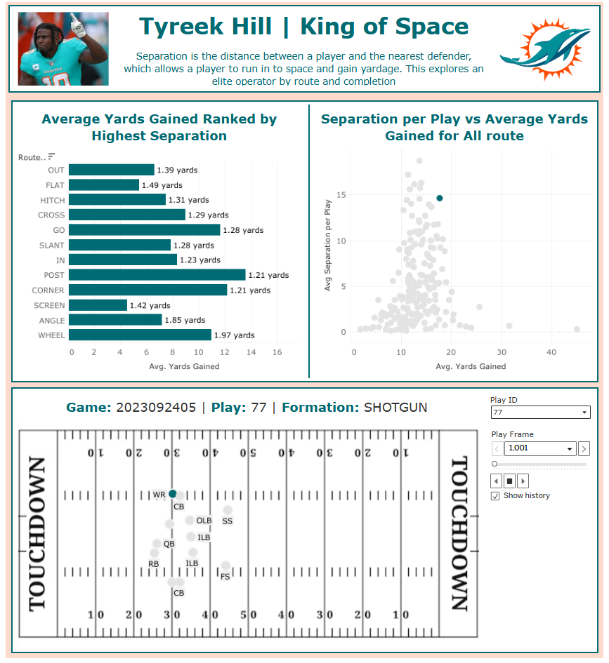
The charts were relatively straight forward. Once I had calculated the average separation for the receiver frame by frame, this meant I could bring it in to the data model to create a scatter plot against the average yards gained per play, for each player during the season.
The bar chart came about as a rethink due to the issue with the data, and I decided to pivot to the average yards gained per Route type run, and ranked by the highest separation.
The field map visualises the plays during the NF, showing the players on the field before the throw, and then then the offensive targeted receiver and the two nearest defender whilst the ball is thrown until it is caught or hits the ground. The trail is shown behind them to show the path run by each player.
Reflection
The dashboard is definitely my best work of the week, and my favourite work completed. Whilst I have very little knowledge about the NFL, I do enjoy sports and analytics surrounding it. I am content with the output, especially with the notable improvement in formatting, which makes this dashboard look much more put together. The screenshot below shows my dashboard at the time of submission, but I have included the link here for when I hopefully get the time to create the insights I originally set out to make.

