


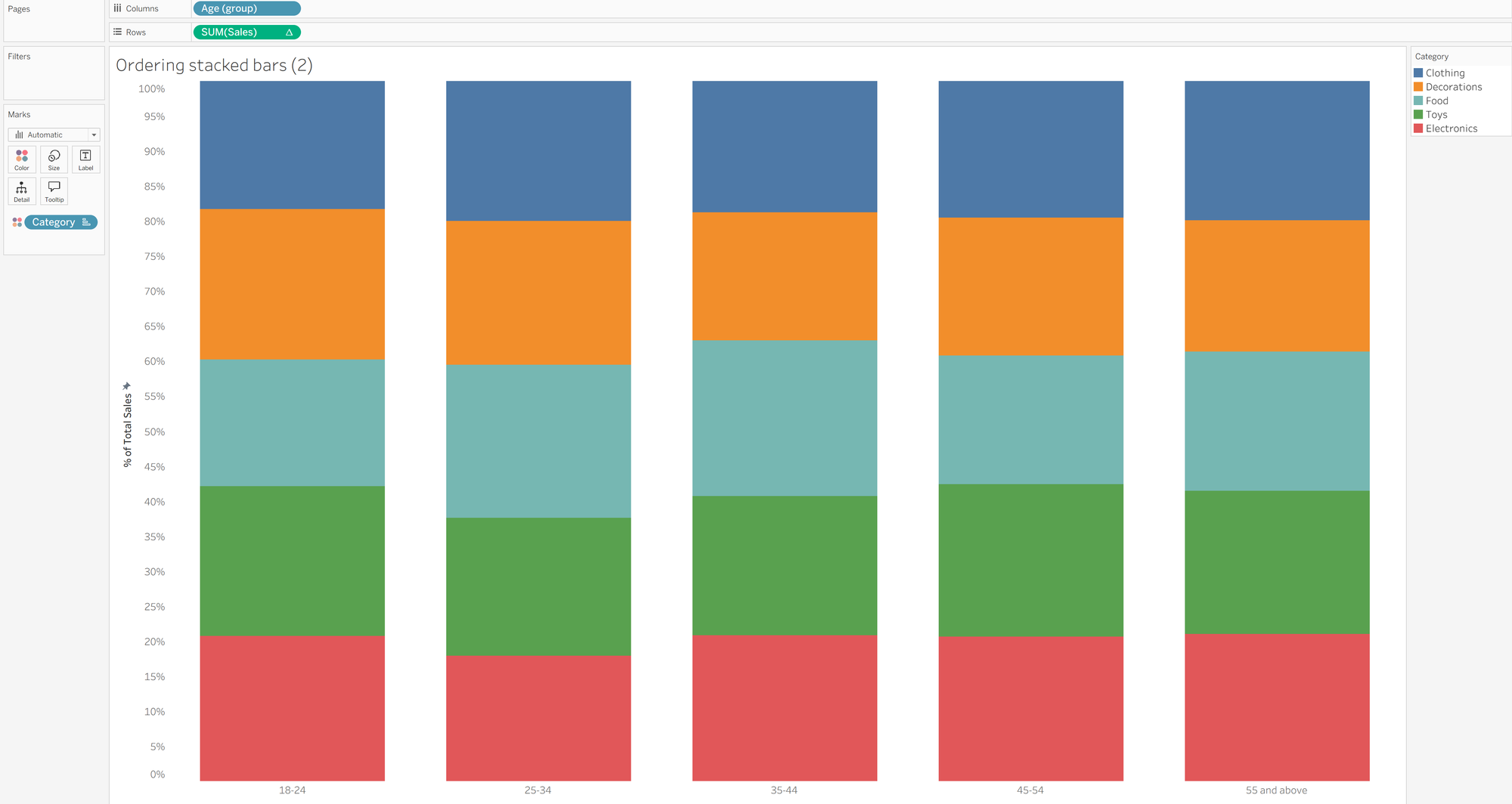
You might have heard that stacked bar charts are not the best way to demonstrate comparisons between different categories and therefore you might be wondering why I'm doing a blog post on those very charts. Well, what if I told you that there's a way to resolve at least one of the issues that arises with using a stacked bar chart, making it a little better at demonstrating comparisons between the categories, although it comes at a user cost? The key issue that I'm referring to here is that it's quite difficult to gauge differences in size of the chunks (pretty sure that's not the official terminology but it was the best way of describing it to my knowledge!) between the different categories. In the instance of the feature image, the categories in green, orange and light blue are in the middle of the bars which make them harder to compare across the age groups whereas the red and darker blue at the ends of the bars are much easier to compare. What if there was a way to reorder the bars depending on the category that the user would like to compare? Well, as this whole paragraph has indicated, there is a way and we'll be walking through how to do that in this blog post. I used a Christmas sales dataset because I'm writing this in the midst of the festive season but you could just use the superstore data if you don't have anything specific that you're analysing.
Step 1: Create your stacked bar chart. Add one of your dimensions onto columns (for me, this was age group as I wanted to compare spending between different age groups) and your measure onto rows (for me, this was sum of sales). I then added my other dimension (the one I was chunking by - category) to colour in my marks card. To make the proportions comparable, rather than the volume of sales themselves, I used a quick table calculation to make sum of sales as a percentage of total.
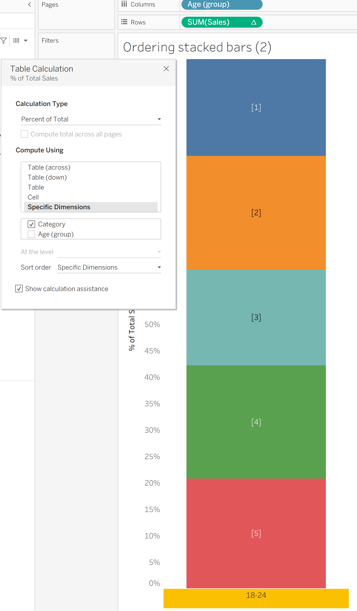
Step 2: Create your parameter. For the user to be able to select their chosen category, you need to create a parameter which will interact with the chart and demonstrate what the user wants to see accordingly. You can create this parameter really easily by simply changing your data type to a string, making allowable values a list and adding values from your chosen dimension. Make sure that you name your parameter appropriately because your user will be using this parameter to select their chosen category when your chart is published.

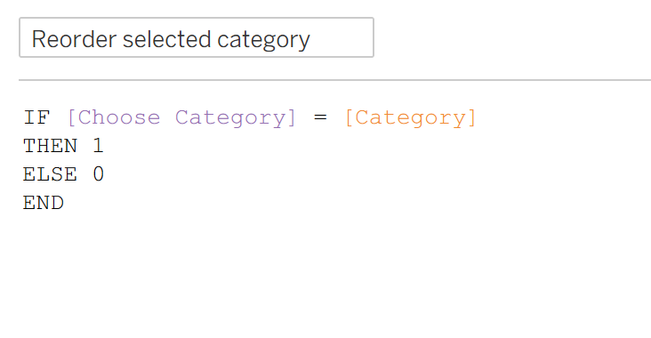
Step 3: Create your measure related to your parameter. To make this connection, you first need to create a measure value so that if your category is the selected category from the parameter, it's equal to one value and if it's not the selected category then it's equal to a different value.
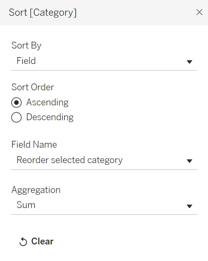
Step 4: Sort the bars according to your parameter. To do this, you need to go to your category field in your marks card and select sort from the drop down in the top right. You want to sort by field, ascending if you want your chosen field at the bottom of the chart (and have chosen the same values as I did in the calculated field), your field name is whatever your calculated field from step 3 was and you can aggregate as you please from the standard aggregations (I typically just stick with sum).
Now that everything is connected, show your parameter and try it out. Your chart should change accordingly! I hope this has taught you something new and you might even be thinking of different ways that you can implement this in other charts. Until next time, happy charting!