


Tables in Tableau are easy to create, but much harder to customize. In this blog, I’ll walk through how to build custom tables with icons, layered text, adjustable fonts and sizes, and even charts embedded directly within the table.
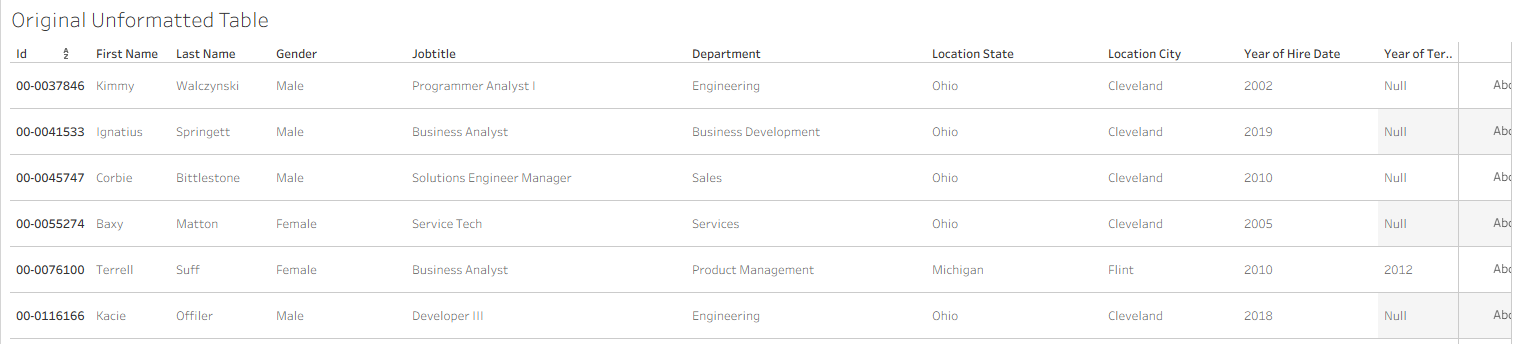
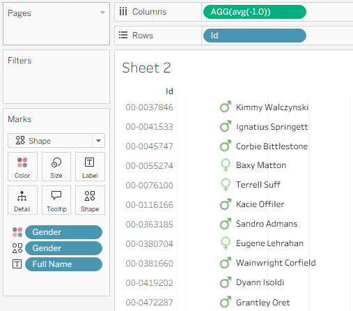
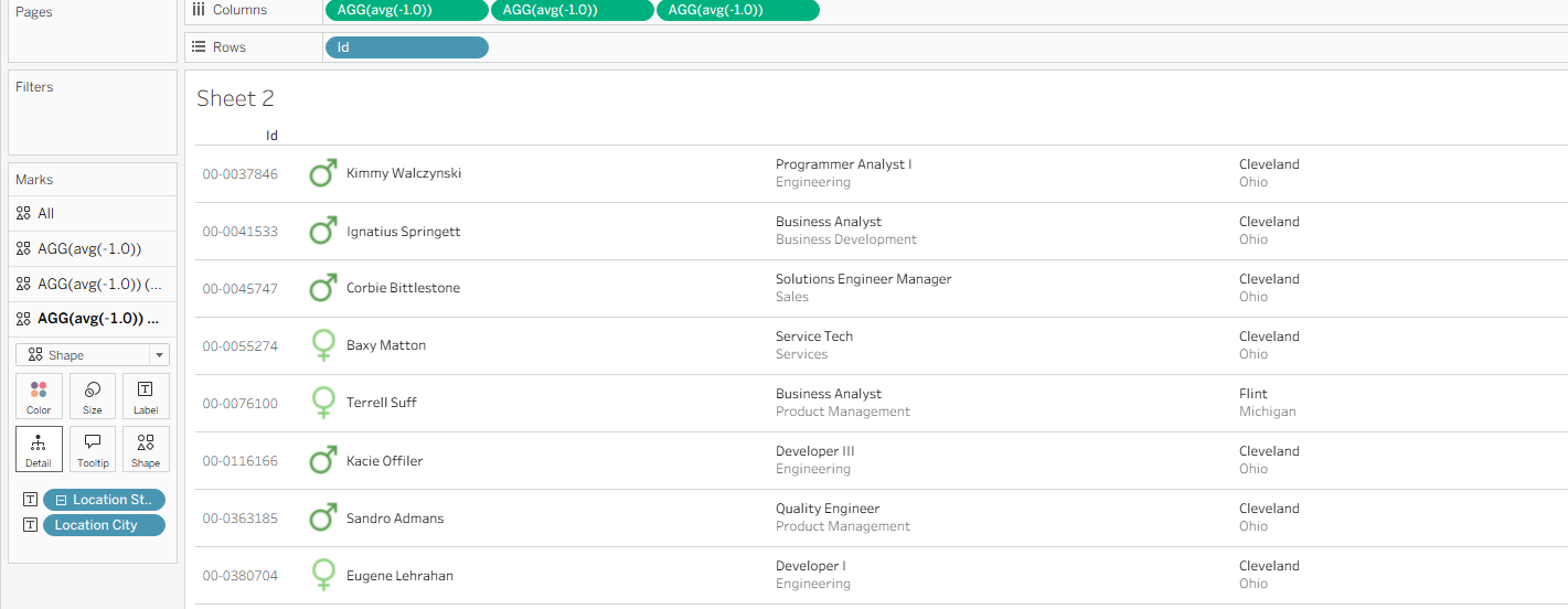
We will start with this basic table displaying information about people who have worked at a company:
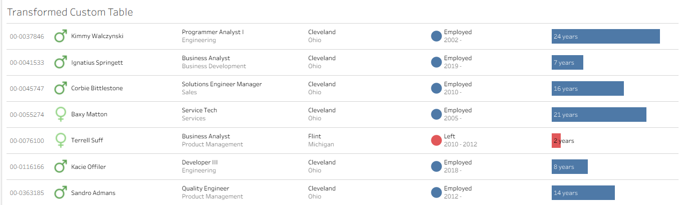
and transform it into this much more visually appealing, custom table:
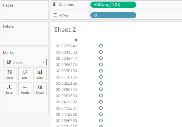
To start, drag everything off of rows except for the unique row identifier. In this case, Id. Then, in Columns, type the custom calculation "avg(-1.0)". Change the chart type to shape, and you should get something that looks like this:
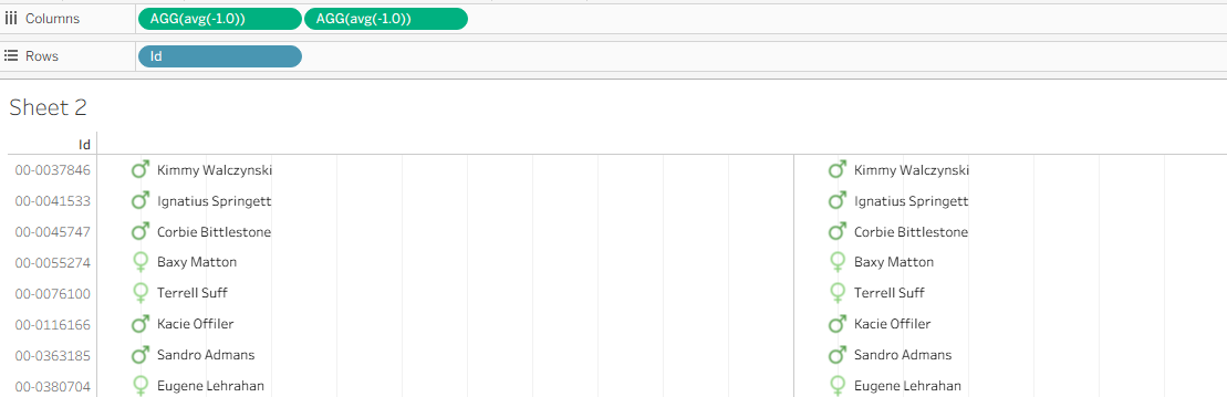
This custom calculation on Columns will serve as the first column in the table. Whenever you need to add another column, simply duplicate the pill and place it next to the existing one on Columns.
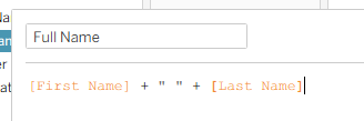
Instead of blue circles, let's make this column display each users full name. Since full name is not currently in the data set, create it with a calculation:
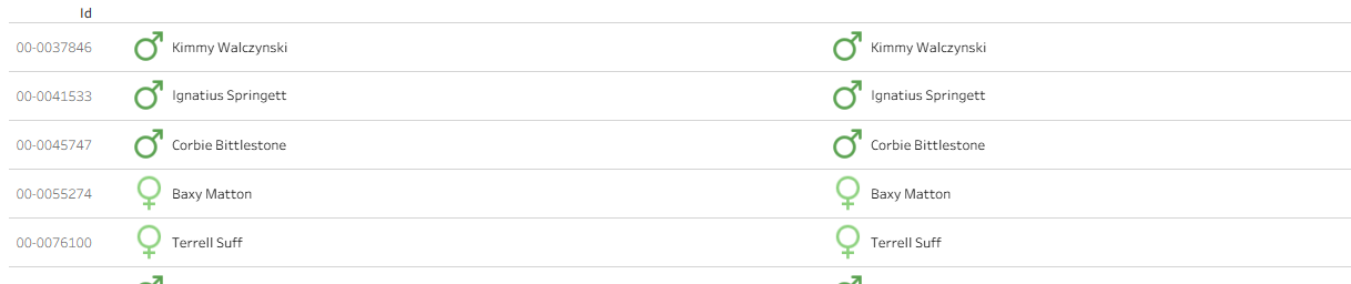
Drag this new Full Name calculation on to label. Drag gender onto shapes and set them to the corresponding gender shapes, then drag gender onto color and set it to your preferred colors. If the spacing between rows is too small, drag out the space between Id numbers to give yourself a little more room. This should leave you with a chart that looks like:
The first column is now complete!
Creating the next column by duplicating the pill on Columns should leave give you a view of:
Before going on, make sure to correctly format the lines on the chart.
Remove the grid lines, and add faint row dividers to make it clear what one row in the table is referring to.
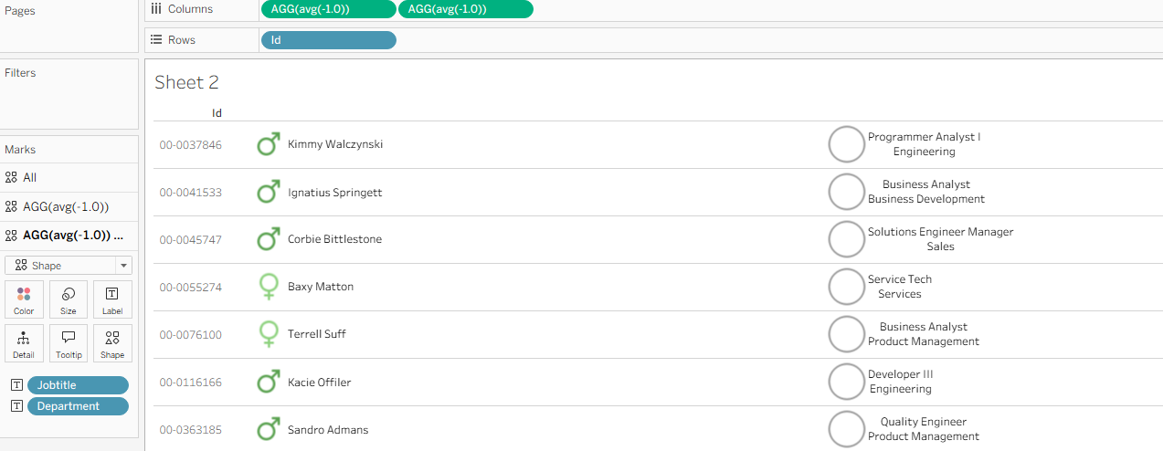
For the 2nd column, remove all the duplicate name and gender information. This column will instead show job title and department. Drag both fields onto text in the marks card for the new duplicated calculation on Columns.
To correctly format, click on label and click the 3 dots next to text. Left align both job title and department, and make department a slightly lighter color.

To get rid of the unwanted circle next to the text, slide the size mark all the way down, then click on color and slide the opacity down to 0%. This should leave you with a column formatted as:

The next column will be very similar, only instead of job and department, the text will be location city and location state. Create a new duplicated calculation on Columns, drag in the desired text, and complete the same text and shape formatting. The updated table should look like:
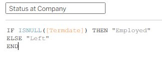
The final step piece of information to include is something that shows if a person is still at the company. To achieve this, let's build a column that either shows the text "Employed" or "Left", the date range of years at the company, and a dot colored based on employment status. To start, create a calculation called status at company. This will return "Employed" if the employee has no end date, and "Left" if there is an end date.
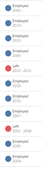
Drag this calculation onto label and color, and set the color to red for left and blue for hired. To add the date range at the company, drag hire date and termination date onto the label as well. Click on the label mark to format everything to your liking. The final result should look something like:
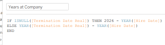
One extra addition to fully demonstrate this employment year range is a bar chart that shows the number of years at the company. Firstly, a calculation has to be made to calculate the total number of years at the company:
Instead of making a new duplicate of the dummy calculation on Columns, drag this calculation itself onto Columns. With a little added formatting to slightly size down the bar, color it based on status at company, and add a label for years, you are left with something like:
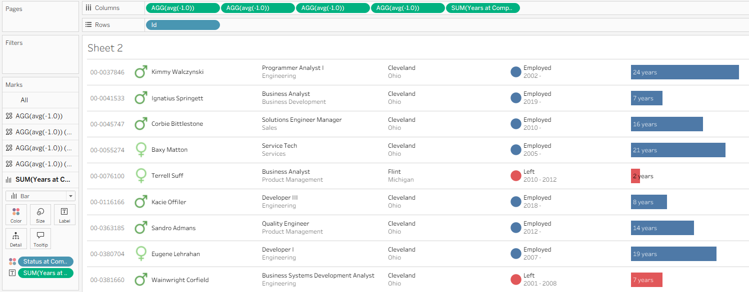
The new table is now complete with added features such as custom colors, icons, formatted text, and a bar chart. It took a lot of work, but comparing the finalized table to the starting point shows how much of an improvement was made.
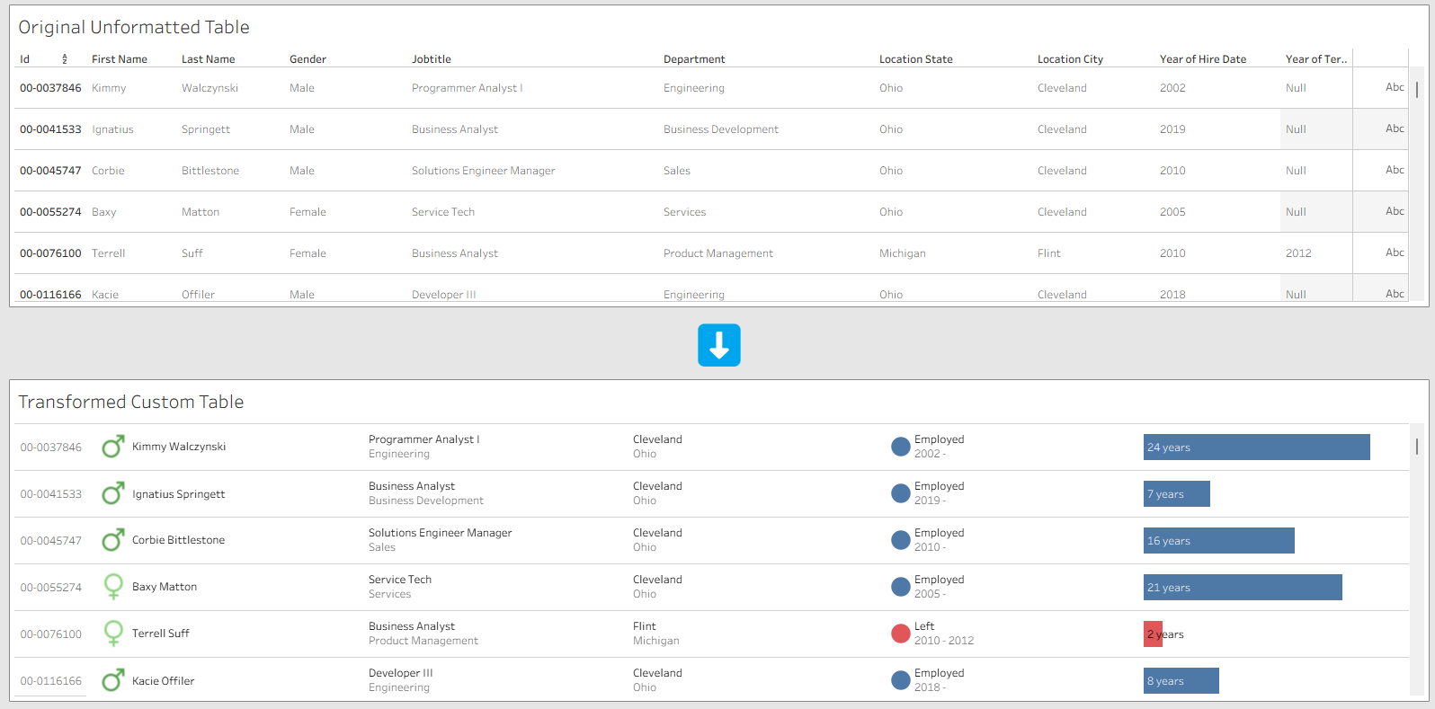
This new table not only is much more visually appealing, but also allows for much easier comprehension and analysis because the information is formatted more intuitively.
When creating tables in the future, keep these techniques in mind if you're looking for a way to really make them pop!
To see the final result or to download and see the worksheets and calculations in Tableau, you can access the chart transformation viz here: https://public.tableau.com/app/profile/george.chachkes/viz/TransformingTableauTables/Dashboard1.