Dashboard Week Day 4 marks the final day of this week. The data we have been given is the same dataset used for Round 2 of the application process. Our task is to find as many insights as possible within the given time frame. The dataset records information about US congressmen, their travel trips, the time of report submission, and the sponsors of the trips.
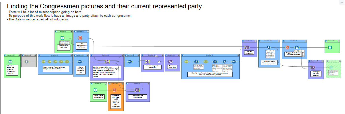
One thing I noticed missing is the political party affiliation of the congressmen. I inputted the data into Alteryx and decided to search the web for the congressmen's information. The quickest source I found was Wikipedia, which has a page containing all the information about the current congressmen. Since there is no way to download the data, I plan to use Alteryx to scrape the information from the web page. Using Alteryx tools, I was able to download the source page information, parse out the political party information along with images of the congressmen using regex, and then append it to the original dataset. The dataset now includes all the party information and attached images to the main set. However, one problem remains: the dataset contains congressmen from 2020, while the information on Wikipedia only includes the current congressmen, which means that there will be some congressmen with missing information.
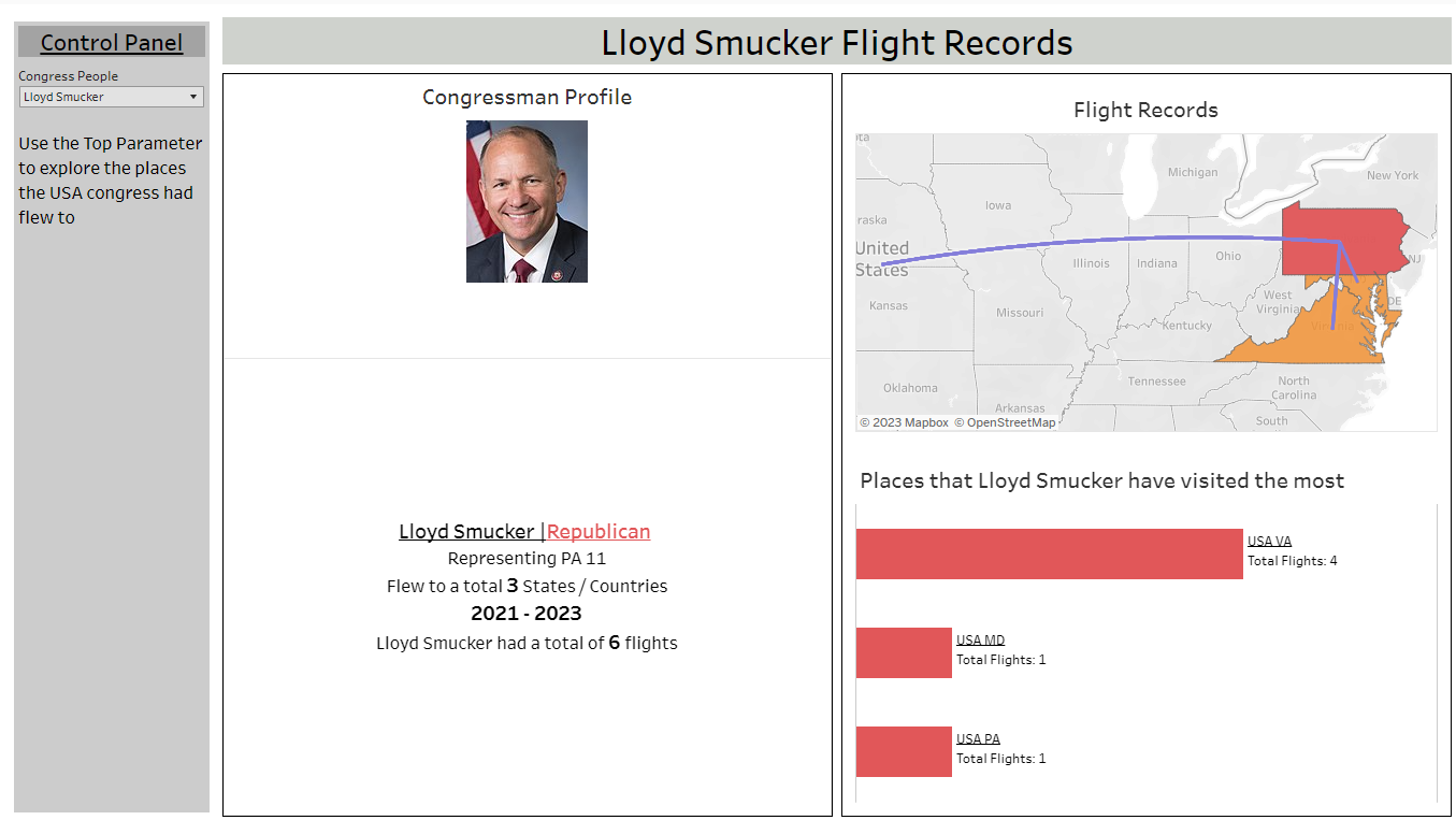
Next, I opened Excalidraw and Chat-GPT to explore potential questions I could investigate. However, I ignored all the questions and instead started drawing the design of the dashboard and outlining my plans for it. My idea is to create a congressmen profile overview, giving the user the option to take a closer look at the selected congressmen while viewing their travel data.
In Tableau, I was unable to fully realize my idea and uncover insights, but I managed to create a basic version of it. Initially, I attempted to create a side-by-side scroll bar. However, it was not organized in a way that allowed for ranking. So, I abandoned that idea and opted for using a dropdown parameter instead. The next chart I created was a flow map. Since there is no longitude and latitude data available, I downloaded a generated map from Tableau and joined it with the table to obtain the necessary spatial data for plotting points. Lastly, I created a bar chart that displays the number of trips each congressman has taken to a particular location.