


After writing about the first version of this dashboard, I wanted to do a bit more work on the part that matters most to me in data visualisation: making the interesting stuff as easy as possible to see. To me, good dashboard design is about reducing the amount of effort the user has to put in. If something is worth noticing, they should not have to work hard to find it.
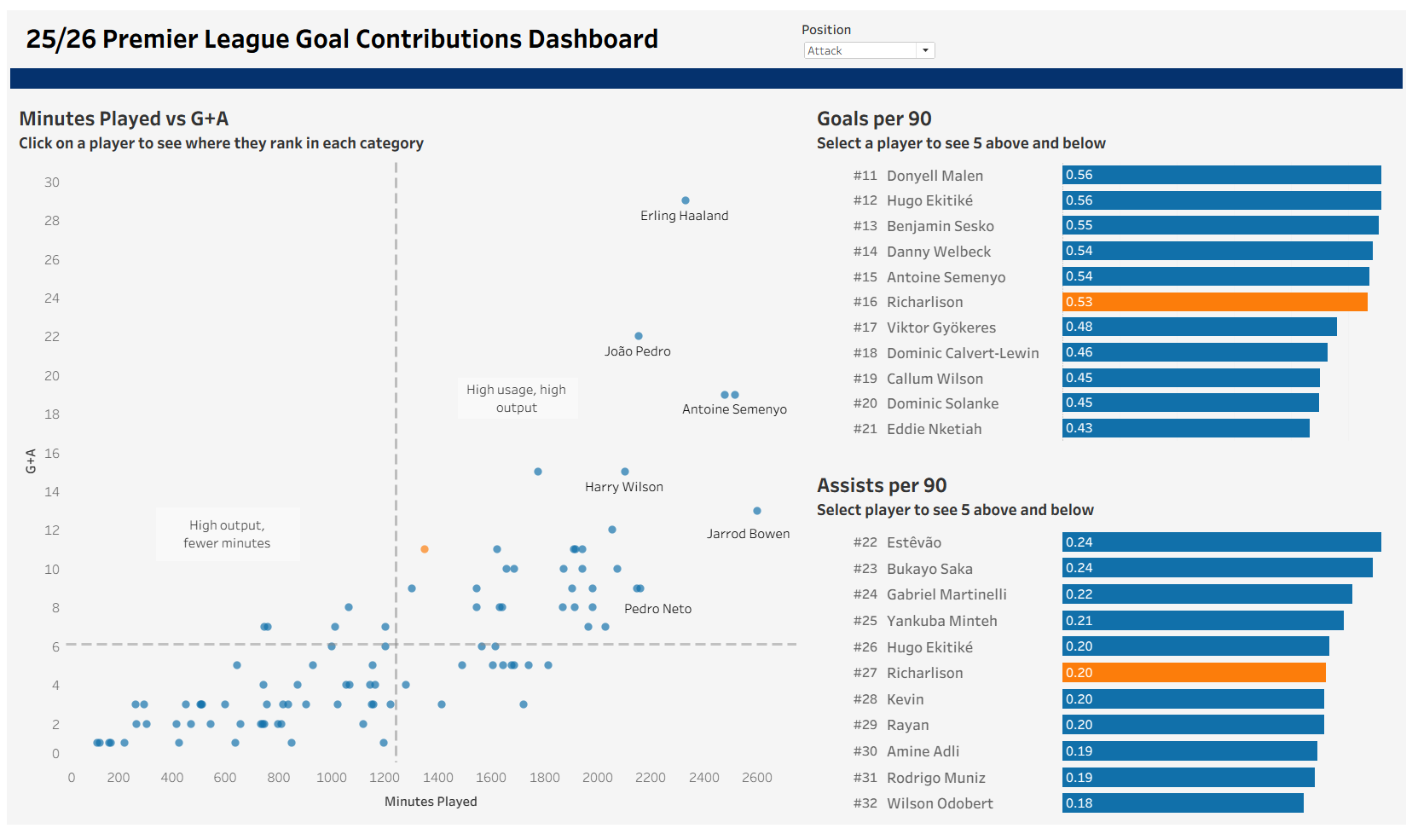
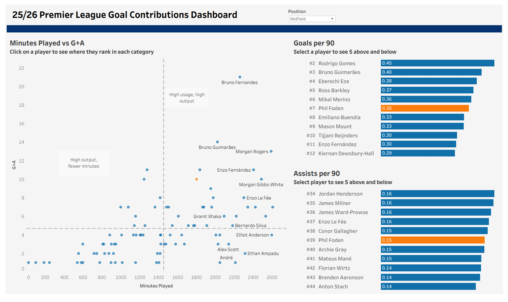
The main thing I added was ranking. The scatterplot was useful for spotting who was producing, but I wanted the user to be able to click on a player and immediately understand where they sit compared to others in their position. To do that, I created a parameter called Selected Player and used a parameter action so that clicking on any player on any chart updates that parameter. That meant the whole dashboard could respond to one selection, rather than making the user jump between separate filters or controls.
For the goals per 90 and assists per 90 charts, I created ranking calculations using RANK_UNIQUE([Goals per 90], 'desc') and RANK_UNIQUE([Assists per 90], 'desc'). I added those ranks as a separate column next to each bar chart so the user could see straight away not just the value, but where that player actually sits in the league. I think that makes a big difference, because a number on its own can be hard to judge quickly, whereas a rank gives instant context.
To get the charts to centre around the selected player, I built a selector calculation that only returns the selected player’s rank inside the window:
WINDOW_SUM(
(
IF MIN([Player Selector]) THEN [Rank Gp90]
END))
From there, Tableau could compare every player’s rank to the selected player’s rank and decide whether they were the one being selected or not.
Once I had that, I used a filter to only show the five players above and below them:
ABS([Gp90 Selector] - [Rank Gp90]) <= 5
I repeated the same logic for assists per 90. The result is a view that gives a lot more context without overwhelming the user. Instead of scrolling through a full ranked list, you can click a player and immediately see the small section of the table that actually matters.
I also spent a bit of time improving the formatting. I made the fonts consistent, changed the background to a softer off white, adjusted the padding, lined the containers up properly, added a proper title, and removed the date parameter so the dashboard had a clearer focus on the current season. None of those are huge changes on their own, but together they make the dashboard feel much cleaner and easier to read.
It is still a simple project, but I am really happy with how it turned out. More than anything, this version feels closer to the kind of dashboard I actually want to build: one that does not just show numbers, but helps the user understand them quickly. For a first personal project, I am pretty proud of it, and hopefully it is the first of plenty more.
You can check out the finished dashboard here: https://public.tableau.com/app/profile/harry.singler5859/viz/PremierLeagueGoalContributions/Dashboard