


Our first two days of dashboard week were Power BI focused and used synthetic data on a sports inspired e-commerce company called PitchSide Pro. Given the World Cup was in full swing it was certainly an appropriately themed project.
PitchSide Pro and the Brief
PitchSide Pro are a Global e-commerce retailer which specialises in selling football kits, national team gear, boots, and fan culture collectibles. Over the last five years, their business has expanded through seasonal spikes, digital channel growth, and major tournament moments. The company wants to know what is driving revenue over time and where the business should focus its attention to sustain growth. The dashboards created need to provide both a high-level overview as well as the ability to drill down into specific areas.
As you will see I decided to create three dashboards, one of which was an executive summary.
The Process
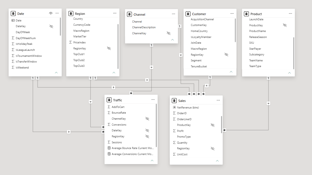
This project was very much focused on the dashboard building, the insights found and the recommendations which can be made off the back of that. The data modelling was very minimal, the only major change was converting the date table into an actual date table within Power BI.
Initial Sketches and Ideas
One of the most difficult aspects of the project was the initial ideas generation and sketches. The brief was not very long, nor was it overly specific. This gave more freedom in terms of what could be created but also more decisions and considerations to be made. My initial research focused on what an e-commerce executive might want to know, for example specific metrics like bounce rate and conversions. The initial sketches formed the groundwork for what was to be built - see figure 2 for the executive overview sketch.
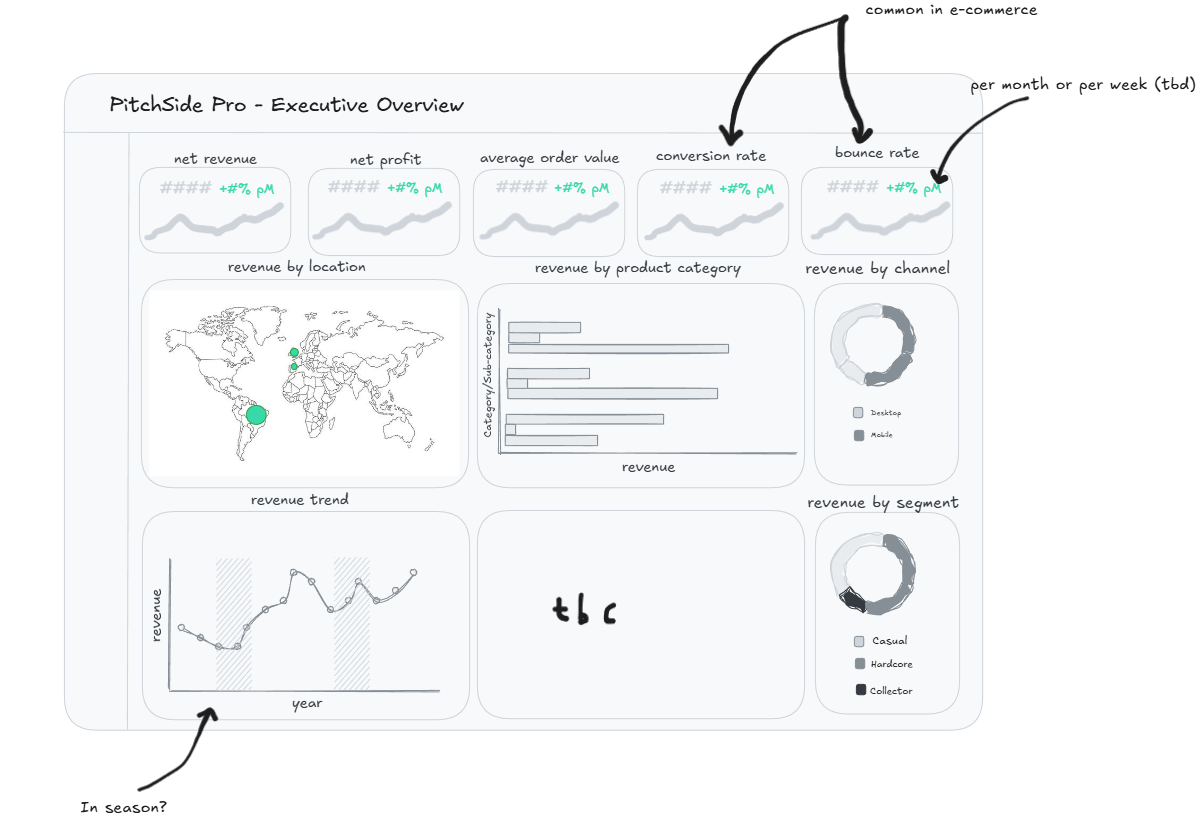
The intended user was an executive within PitchSide Pro so this influenced the chart types, metrics and overall theme of the dashboard greatly. Key KPI's such as net revenue and profit were essentials. I also wanted the values displayed to be relative to another value - in this case the most recent month compared to the previous month.
Having done some sketching I decided to go into Power BI to roughly build out some of the charts - and see how feasible they were with the data provided. Remembering the DAX calculations for some of these metrics was a key test during the project but luckily many of the calculations were repeated with just different measures substituted in and out. This stage of the project was highly iterative in that I went back to the drawing board having built out charts if I felt they didn't work well. I also began thinking about two other dashboards which could be used to explore specific areas within the business.
As PitchSide Pro is a sports themed brand and heavily influenced by tournament seasons, I decided to do a dashboard focused on the impact specific events have on the revenue. I also thought it would be useful to have another dashboard which allows a user to drill down to specific customers based on their location, acquisition, tenure etc. to see how they are driving revenue.
Below are the dashboards which were created...
Next Steps and Feedback
Overall I was happy with what I was able to produce over two days and managed to stick quite closely to my initial plan, however there are certainly still things to improve:
1) Ensure all line chart y axes start at 0
2) Add in an information tooltip to aid with navigating around the dashboard
3) Format tooltips