


For our second day of dashboard week, we were given access to a massive collection of data from Airbnb, and asked to create a dashboard in PowerBi based on the country/city we selected to focus on.
You can use this dataset too at https://insideairbnb.com/get-the-data/ !
For my dashboard, I chose Greece, and got started on exploring the data. One of the first things I noticed was the extra verification, as well as the fact that some hosts had descriptions about themselves/their business in their bio. I thought it could be interesting to focus on whether identity verification or a filled out about page would have a higher impact on booking ratings.
First, I started by sketching out what kind of charts I wanted to build for the dashboard. Exploring the data before this step was really important, because it gave me more ideas and a better sense of what would be possible to do with the dataset.
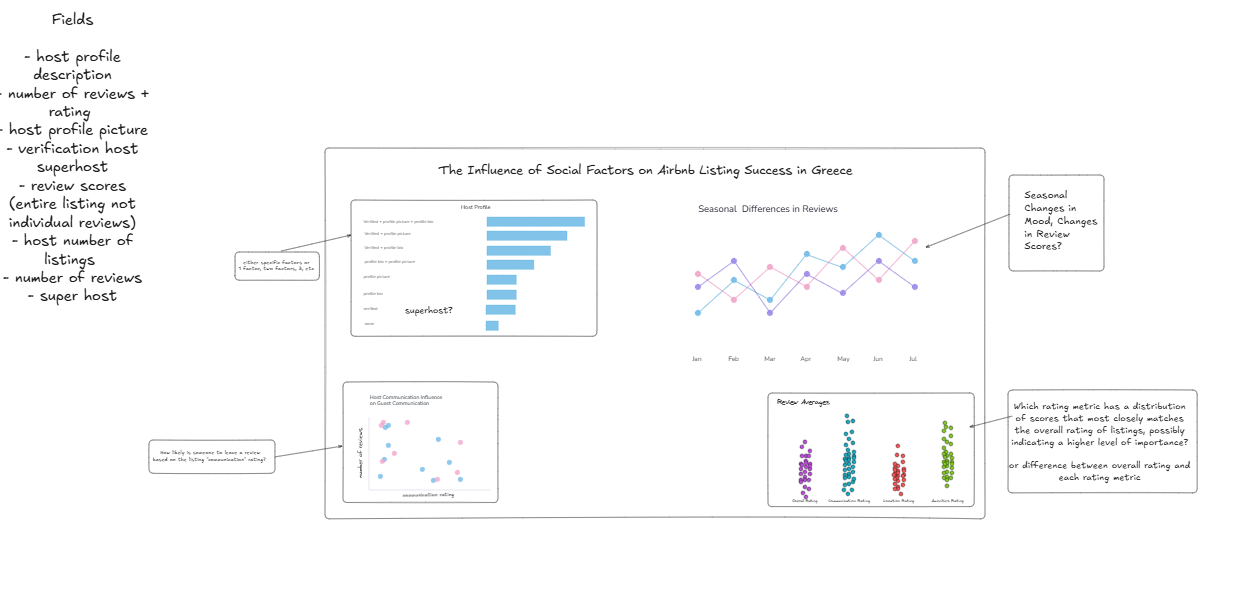
Unfortunately, it was taking me a little longer than I’d like to finish sketching. I ended up moving on earlier than I would've liked and started building even though the sketch wasn't completely finished because I was worried I wouldn’t get to finish building in time.
Before getting started on building out the dashboard, I began data cleaning. I did this directly in PowerBi, as it didn’t require too much editing. It mostly consisted of changing column types and removing null columns.
I spent the majority of the day building out the dashboard, and ended up running into some issues with my processing time as I had many different tables connected to each in my data model.
However, I was able to put the dashboard together with new charts on social influences.
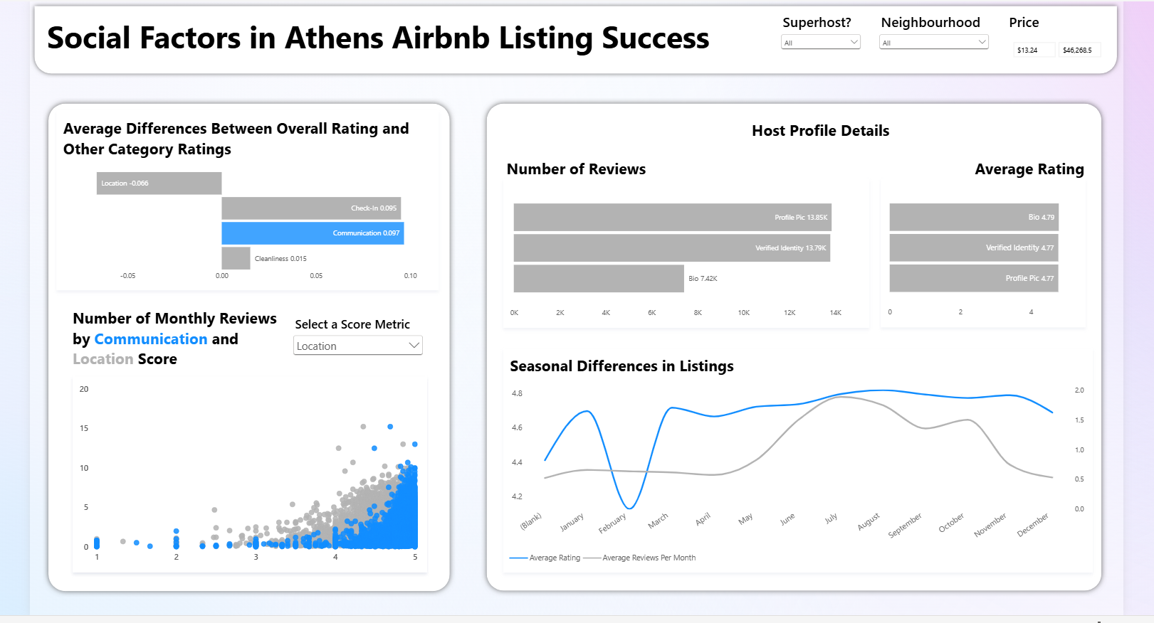
My main insights were that high-level communication has a significant impact on the consumers perception of a listing and their willingness to review it. This is especially the case when the host is a superhost. Superhosts have much higher communication scores, that on average far exceed the overall listing score.
Looking forward to Day 3!