


As I learn more data skills during Data School training, I am starting to apply those techniques to passion projects about topics that I love. This week, I learned about some more advanced sentiment analysis software called Text Blob from my colleague Sita Pawar. It is a python package that is capable of taking in large chunks of text and quantifying their polarity (positivity) and subjectivity. To learn much more about Text Blob and its capabilities, stay tuned for an upcoming blog from Sita.
After I found out that Text Blob could identify positive and negative language, I thought through all the media I love to try to find the story with the highest highs and lowest lows. I settled on Into the Woods and found this full text of the script online. To consolidate the data, I copy pasted the entire text into google sheets and downloaded it as a .xlsx file (there are better ways to do this that I will blog about in the future).

Next, I loaded the data into Alteryx to clean and transform it for visualization. In order to plot the sentiment over time, I needed much smaller chunks than 3 enormous wants for the sake of comparison. I decided to use the "Text to Columns" tool in Alteryx and use the "Text to Rows" option so that every time Alteryx found a comma in the text, it would start a new row.
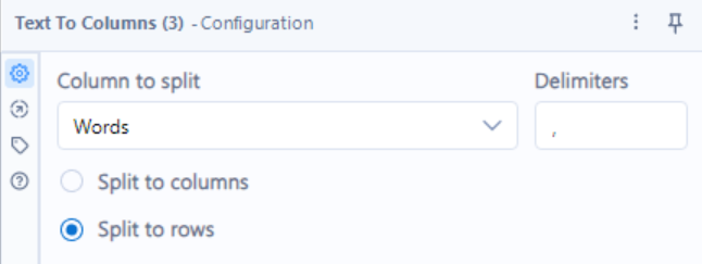
There are certainly more thorough ways to achieve this, but this got the job done, giving me text chunks of random lengths. To adjust for some of the randomness in length and reduce the size of the table (it was about 1,200 at this point) I binned the rows into groups of three, concatenating their strings delimiting by a space.
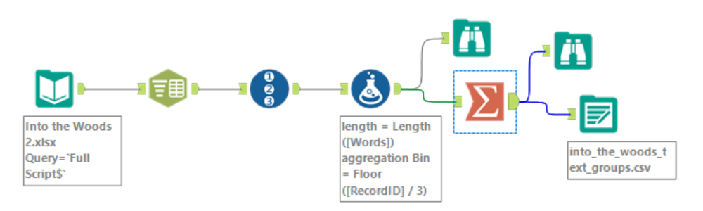
I pasted my full Alteryx flow in below if you are curious. The steps are
- Loading in the data from my .xlsx.
- Splitting the data into rows
- Adding a record ID to ensure things are sorted down the road
- Calculating string length to assess how well the row split worked
- Calculating a new aggregation bin based on the Record ID for future binning
- Aggregating the bins from the previous step
- Exporting the data as a .csv
The binoculars that branch off are steps that I used to inspect the data at those points in the process to ensure I have achieved the types of transformations that I would want.
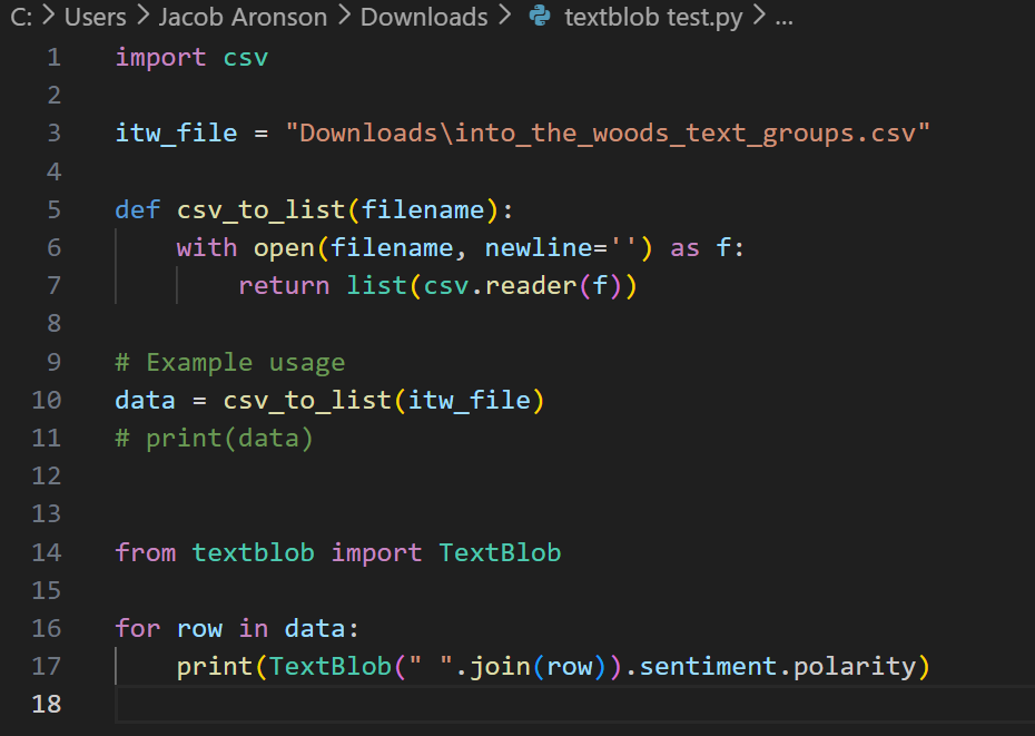
Once I had a .csv, I was ready to input it into python. This step had me caught up in Python minutiae for a bit, requiring me to set up Text Blob, as well as libraries to read in and export .csv files. Using Text Blob also requires creating "text blobs". Once you have a text blob my_text_blob, you can get its sentiment by using my_text_blob.sentiment, and you can get its polarity using my_text_blob.sentiment.polarity. My full code is screenshotted below. I exported the data by manually copy pasting the Python output into Google Sheets and downloading it as a .xlsx (again, the python export .csv method is much cleaner, but this way got the job done as well).
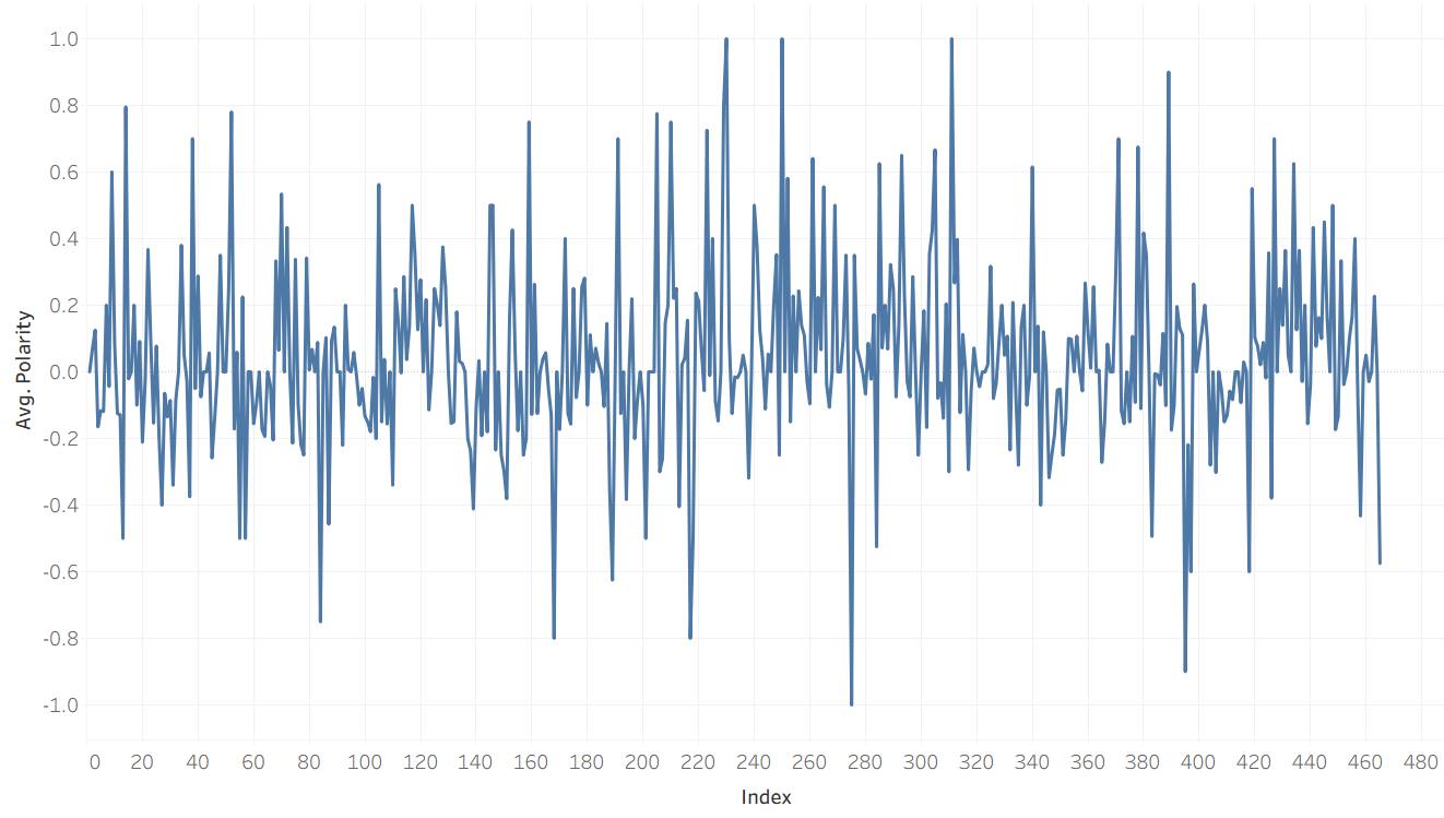
Once the data was loaded into Tableau, most of the work had been done already. Unfortunately, this kind of sentiment data is extremely volatile, jumping up and down at every interval. My first plot of sentiment over the course of the play looked like this:
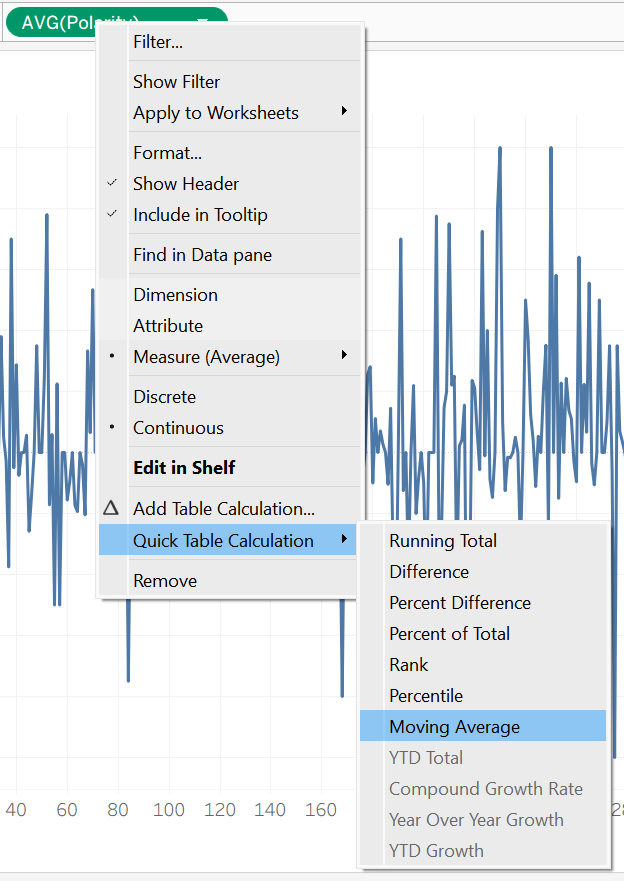
The fix for this sort of volatility is to use a moving average, a kind of table calculation in Tableau which averages the values before and after a given index to smooth out a plot like this. You can access a table calculation by right clicking your continuous pill (in my case, index) and selecting the moving average quick table calculation:
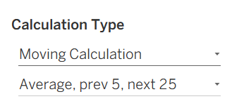
Once the table calculation is in place, you might have to do a bit of editing. In my case, the default range for the average was far too small, which failed to smooth out the plot. In the end, I opted for a moving average that averaged everything from 5 text chunks before a given index to 25 text chunks after. I ultimately placed reference lines at the starts of songs, so if I wanted to capture their moods, I figured I should give more emphasis to what comes after an index than what comes before.
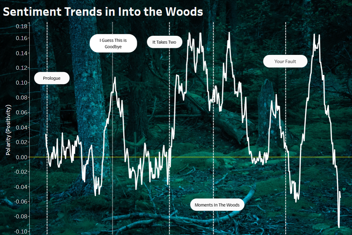
The last few steps were mostly aesthetic! I found a cool public domain background image and changed the colors of the plot design to make them compatible with the background image. Last, I found some key moments in the script, used Alteryx to identify their corresponding indices, and marked reference lines to give the user an idea of the events surrounding the rises and falls in sentiment. In the end, I think the visualization represents the emotional contours of the play pretty well! I won't go into too much detail (or give any spoilers!) but the major songs in the play result in movements in the direction that I could have expected. The tooltip (which you see when hovering over a point) tells you how far that index is into the play as a percentage as well as the sentiment polarity for that index. You can check out the dashboard on my Tableau Public here.
This was a really fun project that combined four major tools (google sheets, Alteryx, Python, and Tableau), while also combining my new data skills with a personal passion of mine. It was also my first attempt at using a background image, which is something that I've wanted to do for a long time!