


The second day of dashboard week felt much more open ended than the first! We were given the URL of the Great British Baking Show's website (https://thegreatbritishbakeoff.co.uk/), and were tasked with scraping data from any part of the website using Alteryx and building a dashboard answering a question of our choice using the resulting data!
As a novice baker, I wanted to design today's build for me as a user! This ended up only being a part of my final product but was a helpful guideline as I brainstormed. Exploring this homepage, I gravitated more towards the recipes section than the results section (that lists players' performances throughout the history of the show). I thought it would be interesting to find achievable recipes from their archives, or better yet learn something about how the people at the Great British Bake Off do their own categorization and organization of recipes.
When I navigated to the "All Recipes" page, I discovered a built-in classification of recipe difficulty:
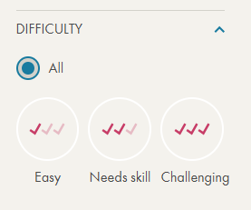
Based on this, I sketched a dashboard to try to understand what makes a recipe "Easy" vs. "Challenging", with the goal being to determine this classification for unknown recipes in the future!
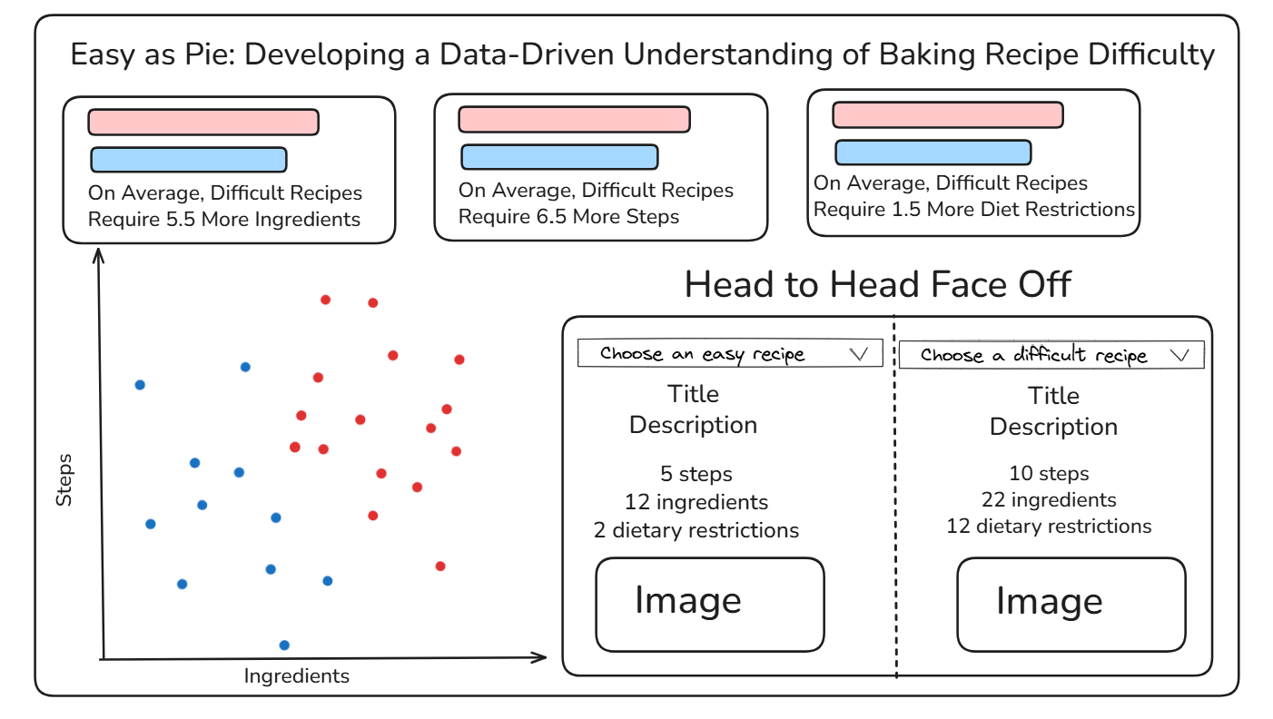
My dashboard sketch is included below, featuring a title I am (very) proud of, three horizontal cards comparing the easy and difficult recipes across three different metrics, a scatterplot visualizing the number of ingredients vs. the number of steps, and a sort of table allowing the user to create their own head to head face off between a difficult and easy recipe.
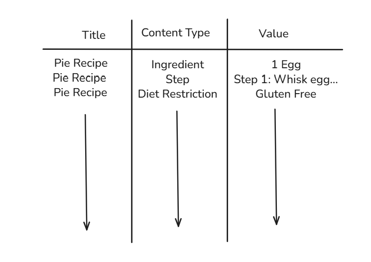
In order to build this sort of dashboard, I needed a long data structure, with three primary fields: recipe title, content type, and value. The ideal data structure would look something like this:
With this plan in place, I moved to alteryx to scrape and structure my data. As with yesterday, I won't go painfully into detail about each step of my flow, but I will give a broad overview of the steps I took.
- Compile the URLs for each page from the "all recipes" page (1 to 15 for easy, 1 to 7 for difficult)
- Download the html for these "all recipes" pages, then use regular expressions to parse out URLs for individual episodes
- Input this list of URLs into another download tool, scraping each recipe individually
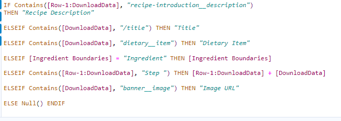
- Use a multi-row formula alongside some data exploration to create a "Row Meaning" field that would eventually become content type (see image below)
- Clean up the data (replace miscoded characters from the webscraping, remove extra spaces, remove remaining html components such as <p>)
- Output as a .hyper file for use in Tableau!
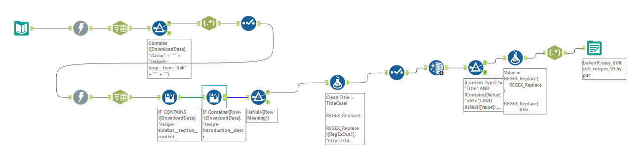
To put the prior (small) checklist into context, I am also going to include a screenshot of my full flow, however the previous list did cover the key steps!
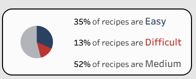
Once I loaded the data into Tableau, I started to build out my desired dashboard! One addition that arrived after the sketch was a pie chart to contextualize the sample size of the easy and difficult recipes relative to all of the recipes available on the website:
To find the finished product, you can check my Tableau Public, which I am excited about, especially considering the compressed time frame to develop it! I had a lot of fun getting to experience the full data pipeline, from question to data collection to dashboarding, all in one day. I am looking forward to day 3 of the week!