


Since this is our first dashboard week challenge, I thought I would keep it simple and focus mainly on what we covered this morning – accessibility.
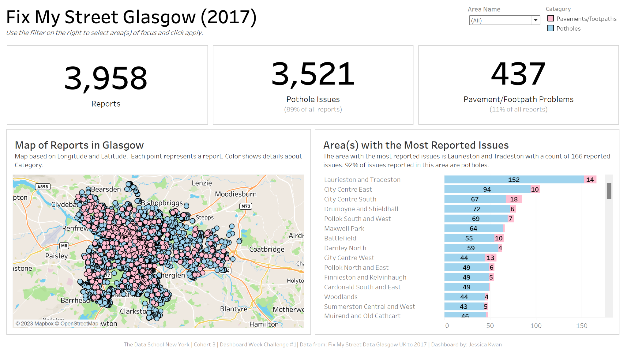
From my first dive into the data, I felt that we could start off with some BANs going across the top, pointing out the number of issues reported.
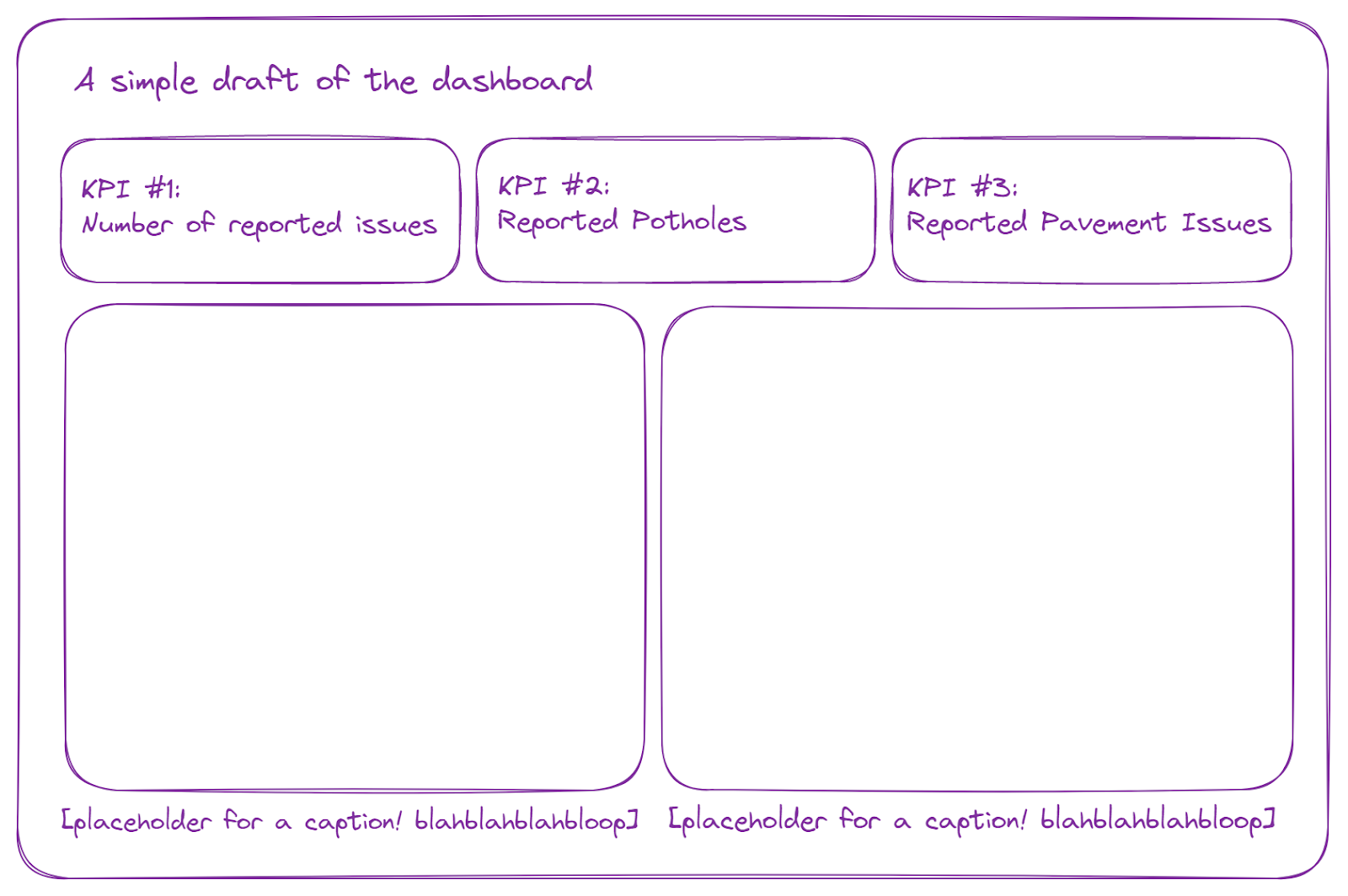
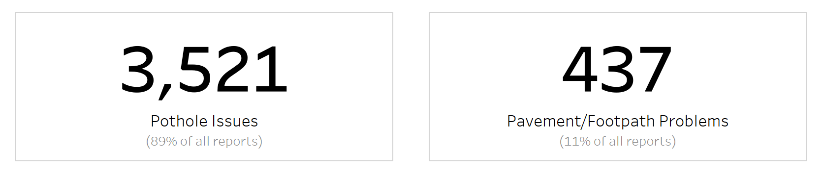
Other BANs would break the overall count into the two separate categories: Number of Reported Potholes and Number of Reported Pavement/Footpath Issues (Definitely not in those exact words as that would be quite repetitive and frowned upon).
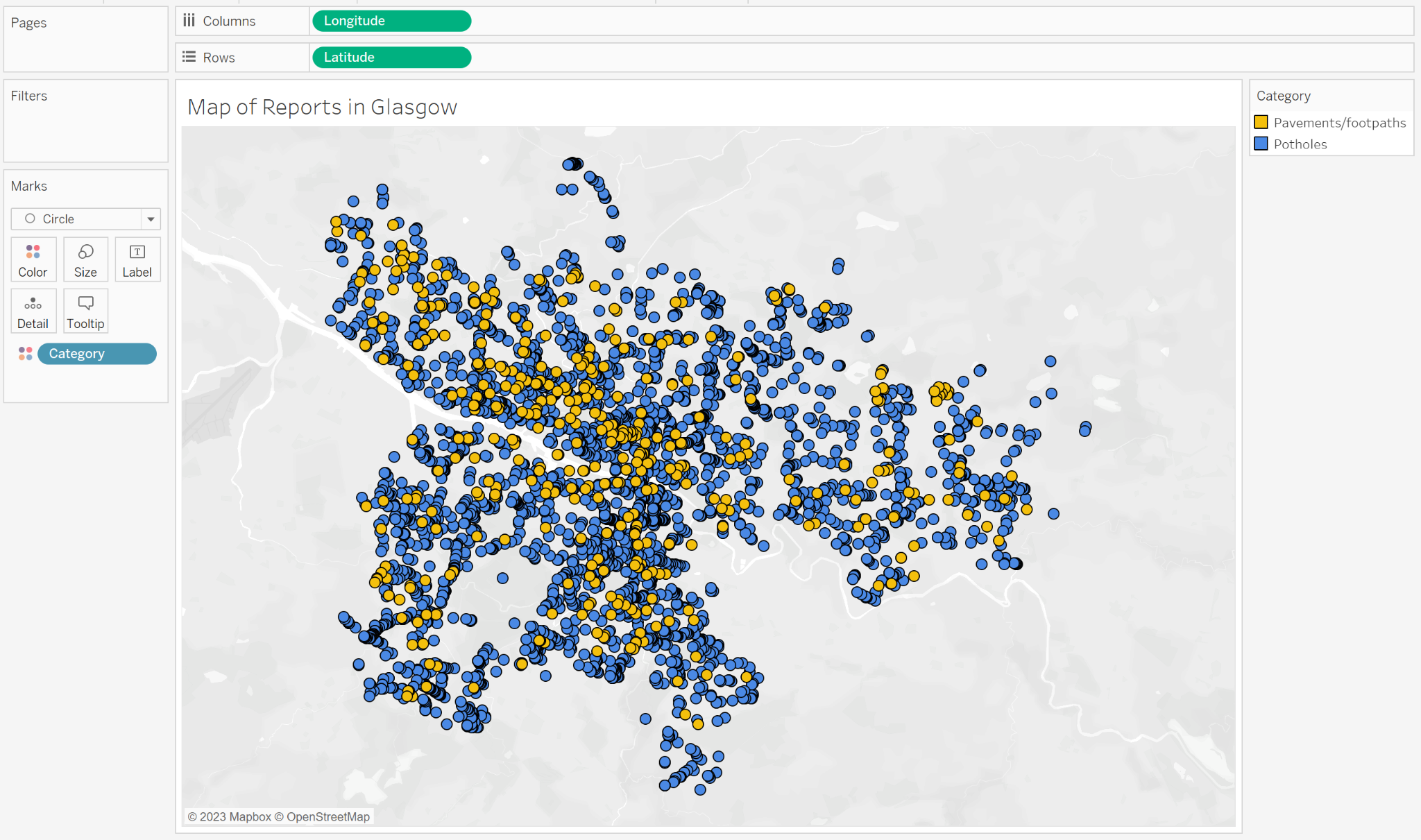
Below the KPIs, I plan to have at least two charts. I wasn’t too sure what to make yet, but I did see that we have a field for longitude and another for latitude. I am a huge fan of maps, so maybe a map would be appropriate? This will need to be tested.
For the other chart, I think a bar chart with bar length representing the count of reports for that area would be appropriate as well.
What colors should we use? What colors would be most appropriate for what we’re showing, but is still accessibility friendly? Not sure yet. So we’ll have to put a pin in that for now.
The results:
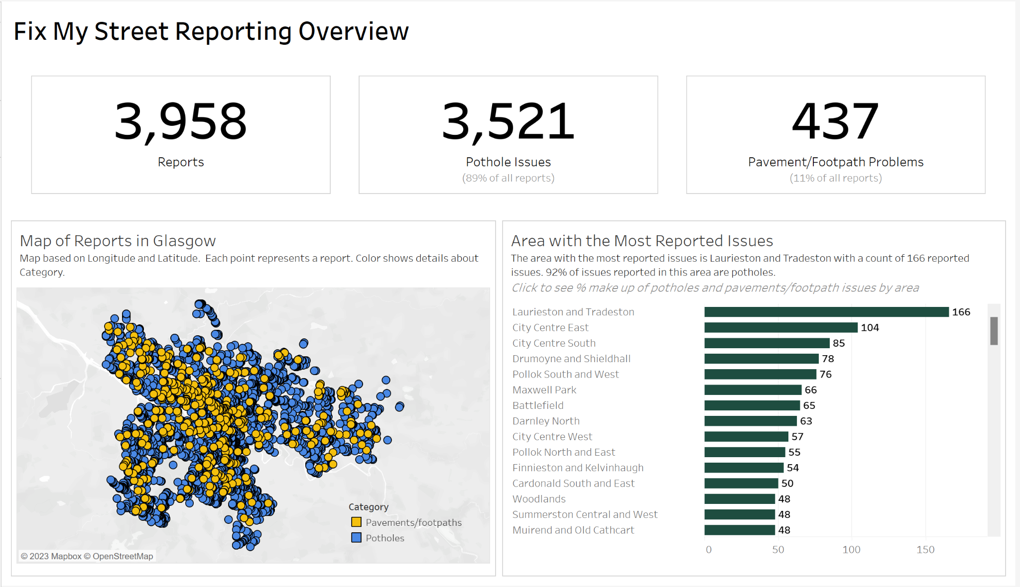
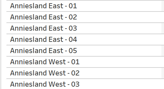
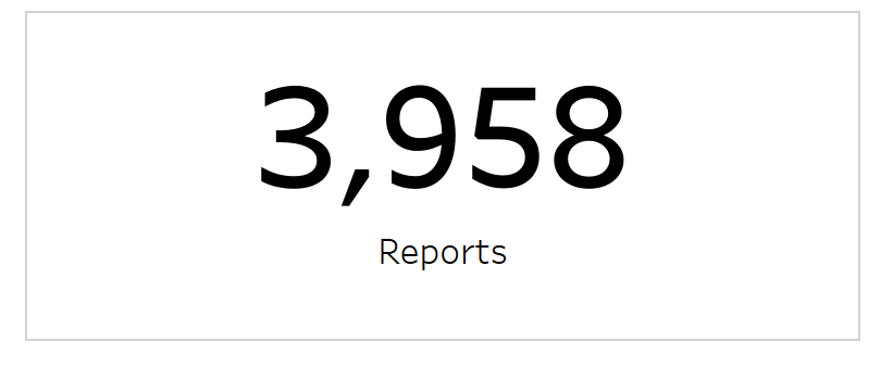
To get the BAN for total reports made, I just created right-click dragged and dropped the Name field onto Text in the Marks Card to get the COUNT of Names. In this case, a value in the Name column would be the Area Name combined with the Number of the Report so for example:
The resulting BAN is the same as above:
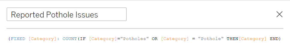
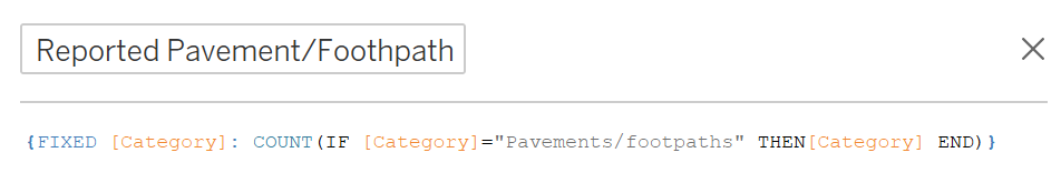
Then to get the two additional BANs, I needed to use a FIXED LOD to get the number of pothole issues reported and number of pavement/footpath issues reported.
I also wanted to give users a bit of additional context so I decided to find the percentage of reported issues for each category. In other words, what percentage of all issues reported are pothole issues? What percentage of all issues reported are pavement/footpath issues? That required additional calculated fields:


Throw everything together and this is what we get:
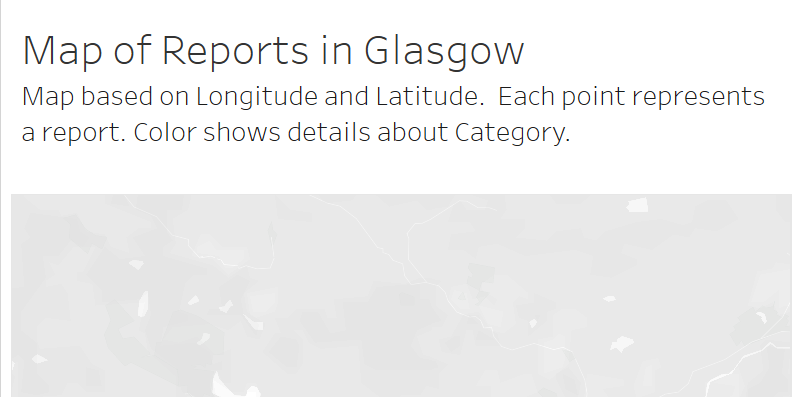
To make this map, I dragged and dropped Longitude to the Columns shelf and Latitude to the Rows Shelf. A base map will then populate the view. I then changed the marks to circles to mark each point that was reported to have an issue. I dragged Category onto color so that users would be able to differentiate between pothole issue reports and pavement/footpath issue reports:
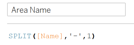
From there I moved on to making the bar chart to determine the area with the most reported issues. But before I could do that, I would need to extract the area name from the field Name. For example: Anniesland East - 01 should be Anniesland East, Maxwell Park - 01 should just be Maxwell Park, and so on and so forth. Luckily for us, we could just split by “-” and get the area name using this calculation:
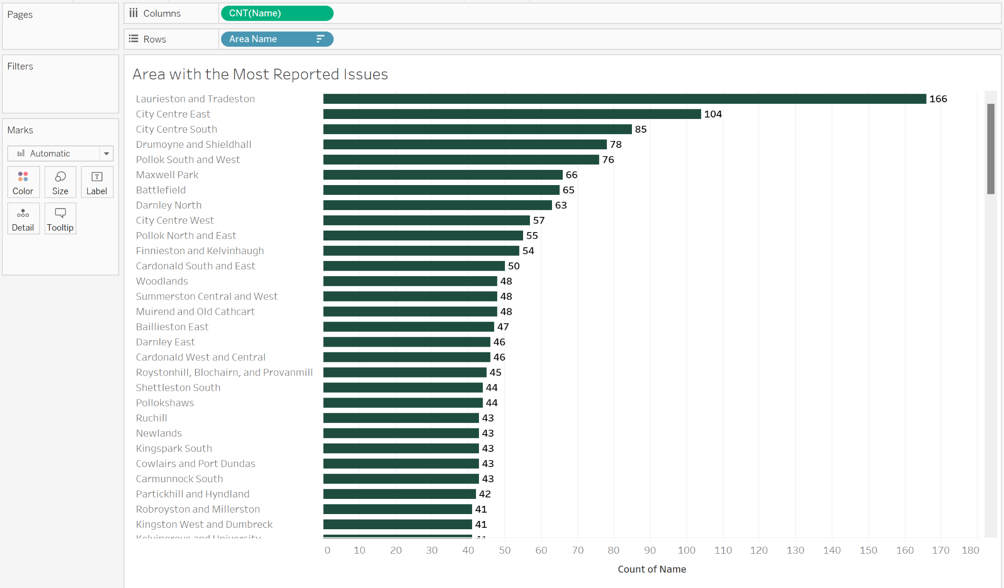
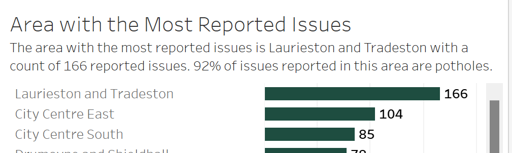
Right-click and drag Datazone or Name onto the Columns shelf (either one still returns the same count, but for consistency's sake, we’ll use Name). Put Area Name on Rows and voila, our bar chart:
Now, today’s goal was to make a dashboard that a screen reader could process and still make sense. So to accommodate those with visual impairments, but also just for best practice, I included captions in the title to explain the map: “Map based on Longitude and Latitude. Each point represents a report. Color shows details about Category.” I did the same for the bar chart: “The area with the most reported issues is Laurieston and Tradeston with a count of 166 reported issues. 92% of issues reported in this area are potholes.” Putting the caption within the title instead of putting it as an actual caption was due to the fact that members of the cohort realized that the screen reader had inconsistent performance when reading the captions, meaning that the screen reader itself sometimes had trouble processing the text. The best workaround was to put the text in the title itself, but as smaller text.
Now that we have the base for our dashboard, I want to explain the color choice you may or may not have noticed.
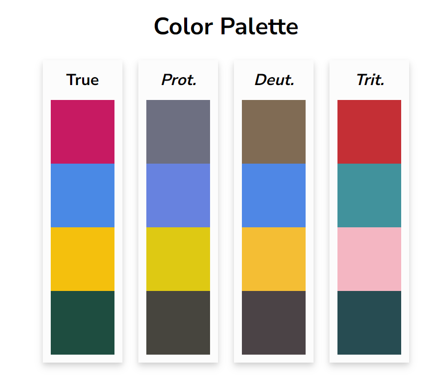
Looking at the piece titled Coloring for Colorblindness by David Nichols, I decided to use the True colors so that even users with color blindness would be able to differentiate between the overlapping dots on the map and not confuse those colors with that of the green I chose to use in the bar.
After presenting to my peers and coaches, I realized that some of the lack of functionality such as a filter and some of the choices I made such as using three super bright and bold colors may not have been the best and may not have been accessibility friendly as I originally thought it would be.
Here is the final published dashboard with some adjustments made:
- All non-title text has been changed to a consistent grey color
- The title of the dashboard better explains the data being used
- In italics under the title, I also left instructions on how to use the new filter that was added
- The filter now allows users to select one or multiple areas of interest
- The color of the map and bar chart now both use the same blue and pink (Shoutout to Connie Koo from DSNY 3 for her wonderful color choice)
- The bar chart is now a stacked bar showing the breakdown of number of issues reported for each category type and colored to match the map
- Blue for potholes
- Pink for pavement/footpath
- The color legend is now in a container on the top right corner instead of floating on the map
- Some chart junk such as unnecessary axis titles have also been removed
Hope you like the dashboard and as always, I welcome any constructive suggestions on my dashboards. If you would like to interact with the dashboard yourself, here’s the link: https://public.tableau.com/app/profile/jessk/viz/JessicaKwan-FixMyStreetGlasgow2017-ImprovedVersion_16855354065840/Dashboard1