


Did you know that before your conscious mind even registers a chart, your brain has already processed its key visual features?
Within 200 to 250 milliseconds, visual information is filtered subconsciously through what psychologists call pre-attentive processing. This was introduced by psychologist Anne Treisman’s Feature Integration Theory, which states our visual system automatically groups and recognizes four fundamental properties:
- Form: Length, width, orientation, size, and shape
- Color: Hue and intensity
- Spatial Position: 2D position and alignment
- Movement: Motion and flicker
When designing charts or dashboards, leveraging these properties allows you to guide your reader's attention effortlessly—before they even read a single label.
1. Length
Take a look at this first chart. What do you notice immediately?
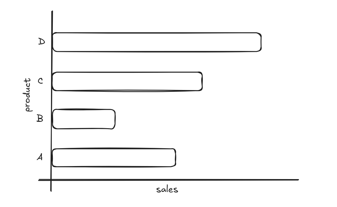
Without checking the axis or reading any numerical data, your brain instantly registers that Product D has the highest sales.
Our brain is exceptionally good at comparing relative lengths aligned along an axis. This makes bar charts one of the most effective ways to display quantitative data.
2. Color: Steering the Reader's Focal Point
Now, look at the updated version:
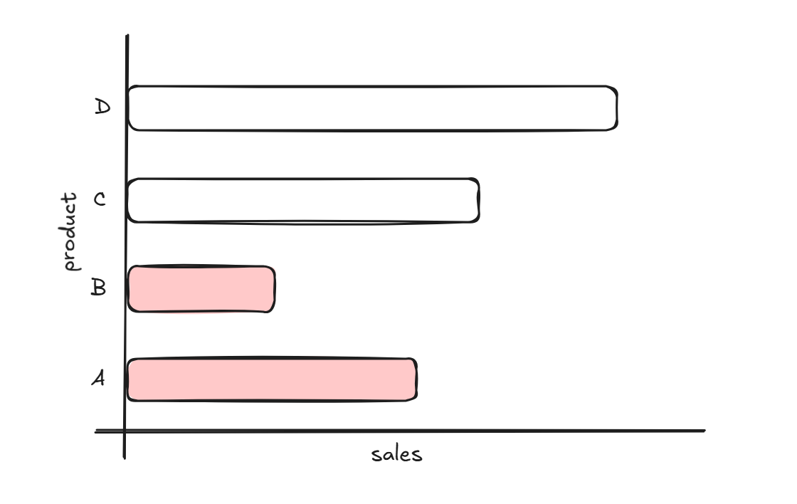
Notice where your eyes went first this time. While Product D remains the longest bar, your attention was immediately pulled toward Products A and B.
By adding color, you create a secondary focal point. This allows you to tell a specific story—such as highlighting a specific product or drawing attention to regional performance—without altering the underlying data.
Final Thoughts: Designing for the Subconscious
Understanding pre-attentive attributes allows you to build a clear visual hierarchy. By intentionally choosing when to leverage length, position, or color, you ensure your audience spends less energy trying to figure out what they are looking at and more time understanding what it means.