


Pareto Charts are a useful upgrade to the regular bar chart.
They excel at displaying each item's share of the total, showing high-impact items, and highlighting diminishing returns.
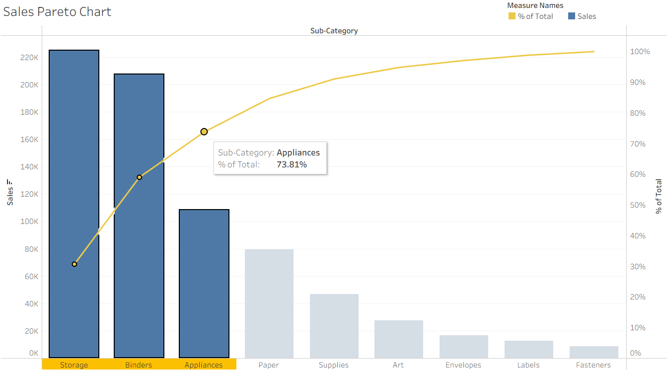
Making the Pareto Chart:
Table Calculations
The technical setup for a Pareto chart includes two table calculations, a Running Sum and a Percent of Total.
Starting from a regular bar chart:
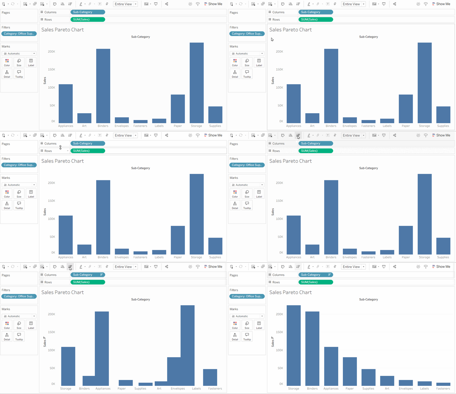
First, make sure your chart is sorted (not in alphabetical order!)
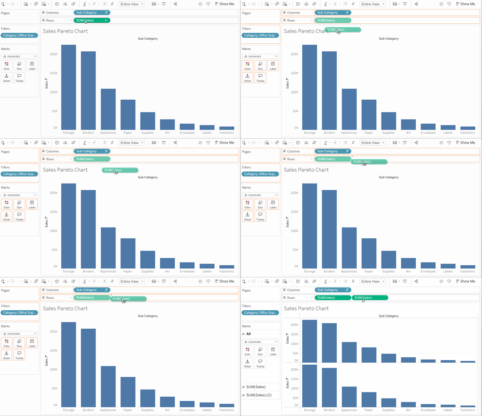
Duplicate your measure, splitting your sheet into two identical bar charts.
We'll leave one of these identical charts untouched, and make changes on the other.
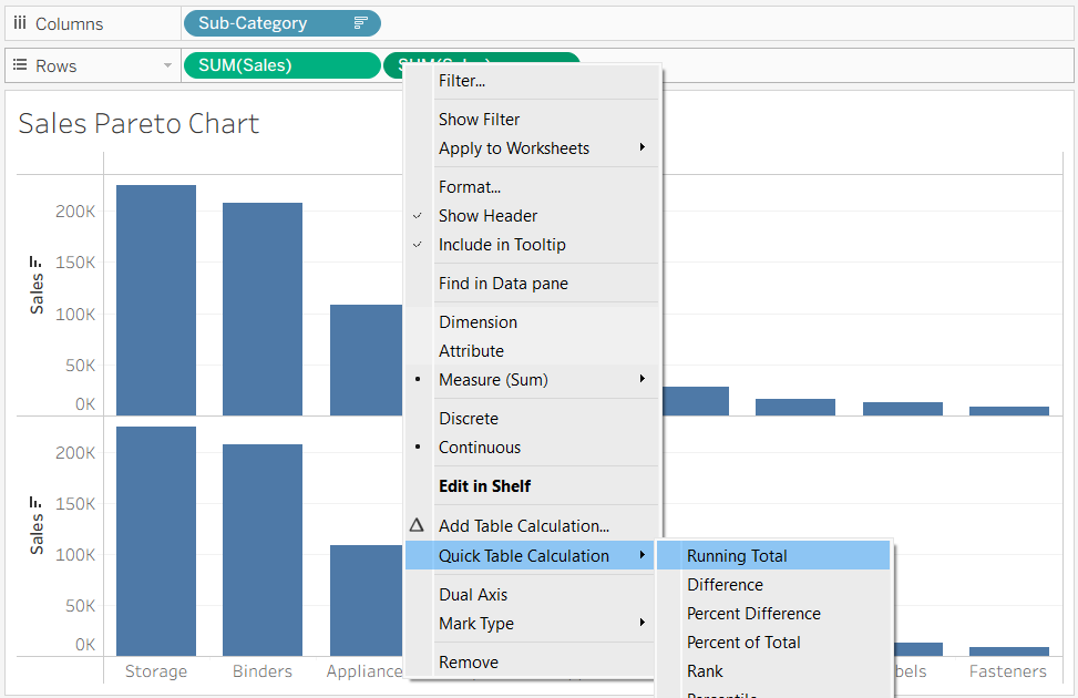
Select one of your identical measures and create a running total table calculation.
A running total shows the how much each item contributes to the total. It's what we use to see how impactful each item is compared to other items.
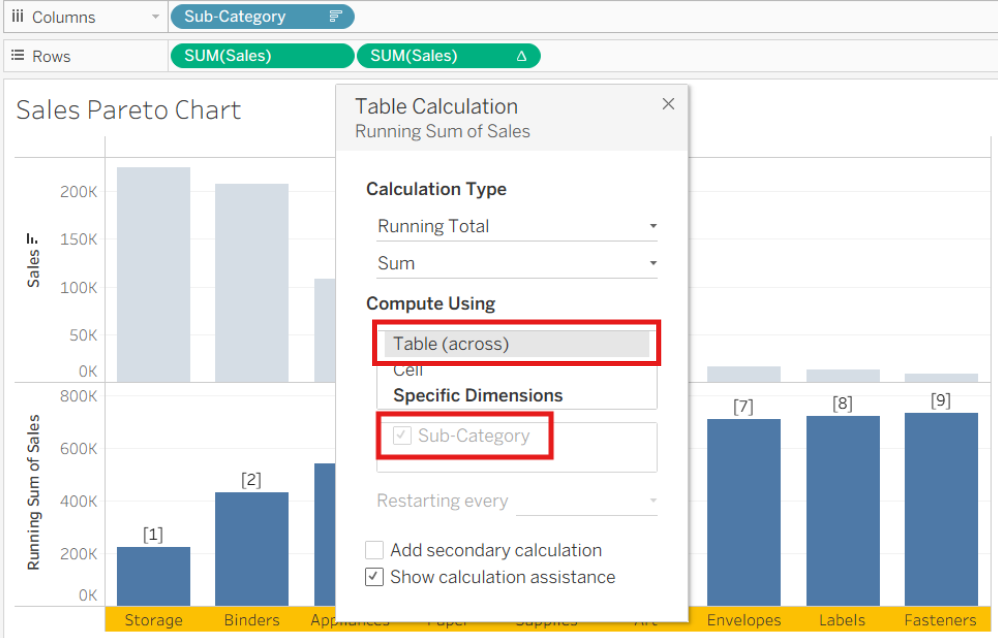
Go to the table calculation settings (Right click measure → 'Edit Table Calculation').
Most Pareto charts can be made computing 'Table (Across)', but if using 'Specific Dimensions', make sure the dimension is selected.
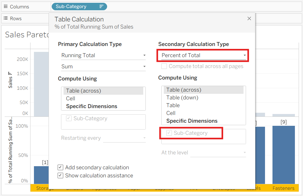
Then, tick 'Add secondary calculation' → Select 'Percent of Total'
(again, make sure the dimension is selected)
A secondary calculation will make a calculation using the results of our first table calculation.
You'll be left with two bar charts, one normal bar chart, and another showing a percentage out of 100.
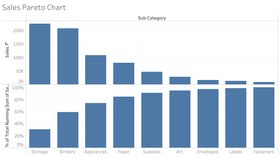
This completes the technical setup we need for the Pareto chart!
What we've created is a chart that shows each item as a percentage of the total - the essential part of a Pareto chart.
Design
Now we convert our percentage bar chart to a Pareto line:
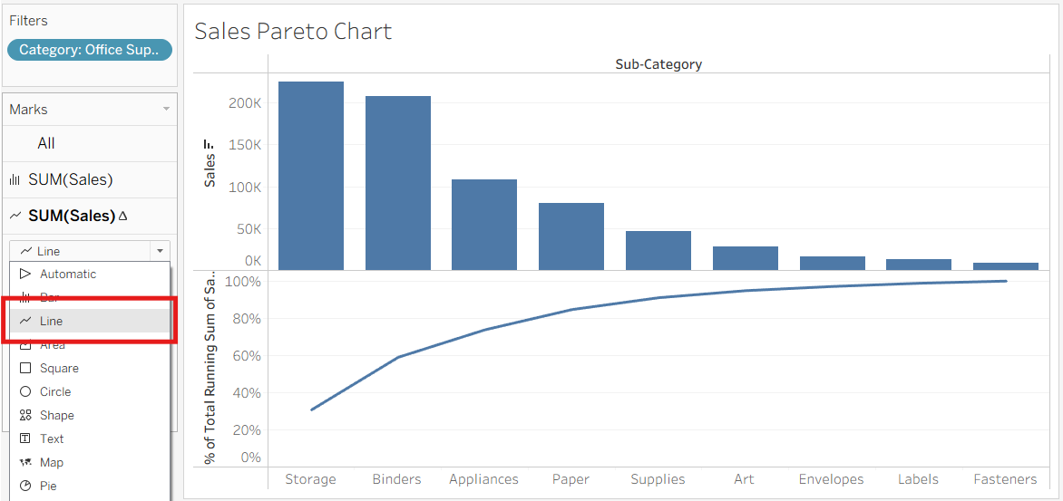
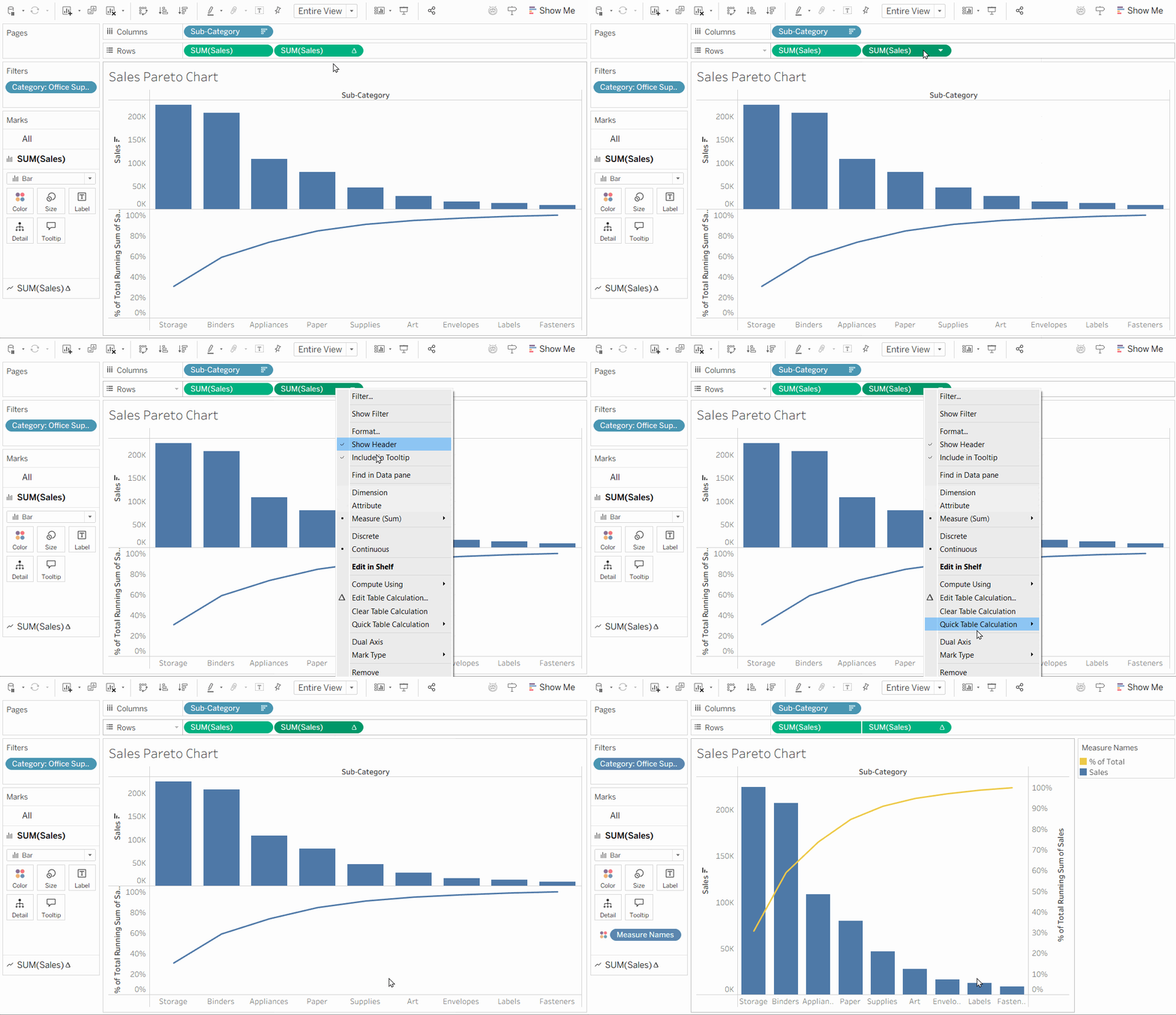
Convert our percentage bar chart to a line chart, and combine the charts on a dual axis to complete our Pareto chart.
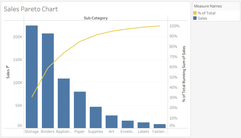
Breakdown
So, what's happening here?
First, a 'Running Total' calculation shows the how much each item contributes to the total. A 'Percent of Total' is used to convert these numbers to a percentage before they're added to our original bar chart using a dual axis.