


The first day of Dashboard Week arrived, and I had no idea what to expect other than it feeling like a whole week of "Friday Projects." Anticipating that familiar rush of anxiety to finish on time, I decided to take a more relaxed approach. I worked at my own pace, trusted the process, and told myself "whatever happens, happens." It turned out relatively well, despite an hour of head-scratching trying to figure out the technical hurdles.
The Data Process
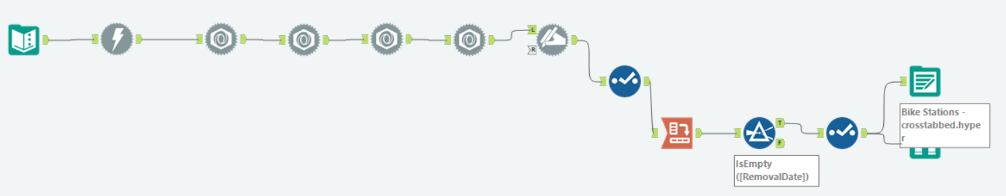
The project kicked off by testing our API skills, using Alteryx to download and parse the data into a usable form. By examining the JSON structure, I could determine how many times I needed to flatten arrays or unnest the data. I used a Cross Tab tool to transform the data into wide format so that all data for each bike point was in a single row. I also ran a second flow to keep the data in its "tall" format, just in case my analysis required it later.
Planning and Sketching
Once the data was ready, I explored it to build a user story. I had specific questions to answer from the brief, so I planned how to extract and visualise that data. I kept my sketches basic, using pen and paper rather than Excalidraw, as I felt digital sketching might eat into precious time.
In fairness, that was the extent of my plan. I didn’t map out a timeline for my tasks, which is something I should do next time. I think I may have oversimplified the project and didn’t stretch my consultancy skills to go beyond the brief, and as a result, my plan wasn't as thorough as it could have been.
The Spatial Hurdle
Working with spatial data was still very new to me. I opened some existing workbooks to understand the first steps of mapping, but I hit a wall when I created parameters for the bike point names. I couldn’t figure out how to connect those string parameters to their related spatial data. Thankfully, some very helpful DSers stepped in to guide me.
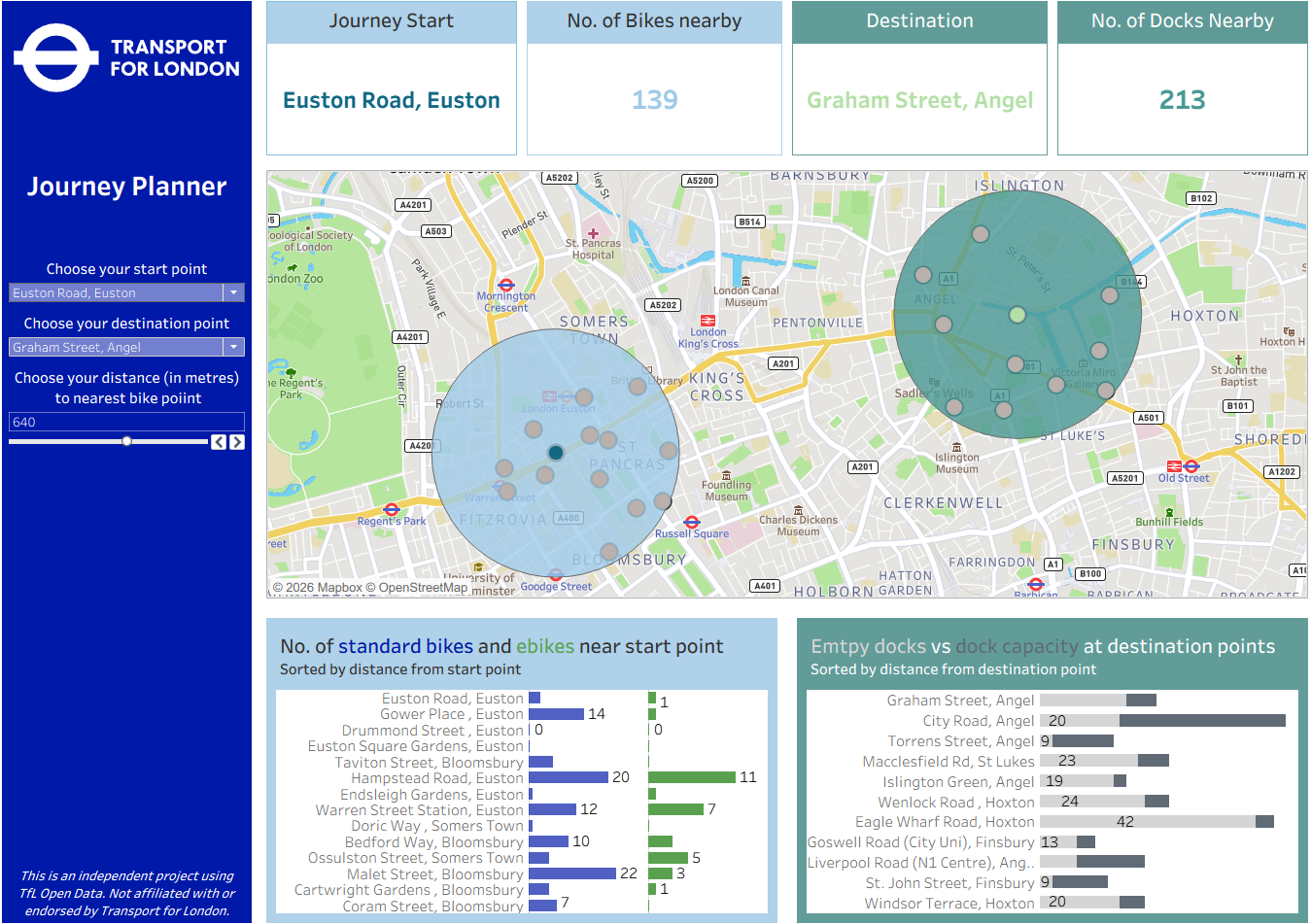
Once the map worked showing the start point, end point, and adjustable buffers highlighting nearby stations, things became plain sailing. From there, it was just a matter of tackling a couple of Fixed LODs. I put a lot of thought into the design and usability, specifically using colour to distinguish between start point and destination data.
Feedback and Limitations
The feedback I received suggested using two separate maps—one for the start and one for the end. With both points on a single map, the orientation became confusing (for example, if a start point was on the right of the map, but its KPIs were on the left of the dashboard). I could then add a smaller overview map containing both points.
I also realised a limitation: because users select points by station name, they have to know the exact road. Since the map filters to show only the selected points, users can't browse the map to choose a location. Another piece of feedback mentioned Map Viewport Parameters, which might solve this. We haven’t covered this tool in class yet, but it’s something I’m excited to look into.
Final Thoughts
All in all, the day went as well as could be expected. I’m pleased with the final dashboard; I sought help when I needed it, and the design is clean. For the rest of the week, I want to work on adding more value from a consultant’s perspective and pushing myself to go beyond the basic brief.