


So, Day 3 of Dashboard Week! After a relatively successful run so far, I strolled into the office with high hopes and chilled vibes… right up until I learned we were building in Power BI again.
While I was glad to have yesterday's battle scars to guide me, I can't say I was exactly skipping toward my desk.
The Mission (and the Pivot)
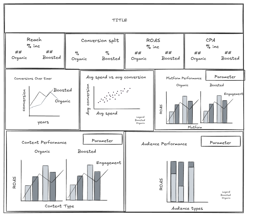
The brief was straightforward: Create a high-level, yearly overview of social media campaign performance for a Head of Marketing. T he goal was to build something polished and "executive-ready" to help a stakeholder quickly identify what’s working and what’s lagging.
I started by doing the usual: assessing the data, planning the day, and brainstorming standard comparisons; impressions, clicks, audience types, etc. But then I hit a fork in the road.
Remembering feedback from Monday about using consultancy skills rather than just "ticking off the brief," I decided to level up. A Head of Marketing doesn't just need raw numbers; they need financial truths that drive budget decisions. I scrapped the basic plan and wrote a new user story:
The User Story: As a Head of Marketing, I need to evaluate the real value of our paid social spend compared to our organic reach. I want to know if boosting posts provides a sufficient revenue lift to justify increasing the budget, or if our organic content is strong enough to carry the brand alone.
Down the Rabbit Hole
With this new focus I had to completely re think and replan my original KPIs and chart choices to showcase the difference between boosted and organic campaigns, and the financial metrics such as ROAS (return on ad spend), CPA (cost per acquisition, the percentage of contribution to conversion value amongst others.
As I was planning and sketching all these out I was still trying to understand what exactly all these metrics meant and how they show whether more money should be invested in boosted campaigns or not.
I spent a lot of time researching and understanding, which slowed down the building of the dashboard. But I wanted to be sure of what I was developing so I could deliver some insights and showcase how this dashboard could be used to help make decisions. So I sacrificed time building, formatting, and polishing up the dashboard, so I could focus on the insights.
The level of research and depth I went into the planning of this dashboard would be something I would do for a say a 2 week project, not 6 hours! So the visual aesthetics of it is a sub par my usual standard. I just didn’t have the time to play with formatting and resizing things to make it look pretty. But I think it has the barebones of a useful insight generating dashboard. I even managed to build in parameters to switch metrics of the charts.
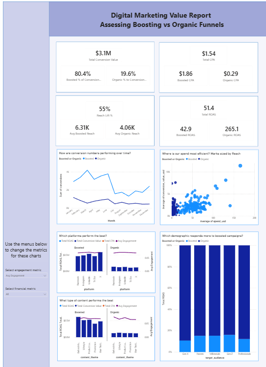
Despite the panic between 2-3:15pm (15 mins before presentation) where I still hadn’t finished building all my KPIS and still had to put them in a dashboard and format, and then try and understand what on earth I had built and what it was showing….in the end I think I delivered something that would be useful and I presented it well enough given the time I had. I even got a compliment from Tom Brown who happened to be lurking on the 1st floor this afternoon.