


The finale of Dashboard Week was a two-dayer. While having the extra time was nice, it was a double-edged sword: more time meant higher expectations and more complexity. Given my limited football knowledge, I knew I had to put in some serious hours of research and planning before I even touched the data.
The Strategy: From "What" to "Why"
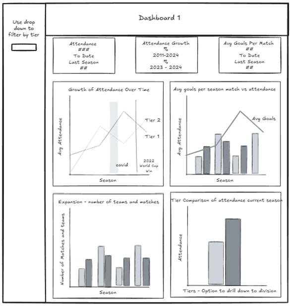
I chose to focus on match attendance and the historical growth of the sport. Since we needed both an executive view and a deep-dive dashboard, I built my user stories around the commercial side of the game.
- User Story 1 (The Executive View): As a Commercial Director for the FA, I want to understand the historical growth of match attendance, soo I can prove to the sponsors that women’s football is a rapidly growing mainstream product.
- User Story 2 (The Deep Dive): I want to compare attendance and popularity across the top 3 clubs against the rest of the league, comparing the major vs minor games, so I can determine if growth is balanced across the teams or if we need to help smaller clubs attract more fans.
The Mid-Project Pivot
I spent most of Day 1 sketching. While Dashboard 1 was taking shape nicely, Dashboard 2 was "niggling" at me. I couldn’t see how my charts were actually reinforcing the story.
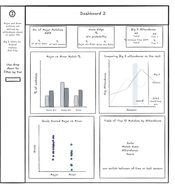
Frustrated and sensing I was losing the plot, I realised as I shut my laptop for the day: If I’m struggling to understand it, my audience definitely will.
During the commute home, I formulated a simpler, sharper angle for Dashboard 2:
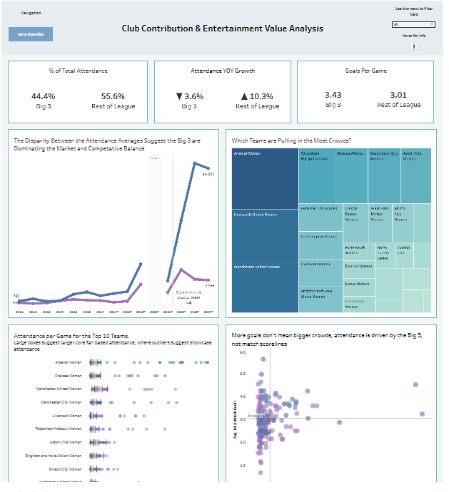
I need to understand if our growth is driven by performance on the pitch or simply the brand power of a few elite clubs (the big 3), so I can decide where to invest marketing.
The "One Hour" That Turned Into Four
Eager to make up for lost time, I hopped back on the laptop at home. I promised myself I’d only work for an hour. Famous last words!
I realised my data was missing pieces for my new pivot, so I tweaked my Prep flow and re-ran it. The result? It completely broke my Tableau workbook. Unable to simply replace the data source, I had to rebuild everything from scratch. Four hours later, I was finally back to where I started. N0t ideal, but at least I wasn't starting Day 2 behind.
The Battle with Reference Lines
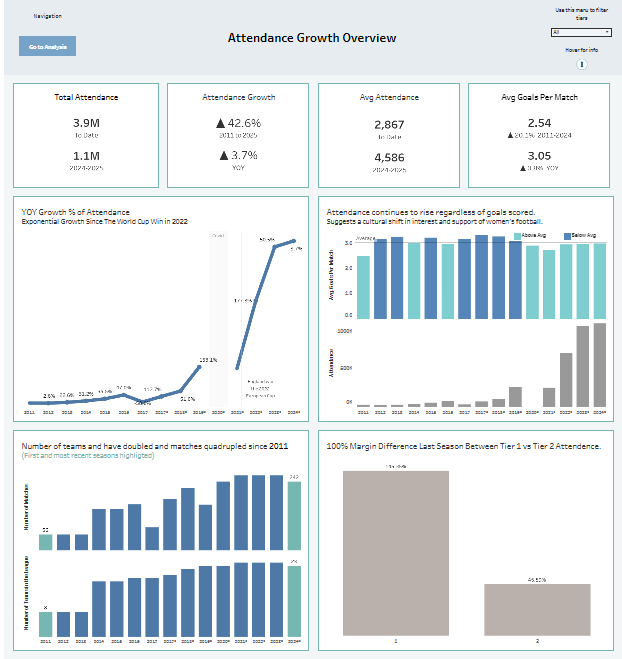
I also spent way too long obsessing over landmark events like COVID-19 and the 2022 Euro win. I wanted to show these on my line charts, but because I chose to use Seasons (Dimensions) as my timeline instead of Continuous Dates (to keep the focus on financial football years), Tableau wouldn't let me add standard reference lines. I eventually had to make an "executive decision" to stop wasting time on a detail that was, in the grand scheme of things, inconsequential, and did found a hacky solution using a dual axis and annotations that hopefully weren’t too ugly.
The Finish Line
In the end, I delivered a polished pair of dashboards. Okay, I forgot to format one KPI, but every single tooltip was on point! I spent a lot of time refining titles to ensure they delivered actual insights rather than just stating the obvious.
However, I managed to get my schedule wrong thinking we presented at 3:30 instead of 3:00. That half-hour loss meant I couldn't properly prep my talking points. My presentation was a bit shaky, and I even had a "brain fog" moment where I forgot how some of my own charts were built!
The Verdict: Hey ho. If I hadn’t gone down a few rabbit holes on Day 1, I might have had a smoother presentation, but I’m proud of the thoroughness of what I built. Lesson learned: watch the clock as much as the data!