


Hello! Today, we’re going to build a chart that shows Cumulative Monthly Sales, broken down by cohorts based on each customer's first year of purchase. The key tools used to build this chart are Table Calculations (which allow you to calculate cumulative sales) and Level of Detail (LOD) Expressions (which help determine which cohort each customer belongs to).
We’ll use Tableau’s Superstore dataset for this demonstration.
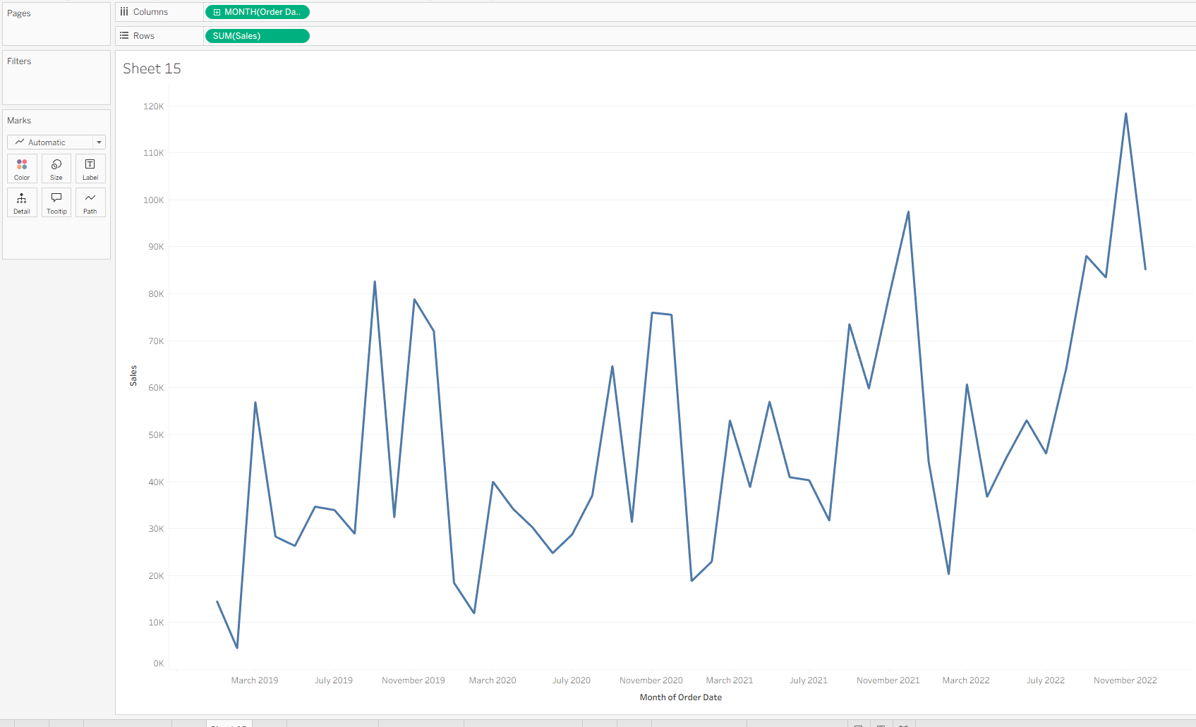
Step One: Build the Month vs. Sales Chart
- Select “Order Date” and drag the pill to the Columns shelf. Choose Month (Continuous).
- Select “Sales” and drag the pill to the Rows shelf. It will default to SUM(Sales) — leave that as is.
Now that we have our base chart, there are two main enhancements needed:
- First, we’ll use Table Calculations to convert the chart to show cumulative sales.
- Second, we’ll create a calculated field to assign each customer to a cohort based on the year of their first purchase.
Step Two: Convert to Cumulative Monthly Sales Using Table Calculations
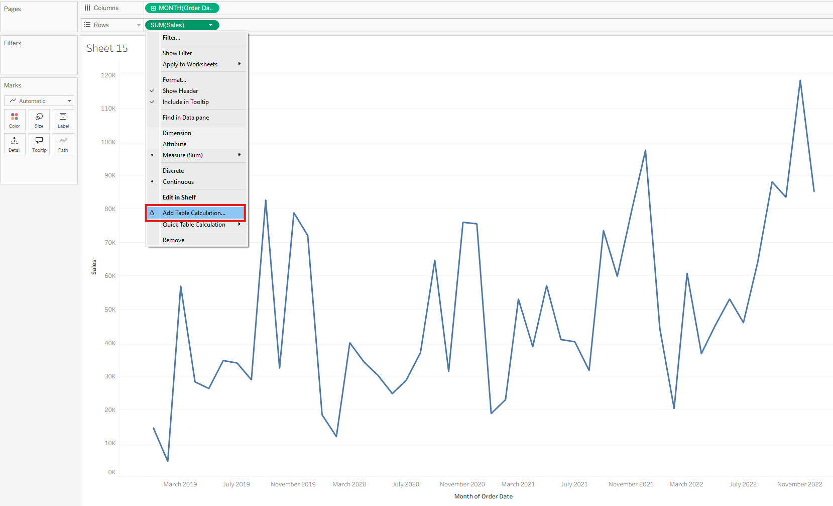
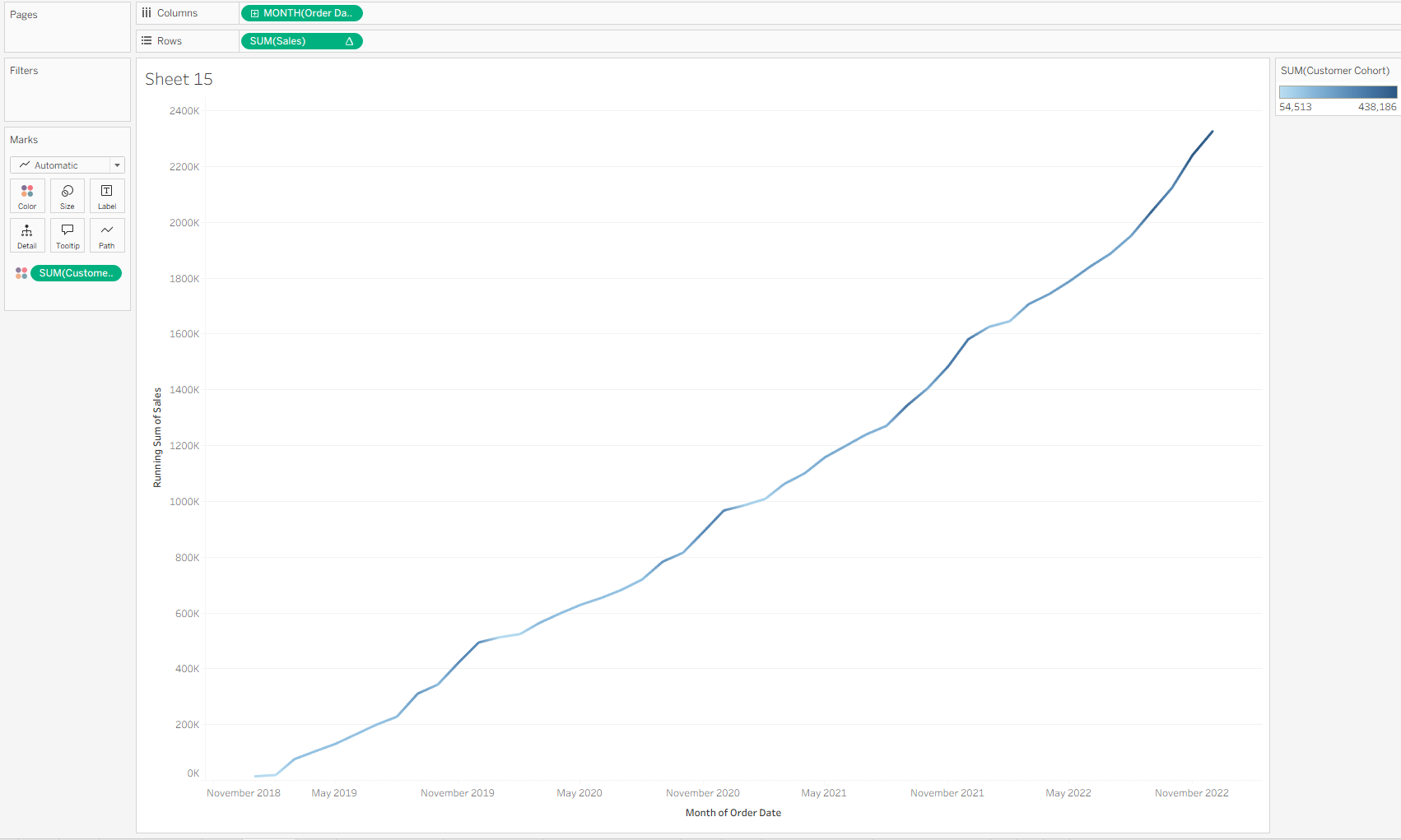
- Left-click the SUM(Sales) pill and select “Add Table Calculation…”
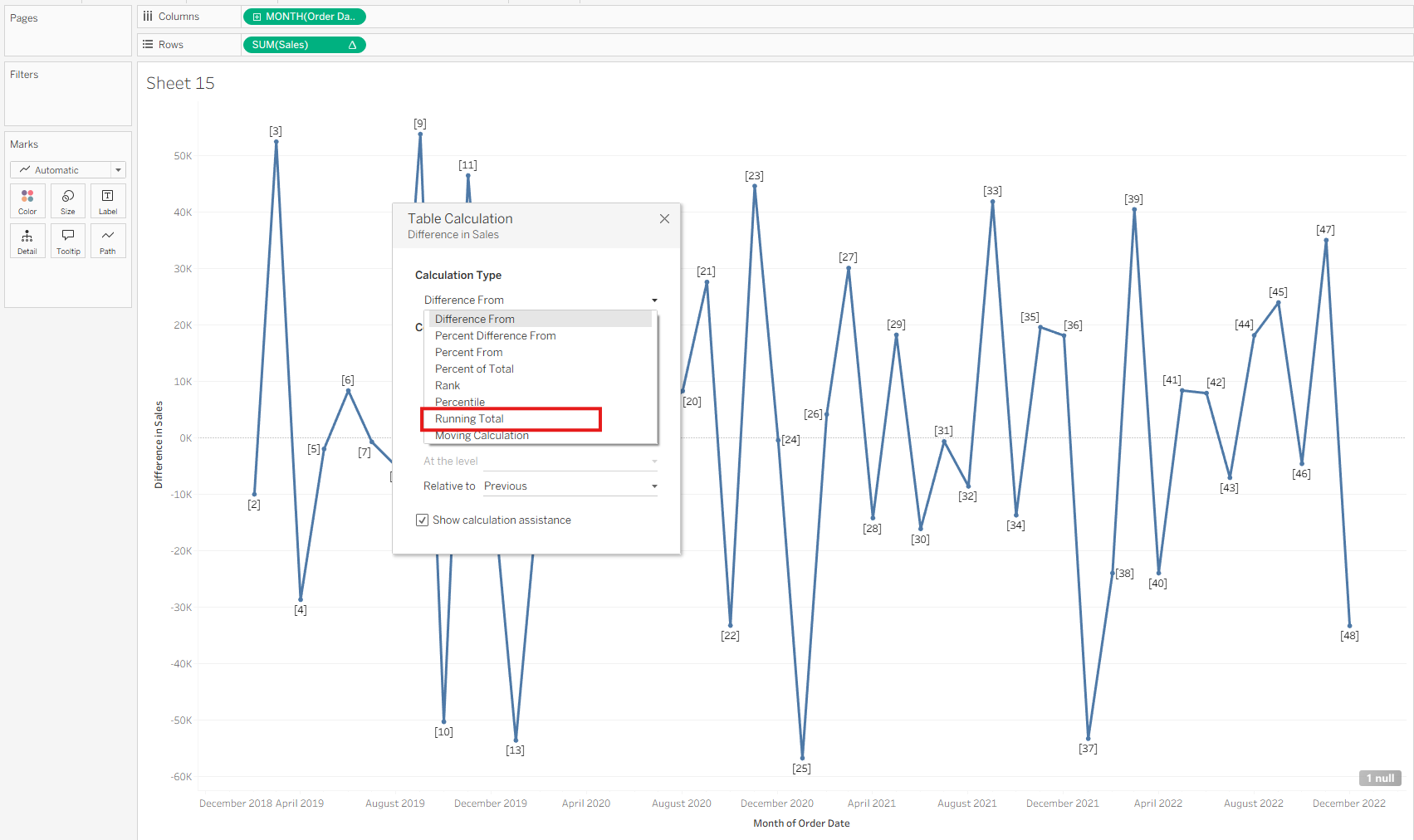
- From the Calculation Type dropdown, choose “Running Total” (instead of “Sum of Total” which is incorrect for cumulative sales).
- Leave the default settings as they are.
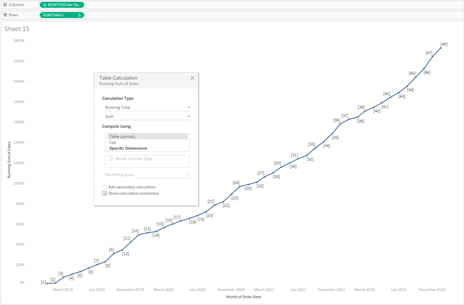
Now, you’ll see a line graph that displays the running total of sales over time.
The next step is to create a calculated field to determine when each customer made their first purchase, so we can group them into cohorts.
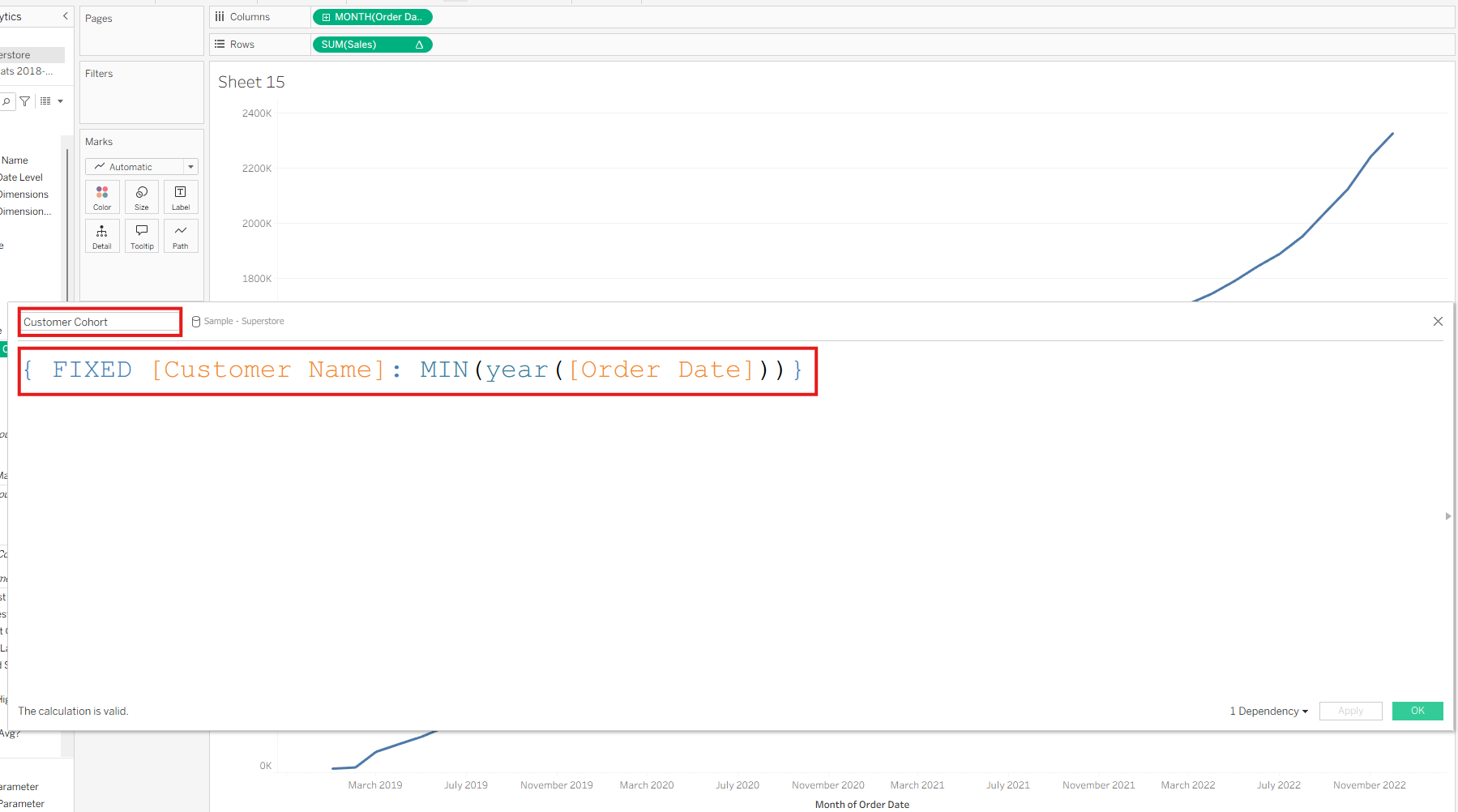
Step Three: Use LOD Expressions to Assign Each Customer to a Cohort
- Go to “Create Calculated Field…”
- Name the field something like “Customer Cohort”
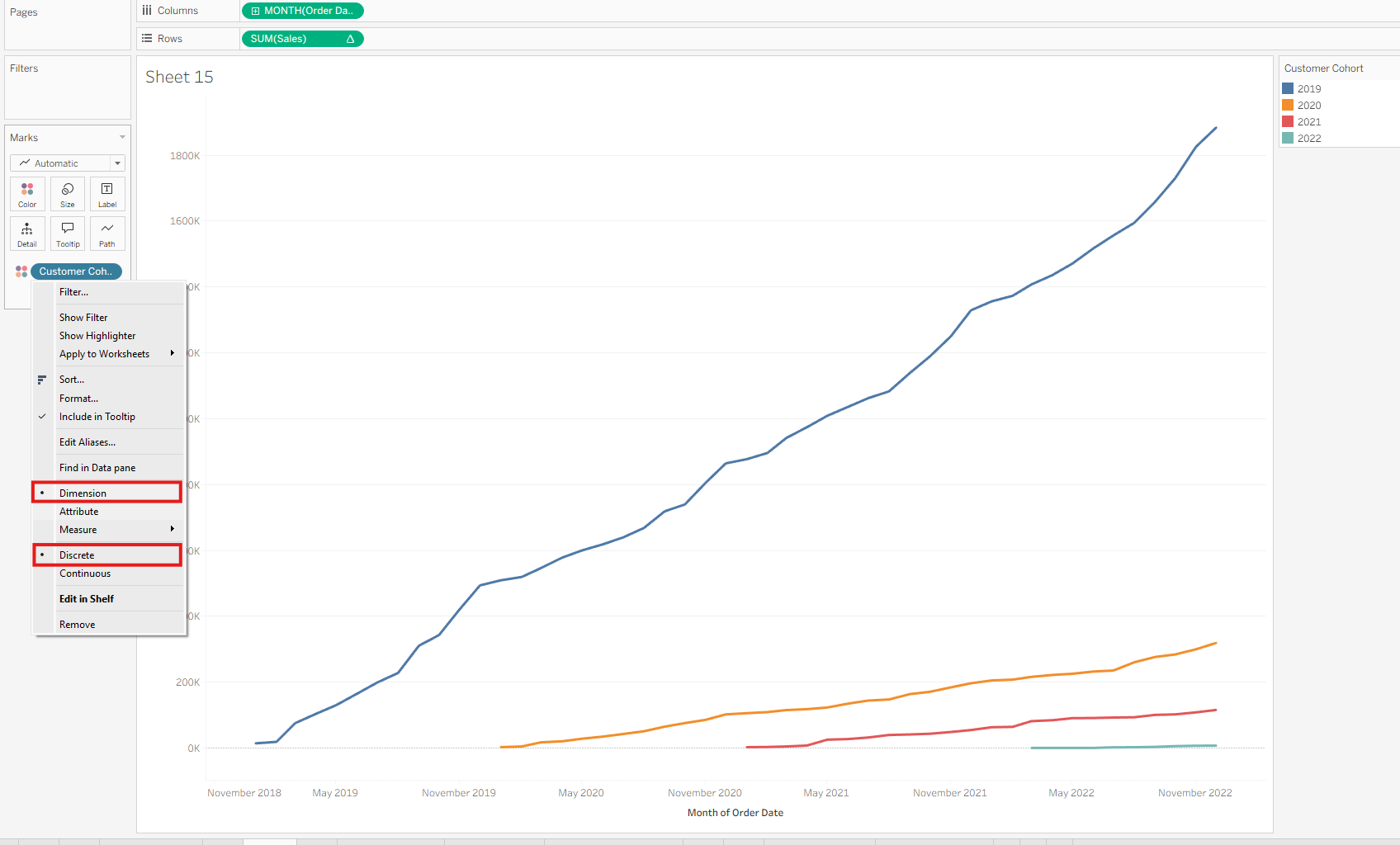
- Use the following calculation: { FIXED [Customer Name]: MIN(YEAR([Order Date])) }
This LOD expression fixes the calculation at the customer level, regardless of what’s in the current view. It evaluates the earliest year of purchase for each customer.
This effectively assigns each customer to a cohort based on the year of their first order.
Drag this Customer Cohort field to the Color mark to break the cumulative chart down by cohort.
Final Notes
These steps can be generalized to your specific dataset. For this example, we used Tableau’s Superstore data.
The key techniques demonstrated are:
- Table Calculations for cumulative values
- LOD Expressions for cohort grouping