


In this walkthrough, we’ll create a scatter plot that highlights quadrants based on the average Sales and average Profit using window average table calculations. This is a great way to quickly identify high-performing and low-performing marks relative to the overall dataset.
1. Create the Scatter Plot
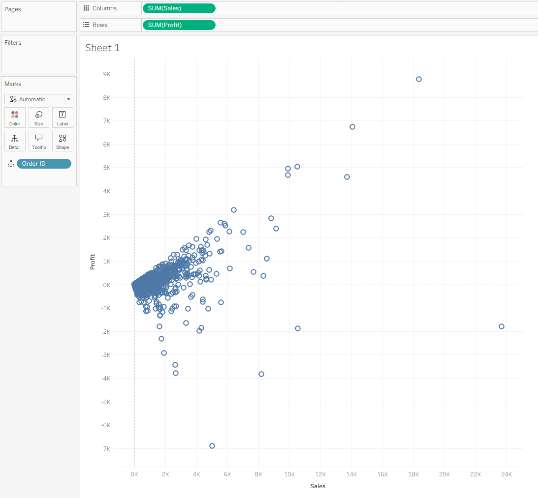
Start by building a basic scatter plot:
- Place Sales on Columns
- Place Profit on Rows
- Break down the marks by Order ID
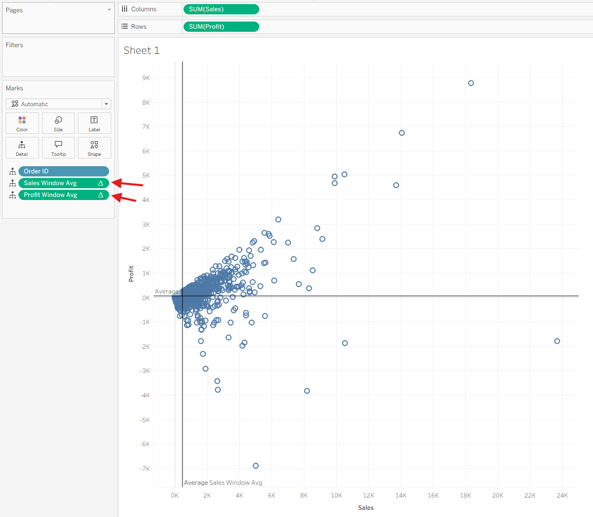
You now have a standard Sales vs. Profit scatter plot.
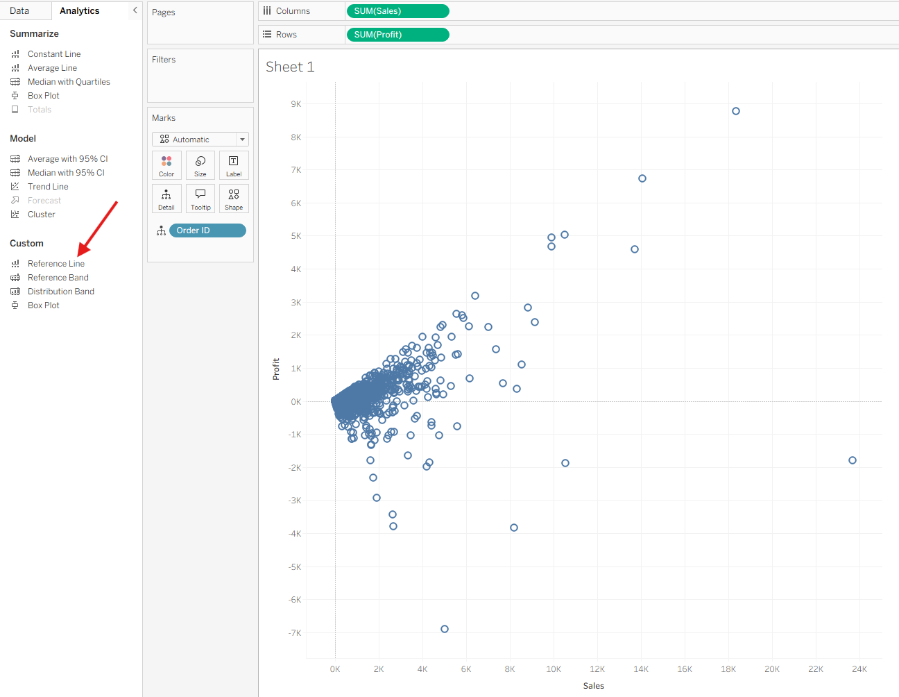
2. Add Reference Lines
Next, we’ll add average lines to define the quadrants.
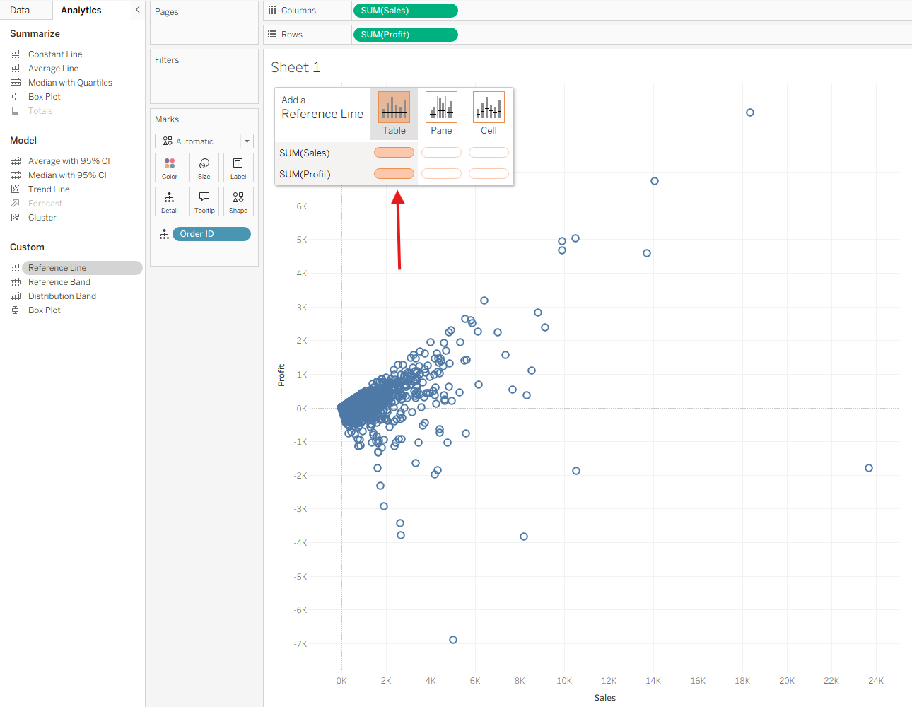
- Go to the Analytics pane
- Under Custom, drag Reference Line into the view
- Drop it on Table
- Add one reference line for SUM(Sales) and one for SUM(Profit)
- Close the dialog for now—you’ll return to it later once the table calculations are built
This temporarily adds constant average lines, but we’re about to replace them with dynamic window averages.
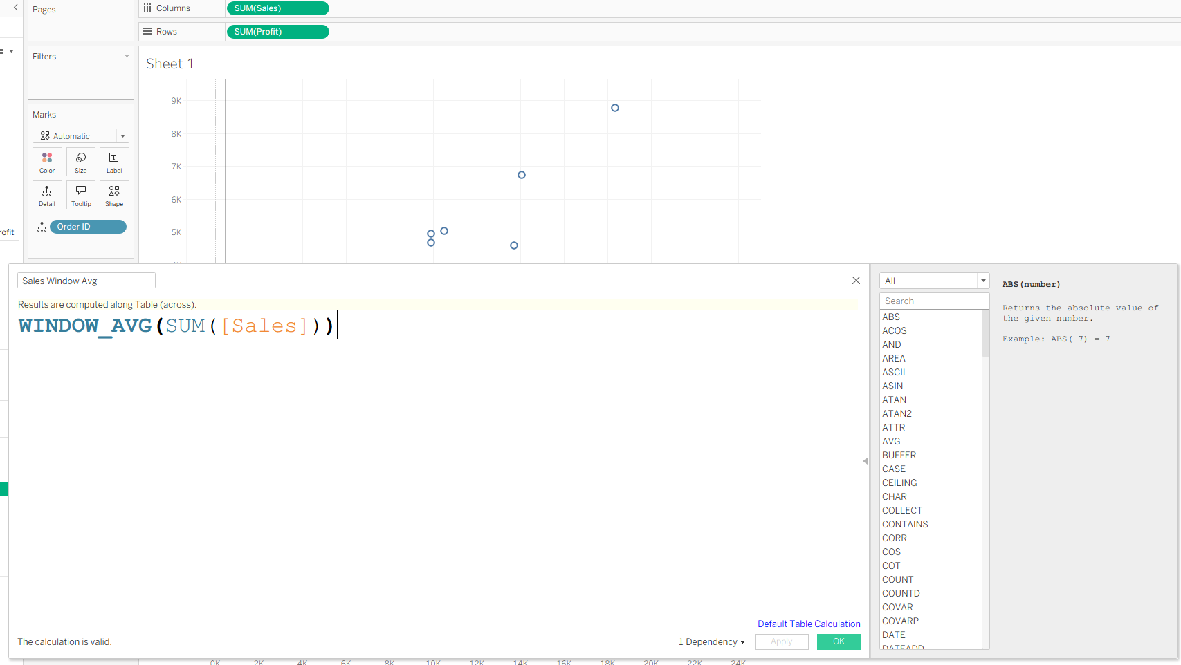
3. Create the Table Calculations
We want reference lines based on WINDOW_AVG, not on the default averages.
Create two calculated fields:
Sales Window Avg
WINDOW_AVG(SUM([Sales]))
Profit Window Avg
WINDOW_AVG(SUM([Profit]))
Now drag both of these calculated fields onto Detail on the Marks card.
Important:
Adding them to Detail is required. If they’re not in the view, they won’t appear as options when selecting the reference line value.

4. Replace Reference Line Values with Your Table Calcs
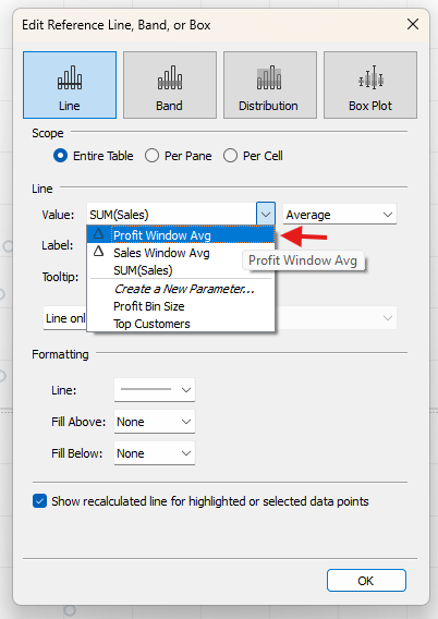
Now return to the reference lines.
For Sales:
- Right-click the average line on the Sales axis
- Next to Value, choose the dropdown
- Select Sales Window Avg
For Profit:
- Do the same for the Profit reference line
- Choose Profit Window Avg
Your reference lines now represent the window averages instead of fixed averages.

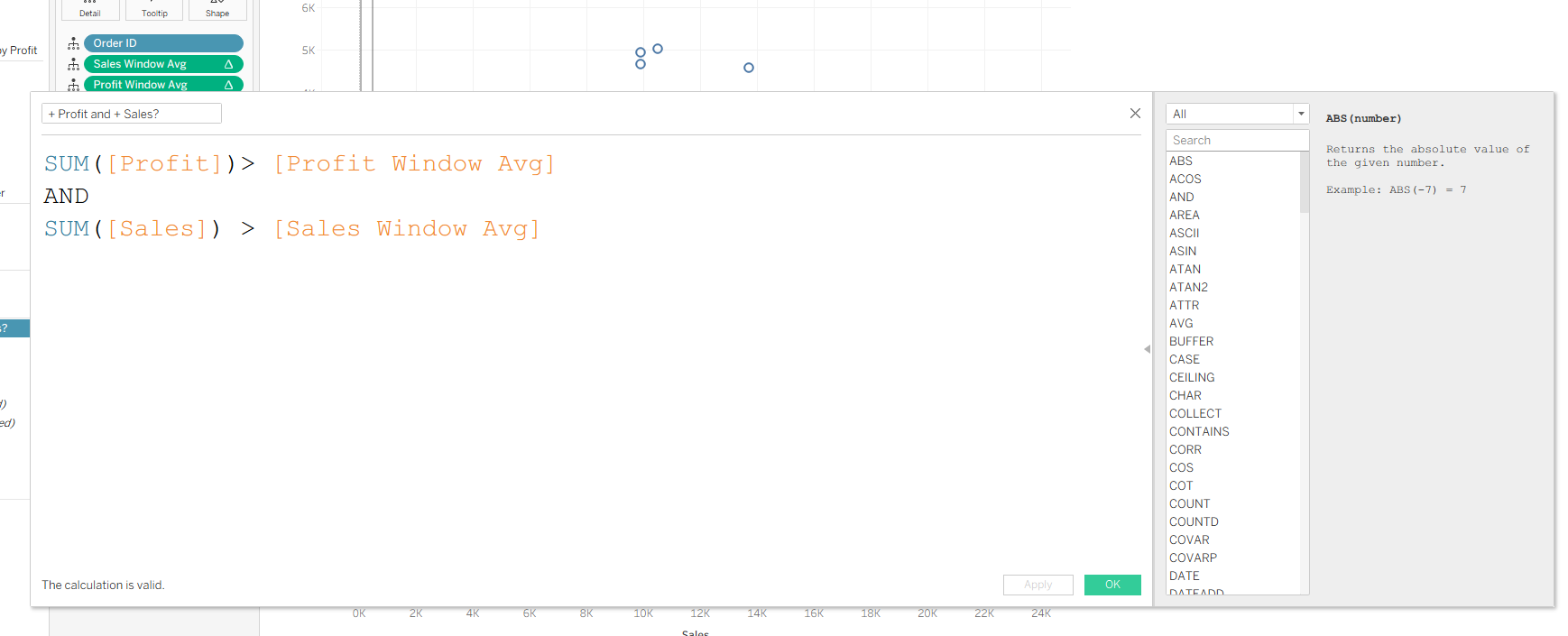
5. Create the Boolean Field for Quadrant Highlighting
Create a new calculated field, for example:
Above Average?
SUM([Sales]) > [Sales Window Avg]
ANDSUM([Profit]) > [Profit Window Avg]
This returns True for marks in the top-right quadrant and False elsewhere.
(You can extend this logic later to label or highlight all four quadrants if desired.)
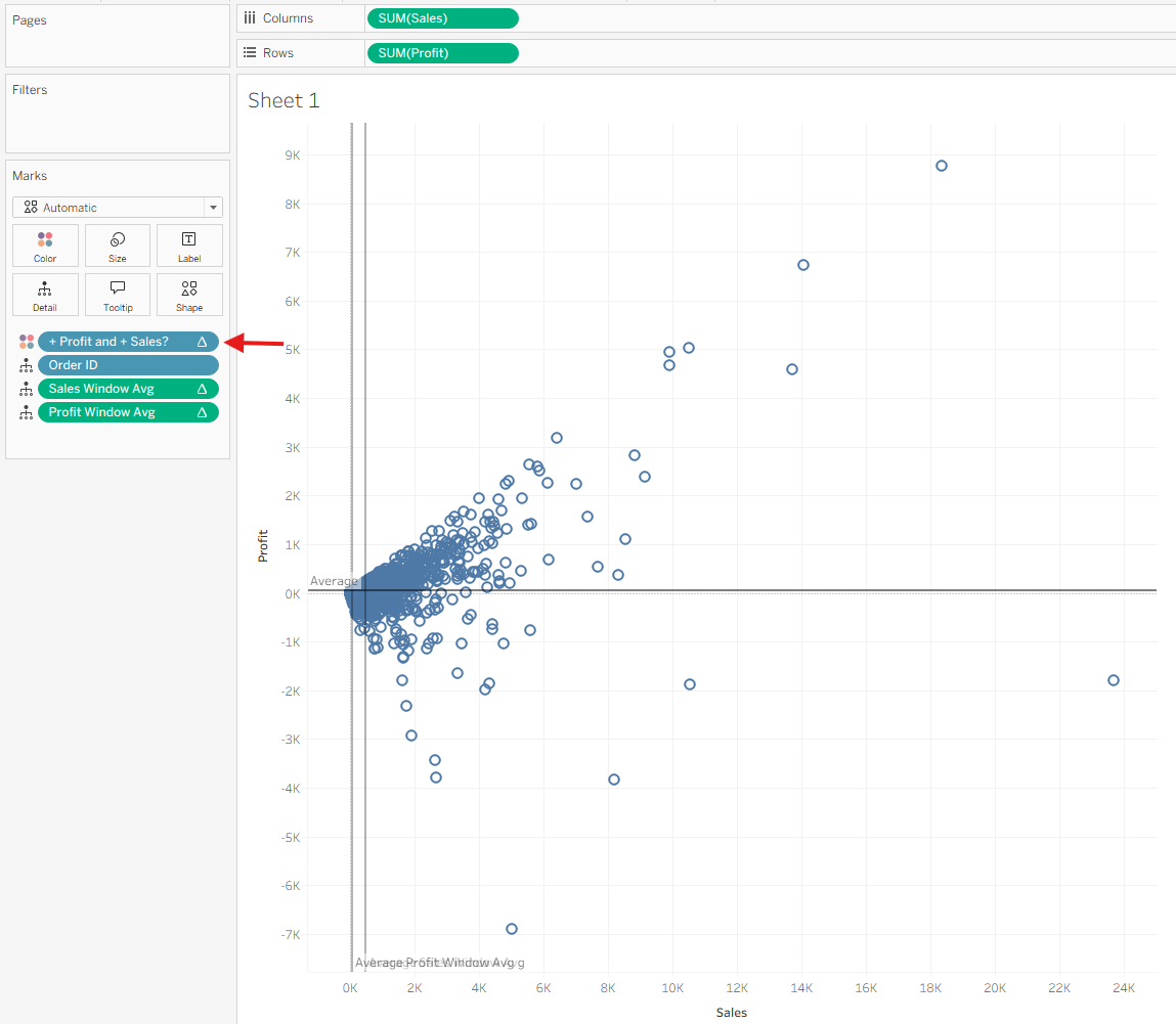
Place this Boolean field on Color.
Note:
At this point, nothing will change yet. The Boolean depends on table calculations that aren’t configured, so Tableau treats everything as Null until you define the addressing.
6. Configure the Table Calculations
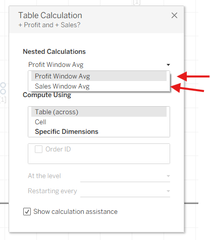
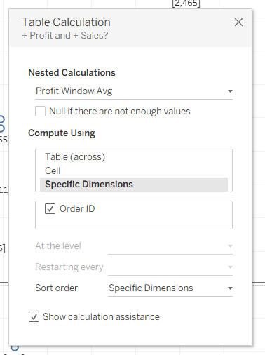
Right-click your Boolean field on Color → Edit Table Calculation.
You’ll see Nested Calculations, because your Boolean depends on the two WINDOW_AVG calcs.
You must configure both:
- Profit Window Avg
- Sales Window Avg
Make sure they are addressed in the same way.
Once both are configured, the highlighting will work correctly.
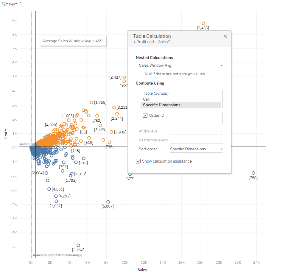
7. Final Result
You now have a scatter plot where:
- The reference lines are based on window averages, not fixed averages
- A Boolean table calculation highlights marks above or below those averages
- The top-right quadrant becomes visually distinct (or whichever quadrant your Boolean defines)
This is a powerful way to visually segment performance and identify meaningful patterns in your data.
