The data used in these examples comes from Tableau’s Superstore sample data.
If you are looking for a walkthrough without detailed explanation, skip to the Invisible Reference Line with Nested FIXED LODs section.
What if you have several charts that all use the same measure on the y-axis?
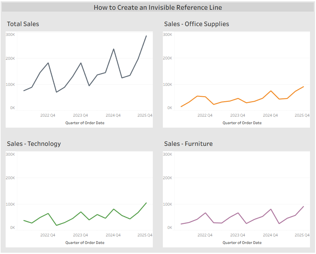
Each chart shows Sales over time. One chart displays Total Sales, while the other three show Sales by Category. This is a common and effective way to compare category performance. However, at first glance it appears that all Categories have similar Sales. Only by examining the y-axis does the user realize that Total Sales peaks around 300K, while Office Supplies and Furniture peak closer to 80K.
This difference is not immediately obvious because Tableau distributes the y-axis evenly across the available space. In this case, we want Total Sales to visually appear higher than any category without requiring close inspection of the axis. Ideally, the top value of all charts should be closer to 300K.
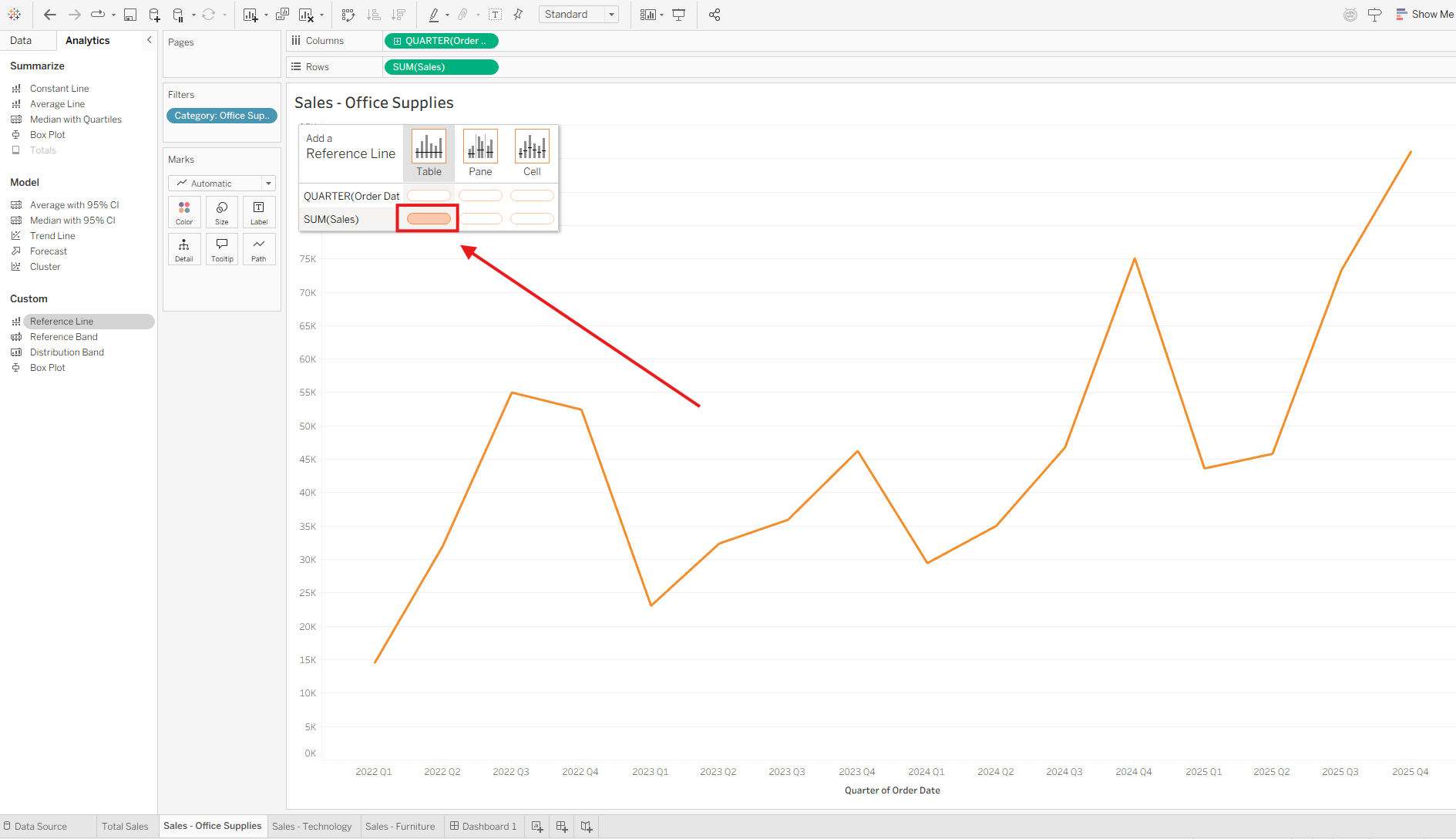
To achieve this, we can create invisible reference lines for the Office Supplies, Technology, and Furniture charts.
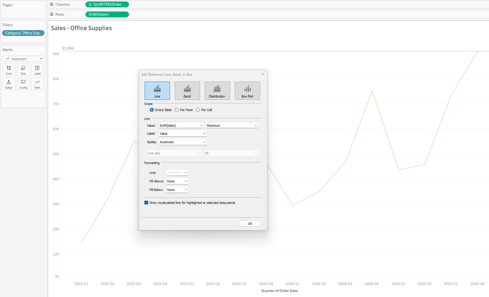
My initial thought was to create a reference line on the Sales – Office Supplies chart using the MAX(SUM([Sales])) value. However, this does not change the view; it only adds a reference line based on values currently in the worksheet. This happens because the MAX value is calculated after the Category: Office Supplies filter is applied.
To get the maximum Sales value across the entire dataset, regardless of Category filters, we need to use FIXED LODs.
Below is a step-by-step walkthrough.
Invisible Reference Line with Nested FIXED LODs
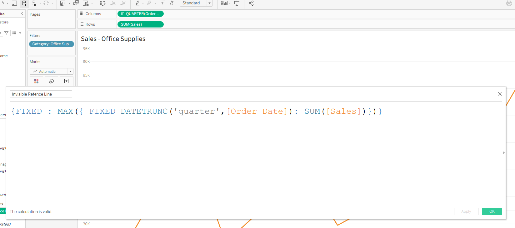
Before adding the reference line, create a calculated field using nested FIXED LODs. This calculation returns the maximum value of SUM([Sales]) regardless of worksheet filters, allowing the reference line to remain consistent.
This LOD has two parts. The inner calculation:
{ FIXED DATETRUNC('quarter',[Order Date]) : SUM([Sales]) }
This returns SUM([Sales]) for each quarter based on Order Date. Because it is a FIXED LOD, it ignores Dimension filters according to Tableau’s order of operations (see Tableau documentation on order of operations).
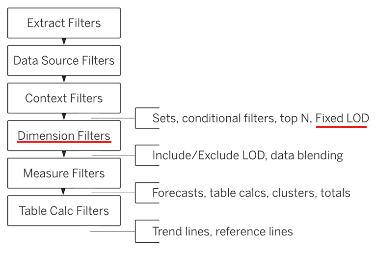
Since FIXED LODs are computed before Dimension filters, this value ignores the Category filter applied to the worksheet and returns Sales for all categories.
The outer calculation is another FIXED LOD, fixed on nothing, that takes the MAX value of the inner calculation. This returns the maximum quarterly Sales value across the entire dataset.
{FIXED : MAX({ FIXED DATETRUNC('quarter',[Order Date]): SUM([Sales])})}
** Note that Context Filters, Data Source Filters, and Extract Filters will still be applied before the LOD is evaluated.
At this point, we have a calculated field that returns the maximum SUM([Sales]) value.
Adding the Invisible Reference Line
Drag the calculated field (e.g., Invisible Reference Line) to Detail so it is available when configuring the reference line.
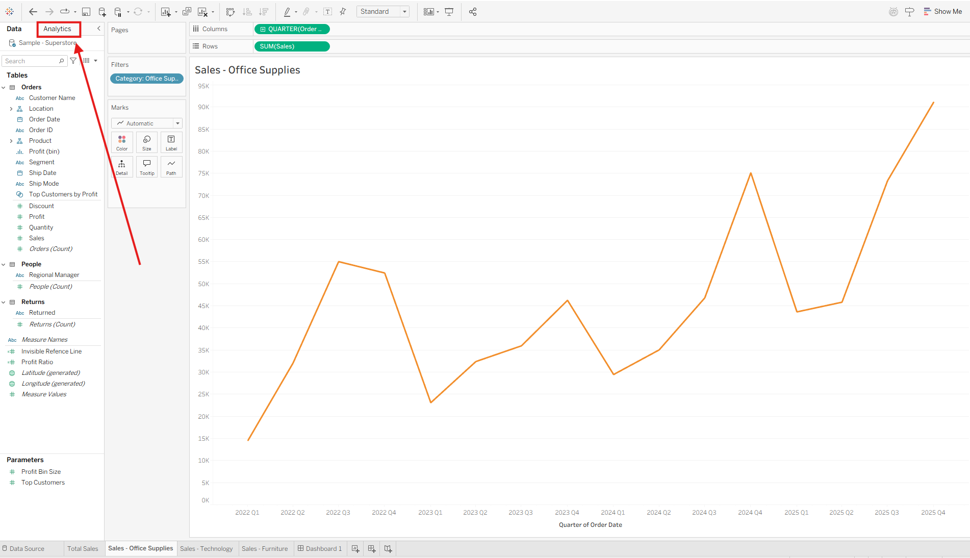
Open the Analytics pane.
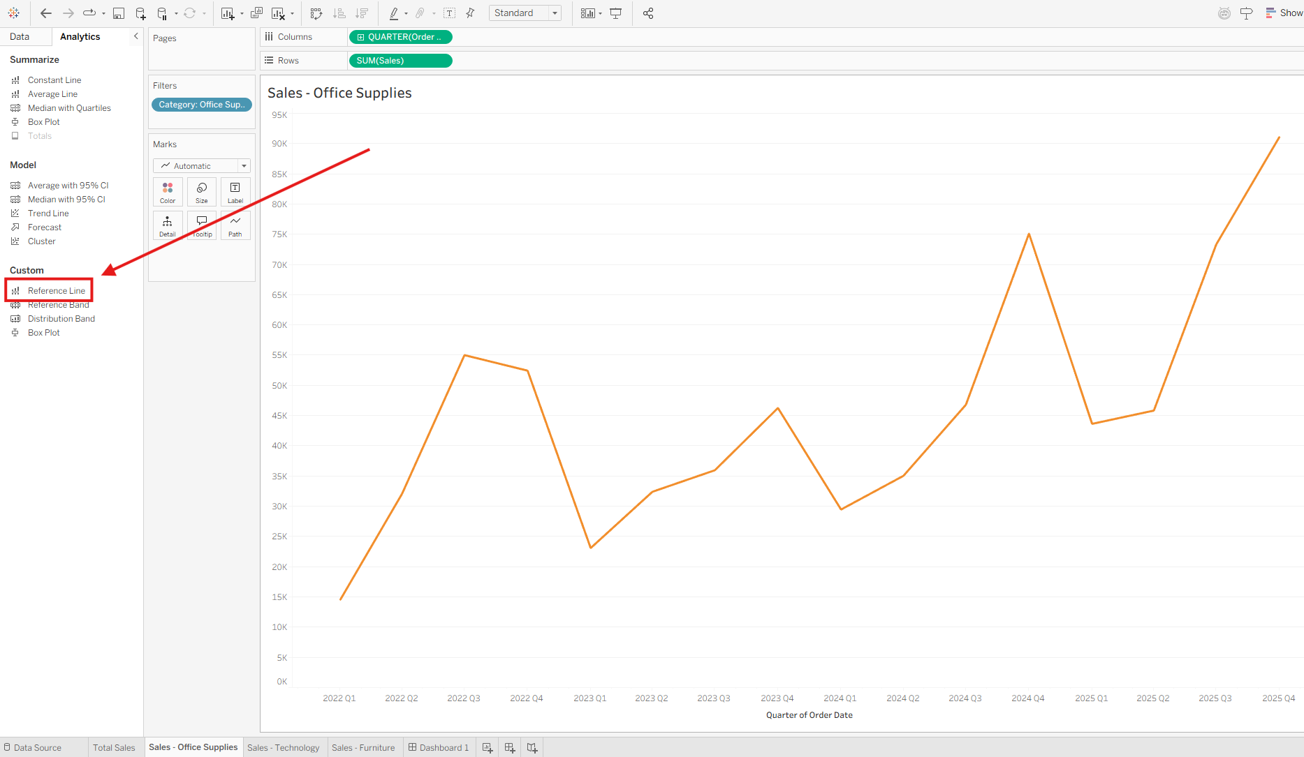
Under Custom, select Reference Line.
Drag Reference Line to Table on the SUM(Sales) axis.
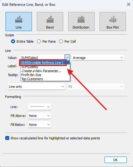
Once the reference line is added to the worksheet, the Edit Reference Line, Band, or Box dialog appears. Keep Line selected and set Scope to Entire Table. Under Value, select the SUM(Invisible Reference Line) calculated field that was previously placed on Detail.
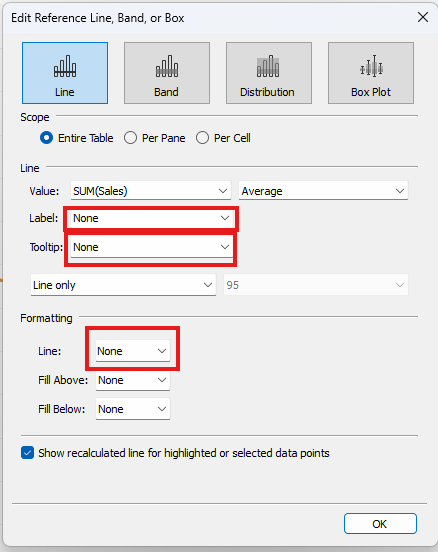
- Set Label, Tooltip, and the Line formatting option to None. This makes the reference line invisible. If you prefer to see the line while building the view, you can leave these options enabled and disable them later.
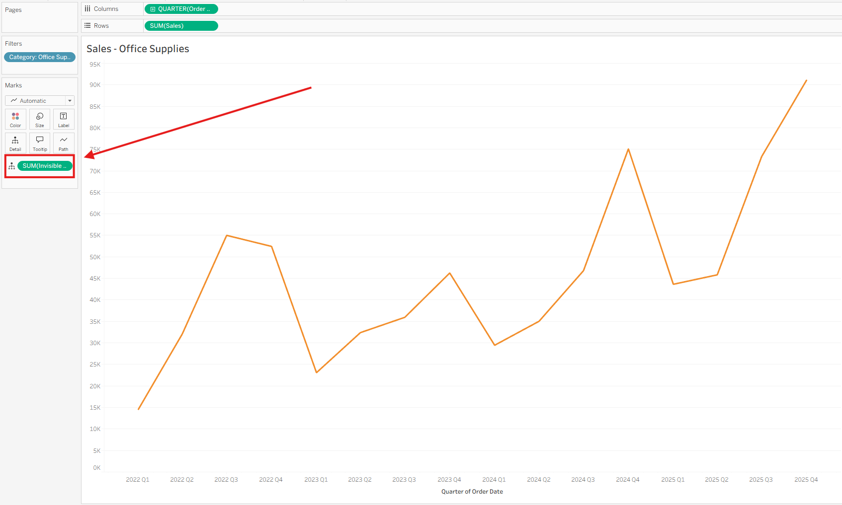
Before the Invisible Reference Line:
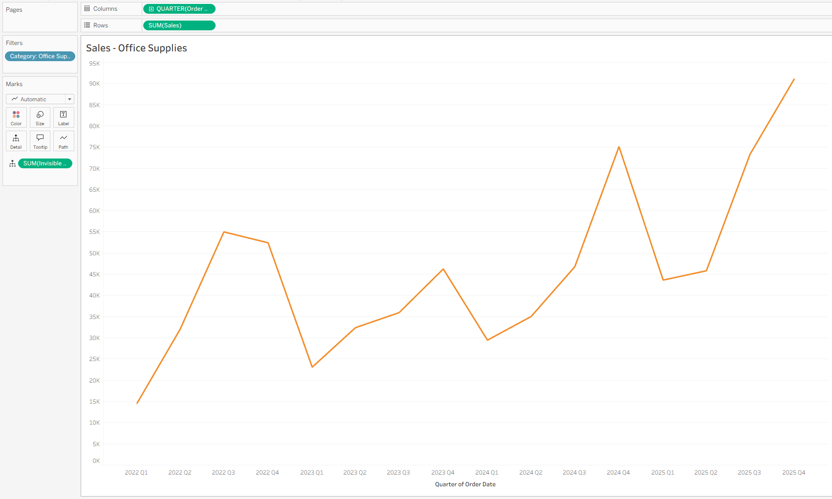
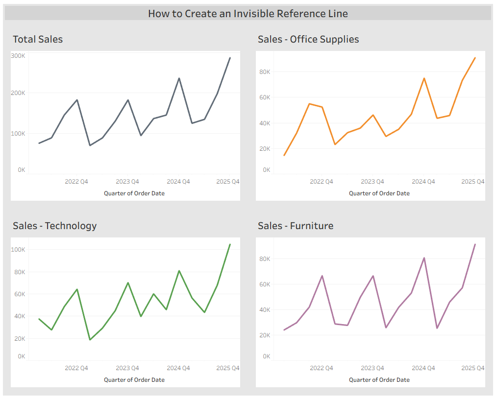
After the Invisible Reference Line:
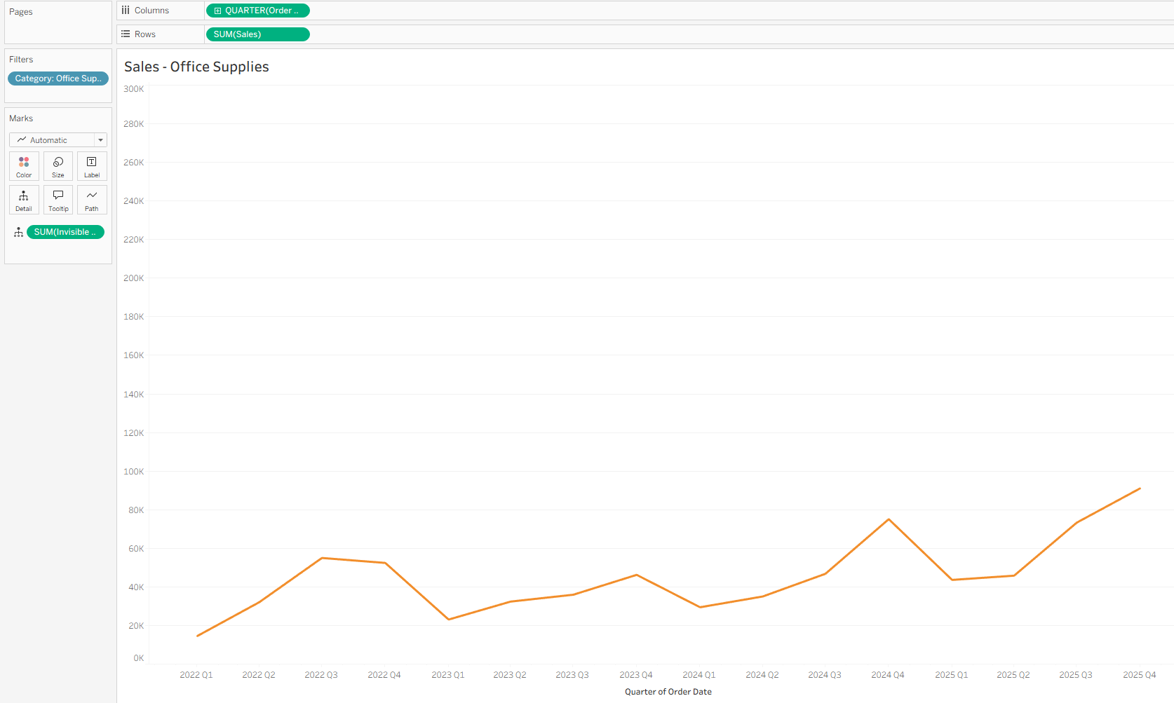
Now, the y-axis maximum for each category chart matches the maximum Sales value from the full dataset. This provides clearer context and makes it easier to compare Total Sales against individual categories.
Repeat this process for the Sales – Technology and Sales – Furniture charts. With consistent y-axis scaling, users can intuitively compare performance across categories and against Total Sales.