


In a previous blog, I outlined three key steps to follow when setting up a business dashboard to prevent tiled containers from appearing. In this post, we’ll take a closer look at what happens when tiled containers do show up—and how to fix them.
Why Tiled Containers Are a Problem
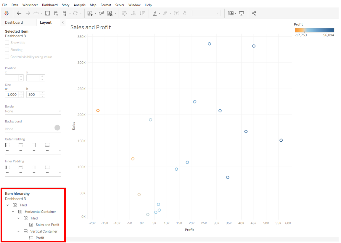
Tableau is built to create structured dashboards, so it tries to auto-populate your view with what it thinks will be most useful. The problem is, if you open a fresh dashboard and immediately drag a sheet onto the canvas, Tableau creates a tiled container by default. You can spot this by opening the Layout tab in the dashboard pane and checking the Item Hierarchy at the bottom. There, you’ll see multiple layers of containers: a top-level tiled container, a horizontal container inside it, another tiled container holding the chart, and a vertical container holding the legend. That’s far more containers than we actually need!
If you notice this happening right away, the easiest fix is to delete everything and start fresh using the setup steps from my previous blog. The key is to float your first container before dropping anything in. Doing this prevents Tableau from automatically building an unnecessary hierarchy for most of your containers.
Avoiding Alignment Arrows
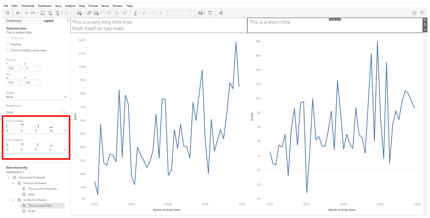
Fixing this initial issue doesn’t mean tiled containers are gone for good—they often reappear in other situations. One common case is when you’re working across containers and trying to line up two dashboard objects. For example, say you start with a horizontal container and place two vertical containers inside it. Then in each vertical container, you add one text block and one chart.
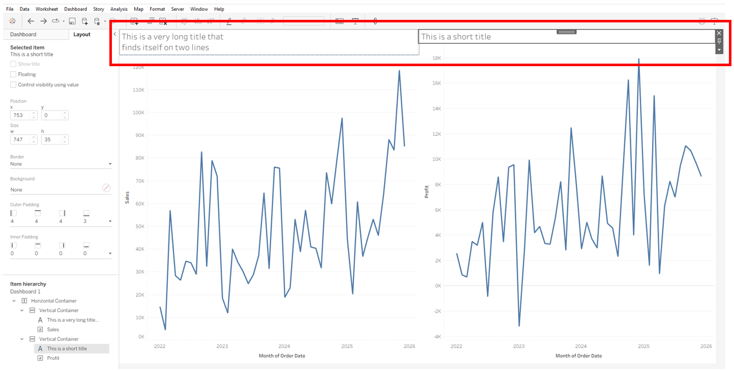
If the text blocks are of different sizes and you try to align them by expanding the smaller one, you’ll likely see alignment arrows.
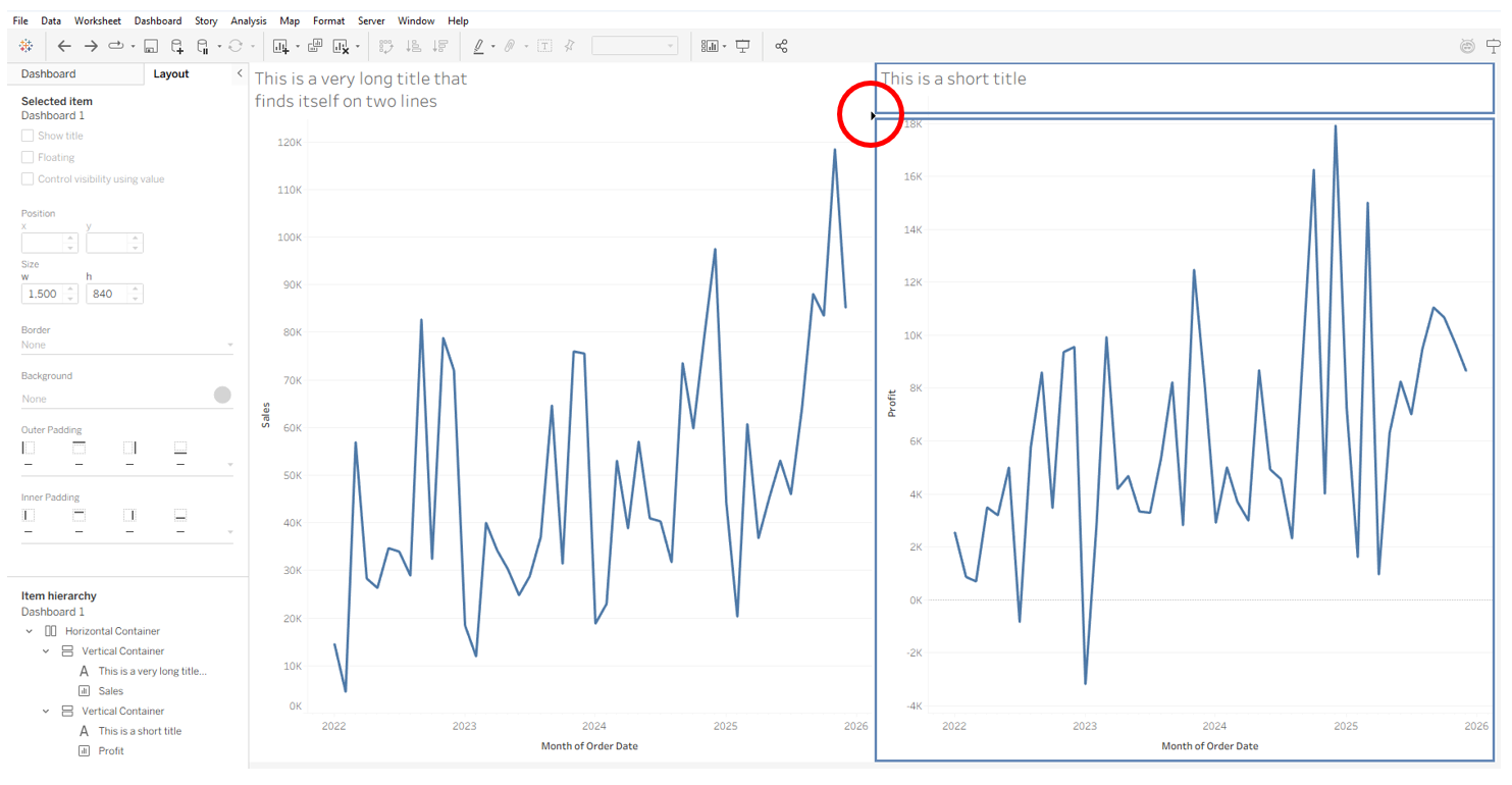
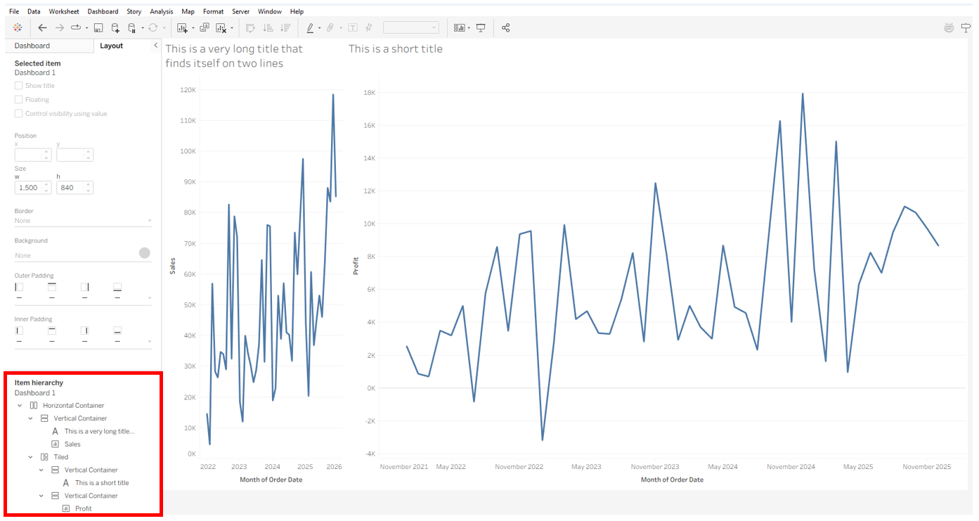
Snapping to those arrows will create extra containers. Looking at the Layout pane at this point, you’ll see that instead of two vertical containers inside a horizontal container, you’ll now have one vertical container and one tiled container. Inside the tiled container, you’ll find another two vertical containers—one holding the sheet and the other holding the text. These extra containers mess up your original formatting and make it harder to align the text boxes the way you want, since the text and charts are now in different orientations.
A better approach is to use padding to fine-tune placement. For instance, here I adjusted the padding on the two text box headers to create the spacing I wanted.
Avoiding Tiled Containers From Legends and Filters
Another place tiled containers often sneak in is when you add a new chart to your dashboard. If your worksheet has filters or legends, Tableau will usually bring those along too. Instead of placing them in the same container as the chart, Tableau puts them in a separate one. If your dashboard already has filters or legends, the new ones will usually get grouped there. If not, Tableau may create a brand-new container. For example, if you’re using a single floating container that covers your entire dashboard and you drop in a sheet with a filter or legend, the chart will go into the floating container while the filter or legend ends up in a tiled container behind it. As a result, the filter or legend may seem to disappear—even though it’s already on the dashboard.
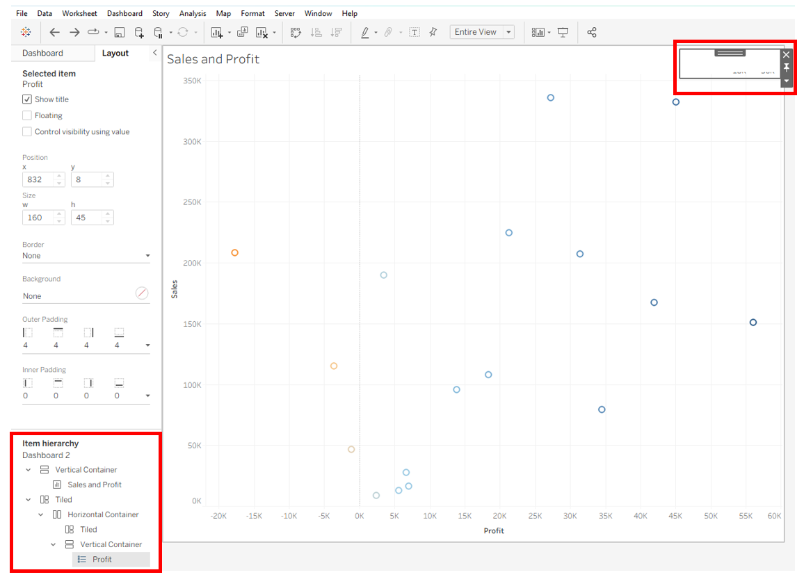
To fix this, open the Layout pane and drill down through the Item Hierarchy until you find the filter or legend you want. Click it in the hierarchy to highlight it on the dashboard, then drag it into the container where it belongs. After that, you can delete the extra tiled container blocks. Going forward, any new filters or parameters will usually appear in the same container as the one you just moved, and you can adjust their placement from there.