Bump charts are great for understanding how rankings change over time and how different items compete for position. Instead of focusing on raw numbers, they highlight relative performance—making it easy to see who’s moving up, who’s falling behind, and how the competition shifts. They’re often used to track things like product sales rank, market share, or sports team standings. In this post, we’ll build a bump chart in Tableau using the Superstore dataset. We’ll be highlighting how regions rank changes based on quarterly sales.
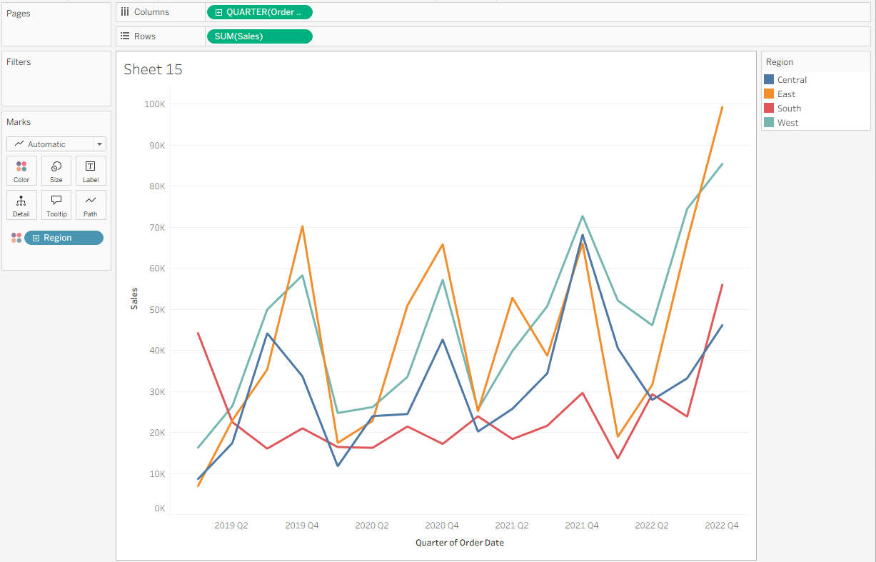
Start by setting up the worksheet with the date, metric, and categorical variables. Right click and drag Order Date to Columns and select Continuous Quarters. Then, put the metric SUM(Sales) on Rows. Finally, add the dimension representing your competing groups—in this case Region—to Color.
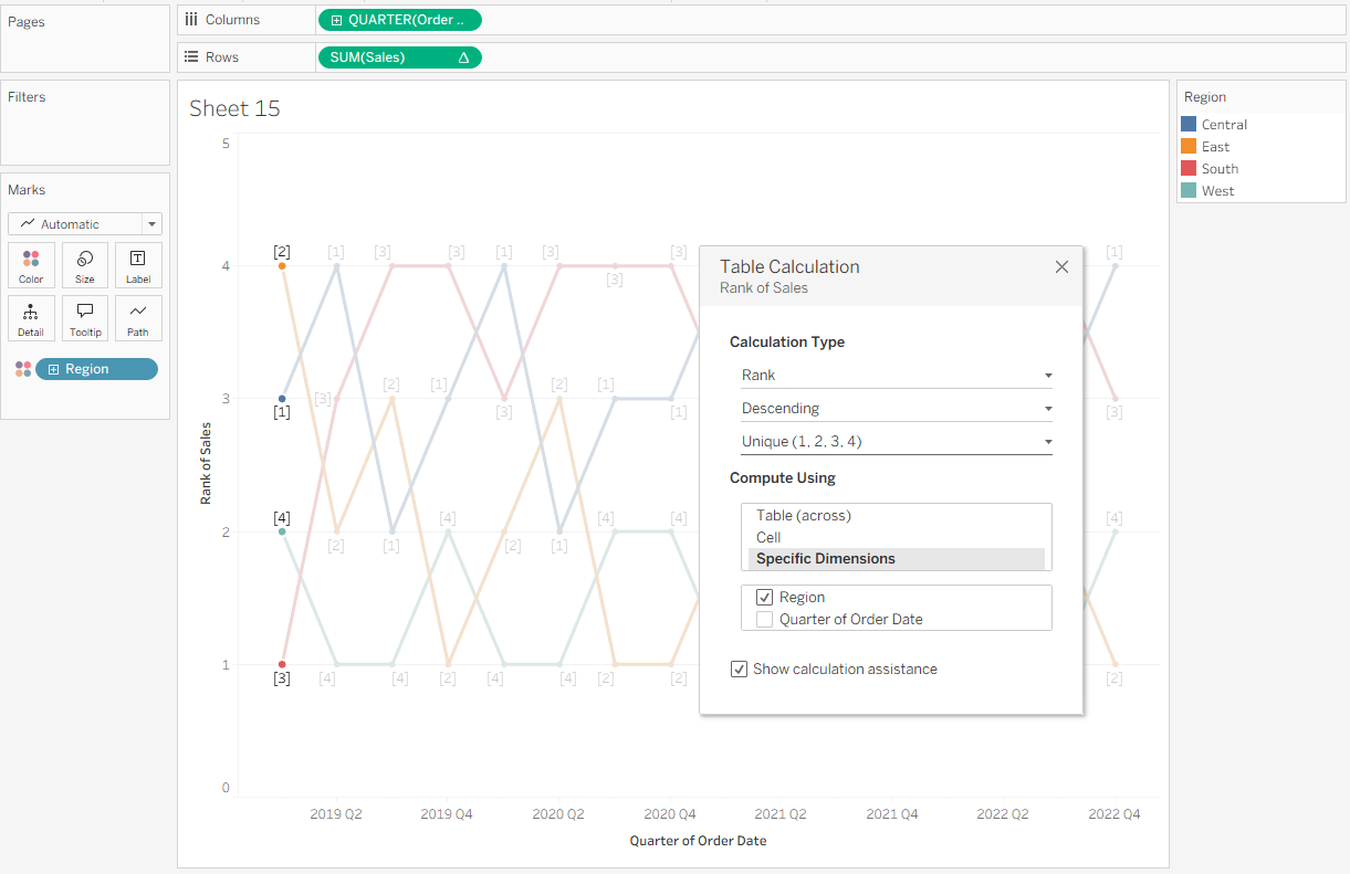
Next, set up your table calculation. Right-click SUM(Sales) and select Add Table Calculation. In the popup window, choose Rank, Descending, and Unique. This will allow us to identify a unique rank for each Region, where rank position 1 is the highest quarterly sales. Under Compute Using, select Specific Dimensions, then check Region and uncheck Quarter of Order Date. This means a new ranking for regions will be returned each quarter date.
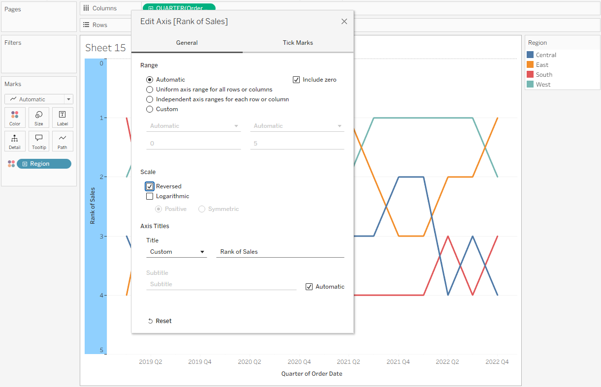
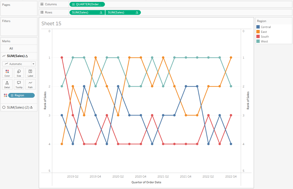
You’ll notice that the lowest rank (4) appears at the top of the chart, while the highest rank (1) is at the bottom. This is the opposite of what we want. To fix this, right-click the Rank of Sales header, select Edit Axis, and then check Reversed under Scale.
Next, add circles to the bump chart to make it easier to see each line’s rank at a given point. Hold Control while clicking and dragging the configured SUM(Sales) pill to the right of the existing pill so that you have two SUM(Sales) fields on Rows. On the SUM(Sales) (2) Marks card, change the mark type to Circle.
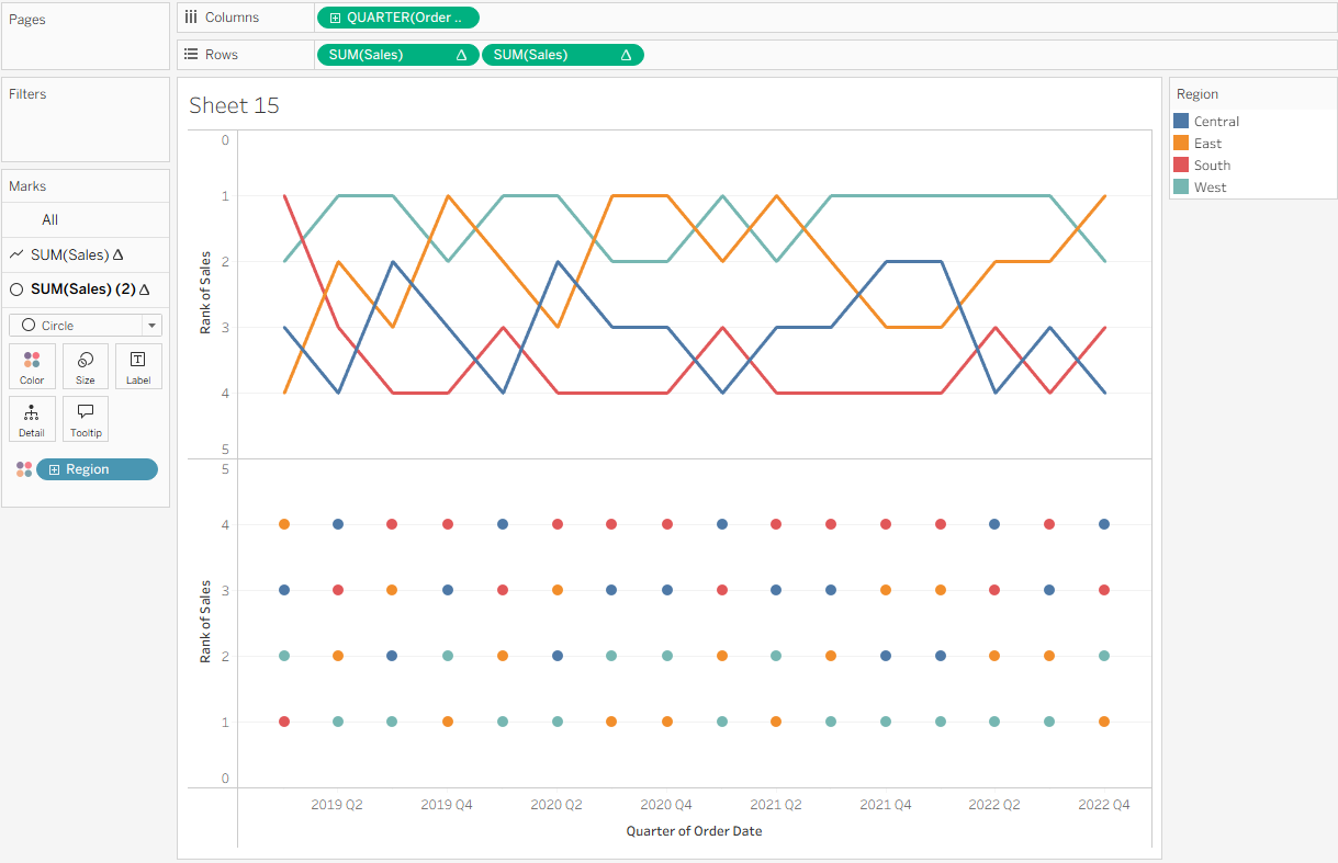
Now create a dual axis. Right-click the second SUM(Sales) pill and select Dual Axis. Then, right-click the axis on the right and choose Synchronize Axis.
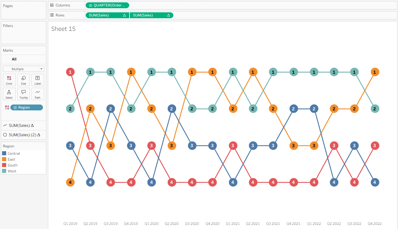
You now have a basic bump chart! A few formatting tweaks can be done to improve readability. On the SUM(Sales) (2) Marks card, increase the Size slider to make the circles larger. Then, click Label, select Show Mark Labels, center the alignment both horizontally and vertically, and increase the font size so the labels are easier to read. This makes it clear which rank each region holds at any given point.
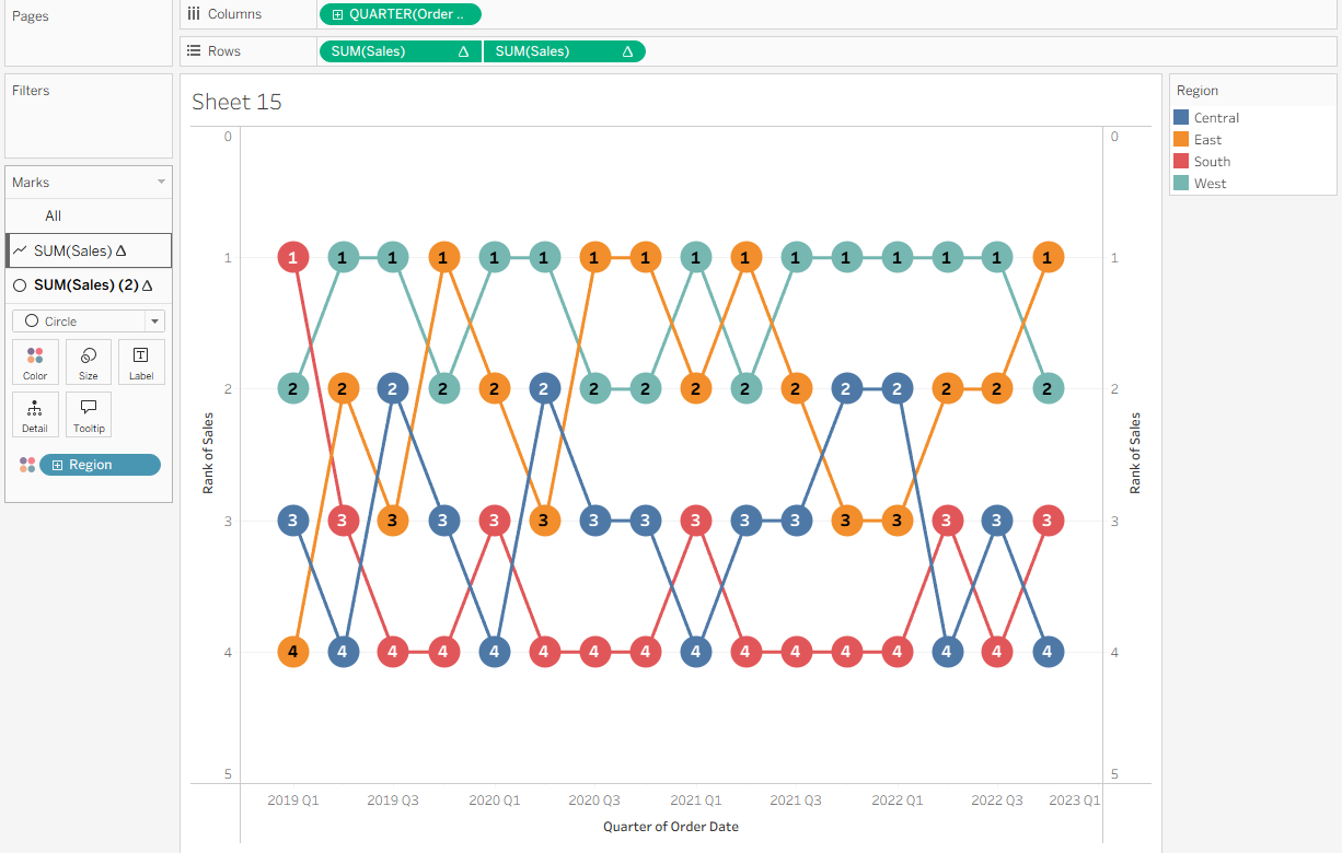
Finally, tidy up the chart for clarity. Turn off Show Headers on the vertical axes, disable row and column dividers and gridlines, and reformat the Quarter axis so it reads “Quarter” then “Year”.