


Control charts are a way to monitor processes over time and understand how much variation is normal versus unusual. For example, they can be used in manufacturing to ensure processes stay within acceptable limits, or in inventory management to maintain enough stock to meet demand without overstocking and risking waste.
In this post, we’ll walk through how to build a control chart in Tableau using the Superstore dataset. Specifically, we’ll look at monthly sales and highlight where they fall outside of the ±1 standard deviation range each year.
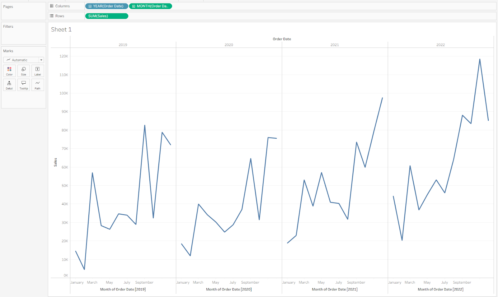
Start by building the base chart. Drag Order Date onto Columns, then right-click and drag it onto Columns again—this time selecting Continuous Month. This creates a pane for each year, each with a continuous monthly axis. Next, drag Sales onto Rows to build out the bar chart. Your view should now look like this.
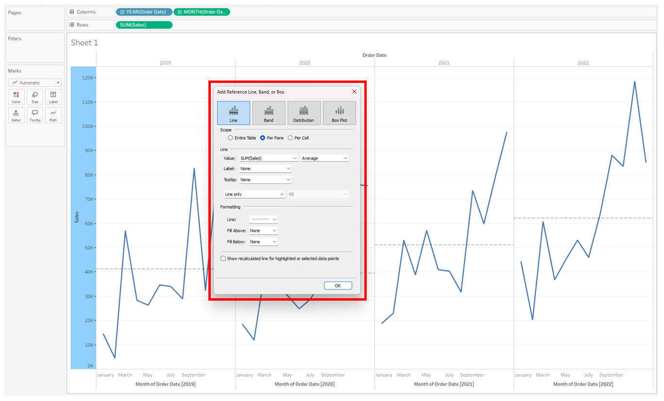
Next, add an average line for each pane. Right-click the Sales axis and choose Add Reference Line. In the pop-up, select Line, Per Pane, SUM(Sales), and Average. To keep the view clean, turn off the label and tooltip, then change the line style to dotted. Finally, uncheck the box that says Show recalculated line for highlighted or selected data points so the line stays constant.
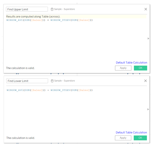
Next, create calculated fields for the upper and lower control limits. These will look within each pane and calculate one standard deviation above and below the average line. We’ll set up two separate fields—one for the upper limit and one for the lower limit.
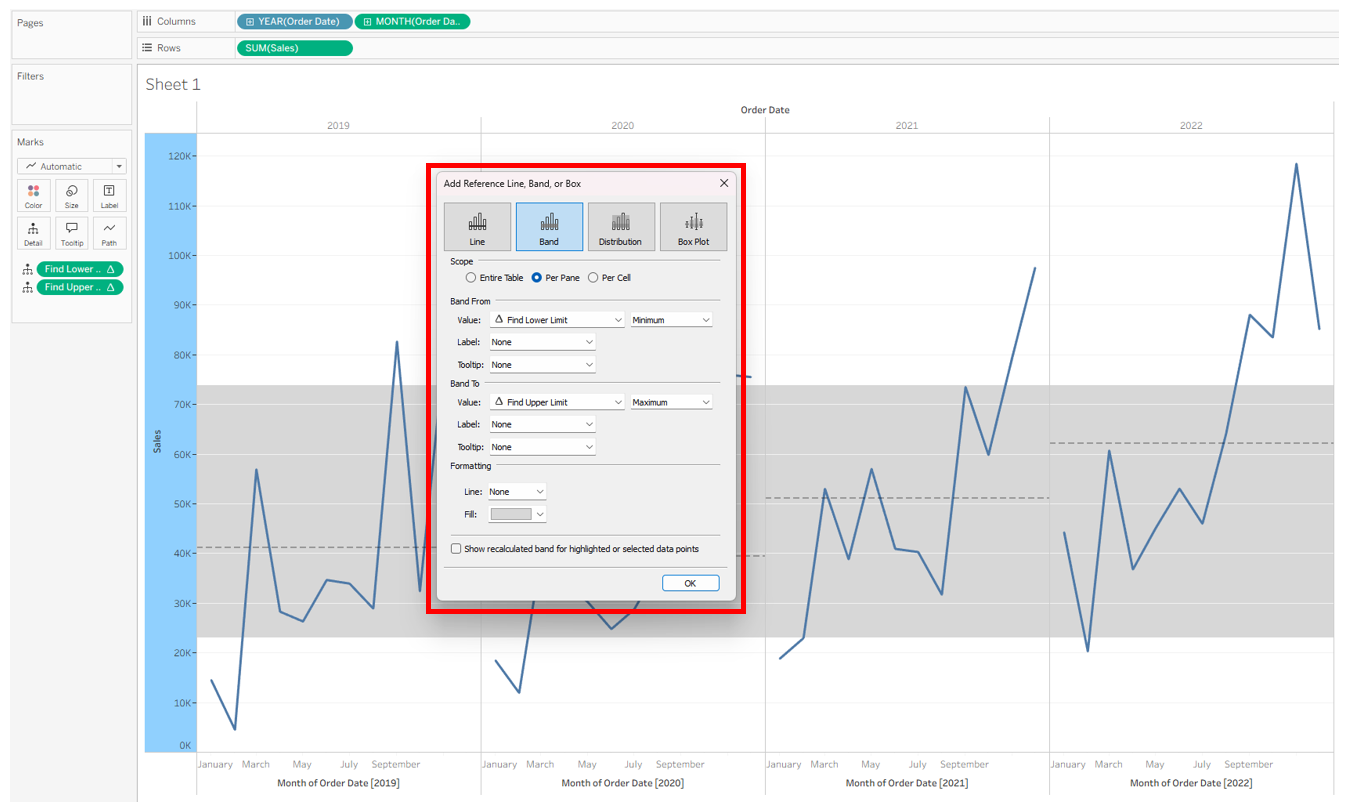
Add both calculations to Detail on the Marks card, then create a reference band. Right-click the Sales axis and choose Add Reference Line. In the pop-up, select Band and Per Pane. For Band From, set the value to Find Lower Limit and Minimum. For Band To, set the value to Find Upper Limit and Maximum. To keep the view clean, turn off labels and tooltips, and uncheck the Show recalculated line… box at the bottom.
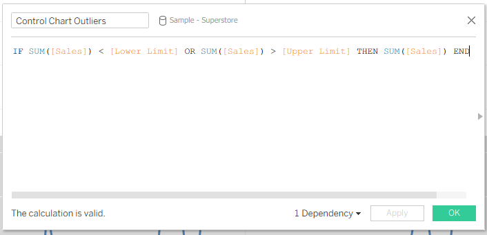
With the band in place, the next step is to flag values that fall outside the control limits. Create a new calculated field called Control Chart Outliers that identifies any points above the upper limit or below the lower limit.
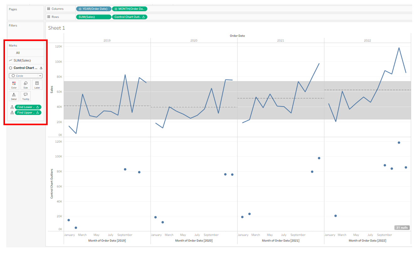
Next, drag Control Chart Outliers onto Rows. This will split the view into two rows: the first shows all sales values, and the second shows only those outside the control range. On the Control Chart Outliers Marks card, change the chart type from line to circle so the outliers stand out clearly.
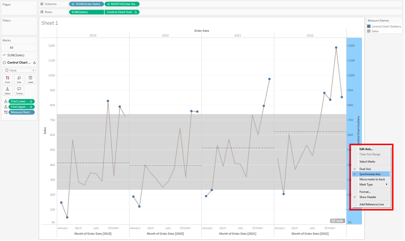
Right-click Control Chart Outliers and select Dual Axis. Then, on the new axis on the right side of the chart, right-click and select Synchronize Axis.
Now your control chart is all set up! From here, you can polish your chart by removing the extra header on the right, hiding the null indicator, adjusting axis labels, updating colors, or making any other formatting tweaks you like.