


Wait… that's my viz?
My Amazon Sales Performance dashboard was picked as Tableau Public's Viz of the Day — my first one. After spending so long admiring featured vizzes and pulling them apart to learn, seeing my own on the homepage felt surreal.
Here's what Viz of the Day is, who inspired me, and the tips I wish I'd had at the start.
What Viz of the Day is, and why it matters
On most weekdays, the Tableau Public team and a rotating group of Ambassadors pick one viz out of millions to feature. Anyone can nominate a viz using the ribbon icon in its top-right corner. The chosen viz is shared on the Tableau Public site, on social media and in the VOTD email, and earns a permanent badge on your profile.
For you, that means visibility, a credential your portfolio carries for good, and new connections. For the community, every VOTD adds to a free library of ideas to learn from. Tableau features authors of every skill level, which shows newer creators the bar is within reach. And since every VOTD starts with someone nominating someone else, I now make a point of nominating the vizzes that teach me something.
The dashboard
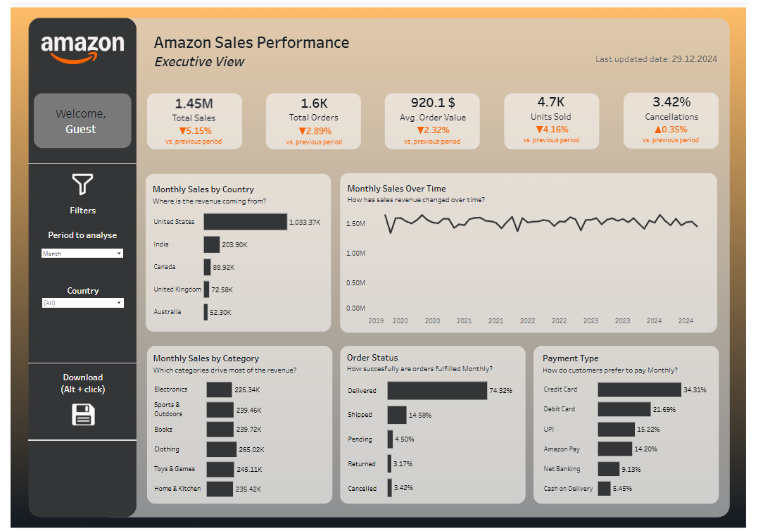
I built it for a busy executive with two minutes to spare who wants to know: Are we on track, and where's the money coming from? Five KPI cards sit at the top — Total Sales (1.45M), Orders (1.6K), Average Order Value ($920.1), Units Sold (4.7K) and Cancellations (3.42%) — each compared with the last period. Below them are sales by country, a trend from 2019 to 2024, and breakdowns by category, order status and payment type.
What I think made it work:
- Every chart asks a question in its subtitle, so you know why it's there.
- Orange is used only for change. Everything else is charcoal and grey.
- No lonely numbers. Every KPI shows how it moved.
- Simple charts and plenty of space, so attention goes to the insight, not the technique.
My inspiration
Shreya Arya's "Let's get down to business" collection was my unofficial textbook. Three of its eight dashboards are Viz of the Day winners.
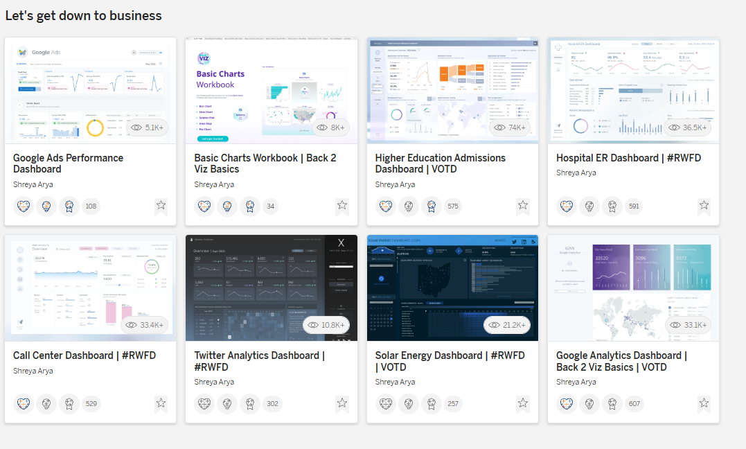
What I took from it:
- Build for a real person — an ER manager, a call-centre lead, an executive.
- Use community projects. Five of the eight use #RWFD or Back 2 Viz Basics, and two of those became VOTDs.
- Find a signature style, but still experiment, as her dark-themed dashboards show.
Tips I wish I'd had
- Write a one-line brief. "A ___ needs to know ___ so they can ___."
- Find a fresh angle. Unique or timely topics get people talking, and nominating.
- Join a community project like #RWFD or Makeover Monday for clean data and a ready audience.
- Sketch on paper first. Ten minutes saves hours of fiddling with containers.
- One chart, one point. If it doesn't answer your brief, cut it.
- Give colour a job: a neutral base and one accent for what matters.
- Add one "how did they do that?" moment — a new chart type, trick or feature.
- Make the workbook downloadable. Letting others learn from it helps your chances.
- Test before you publish: the browser view, phone layout, every filter, spelling and the thumbnail.
- Share the story, give back and keep going. Post your key insight, nominate others, and be patient — the team also considers how recently you last had a VOTD.
Thank you
To the Tableau Public team, to Shreya Arya and to the whole #DataFam: thank you. If you're still waiting for your first Viz of the Day, keep building and sharing. It'll happen. You can explore the interactive dashboard on my Tableau Public profile, and I'd love to hear what you think.