


Custom Shaped scatter plots can be a ton of fun!
They are visually appealing, but better suited for storytelling over numerical analysis.

In my second-phase application for The Information Lab, I used one (in the shape of a pair of lungs) to represent the noted cases of Black Lung Disease. The user is able to hover over each point to read more about the worker’s situation. The bright orange also highlights the growing cases of silicosis.
The true secret of these charts is that they are scatter plots in disguise.
The X and Y values for the shape must be configured manually, but once set up, they are incredibly easy to build and modify in Tableau.
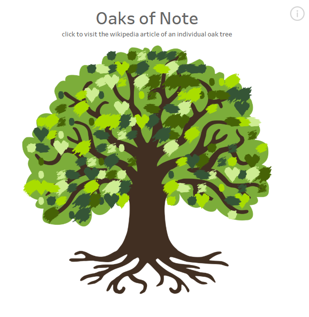
In this series, I will be demonstrating two methods for building these charts: The online tool Automeris and Python. I will be walking through the creation of a "Oaks of Note" Dashboard, using various leaf images to demonstrate how to use the tools.
All of the files for this series are available here:
https://github.com/mcumiskey/Image-to-Point-Cloud/tree/main
Introduction - You Are Here!
Part 2 - Using Automeris to Generate Points
Part 3 - Using Python to Generate Points
Part 4 - Combining Points to Data and Building the Chart in Tableau