


In a recent client project, there was a type of chart that I needed to make that I had never before. They wanted to see a map of all of their seats based on their office, providing only an image of their seating map to create it from. This would have some further interactivity with other charts on the dashboard, so they would need to be able to click on each valid spot on the seating map.
In order to do so, I needed to learn how to create a custom image map in Tableau. With some help from my coach Serena, I was able to make it, and now this blog will go through the steps to create a custom image map of your own.
This custom image map is simply a scatterplot putting the positions of the points on the scatterplot. The background of the chart then becomes the custom image map if we are using the fields that are defined to be our points.
To start, you need to get the image that you're wanting to create the map from. For this blog (and since I want to eventually make a dashboard using it), I'll be creating a map of the different positions on a football field.
- Go to CBI Studio by Interworks, a website that lets you defined position points on an image, and upload your image.
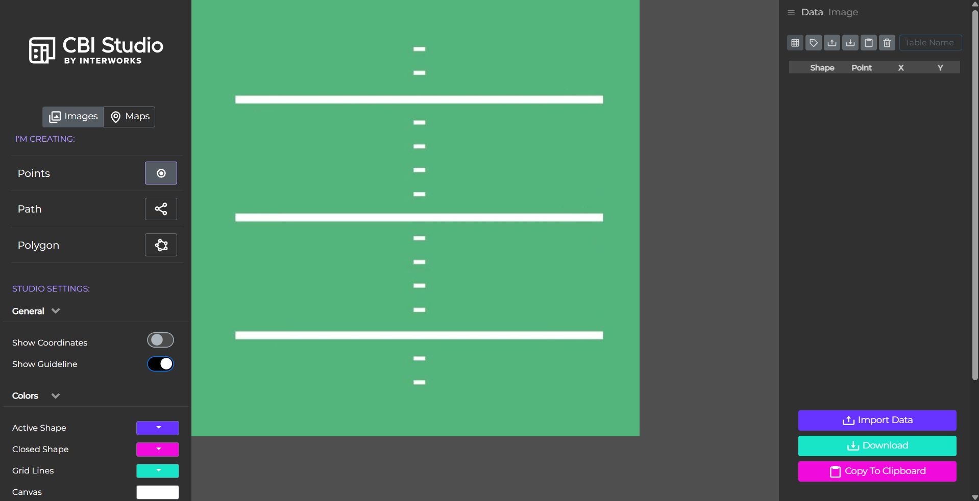
Once on the website, you can drag in your image onto the page to see it there and be able to interact with it. For this, we'll want to keep it on the Points option as we don't need to make paths or shapes, which can be useful in other situations.
- Choose to create points and click on your image where you want your points, then export when finished.
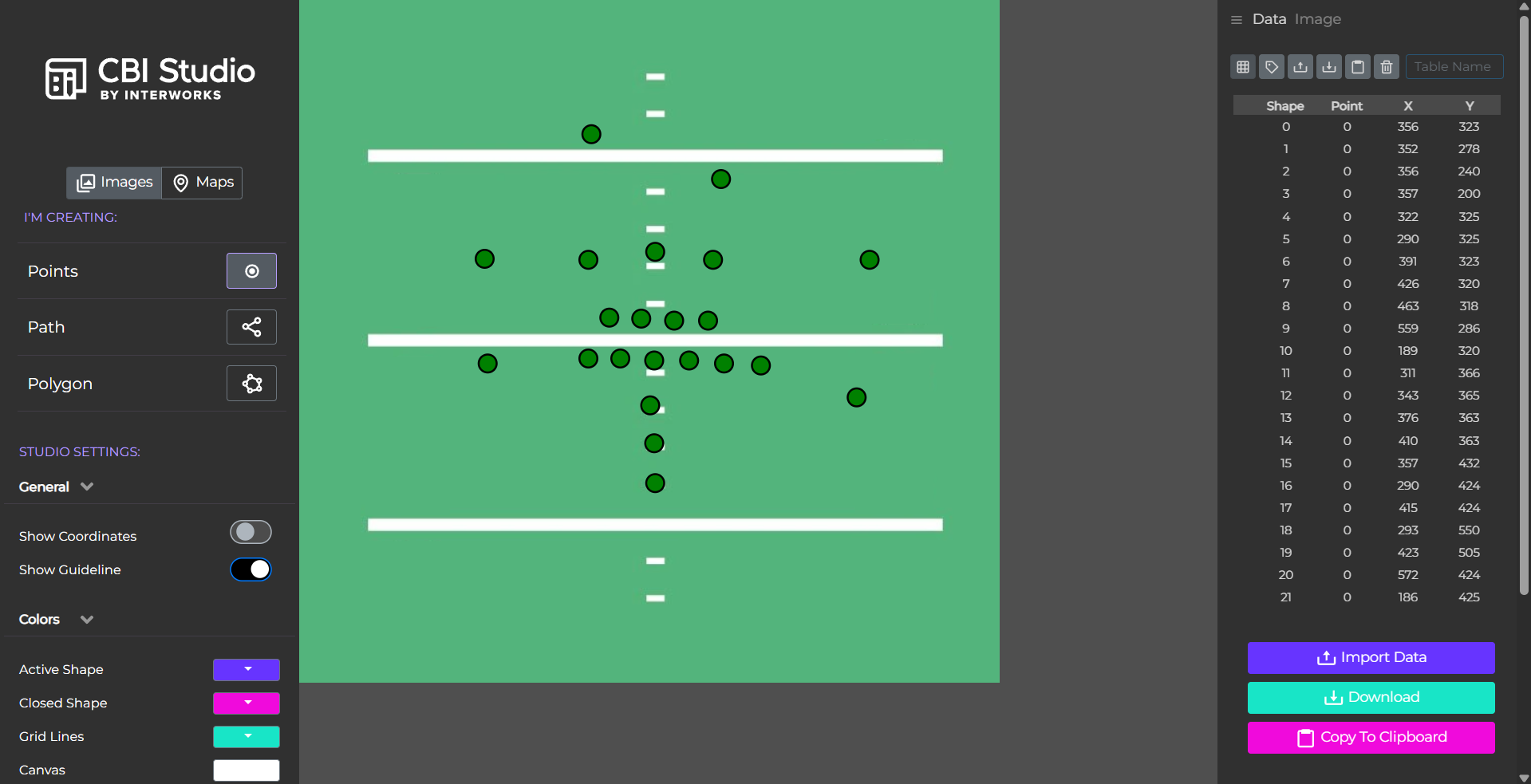
In my example, I'll be adding a point for each position on the football field. Each point represents a vague idea of the different positions that typically appear on the field during play.
With the file downloaded of the point positions, that is what we'll be connecting to whatever data you have to show on the image map. To do so, there needs to be a field to connect with. Plus some of the points may not be exactly where it is that we want them to be, so we also would want to edit their positions.
- Edit the file and add in a new column with details to connect to a field in your data source.
It is a good idea here to keep track of what each points represents when you click to create the point as the only identifier for each point is a simple ID in the order of creation. In my example, I've adding in a field to label each point with their position in the game and if it's an offense or defense role.
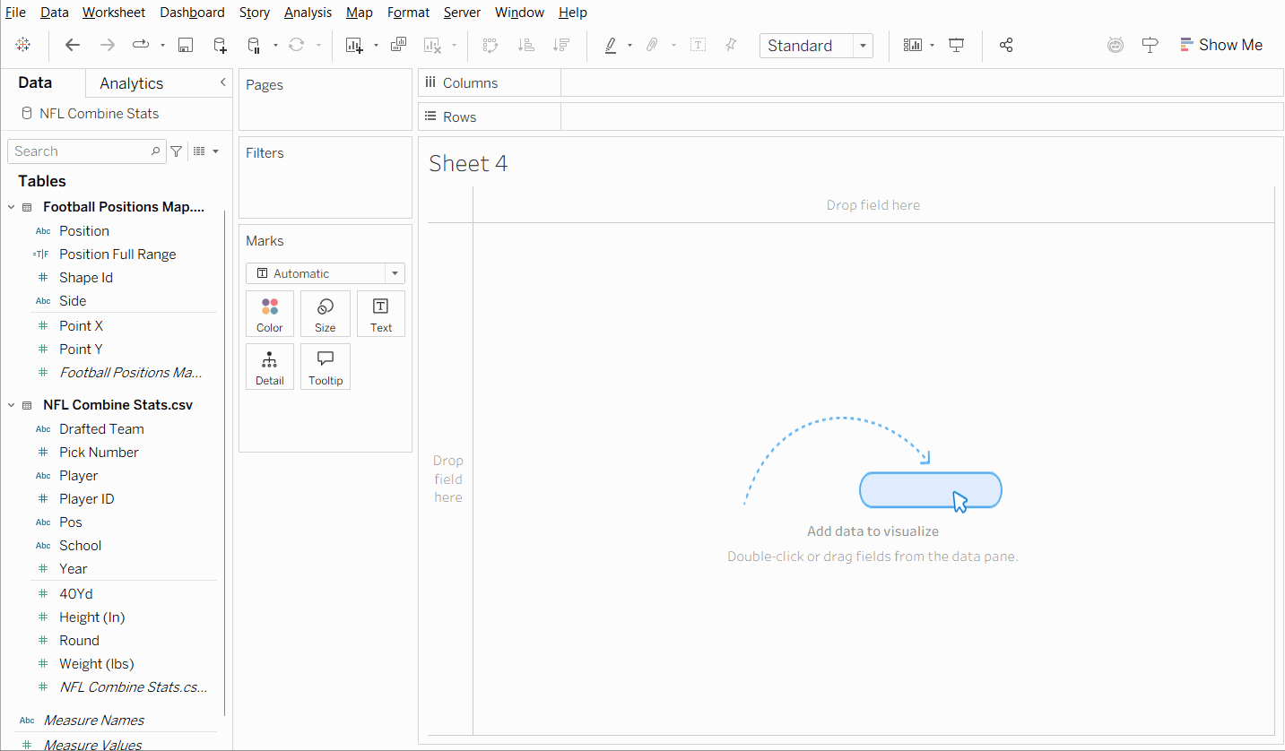
Once the file is complete, we can bring it into the dashboard. To connect it to whatever data source you are using, you can relate it using the field you've defined in the file that contains the point locations. Once the location data is available in your dashboard, you can implement the map in your workbook.
- Add the image as a background image to your data source under the map options. Select your fields for the points and set the dimensions of your image.
Once on the background image window, you can select the fields that would show your map. In this case, it would be the Point X for the X field, setting the right value to the width of your image, and Point Y for the Y field, setting the top value to the height of your image. You can also change the transparency of the image using the Washout slider.
- Put Point X and Point Y on columns and row respectively then have the Shape ID on the detail to split the points into individual marks.
You might need to adjust the size of your axes to fit the size of your image if you want to display the full image. Since it's only still considered a scatterplot, the axes are fitted more for the location of your points rather than the size of the image.
And there you have your custom image map! You can have multiple different images for different fields being used to represent the points as the images are tied to the data source, rather than a specific worksheet or dashboard. From there, you can add measures onto the marks card to gather further insights from your data.