On the ‘quiet’ weeks in which we don’t have a client project to work on, we are still being challenged to work with different data sets and hone our dashboarding and analysis skills each day. One of these weeks is ‘Dashboard Week’, where we are challenged with a new dataset every day, and have just one day to come up with a dashboard, and present it early the next day, before the next data set is given … and the process continues.
Here are the 5 dashboards I came up with – some more serious than others! It was a great challenge as it really forced you to make ideas happen quickly. You can click on each of the links to see an interactive version on Tableau Public.
Monday – Jeremy Poole’s Breakfast Data
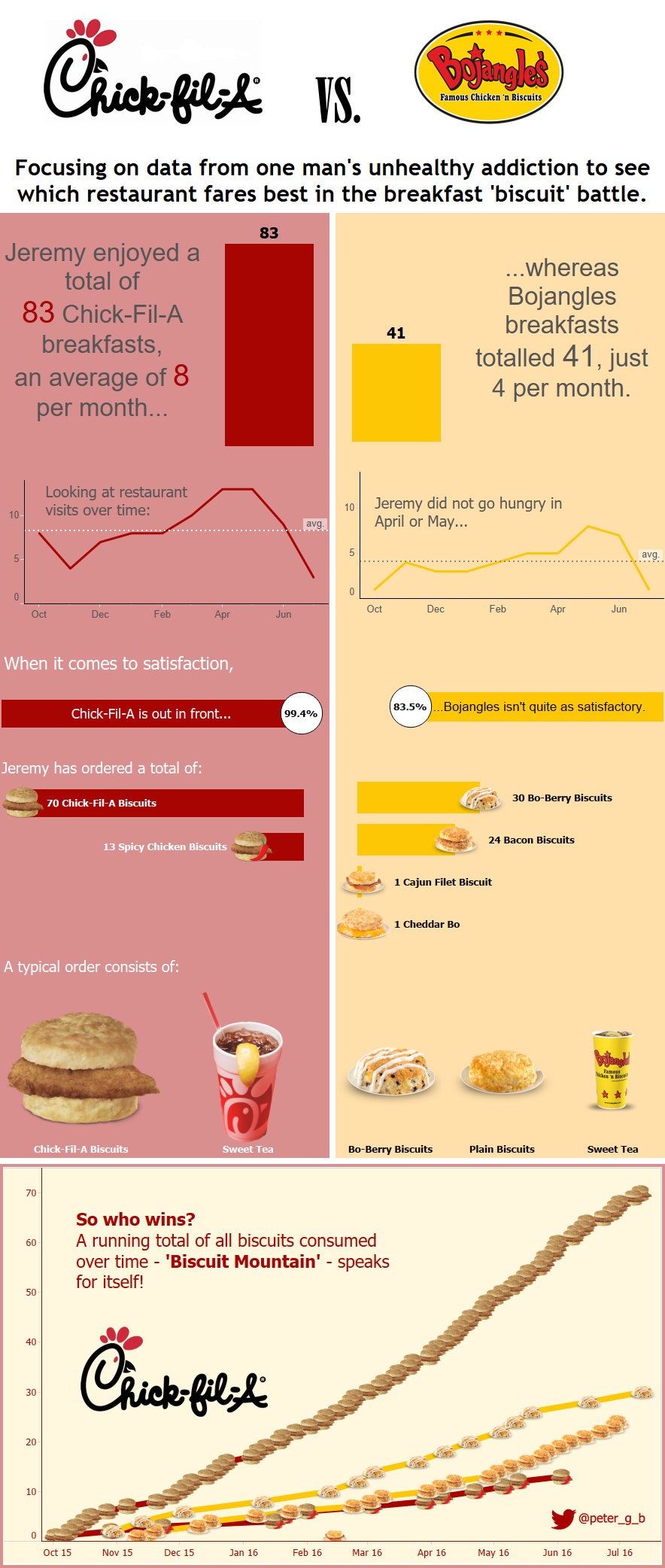
Jeremy collected daily records of his breakfasts at the American restaurants Chick-Fil-A and Bojangles, and kindly allowed us to take a look. Although we didn’t really understand the concept of American ‘biscuits’ with chicken (scones apparently), we came up with some fun and unique designs. Mine was styled like an infographic, climaxing with the use of custom shape files to create ‘biscuit mountain’.
Tuesday – College Scorecard Data
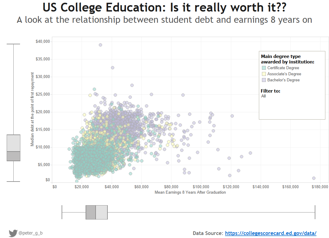
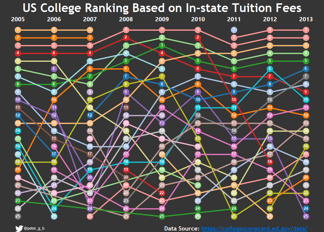
Using publicly available data on American colleges, I looked at the relationship between student debt and future earnings, seeing how educational establishments differed. I used a scatter-plot with box and whisker plots to explore the relationship between the two, though I wasn’t completely happy with the final output. I decided to use the data to learn a new technique – building a bump chart. The dataset was really vast, about 2000 variables in all, so picking and choosing which data to use was time consuming and faffy. I had several ideas that I wasn’t able to implement due to missing data over the 15 or so years available. In the end I ran out of time to make the bump chart truly useful, with the ability to swap out measures etc, but I’m glad I learned a new technique for future dashboards.
Wednesday – Various Historical Data about Bermuda
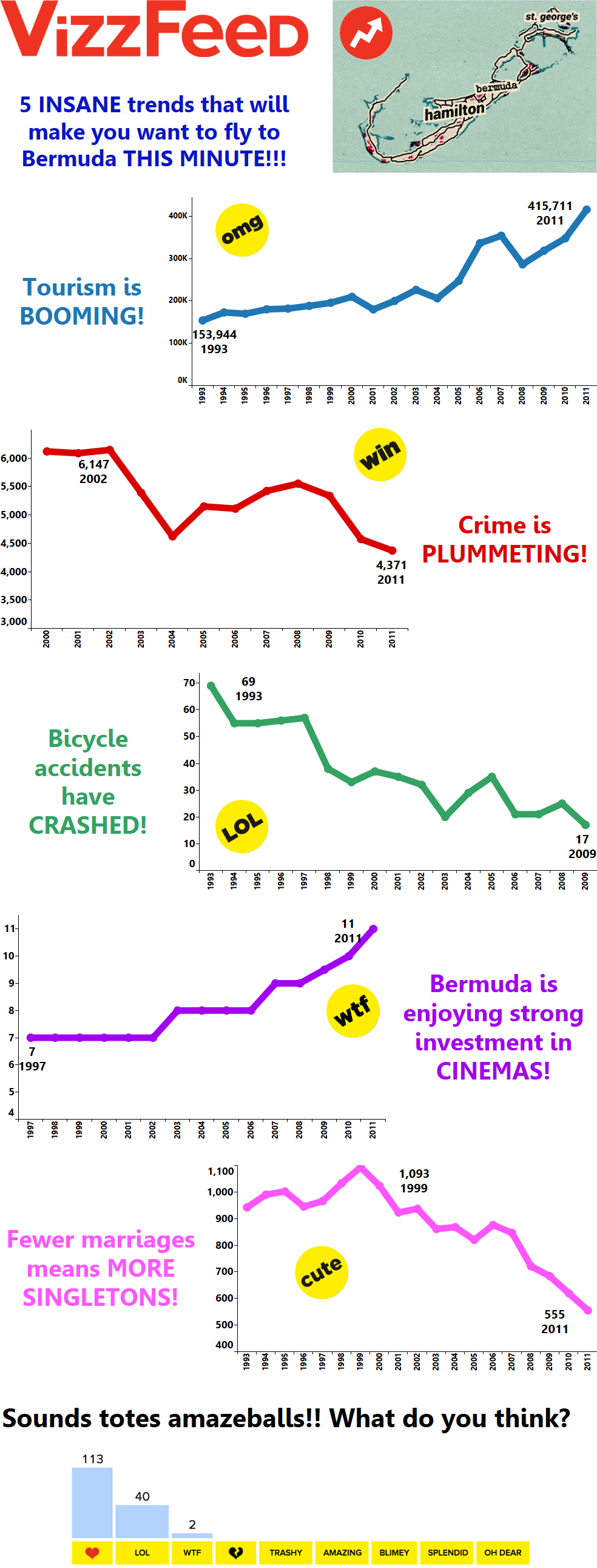
OK so this one was a little silly. The data was used for Makeover Monday, and consisted of 10-12 years of data which revealed trends in various measures about Bermuda. However with no dimensions, it was difficult to really dig into any of these beyond simple trendlines. Many of the vizzes produced with this data weren’t too serious so I went for my first piece of data viz satire. I’m sure the reference is clear!
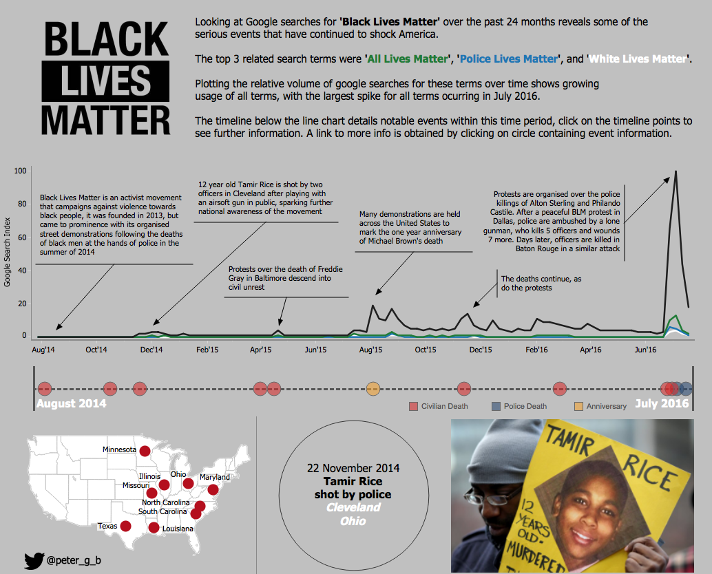
Thursday – Google Trends Data
Finally a serious visualisation. The challenge was to make a dashboard using google trends data. I found an interesting trend in search terms relating to ‘Black Lives Matter’. The google trends data alone hints at significant events that drove the spikes in search volumes, so I made my own dataset by researching the incidents that led to the spikes in searches for Black Lives Matter. This was very revealing, and there could have been many more points on the timeline of other deaths at the hands of American police, however I had limited time, so searched for the events that seemed to explain the google trend spikes rather than list all police caused deaths.
All in all this was a fun and challenging week, I hope you enjoy the visualisations, I’m always open to comments and feedback 🙂

