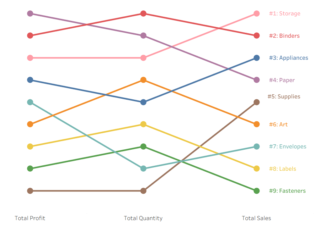
If you've ever created a bump chart before, you'll know that it's easiest to make one over time, but this doesn't always highlight the insights you need because this limits you to just one ranking. Today I'll show you how to create a bump chart with multiple rankings to make the most out of your data.
This method works best if you're ranking a field with 10 or less unique values. In this tutorial, I use a field with 17 unique values, which admittedly isn't ideal but still works in teaching how this type of chart can be achieved. For more information, please refer to the Limitations section of this blog.
Let's say you're working with the Superstore dataset and you want to rank subcategories by profit, quantity, and sales. This is the perfect use case for a bump chart, but if we did this over time, we would only be able to view one of these metrics since this task requires three different ranks—one for each metric being evaluated. So how can we rank all three in the same chart?
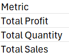
The answer is to create a new table with said metrics! I like to create this table in Excel so I can easily go back and adjust it as needed. This table defines each column of our bump chart, and should look something like this:
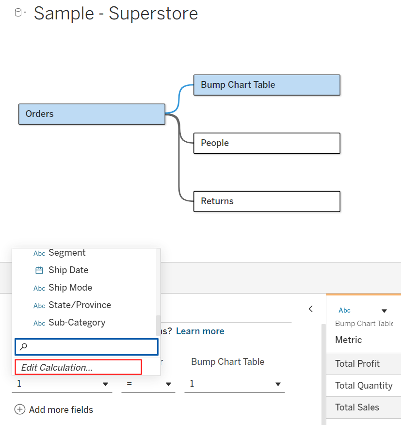
Now, we need to bring this into Tableau and connect it to our original dataset. For this example, I'll be connecting this to the Orders table using a manually inputted relationship of 1=1. You can do this by clicking on the connection between the tables, going to Edit Calculation, and entering 1 on both sides:
Our bump chart is now missing just one major element—the ranking. Since there are three different rankings being computed, we'll need an IF or CASE statement to display them all on the same axis. For simplicity, I'll use a CASE statement:
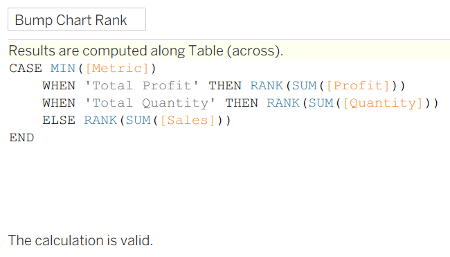
Side note: In case you were wondering why I used MIN on [Metric], it was to ensure that all fields in my calculation are aggregated (thus avoiding the following error):

At any rate, here it becomes abundantly clear how powerful this method is. In this example I used SUM on all my metrics, but you could rank by MIN, MAX, COUNT, etc. and use a different function for each metric (e.g., compare total sales with max profit).
Now, we can finally build the bump chart using:
[Metric]on Columns- Your ranking calculation on Rows
- The field you're ranking on Color
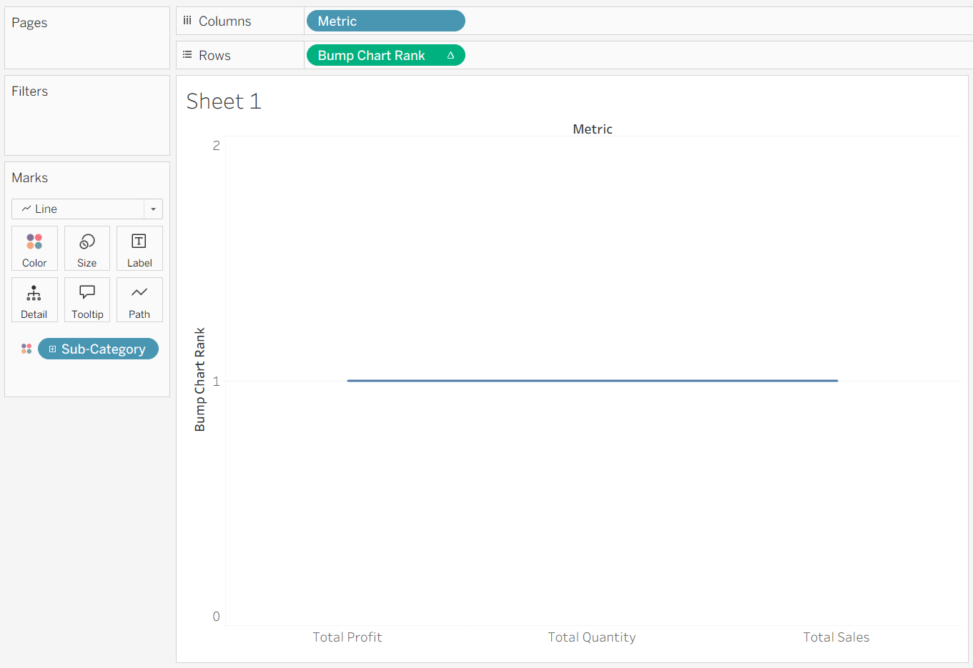
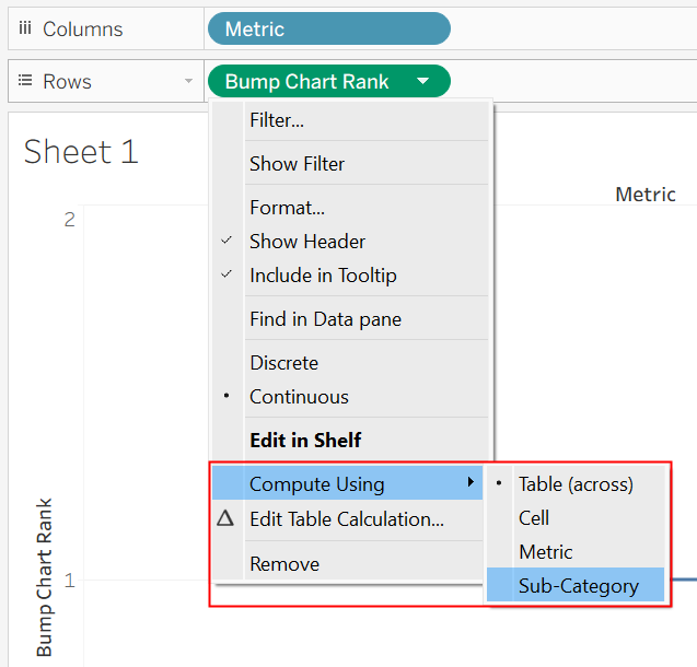
Now you're probably thinking, wait a minute—that's just a flat line! To fix this, make sure your rank is being computed across the field placed on Color (which in our case, is Sub-Category):
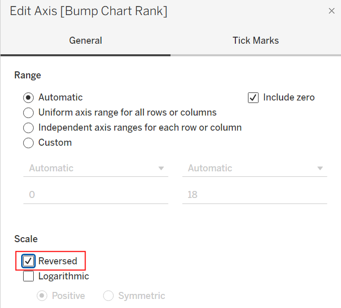
Lastly, right click the y-axis, click on Edit Axis, and toggle Reversed to have the ranks start from 1 at the top of the chart:
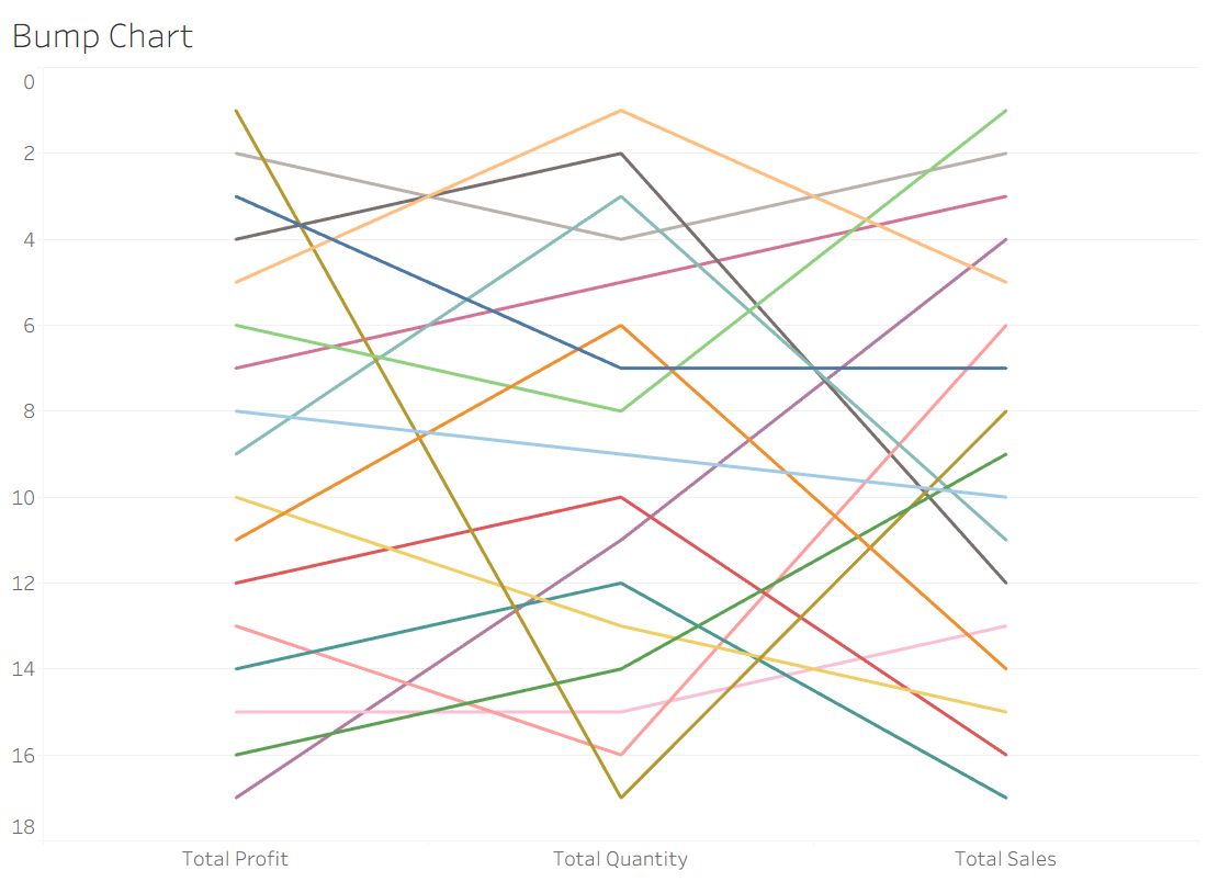
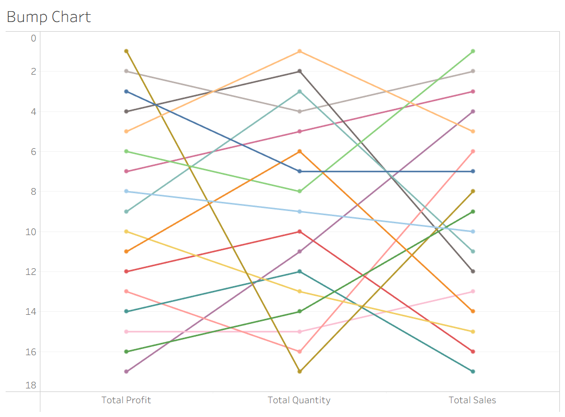
Now you have a bump chart with multiple rankings!
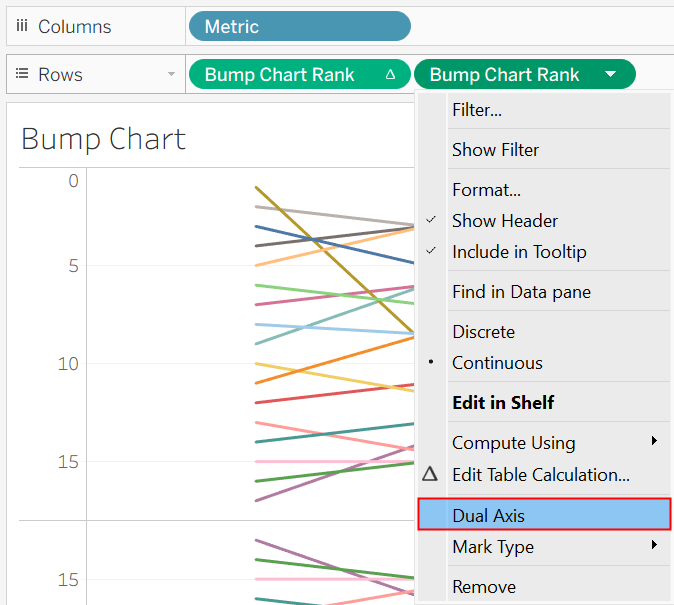
Optional: If you want to add dots on top of each line, you can duplicate your ranking calculation onto Rows, enable Dual Axis, synchronize the axes, and change the mark type of the second layer to Circle:
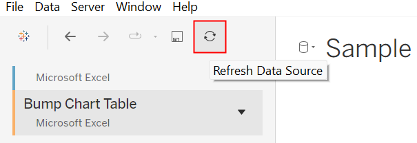
If you decide to change which metrics are shown on your bump chart, you can make changes to your Excel table, save the file, and refresh the data source to have them apply to your bump chart:
Limitations
- Too many unique values being ranked will make the bump chart difficult to interpret.
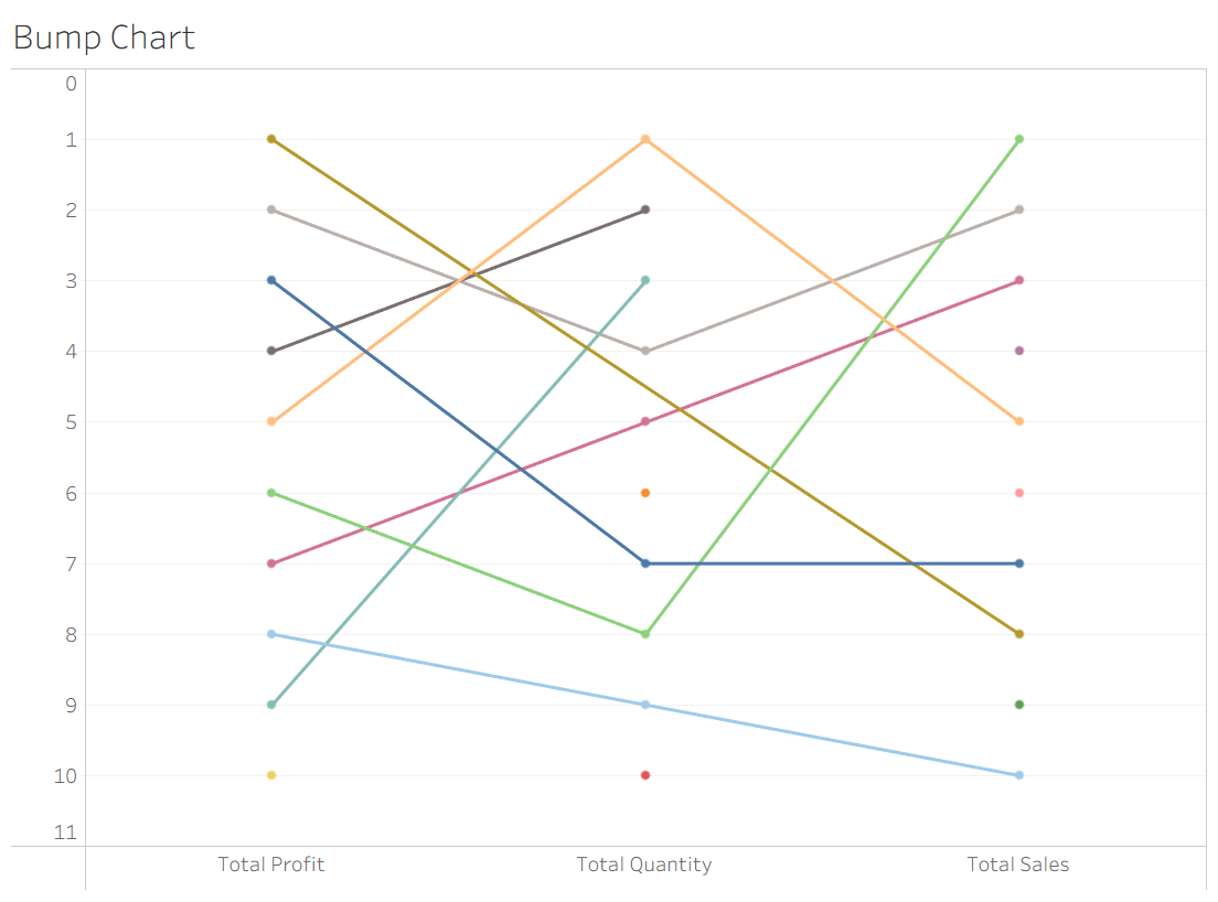
- Unfortunately, filtering down to the top few rankings can create gaps in your bump chart, like so:
Conclusion
Given these limitations, it's clear that like all other chart types a bump chart won't always be the best way to visualize your insights, but when utilized effectively it can be very powerful! With additional formatting and limiting our subcategories to just office supplies, our bump chart could look like this: