


It is day 2 of Dashboard Week and we are right back at it with a new tool! Yesterday, we got our first look at the new Tableau Next web platform, and today we were tasked with reimagining a previous #MakeoverMonday in Power BI. For most of our cohort, including myself, this was our first formal encounter with Power BI. Anyone familiar with the data analytics industry knows that Tableau and Power BI are fierce competitors with similar but different product offerings and people tend to have a strong preference towards one or the other, so I had an uneasy feeling about switching over to the 'other side', but I was excited to see what kind of features that Power BI had that weren't currently available in Tableau.
The dashboard I chose to reimagine was one of the first #MakeoverMondays I completed at The Information Lab. It was published to my Tableau Public on April 8th, just my second day of training, and looked like this:
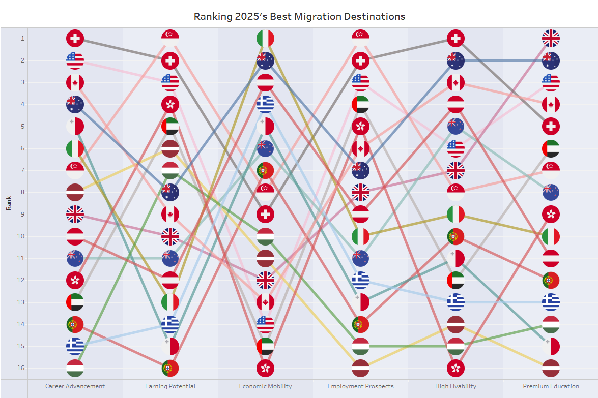
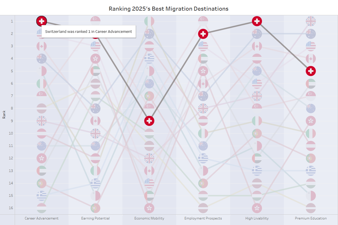
To be fair, I only had an hour to make this. I was able to source a lot of custom shapes and sneak a neat highlight action in there, but, to be frank, this is... not good. Overall, its visually cluttered by the shapes, difficult to navigate a single country's path across dimensions, and missing a good story. Those were 3 things I wanted to change in my Power BI version. This is what I ended up making:
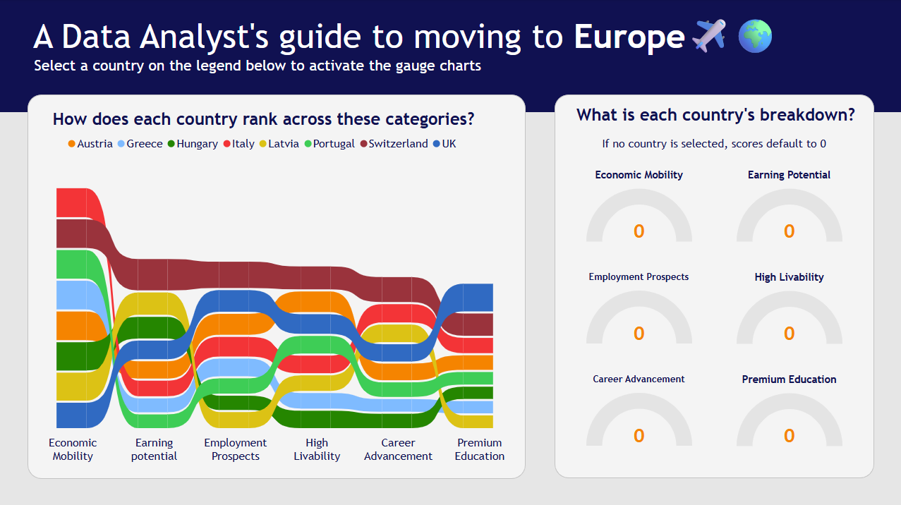
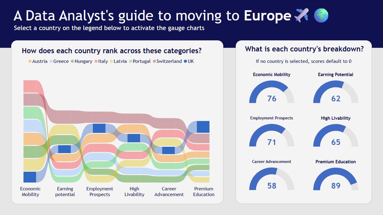
This version is clearly a massive improvement. I created the visualization around an interesting idea (who doesn't think about packing it up and moving to Europe!) which reduced the scope and made it more interesting to dive into. The ribbon chart adds the size dimension to the previous version's bump chart and the gauges on the left act like interactive labels with added context on the country's relative position. As someone who has just built their first complete dashboard with the tool, I wanted to share some of my challenges as well as some of my favorite things about it.
Challenges I faced
1) Parameters are not the same in Power BI. If you want a dynamic dimension, that can be made, however a parameter of values from one column can not be made. Instead, every column can have a 'Selected Value' that can be switched with slicers. Working with this was very difficult, especially considering slicers have a tendency to filter first instead of being used for other purposes (highlighting, etc.)
2) Custom formatting for colors is difficult. I ended up having to set a large number of custom formatting rules because I was unable to write measures as legends. I know that my measures can be aggregated to the columns in the view so I am a little disappointed that I am unable to format with measures.
My favorite things
1) Power BI has so many native chart types! Seeing as though I included a ribbon chart and some gauge charts, it is safe to say I took full advantage of this. I especially love the ribbon chart. For me, it is a more insightful bump chart, as the marks are not only sorted by rank across the different x-axis values but they are sized according to their nominal value in the data, adding that extra nugget of information. Not only that, but they look a hell of a lot like a Sankey!
2) Power BI has a really great dashboard creation layout. Similar to Tableau Next, I have a grid where I can drag and drop different elements and size them to my liking. Unlike Tableau Next, Power BI allows you to overlap elements, which led to me choosing a cool design format from a webpage I saw recently that would be hard to achieve in Tableau without floating elements.
3) Rounded corners. Need I say more?
Overall, this was project a lot of fun to put together and I ended up really enjoying Power BI. As I look forward towards life in my placements, I hope to get more opportunities to work in this tool.