


This week some colleagues and I discussed how dumbbell charts could only be made in Power BI through the use of Viz extensions. Hence, when I found #WOW 2025 Week 19 which challenged me to build a 3-point dumbbell chart using error bars in Power BI I knew I had to accept. In this blog, I will explain how to create such a chart within Power BI.
Firstly, let me explain the dataset I am using for this example. My dataset contains the price index of European countries in 2015, 2020, and 2025. The dumbbell chart will aim to show how these price index's have changed over time.
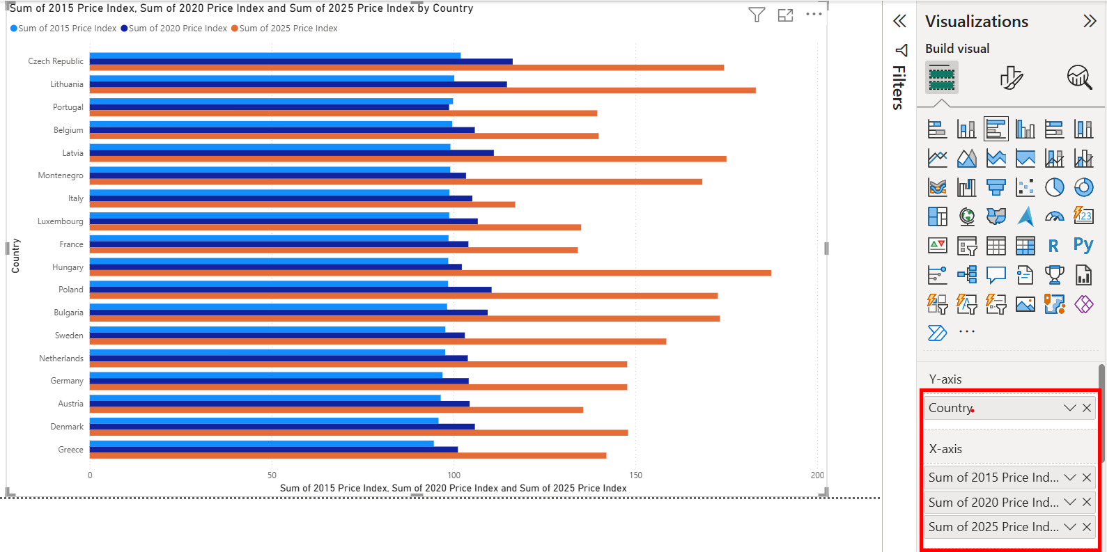
In this first step, I just added my country names to my Y-axis and then all of my values (20** price index) to the X-axis. This creates a clustered bar chart.
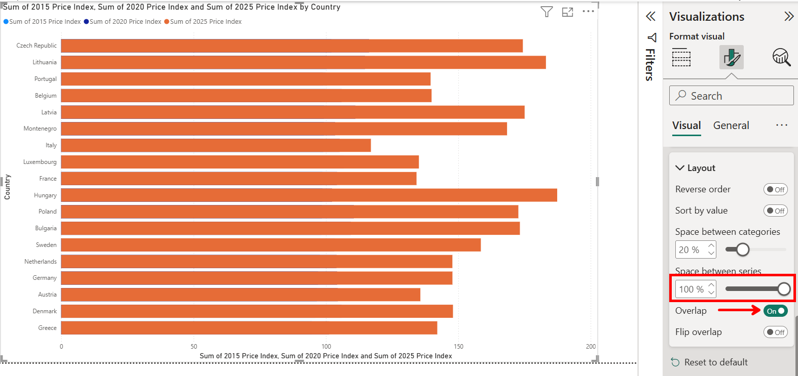
Now we need to go into Format -> Bars -> Layout and turn on Overlap, placing space between series at 100%. This means that all of our bars now sit on top of one another.
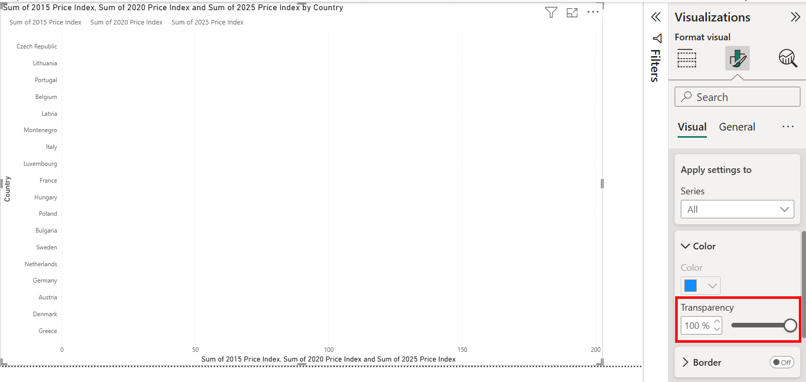
The next step may seem strange, but we now need to make our bars completely transparent, as we are only going to be interested in the errors bars we place at the "end" of each bar.
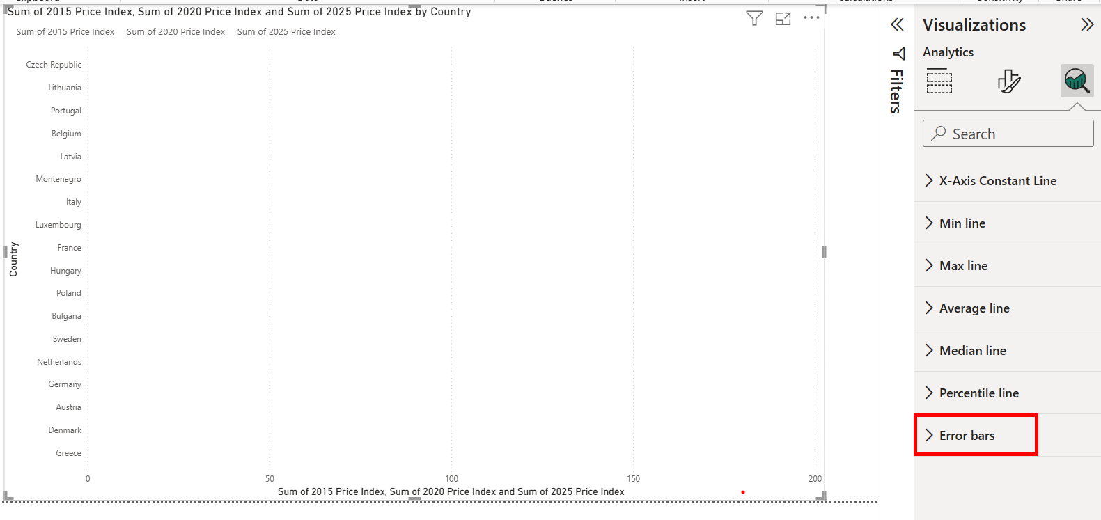
Speaking of our error bars lets go find them within our analytics section
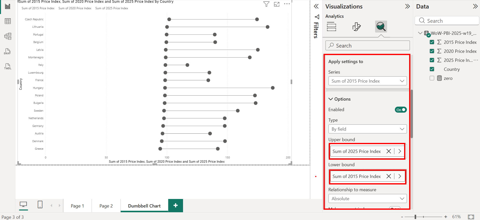
The first error bars we want to add are those pertaining to our min and max values, in our case 2015-2025. Having our Series as 2015 price index place the max value on the upper bound and the min value on the lower bound.
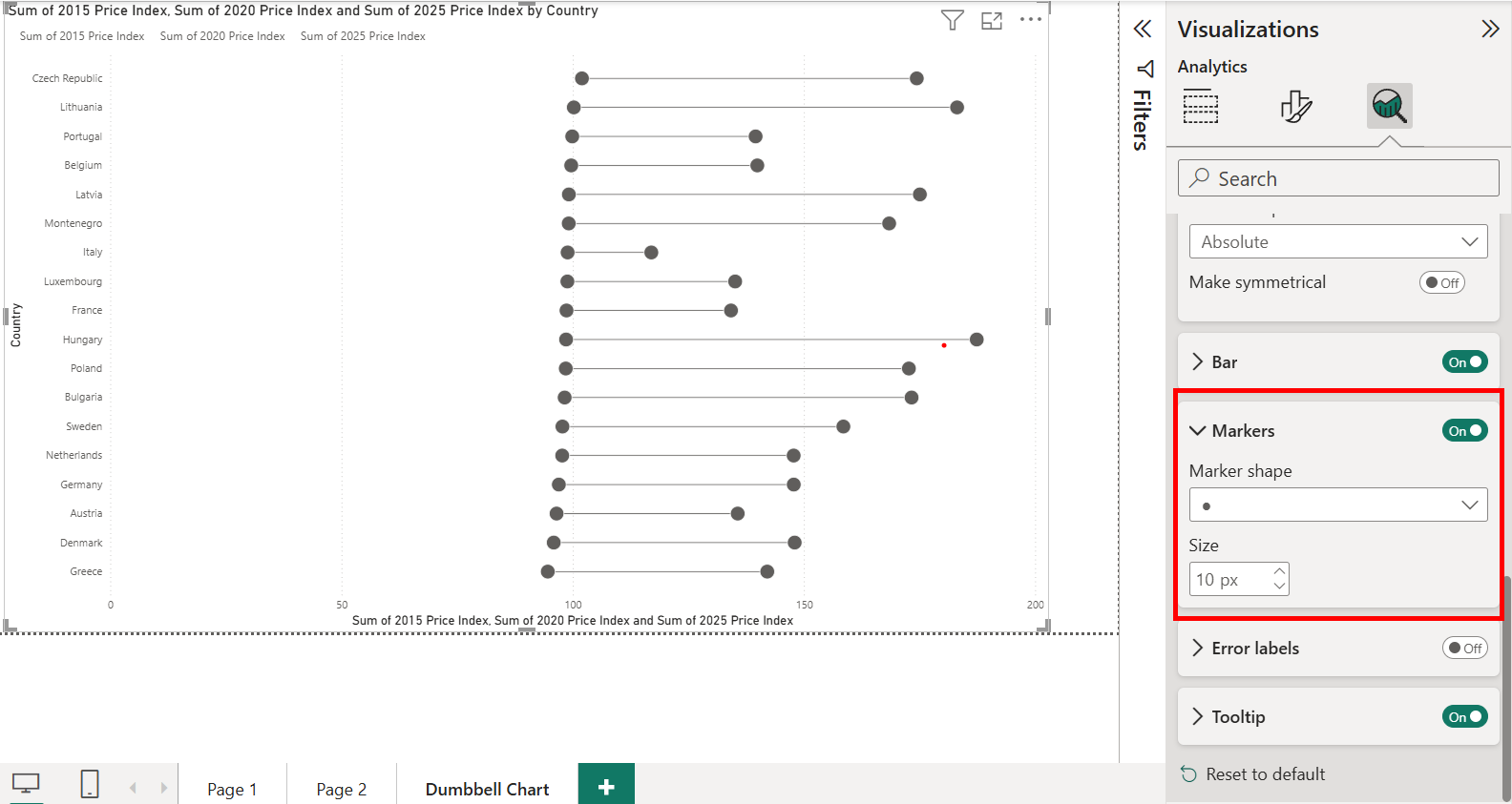
To create the "weights" at the end of our dumbbells change the marker shape to '●' and increase the marker size.
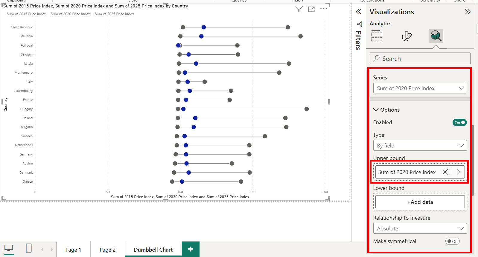
The next step, is to add in our 3rd dumbbell point. To do this change series to 2020 price index and place 2020 price index on either of the bounds, making sure the other bound is empty.
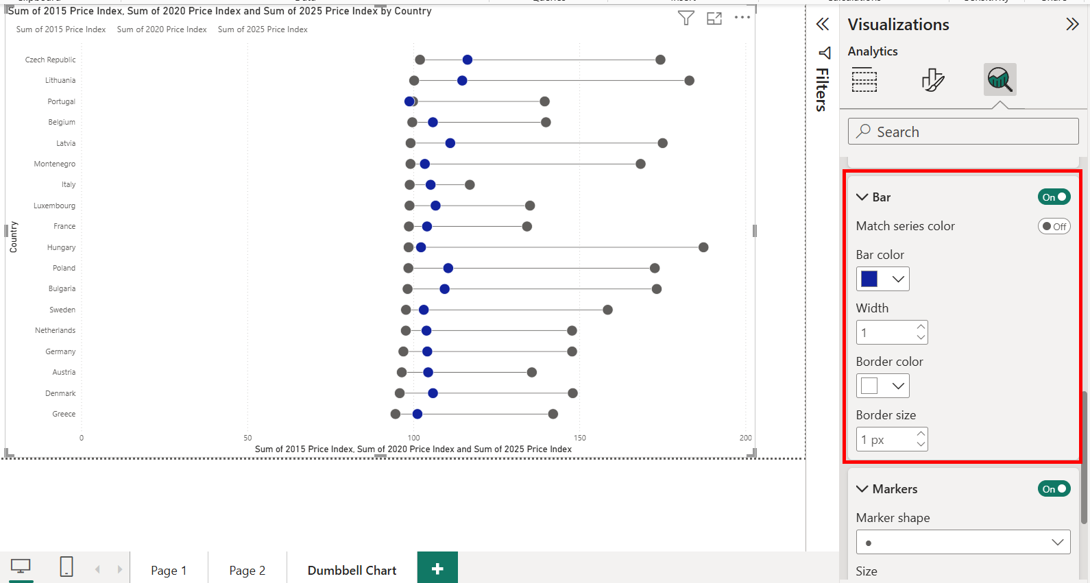
We can also change the colour of this marker, or any other marker to help users distinguish between them more easily.
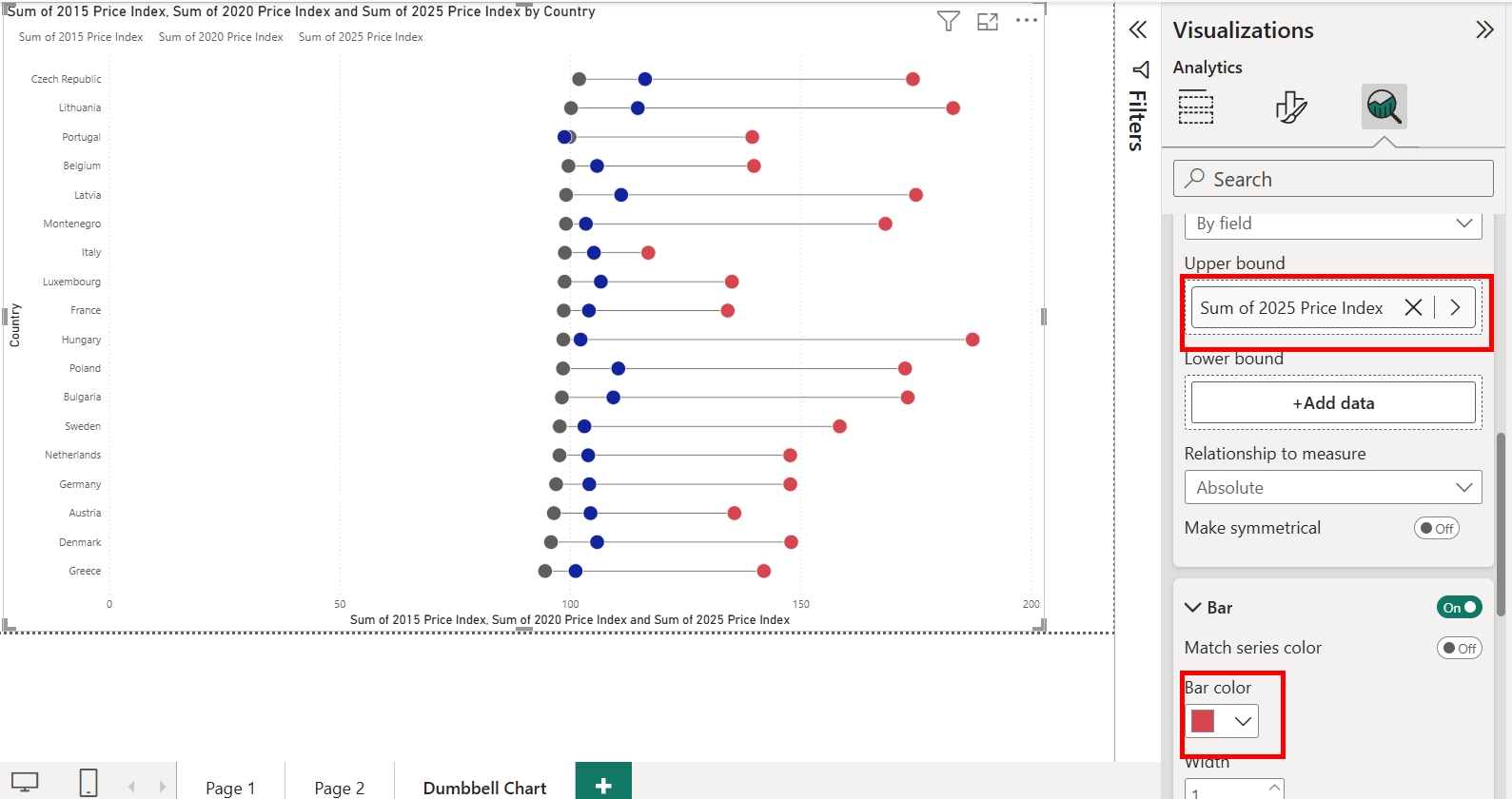
We can also change the colour of our 2025 marker in a similar fashion.
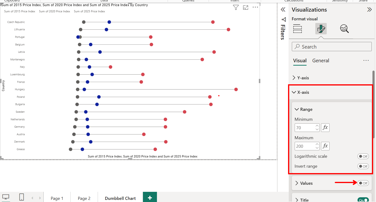
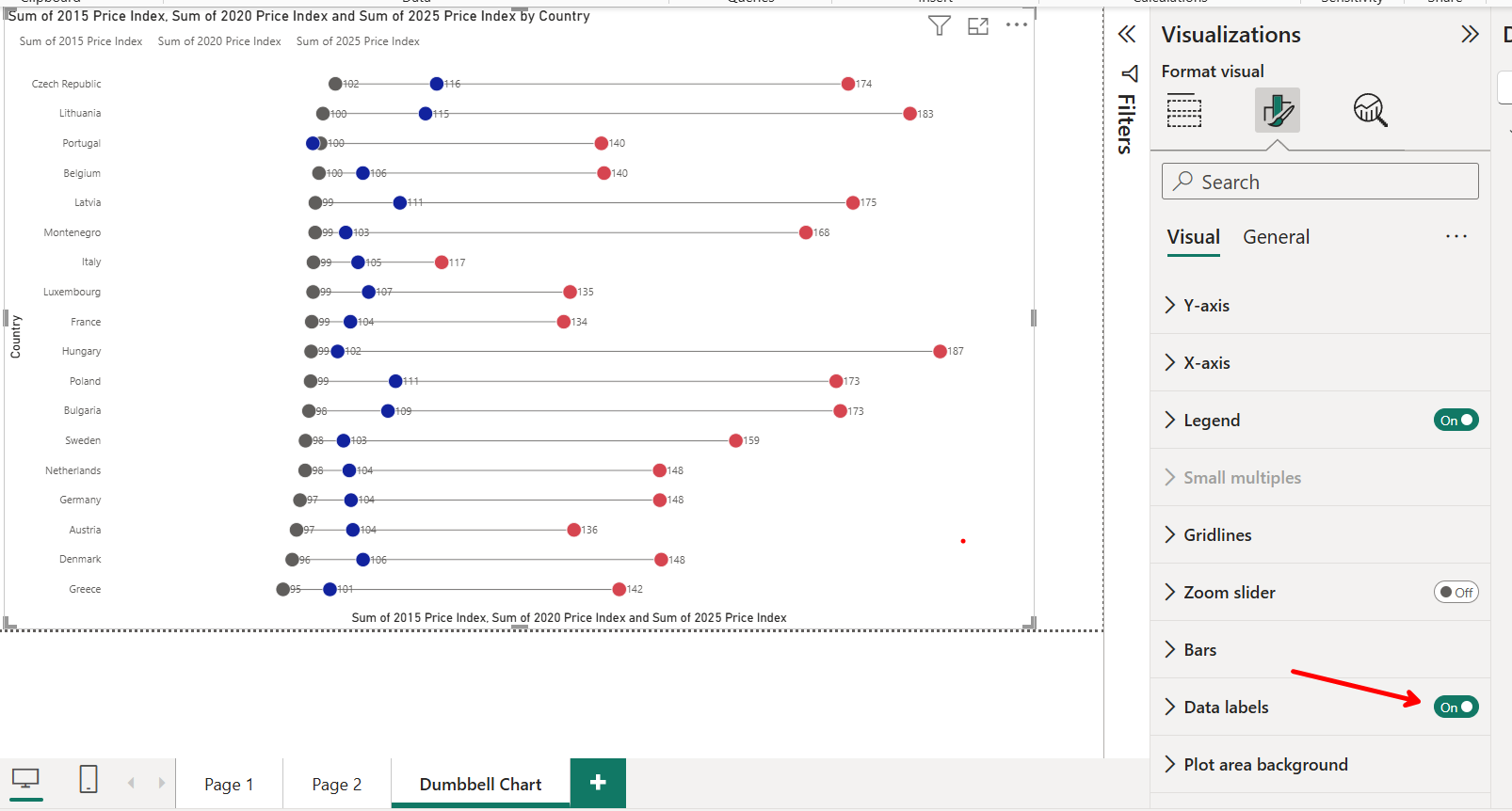
Now that we have our chart all we need to do is format. For example, I have changed the range of our X-axis to make the chart more easily interpretable. As well as turned of the axis values as in the next screenshot I turn on the data labels allowing for easier comparison between points.
You can now go and take this skills and apply them to other visuals like lollipop charts. Which would place a custom "0 value" measure on the lower bound.
One downside of this method is that no matter the point, tooltips will always show information on the maximum value. However, if you want to make tooltips which show information for all dumbbell points then go read this blog to learn how to add a visual into a tooltip: Power Bi - How to add a visual into a tooltip