


Progress bar charts aren’t a built-in feature in Power BI, but you can recreate the effect with a simple workaround. We are also going to make them rounded to add more to our learning.
Here’s how to do it step by step.
- Creating the baseline visual
- Add a Clustered Bar Chart visual
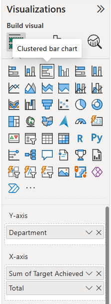
- Drag your categories into the Y-axis (in my example the field name is Department)
- Add:
- Sum of Target Achieved (this is your filled/progress portion)
- Total (this is what the progress is measured against)
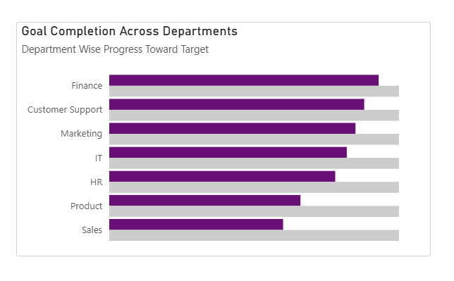
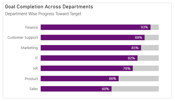
This creates a standard clustered bar chart showing progress vs total.
2. Adjust the Bar Layout
Go to:
Format visual → Visual → Bars → Layout
Turn on:
- Overlap
- Flip overlap
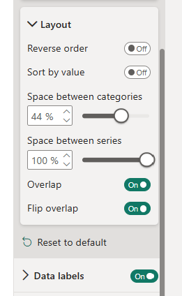
Now tweak spacing:
- Space between categories Controls the gap between each horizontal bar group. → Lower value = tighter layout → Higher value = more vertical spacing.
- Space between series (set to 100%) Pushes the bars in each category fully on top of each other. → This is key to making the bars look like a single progress bar instead of side-by-side bars.
At this point, your chart should resemble a progress-style bar.
3. Create the Rounded Effect
Now for the trick that creates rounded edges:
Go to:
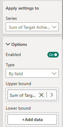
Add further analysis → Error bars
- Apply to: Sum of Target Achieved
- Under Options:
- Set Upper bound = Sum of Target Achieved
- Leave Lower bound empty
Do the exact same for the Total
Why this works:
- The upper bound gives us something to attach the rounded cap to
- Leaving the lower bound empty keeps the left side flat (so it aligns with the bar)
4. Add Rounded Caps
Still in Error Bars:
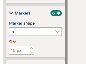
Go to: Markers
- Set Marker shape = Circle
- Increase Marker size until it matches the bar thickness
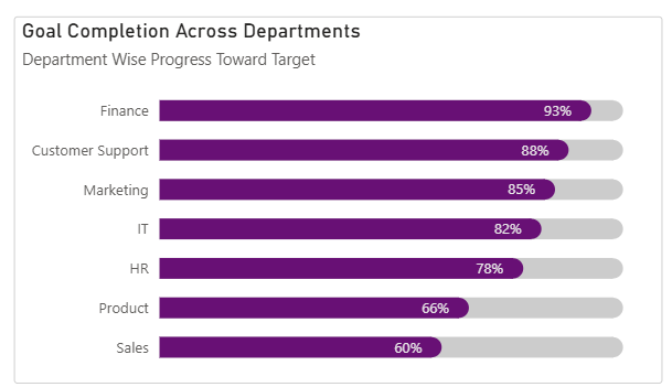
5. Final Result
Some tips:
- Match marker and bar colours: To make the rounded edge blend properly, set the marker colour to match the bar colour exactly and ensure there’s no visible outline mismatch. This creates the illusion of a fully rounded bar.
- Marker size maxes out at 10: If it doesn’t fully match the bar height, reduce your bar thickness in formatting (The example below shows what happens when the markers are too small for the chart).
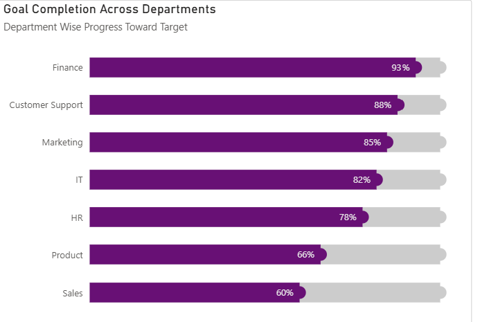
As you can see, progress bars are a clean, effective way to visualise progress against targets and budgets. Hopefully this has helped you to build them in your dashboards soon!