


Day 3 of Dashboard Week focused on recreating an existing Tableau dashboard in Power BI. This was a great way to understand both dashboard design and functionality at a deep level.
Quick note before diving in: I was unfortunately sick during Day 2, so I had to pause my work. I’ll be coming back to that soon and sharing it once it’s complete!
The Challenge
For Day 3, we were given three Tableau Public dashboards to choose from and recreate in Power BI. I chose:
“Demo Insurance Dashboards – Underwriter Performance” by Ellen Blackbird
With limited experience in Power BI, understanding how long dashboard migrations can take was definitely challenging. However, it was also a really fun opportunity to learn by rebuilding something piece by piece.
What I Worked On
This project pushed me to translate Tableau concepts into Power BI, which isn’t always a one-to-one match.
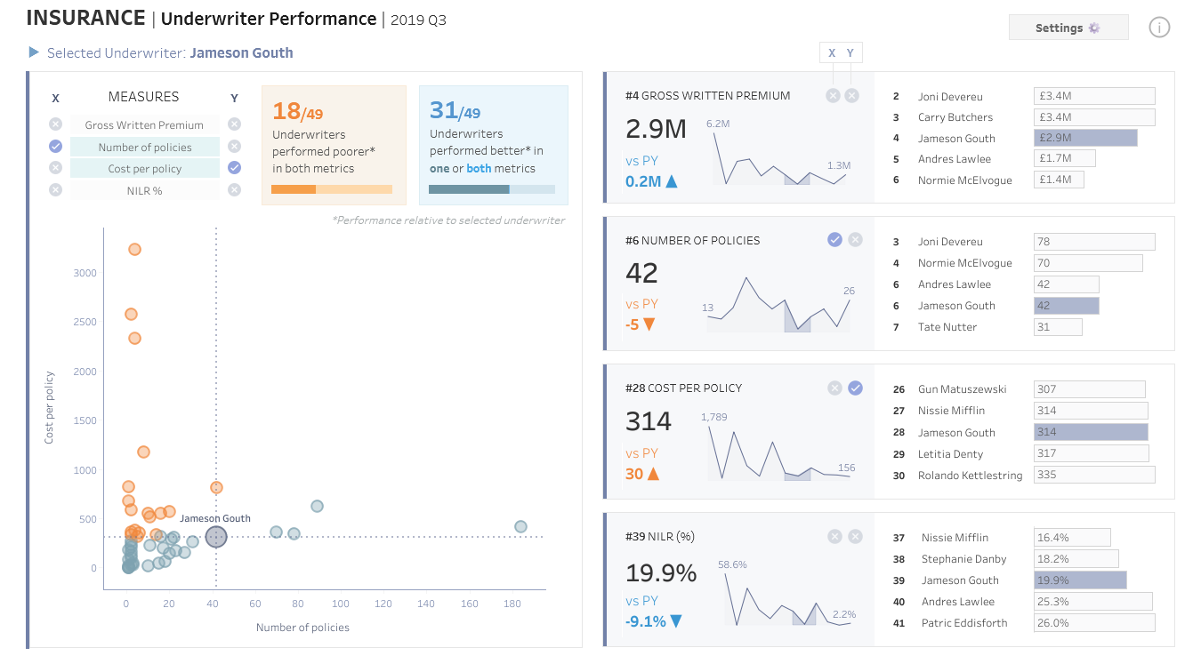
For this project, I started by downloading the Tableau workbook and the data behind it. My first goal was to understand Ellen’s original dashboard and make sure my Power BI recreation stayed true to the same user story and purpose.
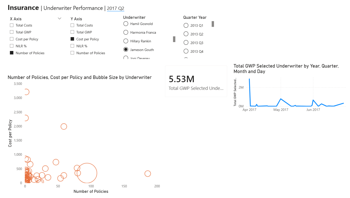
I began by building the scatter plot, which was one of the more important parts of the dashboard. One challenge was understanding how parameters work in Power BI and whether the same structure from Tableau could be translated across. I created dynamic X and Y axis selections so the user could choose which measures they wanted to compare.
Another part that took some time was the bubble size. In the original dashboard, the selected underwriter stands out, so I wanted to recreate that effect by making the bubble larger when a specific underwriter is selected. I eventually realized this also needed to be controlled through a parameter-driven calculation.
I wanted the underwriter parameter list to match Ellen’s dashboard as closely as possible. One thing I noticed was that Ellen had used a context filter for contract status, which affected both the list of underwriters and the scatter plot values. Since I was recreating this in Power BI, I handled this earlier in the process by editing the query and filtering the data before it reached the visualization stage.
Overall, this took a lot of work because I had to figure out the small differences between Tableau and Power BI. However, my main priority was making sure the dashboard still answered the original user story, and then making sure the numbers matched as closely as possible when rebuilding the charts.
What I Learned
This was probably the most valuable exercise so far.
Rebuilding someone else’s dashboard forces you to think differently. You start asking:
- Why was this designed this way?
- How do I recreate this interaction in a different tool?
It also showed me how different Tableau and Power BI are under the hood, even if the final result looks similar.
What’s Next
I’ll be revisiting Day 2 soon once I’m fully back, and I’m excited to keep improving this dashboard further.
Dashboard Week has been a great reminder that sometimes the best way to learn is by rebuilding and reverse engineering great work.