


Introduction
The holy month of Ramadan is observed by millions of Muslims around the world, with fasting each day from Suhoor (pre-dawn meal) until Iftar (sunset). As someone who also fasts during this month, I thought it would be a great idea to showcase how fasting timings and durations differ across countries and cities. The experience of fasting in London can be quite different from fasting in Makkah, Jakarta, or Toronto, and visualising these differences helps highlight the diversity of Ramadan experiences.
This dashboard project is my way of bringing together faith, data, and design to better understand my own fasting schedule and to create a tool that others can use to explore and compare global fasting patterns during Ramadan 2026.
Objective
The goal of this project is to build an interactive dashboard that shows fasting durations around the world during Ramadan 2026. The dashboard will let users:
- Compare fasting hours globally.
- Drill into country- and city-level details.
- See Suhoor (beginning of fast) and Iftar (end of fast) timings.
- Explore how fasting participation and duration vary worldwide.
This will be both a personal tool (as someone fasting) and an educational resource (to explain global Ramadan patterns).
User Story
- As someone fasting in Ramadan, I want to know the timings of the fasting period in my city/country and how it compares with other countries.
- As an educator, I want to visualise fasting participation and durations worldwide so I can understand global patterns, and communicate insights clearly.
Sketch & Design Plan
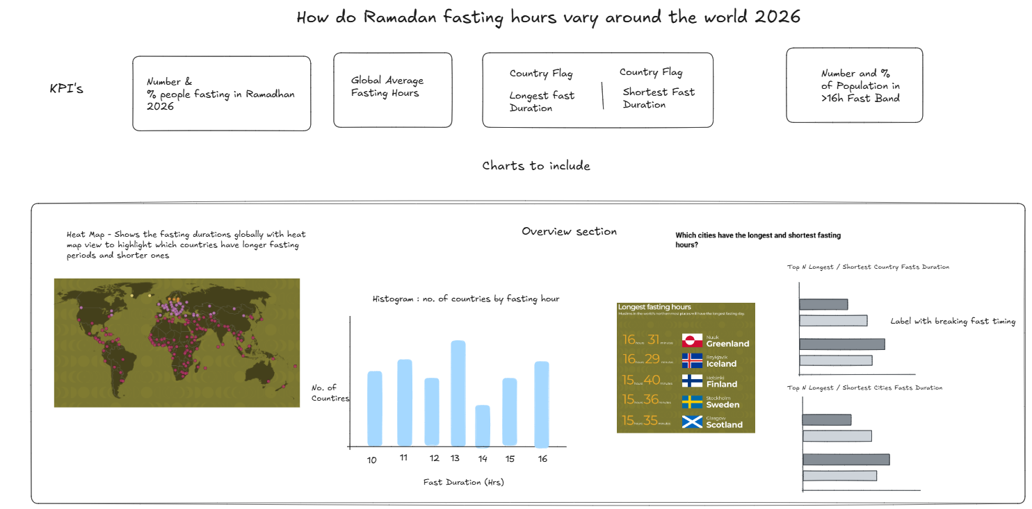
I started with a sketch in Excalidraw of potential KPI's and charts that I thought would meet the user stories needs breaking it down into 2 main sections:
1) Overview Section: Allows the user to look at general comparisons between countries and cities of fast durations for Ramadhan 2026.
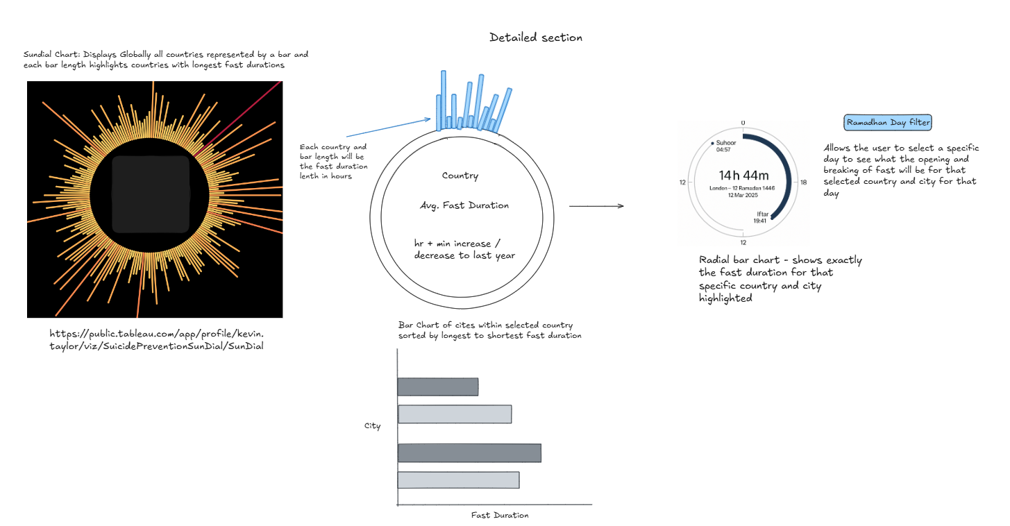
2) Detailed Section: Allows the user to drill down into country and city of choice to see what is the day to day timings to start and break the fast for each day in Ramadhan 2026.
The dashboard will have:
- KPI tiles at the top (global overview).
- Map (heat map) for global fasting durations.
- Bar charts for top/bottom countries or cities.
- Sundial chart showing all countries’ fasting arcs in a 24h circle.
- Radial bar chart for a selected country/city with exact timings of when fast begins and ends.
KPIs to Include
- Global Approx. No. and % fasting people (approx. Muslim population above age 15).
- Global average fasting hours.
- Country with longest average fast duration.
- Country with shortest average fast duration.
- No. and % of people fasting >15 hrs.
Chart Types
- Heat Map – global average fasting duration by country.
- Bar Charts – longest vs shortest fasting countries/cities.
- Sundial Chart – circular view of fasting hours for all countries.
- Radial Bar Chart – one country at a time, showing beginning of fast (Suhoor) → End of the Fast (Iftaar).
Filters / Parameters
- Country selector – filter on one country.
- City selector – drill down to one city.
- Ramadan day (1–30) – daily view of timings of beginning and end of fast for each day
- Top/Bottom toggle – longest or shortest countries/cities in bar chart.
Data Fields Needed
Geography:
- Country, City, Latitude, Longitude.
Date/Time:
- Suhoor Time (start of fast) - Based on Sunrise
- Iftar Time (end of fast) - Based on Sunset
- Fasting Duration (hours/minutes).
- Ramadan Days (1–30).
- Ramadan Year (2025, 2026).
Population:
- City/ Country Population - to calculate % of Muslim population
- Estimated Muslim Population broken down by age demographics (only adults are obligated to fast in Ramadhan) -
Comparison:
- Avg fasting duration 2025 vs 2026.
Data Collection
Two collection methods:
1) Static (approximation) – Manually create datasets based on latitude-based daylight estimates for Ramadan 2026 (17 Feb – 20 Mar) from https://www.islamicfinder.org/prayer-times/?providedDate=1755993600000&type=Gregorian
2)API-based (real prayer times) – Use the Aladhan Prayer Times API. Create Python script to fetch and export a CSV for Tableau which will include the sunrise (beginning of fast) and sunset (end of fast) timings.
Considerations & Definitions
- Ramadan start/end may shift (moon sighting). Current dataset assumes 17 Feb – 20 Mar 2026.
- Calculation methods differ (ISNA, Umm al-Qura, MWL, etc.). The dashboard should clarify which method is used.
Current Progress
-User stories defined
-Sketch & chart plan – defined KPIs, chart types, and filters.
-Selected Fields for Each Chart Type & KPI
Next Steps
1. Create Static Dataset (Baseline)
- Generate an approximate Ramadan 2026 dataset (17 Feb – 20 Mar) using latitude-based estimates with selected countries/cities
- Include daily Suhoor/Iftar times, fasting durations, and population estimates for a core set of global cities.
- This provides a consistent dataset to prototype the dashboard before connecting to live APIs.
2. Prototype Build (Static Data)
- Load the static dataset into Tableau.
- Create the core charts: KPI tiles, heat map, bar charts, and a basic sundial view and radial chart.
- Add filter controls (Country, City, Ramadan Day) to test interactivity.
3. Data Validation & Refinement
- Compare a sample of static durations with real prayer timetables from mosques or online sources.