You can’t spell chart without “art.” Design is at the core of Tableau software, as it gives analysts the tools to make aesthetic charts and sleek dashboards. Design and color were deeply considered throughout Tableau’s development, as for instance color expert Maureen Stone worked to make Tableau’s color palettes and UX design elegant, easily understandable, and accessible to those with color-vision deficiencies.
I began to wonder if you could create art within Tableau, focusing on the visual rather than analytical capabilities of the software. Many Tableau users have combined these elements to create increasingly artistic visualizations, such as Nadieh Bremer, who has some incredible projects that you can view here: https://www.visualcinnamon.com/.
“Data Art” is also an emergent field, with some vizzes made purely for artistic purposes. Leo Newman is a great example, with some really cool vizzes like the one below, which uses coordinates from the Mandelbrot set fractal and colors the circles in a sunset pattern.

https://public.tableau.com/app/profile/leo.newman/viz/MandelbrotVizzes/RubberBands
Another great piece of data art, also from Leo Newman, is a rainbow plasma image. It’s also based on an X Y coordinate system to generate the image, with the color field using several Sin functions. Even though it uses individual points, I thought it was a good example of how marks can merge to form a smooth image - in this case, the small points gradually transition in color.
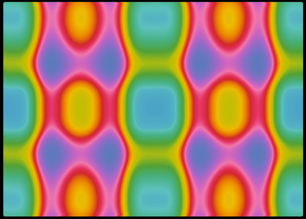
https://public.tableau.com/app/profile/leo.newman/viz/RainbowPlasma/Sheet1
You can form essentially any basic image or shape in Tableau using a coordinate system, and optionally a field that colors marks differently. Lisa Hitch here at the Data School posted a helpful blog about how to map your data points to images and find resources to generate coordinates - check that out here: https://www.thedataschool.co.uk/lisa-hitch/how-to-make-a-custom-shaped-chart-out-of-data-points/.
Her dashboard depicting deaths of children in Palestine, for instance, creates coordinates from a rose image to plot the data points.
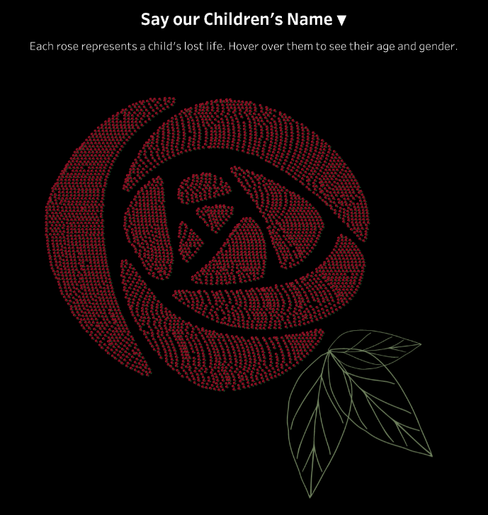
https://public.tableau.com/app/profile/lisa.hitch/viz/SilencedLivesPalestineinNumbers/Dashboard_1
Asha Daniels at the Data School in London has created some impressive vizzes that use a similar coordinate method to create images out of data points. In this case, she creates a version of a plum pudding chart depicting the decline of the Amur Leopard population.
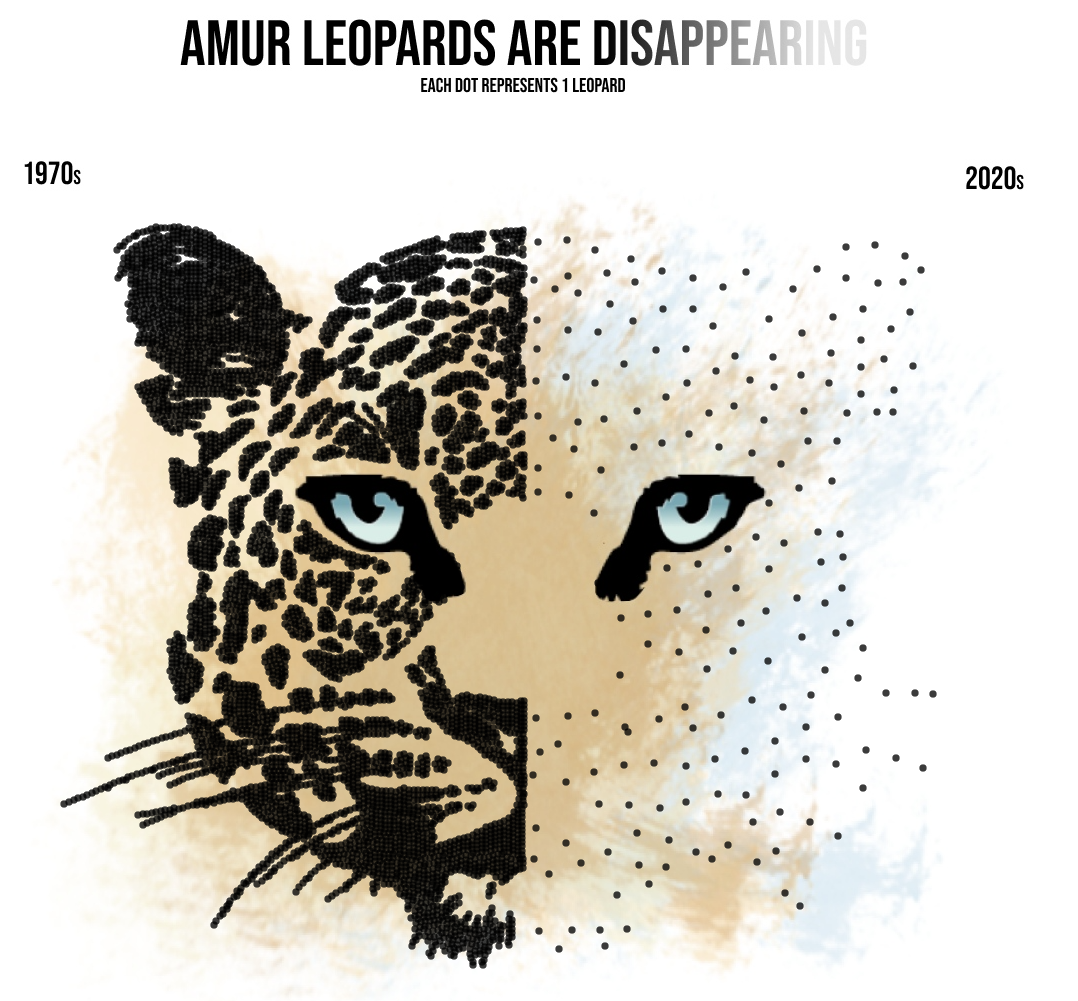
https://public.tableau.com/app/profile/asha4359/viz/AmurLeopardsareDisappearing/Dashboard1
After looking through some impressively artistic vizzes, I decided to try my own hand at creating art in Tableau.
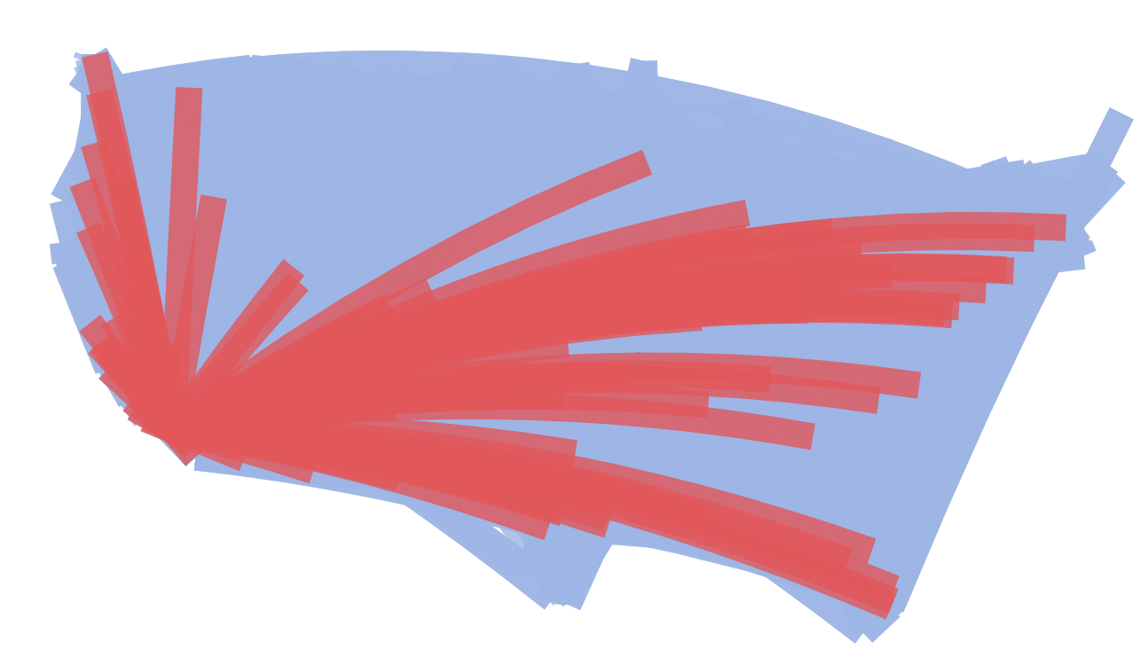
My first example shows data from airline routes in the U.S., using a makeline function to connect origin and destination airports into a route line for each flight. A parameter is used to select a single origin airport (in this case LAX is selected), and then a calculation is used to highlight routes from that airport. As with many of my art experiments, I increased size on the marks card to fill up the chart with more color. I call this one “LAX in Red.”
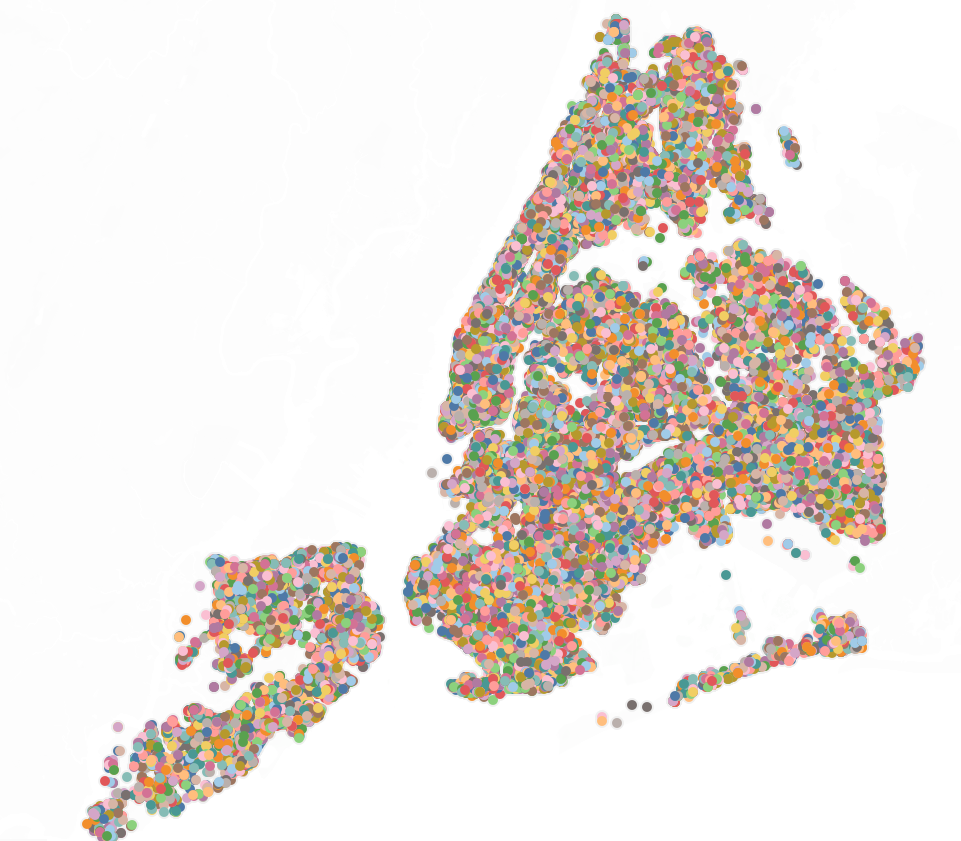
Another one of my art attempts is simply a dot map of rat sightings in New York City, with the individual ID’s of each rat placed onto color. The color of each rat ID uses Tableau’s default colors, cycling through the same colors again when the default color palette runs out. I then removed the background map so that the outline of NYC’s boroughs are formed only by the data points. This is quite a simple map, but I thought it looked like something you might find in a Modern art exhibit. I call it “Rat Paradise.”
Finally, my magnum opus: an attempt to create a landscape painting in a Tableau dashboard. This could definitely be taken a few steps farther and given more detail, but I’m happy with how my idea turned out. I used Tableau’s integrated Superstore dataset for all of the elements, which include an inverted bar chart for tree trunks, as well as their shadows and highlights, bubble charts with different dimension fields put onto detail for tree leaves, and area charts with different date parts on columns for the mountains and ground plane. I floated all of the dashboard elements and had to duplicate sheets several times since the same sheet can’t be on the dashboard multiple times. I call this piece “Sales Forest.”
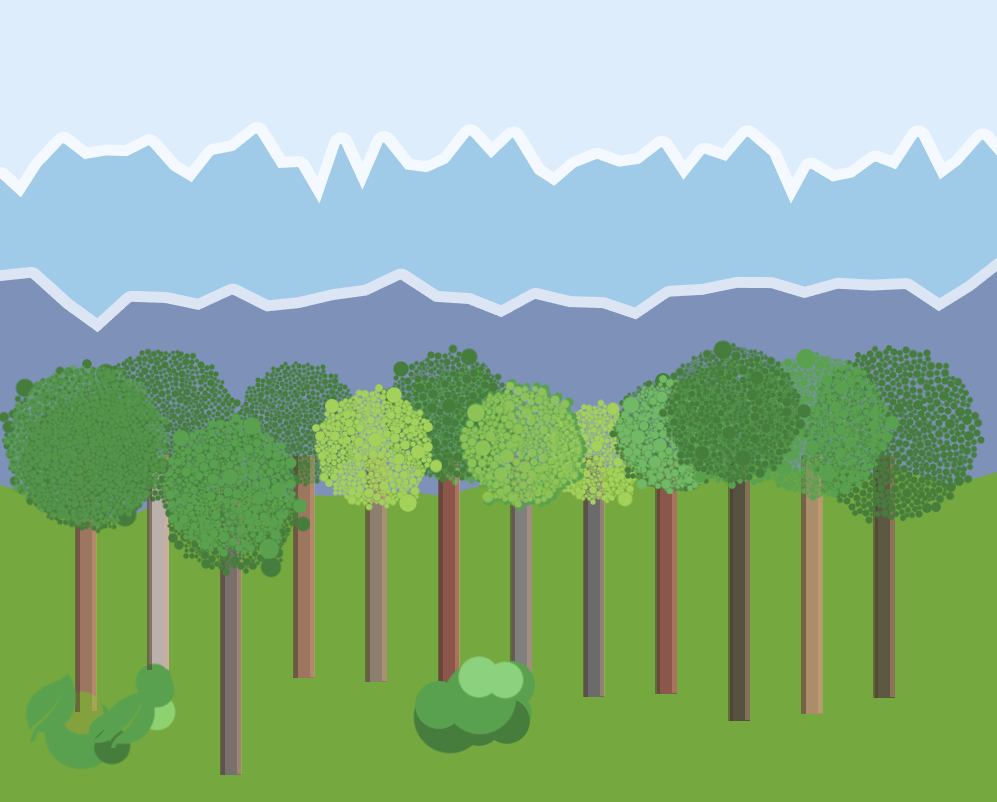
https://public.tableau.com/app/profile/lukebennett/viz/LandscapePainting/Landscape
While I won’t become Tableau Picasso anytime soon, I greatly enjoyed researching data art and trying to create some of my own. It will be interesting to track how art and analysis intertwine in the future, and Tableau is the perfect software to do it with.
Bonus: here’s some more artist-data puns I came up with:
Leonardo da Viz-cchi
Vincent van Graph
Chart Monet
Jean-Michel Boxplot
Henri Matrixtisse
Georges Serplot
Sankey Warhol