For our final day of Dashboard Week (and training!) our coach Val gave us the dataset she used for her application to the Data School (you can find the data here), concerning liquor sales in Iowa. Our instructions weren't as specific as they've been for the previous days. We just had to build a dashboard, with no specifications on the style and content other than the dataset itself.
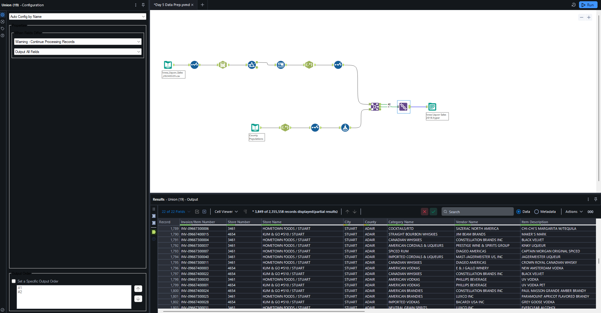
There was a lot of data so I decided to filter it to only 2018 (originally it was 2017 - 2019). The Alteryx workflow to do the data prep was really simple. All I had to do was remove unnecessary fields, filter to 2018, join the data with the population data for each county that was contained in another file, and make sure everything was in the smallest appropriate data type to improve performance (using the Auto Field tool).
Once I started working with the data, I found that some of my ideas didn't pan out very well. The jitter plot I made didn't look quite as good as I had hoped it would (the marks were all piled on top of each other) and I had to abandon my plan for a heat map because the data was similarly skewed.
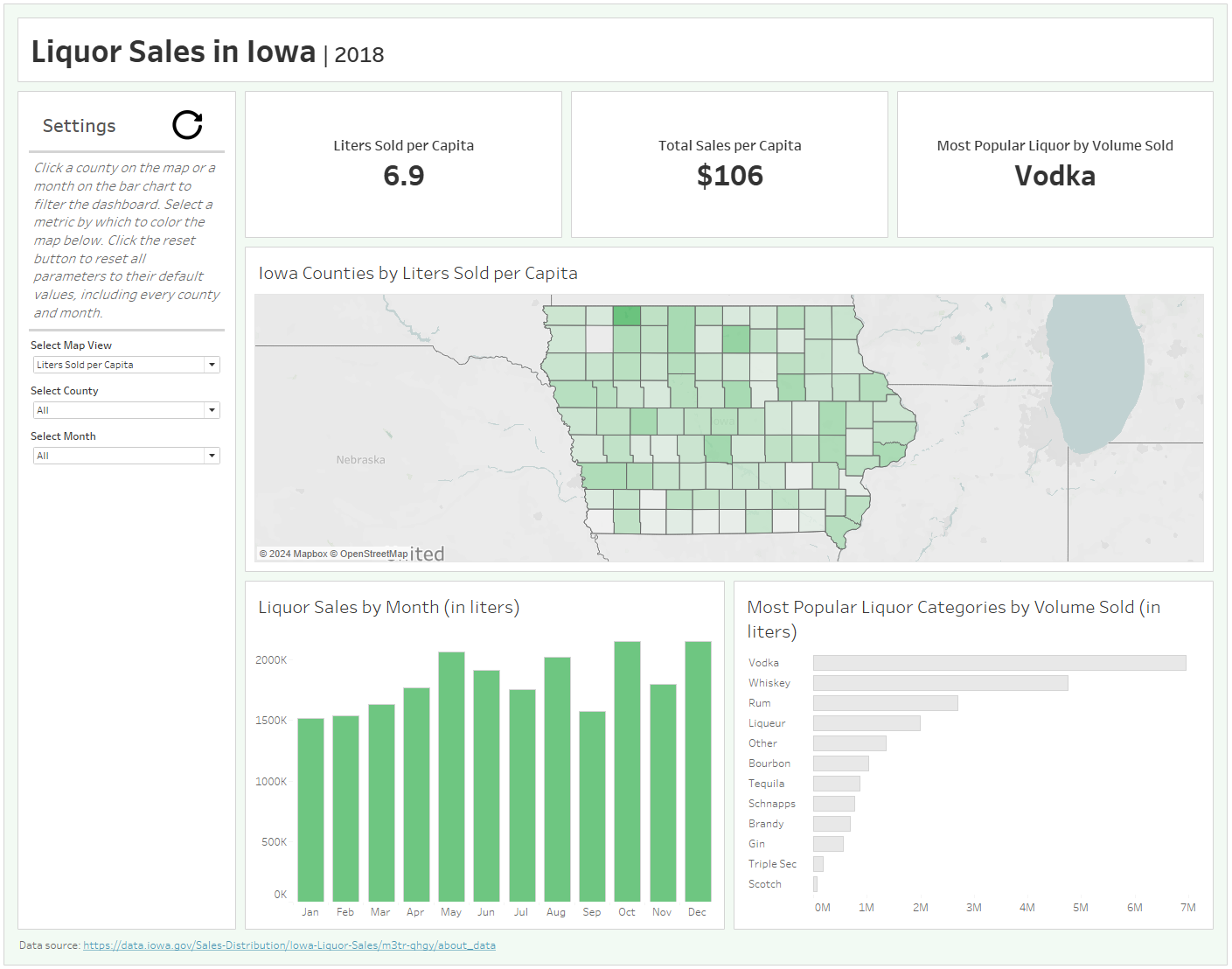
The ideas I ended up going with were a map of the counties of Iowa colored by a different metric depending on user input, a bar chart showing liters sold by month, and a bar chart showing the top selling categories of liquor. The whole dashboard was filterable to a selected county and month (or all counties and months) with parameter actions on the map and the month bar chart.
When it comes to chart choice it's a pretty simple dashboard but I'm pretty happy with its look and its interactive functionality and flow. Here's the link to view it on Tableau Public.